Handwriting Fonts: Most Popular Typefaces, Best for Webfonts
Handwriting, penmanship, or calligraphy: they all have different meanings, and they all pertain to specific aspects of writing. Nevertheless, it was an artistic, personal and quintessential method to translate ideas to a semi-permanent format such as paper or parchment, and be used for different ways, but more importantly, to serve as a communication tool, or historical document. Handwriting fonts such as that of several cursive and script fonts have become very popular in the 19th century onwards to the middle of the 20th century. It has become an important tool since a lot of people, especially from, advertising who wanted fonts that are personal and close to known forms especially if they did not have any lettering specialists.
The history of handwriting is extensive and the handwriting fonts are not just limited to cursive or script fonts. Many other fonts have been based on handwriting and thus, can all be attributed as part of the handwriting influence. Other fonts have emerged such as of transitional and modern as well as sans serif fonts as a reaction against more humanist styles connected to handwriting.
Western Calligraphy
The pen is an important tool for any calligrapher. The pen can be round nibbed or flat-balled. Another important tool would be the brush. If you would compare many fonts of today that are calligraphic, cursive or script, they resemble some qualities of being written either by pen or brush. These are characteristics that define handwritten fonts. Other materials used for calligraphy include ballpoint pens as well as felt tip pens but since they produce only thin lines, they do not create fluid, angled lines and variations in strokes. Writing also employed the use of inks. Water based inks are preferred since they are not as viscous as oil-based inks.
In the west, Sacred Western Calligraphy contained unique features as apparent with the illuminated manuscripts. There is an obvious need for ornamentation and letters, especially first letters of each chapter would tend to carry a more artistic flair. Nevertheless, strict rules applied when it came to Western Calligraphy. There is a geometry followed and the rhythm of the text had to be observed. The characters also had specific forms and stroke orders to create consistent results. The unique feature of western handwritten calligraphy is that sizes, colors and styles have different connotations compared to typefaces that focused more on form. Also, with the Sacred Calligraphy of the West, it did not have to be legible but the viewer can definitely empathize with the artwork. A good example of contemporary Western Calligraphy can be explored in Saint John’s Bible.
Latin Calligraphy
Latin script was a defining component of western calligraphy and has been developed in Rome to different formats. The Roman Imperial Capitals, Roman cursives and Rustic capitals are used specifically for different media and purposes. Developments continued during the 2nd and 3rd centuries when uncial was created and became very important for monasteries especially when copying the bible. Thanks to the monasteries, they were able to keep old calligraphic legacies within the 4th and 5th centuries as the Western world of the past fell under the Dark Ages. The uncial generated a wide variety of forms depending on where it was used. The styles are dependent on the monasteries. Some of these forms are cursive in nature and like some cursive fonts today, they are not the most pleasant to read especially in extended texts.
When the Carolingian Dynasty came to being, a standardized form of writing was adopted. The style would come from popular monasteries in the 8th century. The Carolingian Script was established and its influence spread across other territories and kingdoms. The said form was adopted for several centuries until they outgrew the past forms and the Carolingian script was transformed to gothic. Its compact and economical format becomes highly popular across Europe. During the 13th century, the first printer was created by Johannes Gutenberg and so the first typeface to be used was the Gothic style. In the 15th century, the Italian humanists created a unique variation to Carolingian and were termed originally as littera antiqua which we now recognize as the humanist minuscule.
With Postcards Email Builder you can create and edit email templates online without any coding skills! Includes more than 100 components to help you create custom emails templates faster than ever before.
Free Email BuilderFree Email TemplatesWith the popularity of copperplate engraving, handwriting became more popular since penmanship books can now be produced faster. They first appeared in 16th century Italy. As the centuries progressed, the need for penmanship became more important.
Handwriting, especially with that of cursive writing has become very important in the 19th century and towards the 20th century. While handwriting and cursives are still required in some schools today, for some reason, the discipline of formal penmanship has been lost due the availability of fonts. For some, traditions like perfect penmanship are obsolete, but with the help of typefaces today, we are able to look back at the history of human skill, how technology became extensions of the hands, and how we perceive good handwriting nowadays.
Most Usable Handwriting Fonts
Carolyna Pro Black
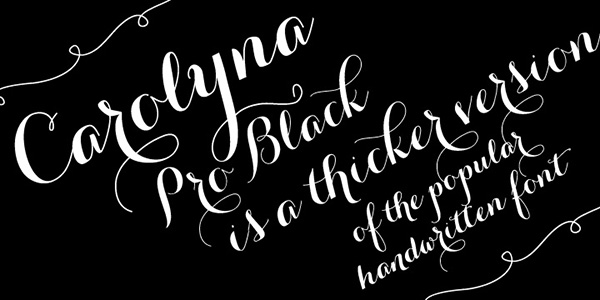
Carolyna Pro Black is said to be made with readability in mind so that despite lavish and whimsical appearance overpopulated with swashes it is still easy to perceive. Though to be honest, the font is suitable for displaying titles or adding to UIs decorative touches. Delivered with more than 1000 characters it has capabilities to work with foreign languages, from Eastern to Western European ones. It has open-type features and stylistic alternatives.
Melany Lane
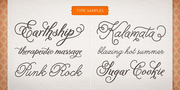
Melany Lane has an elegant letter-hand touch that endows the typeface with an exceptional delicate nature. The artist is managed to transform traditional letterforms into a subtle and exquisite font with flourishy appearance and charisma. It is an ideal option for feminine projects. To help you produce a finished and more profound effect, in the package you will find some additional stuff such as 14 complementary seamless patterns.
Insolente
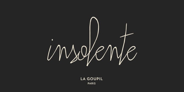
Insolente has an ultra-narrow and a bit quirky appearance that lets create modern projects with a fashion vibe. It mimics human signature and gives headings a personal touch. It comes with
With Pulsetic you’ll be instantly notified the moment your website, API, or server becomes unavailable. Monitor uptime from multiple global locations and respond to incidents before your users are affected.
Create beautiful status pages in minutes to keep customers informed during outages and build trust with transparent communication.
Start Monitoring for Free- ligatures;
- double-letter ligatures;
- alternative ornamental glyphs to embellish beginning or end of a word.
It works great with OpenType-friendly apps, yet, unfortunately, does not include all the necessary characters to write in all kinds of foreign languages.
Peoni Pro
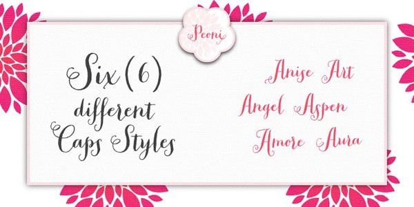
Peoni Pro is claimed to provide your project with marvelous authentic custom-lettering feel. It owns a huge potential that lets you use
- contextual alternates;
- standard ligatures;
- swashes and contextual swashes;
- discretionary ligatures;
- tabular numbers;
- proportional old style numbers;
- 6 Caps styles.
The stylistic set covers all the common characters, yet you can experience some problems while using the font in applications that do not support open-type.
Belinda
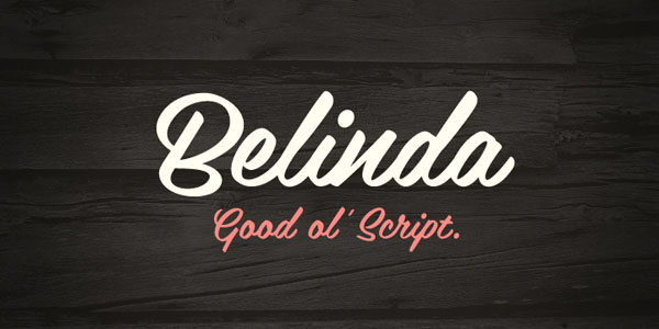
Belinda has a smooth, elegant appeal that is achieved through an excellent combination of subtle curves, curved lines, and boldness. It is an ideal solution for making headings look delicate yet visually weighty. What’s more, the typeface also has a retro nature that enables to collaborate with UIs that go for an old style atmosphere.
Susa
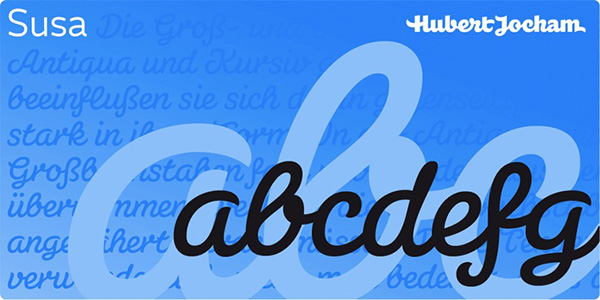
Much like the previous example, Susa looks elegant and delicate even in a great weight. Thanks to smooth lines and absence of sharp edges this brush-inspired calligraphy font achieves chic and delicacy with an ease. It is presented in a light and bold version and comprises all the required symbols to display Latin-based letterings.
Nakata
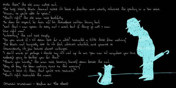
Nakata is a polished script font. Inspired by the characters created by Haruki Murakami, it has a subtle sense of Japanese nature with lots of intelligent features and a slightly messy appearance. Although it includes ligatures and stylistic alternates, nonetheless, it speaks preferable Roman-based languages.
Au Revoir
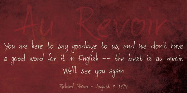
Au Revoir has a French charm that exudes an image of sophistication and exquisite taste without being posh. It marries up subtlety with simplicity thereby strengthening legibility of this beautiful cursive typeface. It can be used to write a long copy or just several words. The glyph coverage lets you cooperate with different European languages.
Lu Px
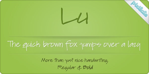
Lu Px tries to strike a balance between quirkiness and legibility to produce a harmonious and elegant typeface. It is a bit whimsical and rough. Delivered with an extended set of characters, the font supports various languages from Dutch to Czech. However, when it comes to styles, it offers only two options: regular and bold.
Bombshell Pro
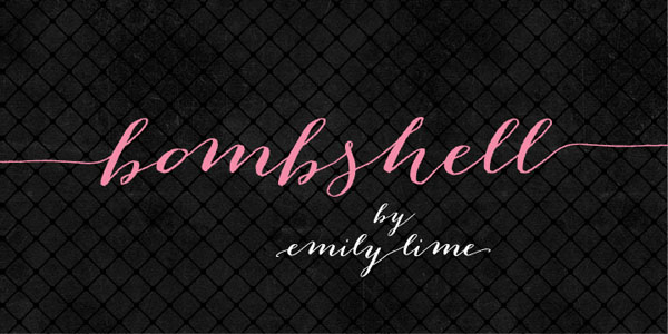
Bombshell Pro is an excellent instrument for creating realistic signatures or impressive headings. It is an increasingly decorative calligraphy type that lets you add charismatic swashes to the beginning and end of lowercase letters or just use long subtle connections to give an extra charm to the word. It includes
- more than 800 glyphs;
- initial letters;
- terminal letters;
- alternates;
- Roman numerals.
Hipster Script Pro
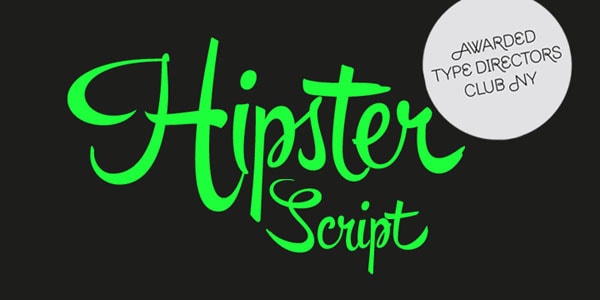
Hipster Script Pro expresses a personality of modern urban culture. It skillfully emulates brush lettering, erasing borders between digital and handwritten. The font has received several rewards and certificates.
Jacques & Gilles
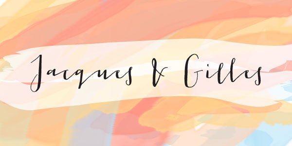
Jacques & Gilles is a cursive font that is hardly can be called elegant. It is fanciful and eccentric with some stylistic traits that mimic human touch. The author skillfully incorporates two different temperaments. Thus, lowercase letters are marked by Jacques persona and uppercase letters by Gilles persona. Used in tandem they obtain a spectacular result.
Ride my Bike
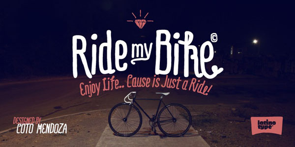
Ride my bike was designed by the talented artist Coto Mendoza. The type combines senses of urbanity, sports and youth to convey a street style and a dynamic subculture of bicycle fans. It comprises
- more than 600 glyphs;
- almost 100 dingbats;
- alternate characters;
- ligatures;
- terminals and leading characters.
You can mix and match various weights and styles to prettify headlines and titles. For less sophisticated users, the author has provided other type format rather than OpenType.
Sketchetik
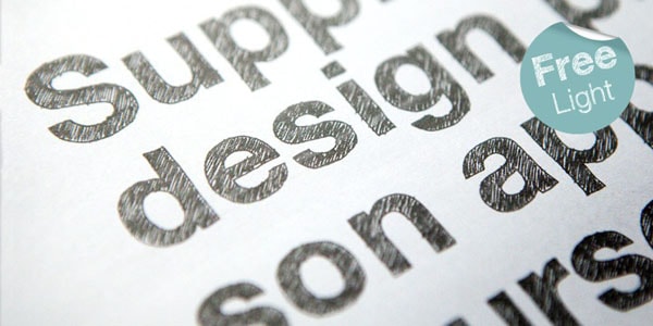
Sketchetik is a bold and massive typeface that has a hand-written nature inspired by school doodles. It comes in four styles: light, regular, bold and black. There are also two variations of filling such as outlined and solid. The only drawback is that it is available only for desktop and web projects.
LUELLA
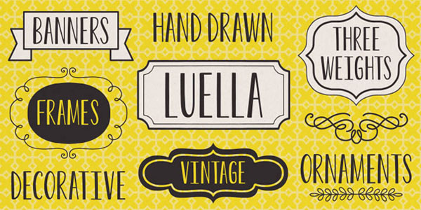
Luella is a charismatic feminine typeface with a note of vintage appeal. It looks elegant and subtle. Delivered with three basic styles such as regular, bold and black it can be used for displaying either short copy or long headline. To feel the whole power of this typeface, you should buy a special complementary set of frames and decorative ornaments.
Hand Gothic
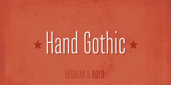
Hand Gothic is aimed to express the strong and enigmatic personality of this dark culture. It is a condensed typeface that ships only in two weights (regular and bold). Nevertheless, it has a potential to co-work with different European languages. Thus, thanks to OpenType format, ligatures, alternate characters, case-sensitive forms, and small packages of icons and arrows made on the same theme, you can create eye-catching titles that speak in English, French, Polish and others.
Sugar Pie
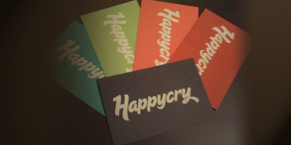
Sugar Pie is a bold and hand-written typeface that looks soft, polished and exquisite. It tries to fake brush scripts of the late 60s. It offers numerous variations provided by ligatures and alternates with loops and swashes. It has artistic traits, yet it remains legible on the screen of any size.
Signalist
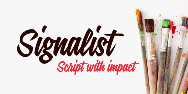
Signalist is another brush-inspired typeface in our collection that echoes traditional soft scripts. It is spruced up with dynamics and fluency. Although glyph coverage needs some improvements and extensions, yet it is an ideal for showing copy in Latin-based languages. Moreover, you can use it in different sorts of projects, including e-books and apps.
Conclusion
Handwritten fonts have a delicate nature, even when they are set in bold weight. They can be chic, refined, fragile, fancy, quirky and even a bit messy. Although it seems that they are destined to accompany project with subtle aesthetics, however, as our list shows, there are font families that have hipster-inspired traits, Gothic motifs, sports vibe, urban appeal, retro piquancy, and even a slightly sketchy feeling.
