24 Amazing Landing Pages for iOS Apps
It seems like iOS apps are coming out left and right now-a-days. It’s amazing how many of them are well executed and interesting apps. I’ve scoured the web – mostly Product Hunt – to collect as many as landing pages for apps as I could find in order to bring you and inspiring list.
These landing pages are simple, elegant, fun and, above all, well designed. I’m sure you’ll enjoy them all. I do hope you’ll give a shot to some of these apps too as they are pretty great themselves.
Landing Pages for iOS Apps Examples
Timeful
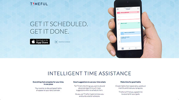
Timeful is a smart calendar/time tracking app. It uses complex algorithms to improve how you spend your time and how you can be more productive. It tries to think for you in order to help you get stuff done as well as relax by planning time off for you as well.
Keeply
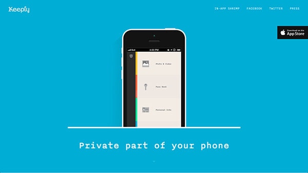
Keeply is a privacy protection app that helps you keep sensitive information in a secure place. You can store all sorts of things like photos, passwords, conversations, notes or even contacts. It’s all stored away in this lovely, minimal but colourful app.
With Postcards Email Builder you can create and edit email templates online without any coding skills! Includes more than 100 components to help you create custom emails templates faster than ever before.
Free Email BuilderFree Email TemplatesHeyday
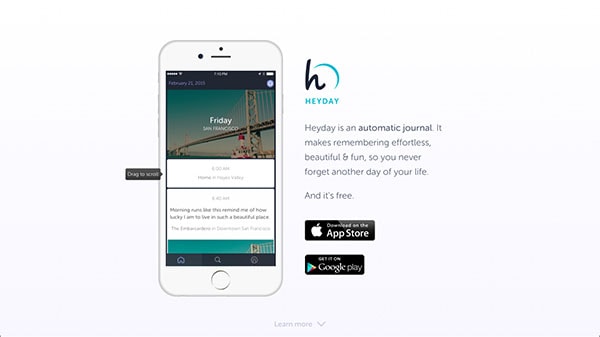
Heyday is an app that helps you track your day-to-day stuff – it’s a journal. The cool think about their landing page is the interactive iPhone app that demos the actually iPhone app for you. It’s a neat and clever way to show off the app right away to potential users.
Legend
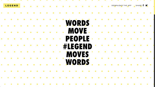
Legend animates text for you in either a Gif or a video format. You type in some magical words and it animates them for you. As you scroll through the landing page it shows off various animations – it’s a fun way to demonstrate the output of the app. What I love about this app is that everything is so vibrant and lively.
Storyline
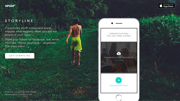
Storyline is an iOS app, which allows you to record voiceovers for your photos. It’s great for uploading videos to Facebook where you can explain what the photos are all about; it’s an interesting concept being able to talk about your photos as if in fact you were telling someone a story about them.
Marvel
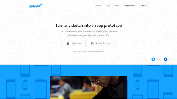
Marvel is a web app for creating interactive prototypes. However, they also have an iOS that works great with paper prototypes. You take a couple photos of the wireframes or sketches you’ve made and create a simplistic prototype right in your phone. I imagine this works best for testing mobile apps or mobile versions or responsive websites.
With Pulsetic you’ll be instantly notified the moment your website, API, or server becomes unavailable. Monitor uptime from multiple global locations and respond to incidents before your users are affected.
Create beautiful status pages in minutes to keep customers informed during outages and build trust with transparent communication.
Start Monitoring for FreeDull
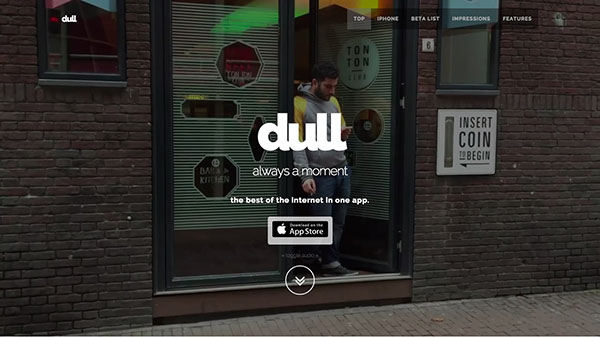
Dull is a content app which brings you the best content from around the web from places like Techcrunch, Gizmodo or even Esquire. The whole idea is that while you’re waiting around or are bored you should never have a dull moment so Dull aims to provide you great content in order to fill that moment.
Clipapp
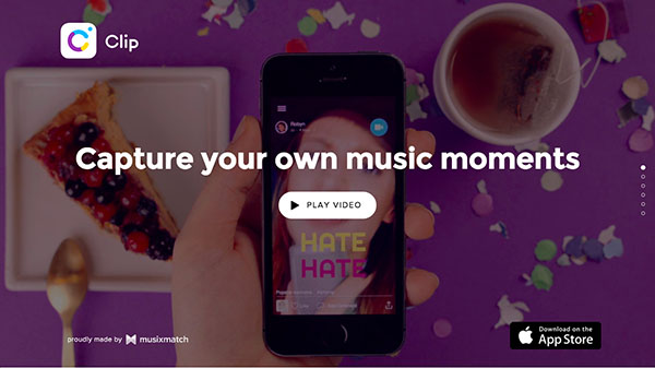
Clipapp is a pretty fun app that allows you to record your own music videos to share with friends. What often ends up happening is you’re just goofing around, but it’s fun nonetheless. I’m really enjoying the fun and vibrant energy of the landing page’s design. It sparks fun and creativity within me as I scroll through the page.
4Beats
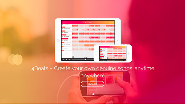
If you’re into music, you’ll be into this app! 4Beats allows your to create your own original music tracks on the go with your iPad or iPhone. It’s pretty fantastic how easy it is to create your own songs. The landing page is vibrant, colourful and exciting.
Instapaper
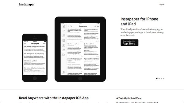
Instapaper is a ‘read it later’ type of app where you can save articles for later reading. The application is quite popular and is well known for it’s simplistic UI and amazing focus on readability. The landing page reflects this style too because it puts the focus on the app in the screenshots. Everything else is just text that’s well organized on the page.
Clips
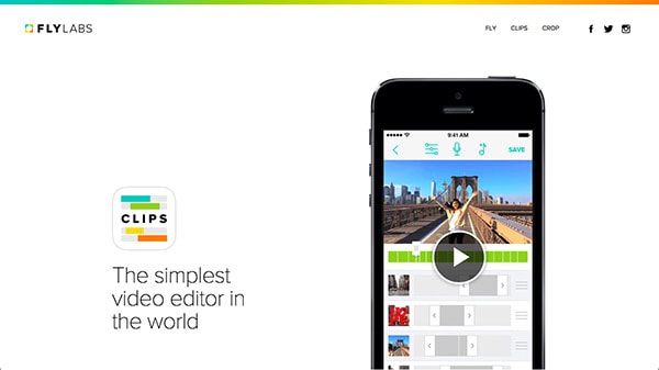
Clips is a simple video editor with a few key functionalities. It basically allows you to cut and edit together video streams on your iPhone. It’s key feature is its ease of use and the landing page reflects that; it walks you through how exactly to edit video with the app. It is, in fact, easy like 1, 2, and 3.
TeeVee
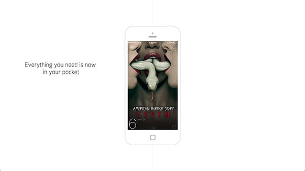
TeeVee is for those of you who are obsessed with your TV show – I know, I am. It lets you do a verity of things but most importantly it lets you explore and track your favourite shots by providing you with numerous information like trailers, summaries, actors info and what not.
Do IFTTT
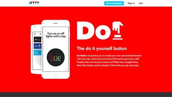
If you enjoy having your tasks or live automated this app by IFTTT is for you. Do is a do it yourself button platform that allows you to create your own exciting recipes for automation. The landing page is super informative as it provides you with numerous examples as to how exactly this new app would be useful to you.
Duolingo
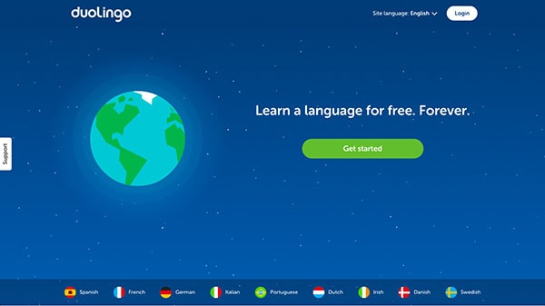
Duolingo is an app for learning languages; they currently offer 9 languages. It’s a self-paced and free program which has seen a lot of success stories. They have an amazing branding going on with super friendly and inviting illustrations guiding your way through as you learn a language. Their landing page too is extremely approachable and inviting – and it should be as learning a language can be very intimidating.
Abacus
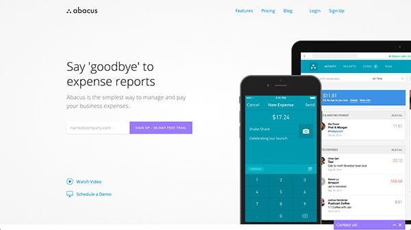
Abacus is an app which helps you manage your business expenses. Their landing page and their app is pretty colourful actually and look anything but intimidating. There isn’t much to the landing page, but a couple of screenshots and a bright CTA to try the trail. But, then again, you don’t need anything more.
Mailbox
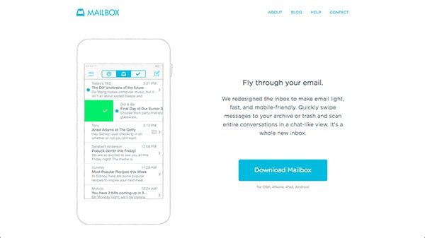
Mailbox, as the name suggests, is a mail app. If you love minimal, clean, and simple design this app is for you. It doesn’t rely on heavy design elements at all; instead it focuses on clarity to provide you the easiest, most productive email experience. Their landing page is a perfect representation of this as well.
Noisli
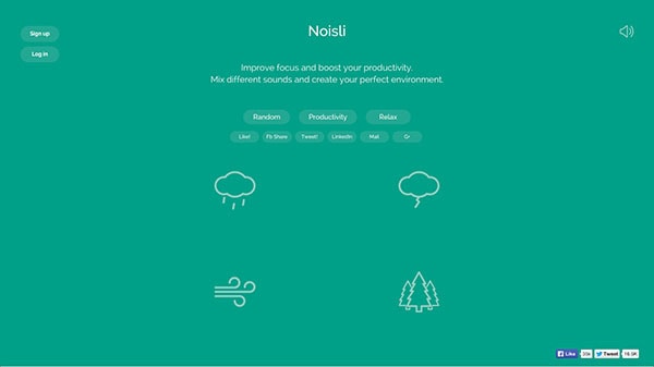
Noisli is an app that creates ambient background noises like rainfall, wind or even train track noises. It’s an interesting app for sure but definitely fun too. Who wouldn’t mind listening to some beach waves while trying to relax and sleep at the end of a long day? On top of that, their app is super clean and to the point.
Threes
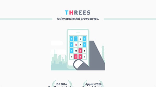
For the gamer in all of you I give you Threes. Although this app made a big splash a few months back. I think it’s nice to take a look at its landing page nonetheless – it has such lovely colours, which make the whole page look extremely pleasant.
Squarespace
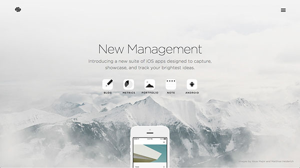
Squarespace is a website hosting platform. It’s mobile app is absolutely gorgeous; it shows off Squarespace’ elegant and minimal design style – naturally. The landing page is great too as it show you the app in a story like fashion.
Medium
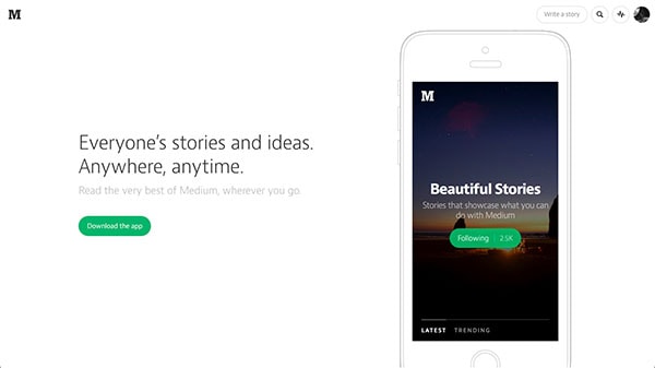
Medium is an online blogging platform where anyone can post. Their brand represents the experience of the users; they are very focused on making sure the reader has the best possible reading experience; this is true on their website, their mobile app and their app’s landing page. It’s all about getting right to the point.
Acorns
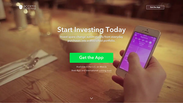
Acorns automatically transfers over space change from your day to day purchases and invests it into diversified portfolios for you. Their app is colourful and bright making investing and finances less dull. The same is true of the informative landing page.
PaidHQ
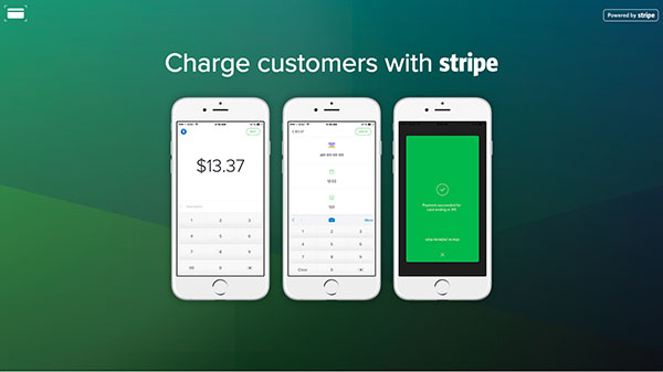
PaidHQ is a mobile app for Stripe payment processing. It’s simple, it’s easy, it’s intuitive. Their landing page is exactly the same way in order make sure you can easily take payment on your mobile phone.
Peek
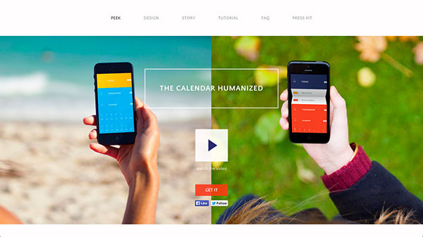
Peek is a new kind of mobile calendar. It’s fun, colourful and a bit different. It uses interesting gestures to provide a new kind of experience. It’s really fun to look at thanks to its unique colour scheme and design. It’s all about improving the way people experience calendars and time management.
IA Writer
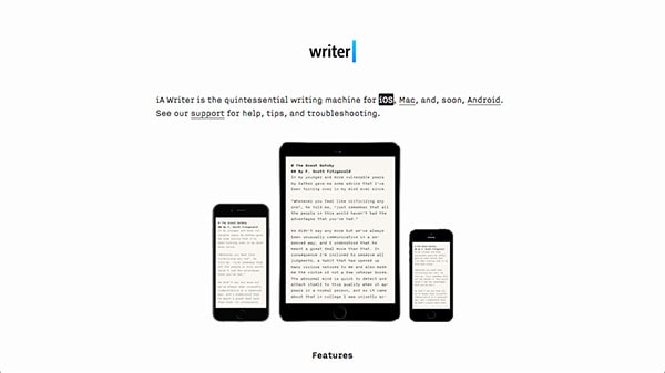
AI Writer is a multi-platform writing app. Their design philosophy is to focus on typography in order to improve the user’s writing experience. It works really well for them as they’ve won countless awards and mentions throughout the web. Their landing page represents their design style well too by keeping things simple and minimal.
Conclusion
I’m certain this list of 24 landing pages will inspire your next design. When it comes to landing pages, simple and elegant seems the way to go. All of these designs were well though out and great; some of the pages were minimal, some colorful and some big and bold. Nonetheless, this list was made in hopes to keep your creative juices flowing through inspiration.
