15 Best Websites with Non-Standard Navigation
Navigation is among the most important pieces of every single website. No content would be reachable without properly designed navigation that answers the questions “where am I?” and “where can I go from here?”. We got used to either a top, left or right menu. They’re patterns used since the beginning of the web.
Something changed in 2013 though. Designers started to play with the concept and come up with really creative solutions. Some of them are more usable (bottom navigation), some less (usage of a keyboard in navigating through a website), but all in all this is an interesting and popular trend that’s changing the way the Internet looks.
Designers and Web Developers that are using UXPin – The UX Design App reported many time this year, that using non-standard navigation is a major and still growing design trend that is loved by their customers. It certainly catches an eye and in some cases improve the engagement of users while browsing the web.
Take a look at the 15 best examples of non-standard navigation elements and brace yourself for a ride. Some of the examples are really creative.
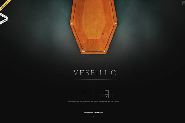
Vespillo le film
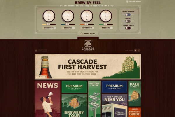
Cascade Brewery Co – Brew by Feel
With Postcards Email Builder you can create and edit email templates online without any coding skills! Includes more than 100 components to help you create custom emails templates faster than ever before.
Free Email BuilderFree Email TemplatesAdidas Group Retail Careers

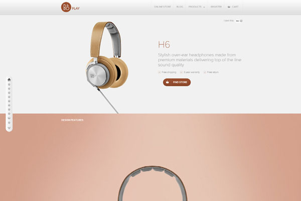
H6
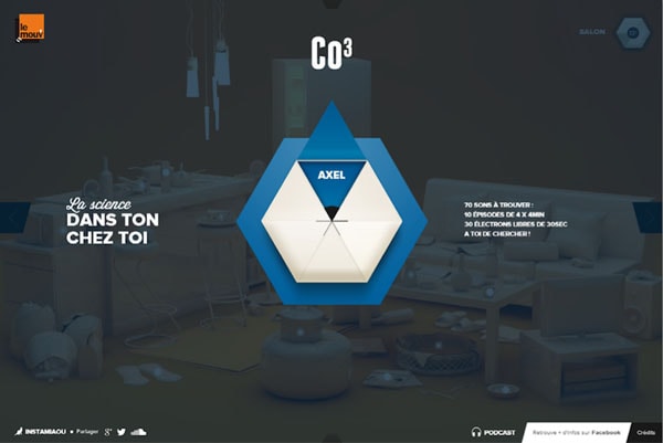
CO3, la science dans ton chez toi !
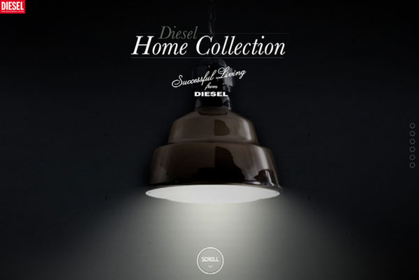
Diesel Home Collection
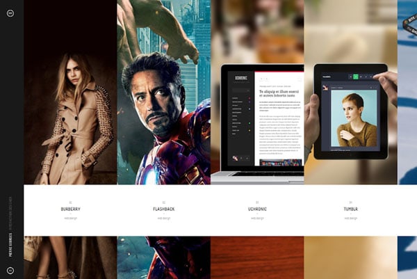
Nerval / Pierre Georges, interaction designer.
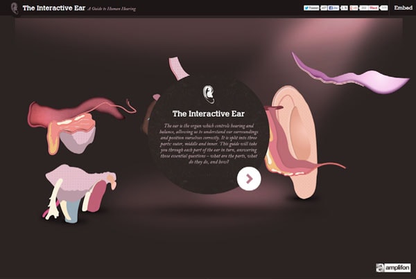
Interactive Ear tool showing how the ear works by Amplifon
LE ROCKWOOD – ROCK WITH US
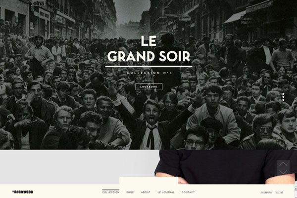
Experience Designers
With Startup App and Slides App you can build unlimited websites using the online website editor which includes ready-made designed and coded elements, templates and themes.
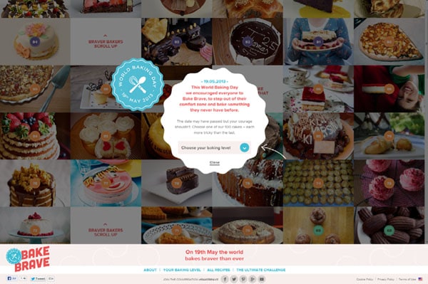
Try Startup App Try Slides AppOther ProductsWorld Baking Day – 19th May 2013
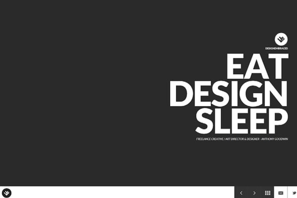
Design Embraced – Anthony Goodwin
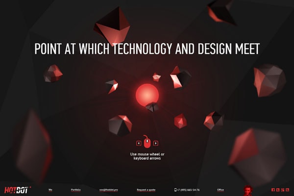
Hot Dot
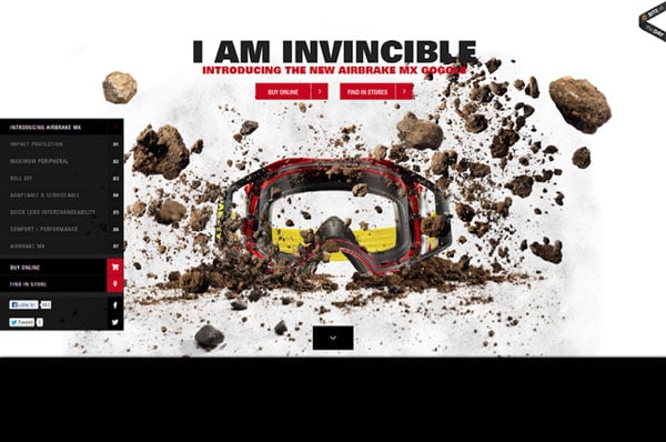
Oakley Airbrake MX // A Revolution In Impact Protection
