Clean and Neat Outline Components in Website Design
Transparent outline boxes are quite rare components in a website design. In order to use them properly and effectively, the project should have a solid foundation that will provide a striking contrast between background and foreground elements.
Certainly, such a traditional and widely-used color scheme as black-and-white combo as well as other mixes of contrasting colors fit perfectly for this job, but, nonetheless, another aspect needs to be taken into consideration, and it is the thickness of the border that can also help to distinguish elements or, on the contrary, drastically merge them with a design. Almost the same goes to opaque buttons with strongly-marked frames.
The outline boxes both transparent and light-tight – that are happened to be in the right place – give the design its own special appeal, impressing on the visitors a sense of subtlety and sophistication.
Below, you will find our collection of attention-grabbing website designs that ably utilize outline boxes for various purposes.
Examples of Outline Components in Web Design
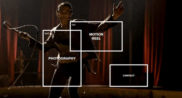
Olivier Staub has an unconventional, truly simplistic main menu that is really vital for a website design, featuring a spectacular full screen image slider. The huge outline boxes along with regular bold type easily strike the eye of visitors and don’t distract attention from selected portfolio items.
With Postcards Email Builder you can create and edit email templates online without any coding skills! Includes more than 100 components to help you create custom emails templates faster than ever before.
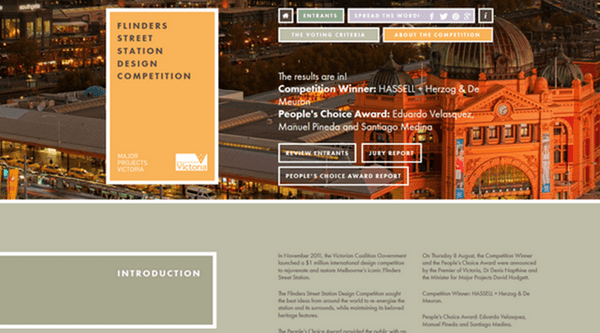
Free Email BuilderFree Email TemplatesFlinders Street Station Design Competition. The website includes a great deal of outline boxes that are used for various purposes. Majority of buttons and image frames have thick borders. The fully transparent rectangles work perfectly well in tandem with opaque buttons, made in a soft muted coloring.
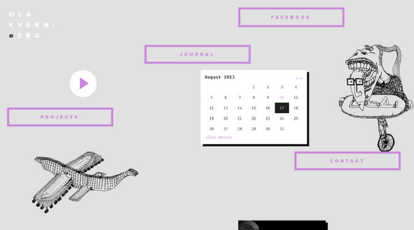
Ola Kvernberg. The website looks clean, visually appealing and unique in its own way. The designer successfully conveyed his personal style, introducing a creative and interactive front page. Several marvelous monochrome illustrations leave enough room to breathe, and beautifully complement sleek violet buttons that are scattered throughout the page.
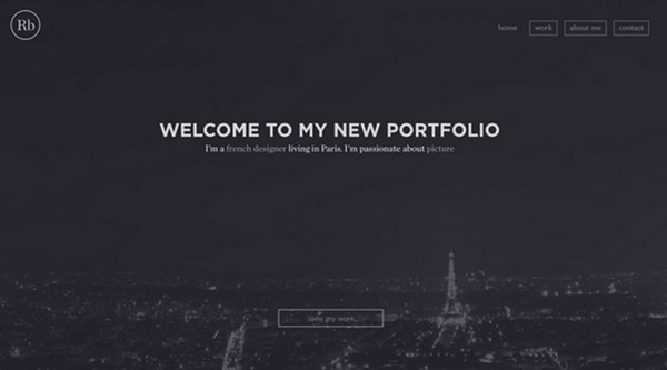
Romain Briaux ably welcomes visitors to the site, demonstrating the picturesque photo of a night Paris. Both main menu items and link to portfolio section are decorated with subtle light outline frames that help to become noticeable and perfectly complete the design.
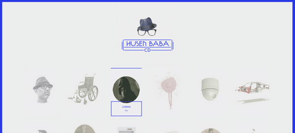
Husenbaba takes a fresh and minimal approach with its design that definitely grabs users’ attention with its purity and originality. Use of slim line buttons is a wise choice here, since this delicate touch is able to maintain harmony, unobtrusively sets presented artworks apart from a light background, and connects the entire theme together.
With Startup App and Slides App you can build unlimited websites using the online website editor which includes ready-made designed and coded elements, templates and themes.
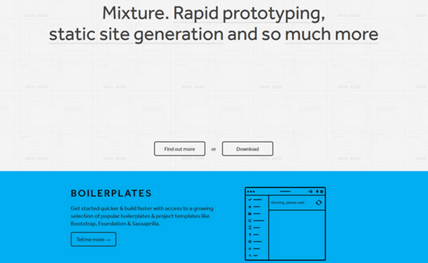
Try Startup App Try Slides AppOther ProductsMixture is another simple and minimal website design in our collection that manages to pull off neat and clear appearance with ease. Since the website showcases various advantages of the prototyping tool via graphical outline sketches, the contour style – is intentionally applied to buttons in order to fully support the whole design.
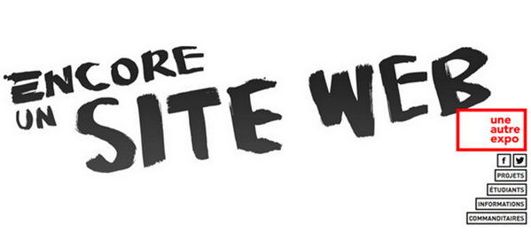
Un autre expo. The website looks well-organized and properly-structured, skillfully providing users with a lot of helpful information. The designer leverages a small right-sided navigation, which is devoid of any embellishments, to maintain a bit of simplicity feeling, and nicely supplement the main page.
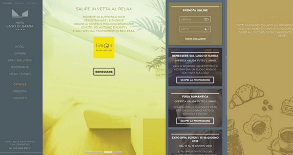
Hotel Lago di Garda has a delicate and eye-catching look. Here, the contour style is put to work to give the theme a note of subtlety. Being bright, light and fully transparent, components on the right column naturally stand out.
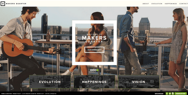
Makers Quarter. Here, the designer employs fatty borders to visibly isolate the slogan and link to the community page. The light coloring helps component look strong and sharp against a full screen image slider with fantastic pictures. The main slider navigation also has the same style.
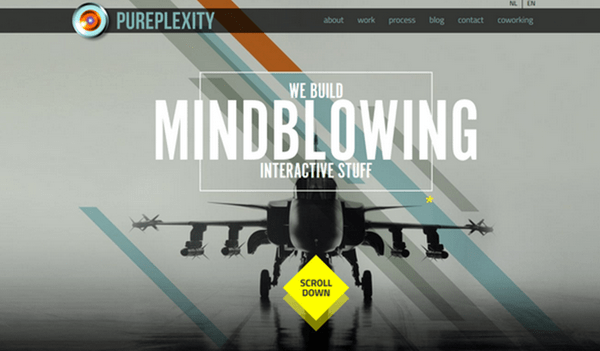
Pureplexity has a subtle geometry vibe due to marvelous background that is based on a smooth subdued color scheme and a numerous diagonal stripes. The website design also includes a lot of simple flat shapes, thus the main slogan with a thin outline frame looks native and appropriate.
Quechua utilizes technique of a digital collage in a unique and singular way, leveraging it in order to attractively place visual data. The designer makes use of a dozen outline shapes and forms to tastefully decorate the website.

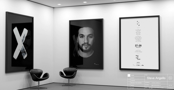
Steve Angello’s welcome section possesses an exciting monochrome photo background which serves as a stunning foundation for an uncommon principal menu. The latter is compactly-arranged on the right corner and provides users with a comprehensive navigation that represented by means of a drawing stamp .The menu is definitely a nice and ingenious touch.
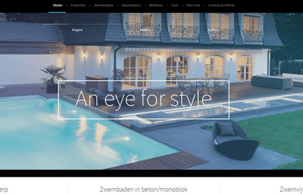
LCDV. The designer wonderfully encloses the tagline, which is executed in ultra-thin typography, into a thin delicate frame that quite well fits into the website design with deluxe, splendid photos. The buttons are also presented by virtue of a contour style in order to effectively pull the design together.
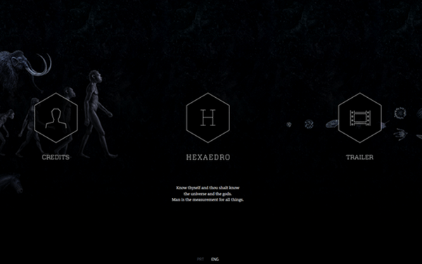
Hexaedro. The website delightfully incorporates the small distinctive navigation that includes 3 basic links. Each link is represented by rough-edged hexagon and plain intuitive icons that are bolstered by slim terminal-like font. The menu is properly coupled with a dark conceptual background.
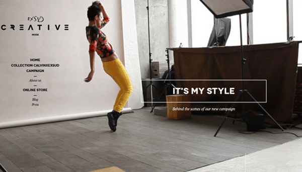
Exsud Creative. The website is aimed to showcase various exceptional gallery items that are supported by neat captions, enclosed in thin frames.
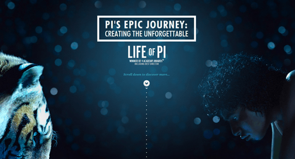
Life of Pi is an incredible website that demonstrates dramatic scenes from the epic movie. Each key section is marked by a discernible outline box with a title in it, which flows nicely into the content and harmoniously interacts with photos and visual data.
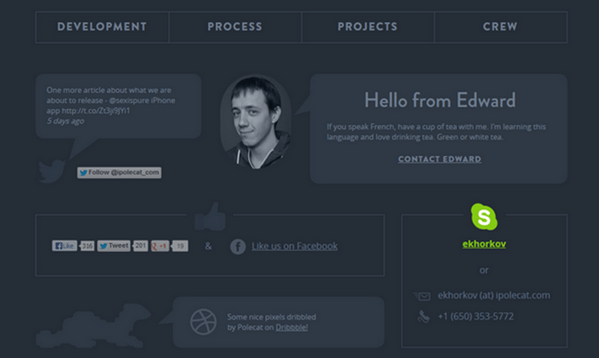
iPolecat has several functional outline components. The website has a marvelous illustration-driven header that is nicely supported by a sharp and clean menu. Moreover, the footer also comprises a couple of outline widgets that help to work the social media and contacts into the layout.
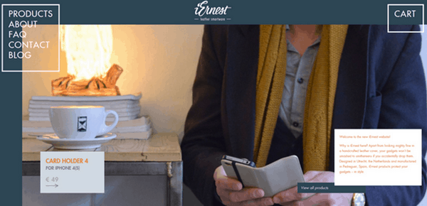
iErnest. The designer highlights 2 main features of the website, enclosing them into sleek outline frames. Thus, basic navigation and cart module got distinctive and good-looking appearance.
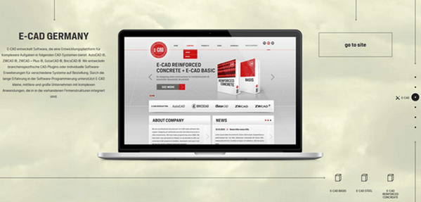
Rafal Wasniowski’s online portfolio easily directs the users’ eye throughout the website via thin guide lines. The designer uses delicate blocks to adorn “go to site” buttons that help to engage the user.
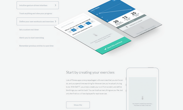
BeFIT. Here, the designer makes use of outline boxes to pinpoint buttons, links and menu items. On the whole, the website looks neat and clean.
Reflection
The outline boxes – placed on complicated and intricate backgrounds – look delicately and neatly, easily pushing the eye towards the buttons. They are handy tools for adding a sense of lightness and exility to any website design.
