Life in Motion Road and Travel Theme in Website Design
Images of roads, videos featuring highways and a keen sense of spiritual journeys and voyages – today we are going to take a look at diverse well-crafted website designs that bear imprint of a travel theme. Though it seems that such factors are inherent only to specific websites, those that deal with expeditions, logistics or some kind of adventure, in fact all these elements can easily take root in other designs that actually have nothing to do with such spheres.
For example, photos featuring deserted highways can be easily associated with openness, acceleration, speed and smoothness. This spectrum of emotions is perfect for supporting slogans and taglines of various ambitious companies that try to express their performance and possibilities via motion values. Other adherents of a road theme are car manufacturers that simply cannot imagine their promotional websites without it. Even a trendy approach of visual storytelling in almost every second case implies some kind of a visual path that is quite often presented with a help of an illustrated track.
In general, this is a broad theme that can either get straight to the point or simply remain passive, keeping the theme alive.
Travel Theme in Web Design
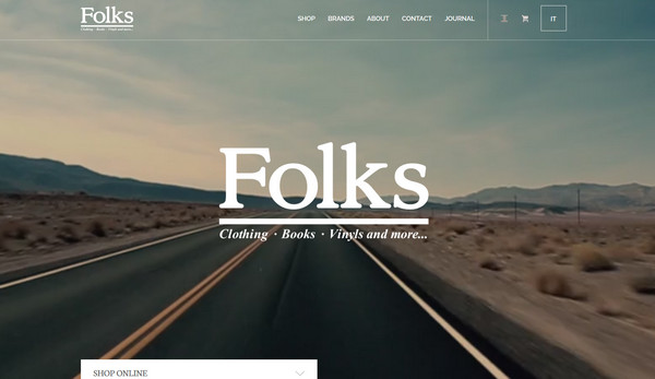
Folks Verona is a contemporary online shop that specializes on various types of goods. The home page greets its users with an alluring video background with an endless journey along the road that slightly symbolizes an urban touch of the promoted products.
The New Mercedez-Benz – The website is called “The Forgotten Roadtrip”, so it’s not surprising that the first thing that catches the users’ eyes is a road in a desert. This is a part of a promotional campaign that includes several videos and images.
With Postcards Email Builder you can create and edit email templates online without any coding skills! Includes more than 100 components to help you create custom emails templates faster than ever before.
Free Email BuilderFree Email Templates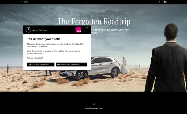
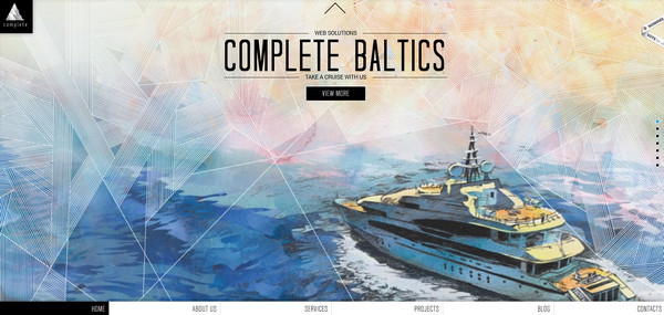
Complete Baltics – The home page boasts of its ingenious artistic appearance that is achieved with a help of incredible watercolor-style slides. The latter depicts an amazing voyage theme that is bolstered by pleasant sleek effects.
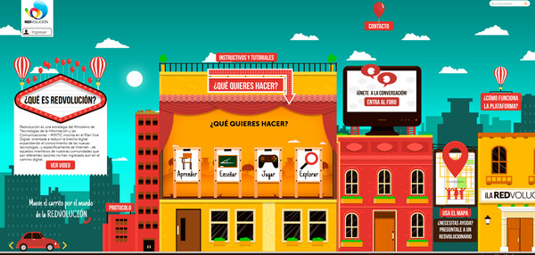
Redvolucion – Majority of websites that adopt a visual storytelling solution feature a trip through some imaginary world. And Redvolucion is no exception; it also offers its readers to wandering around the brisk city center in order to get acquainted with the agency.
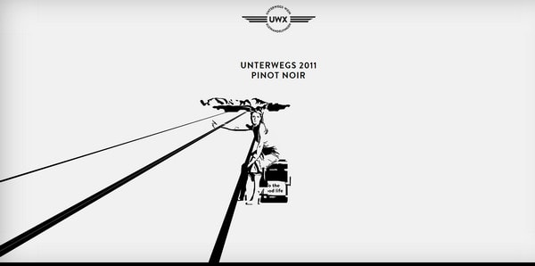
Unterwegs has a beautiful ink-style welcome section that radiates of purity and neatness. The image of a road here is used to greatly support and visualize the main tagline “To the good life”.
Raclettre – Though it seems that in this case the image of a regular city street has nothing to do with the promoted product, actually much like example 1 here the road theme serves as an indicator of an urban belonging and a symbol of coziness and serenity.
With Pulsetic you’ll be instantly notified the moment your website, API, or server becomes unavailable. Monitor uptime from multiple global locations and respond to incidents before your users are affected.
Create beautiful status pages in minutes to keep customers informed during outages and build trust with transparent communication.
Start Monitoring for Free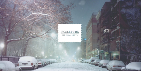
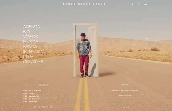
PC Baruk – Here the website design especially the welcome section that includes series of eye-catching photos made in the road theme is aimed to support the new album and of course, to promote the artists.
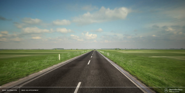
The Perfect Kilometre – This is another original, creative and fully interactive website owned by Mercedes-Benz. The travel theme here serves as a representative tool for revealing the whole advantages of its trucks.
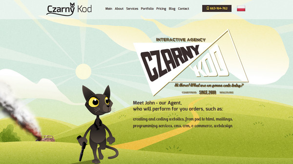
Czarny kod – The website has a brutal mascot – black cat – that visualizes the nameplate of the agency. Since the team associates every task with a mission, the website includes several picturesque scenes where the mascot conducts a covert operation.
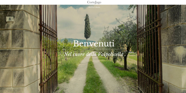
Corte Jago – The website features a flawless photo background that almost literally serves as an opening door to the gorgeous Italian hotel. The front page lets you take a leisurely walk through its place by means of a small intro video.
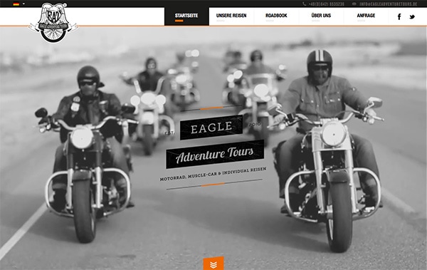
Harley Touren – The website is dedicated to adventure tours, so the website as befits conveys a proper mood and establishes an atmosphere of risky, brutal and exciting undertaking.
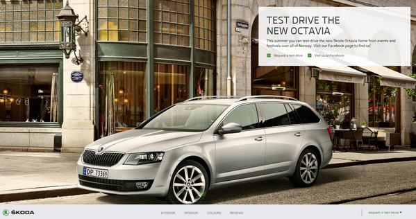
Skoda Octavia 2013 – As well as majority of websites of car manufacturer, it also includes a picture of a natural environment of its new product aka city streets. The car showily fits into an urban landscape.
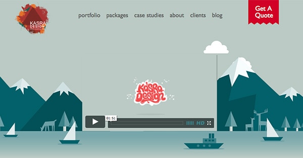
Kasra Design – The agency makes use of several vector-style illustrations that are made in a travel theme. There are small animated scenes of traveling by sea and traveling by train that slightly dilute the main static page.
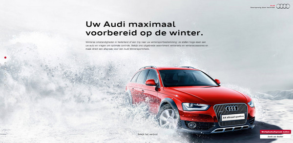
Special Audi – This is another spectacular website in our collection dedicated to promotion of a new car. As usual, the welcome section tries to bring more focus to the product with a help of fantastic photo manipulations.
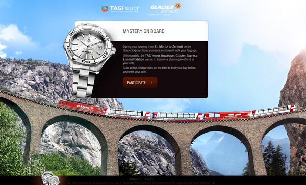
TAG Heuer – In order to engage users and promote the product, the website offers its readers to participate in a small cloak-and-dragger game that take place in a train and at the same time insensibly familiarize them with all benefits of buying TAGHeuer goods.
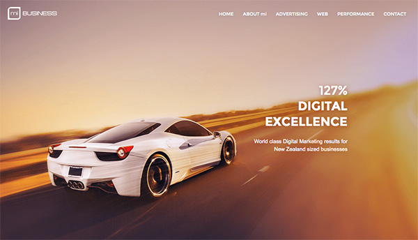
Mi Business – This is a quite common usage of a road theme. The presented below image of a fast moving car that modestly occupies only the header of the website is intended to enhance the slogan of the company “The High Performance Digital Agency”
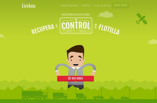
Linkio – The design of the welcome section is directly linked to the company activity. Small animated greenish scenery immediately gives a glimpse of its services.
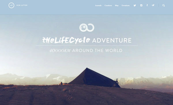
The Lifecycle Adventure – As the nameplate implies, the website is dedicated to various bicycle journeys. So it is quite predictable that the website gets the feel of adventure from lots of fantastic pictures made around the world.
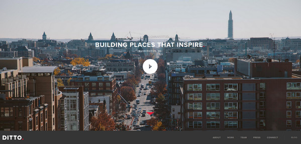
Ditto – Though the website has a more urban atmosphere, it also has a hint of a road theme since tit is quite difficult to imagine a city without roads.
Conclusion
Traveling theme hides numerous opportunities whether it is presented via simple photos or incredible drawings. It helps to work up unquenchable thirst for adventure or vice versa set up a serenity atmosphere with a help of endless roads and open highways. It can convey a gamut of emotions and perfectly match the mood of any project.
Share with us other good examples of website designs featuring roads, highways or those that offer users to set out on a journey.
