Crafty Multilayerness – Scrapbook Style in Web Design
There are different ways to attract users making website design memorable and sophisticated. Bringing alive such a complex and crafting style as scrapbooking is one of the well-tried and reliable methods to make something extraordinary that will definitely grab viewers’ attention. Although, in order to succeed you have to overcome a lot of difficulties that occur during its realization.
In real life this art direction implies notebook and a great deal of photographs or printed media that glued on it. Whereas in website design such effect is achieved by massive use of paper-based textures, non-uniform background, overlapping layers with expressive differentiations and neat shadows, that is complemented by school-styled lettering and scribbles making website appearance to look advanced, bulky and dimensional with obvious multilayerness in mind. Certainly such a composite layout can bring negative impact especially when it has an out-of-date look, so in order to make perfect crafty multilayered website design you have to follow modern trends and use contemporary materials, and then even pervasive flat design which is apparently a hot trend nowadays, will pale in comparison to scrapbook style.
Now you can take a look at our list that includes artistic website designs with charming multilayered effect that is mainly achieved by means of scrapbook or collage technique realization.
Scrapbook Style Websites Examples
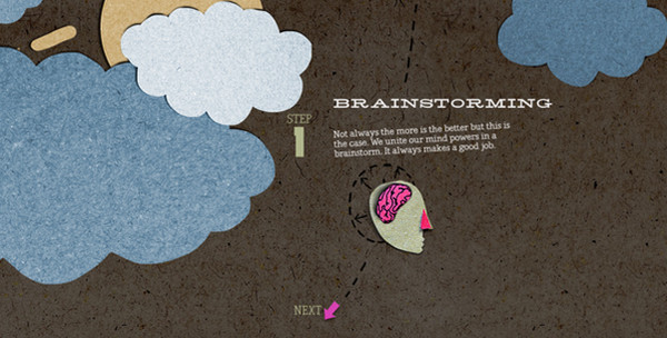
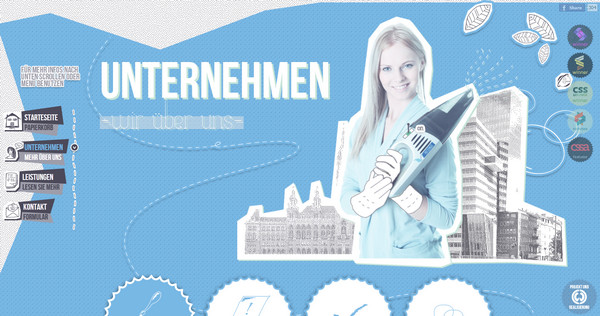
Dego Interactive is built upon paper-based textures that are reflected in every part of design; every decorative element is a cardboard cut that occasionally accompanied by hand-drawn illustrations or lettering.
Kinderfotografie uses a blend of vintage paper-texture frames, sophisticated fabric-based tags and badges.
With Postcards Email Builder you can create and edit email templates online without any coding skills! Includes more than 100 components to help you create custom emails templates faster than ever before.
Free Email BuilderFree Email Templates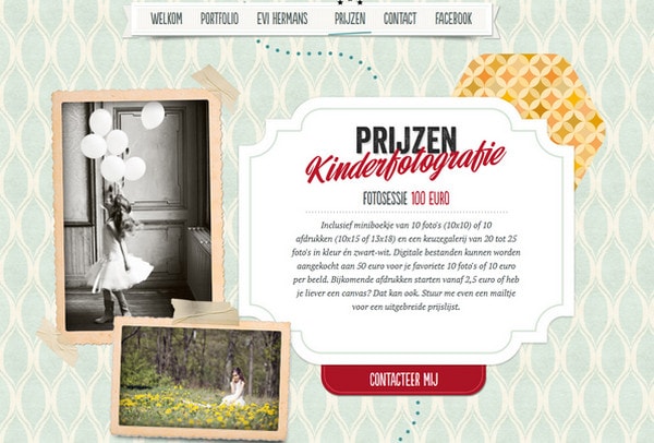
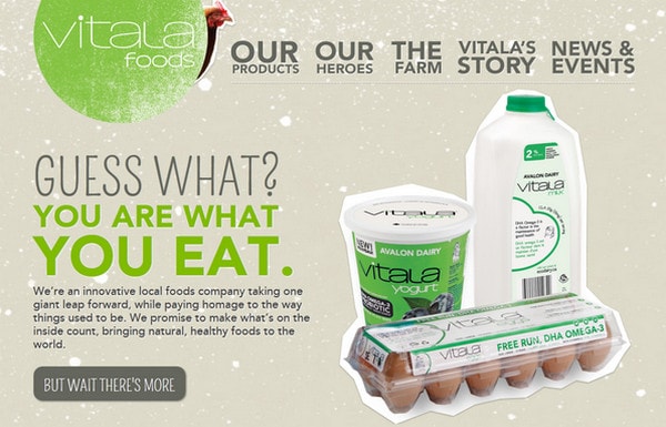
Vitala Foods makes use of paper cut illustrations providing each page with its own decorative element.
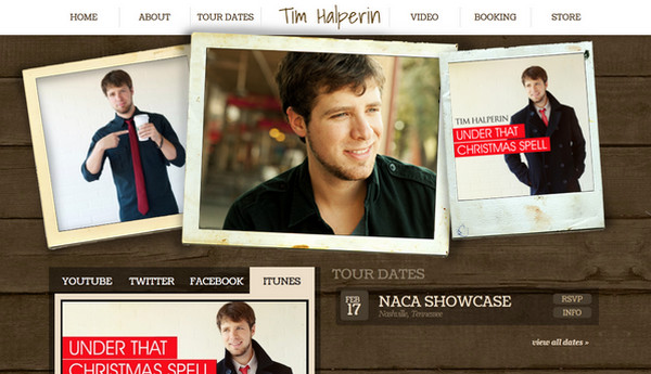
Tim Halperin is personified by set of slightly overlapping images that are enclosed in an aged almost vintage styled frames.
Troll d’idees screams retro style with a harmonious insertion of layered neatly superimposed images.
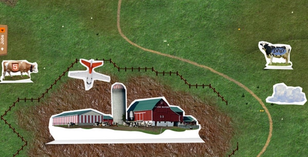
Land een job bij Intracto has an adventure vibe which is achieved by a bunch of white tight paper cut images and rough paperboard textured background.
With Startup App and Slides App you can build unlimited websites using the online website editor which includes ready-made designed and coded elements, templates and themes.
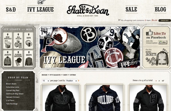
Try Startup App Try Slides AppOther ProductsStall and Dean goes for classic vintage style with grunge touch which is due to the particular arrangement of widgets and data blocks in some respects resembles collage manner.
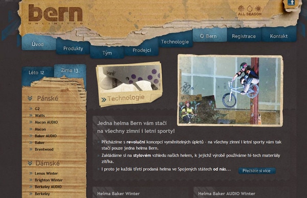
Helmy Bern is another example of using heavy textures in order to add a note of multilayerness putting together varied pieces of cardboard and thick paper.
Putzengel employs accurate and elegant approach of representing each part of a page in a separate layer making a website look clear and neat.
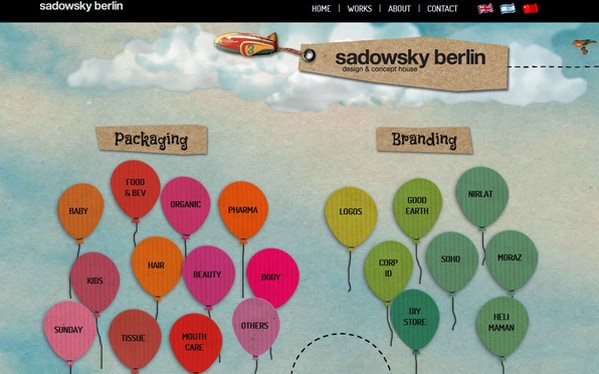
Sadowski Berlin recreates multilayer feelings on account of arranging tags and logo on thick paper-based blocks that are slightly protuberant.
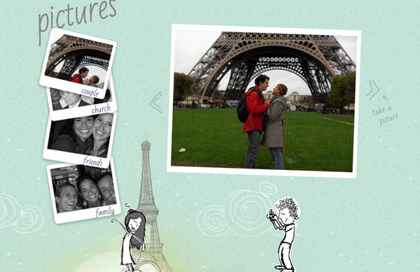
Pati and Felipe represents their love story by means of sky blue noised layout that is complemented by images and illustrations made on paper.
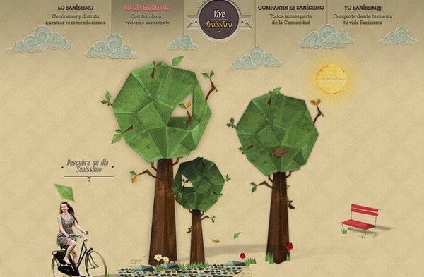
Sanissimo does a good job of crafting multilayerness adding to a website dimension feeling.
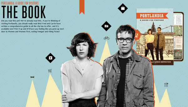
Portlandia mimics collage style by means of exuding abstract background with geometric shapes and images on foreground with provocative strokes.
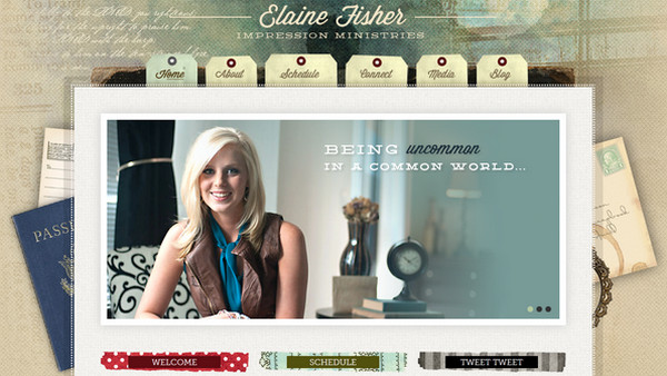
Elaine Fisher goes for classic scrapbook style with a great deal of overlapped images, heterogeneous background with watercolor effect and tag-like menu items.
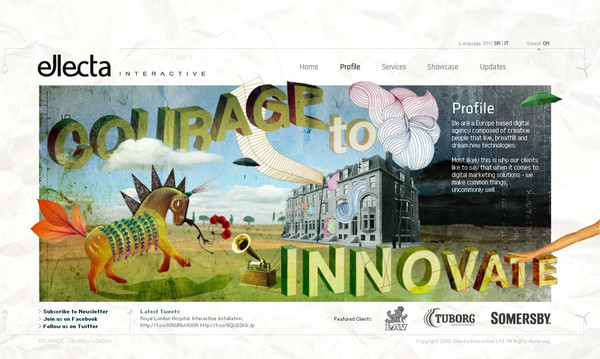
Ellecta Interactive provides each page with an exceptional collage-styled background that serves as a decorative element.
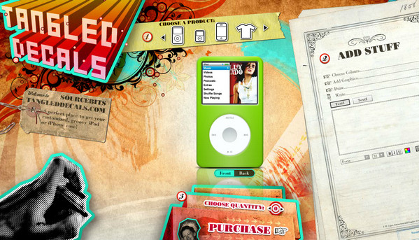
Sourcebits TangledDecals literally collects landing page from a different pieces making it look heavy-textured and retrospective.
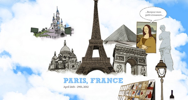
Two years together is another love story in our collection. In contrast to the previous example this one takes us to the clouds, which are filled with set of imposed images.
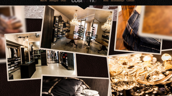
Cosentino represents gallery as a digital photo collage with a lot of quality professional shots.
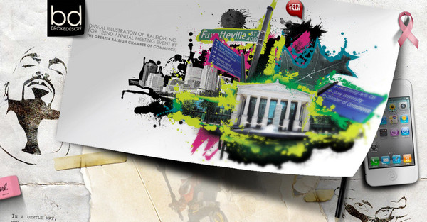
Brokedesign looks a bit messy due to patchy almost replete background and flamboyant image slider that has elegant slightly folded corner.
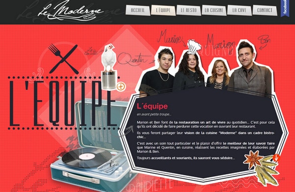
Le Moderne uses paper cut out technique in order to make images stand out.
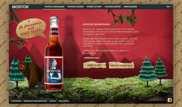
Wostok imposes one paper-based layer to another thus creating multilayered scene.
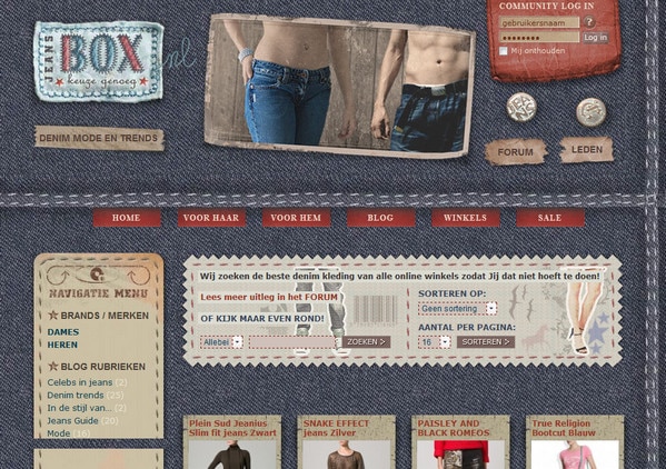
Jeans Box pulls its identity from original jeans style leveraging different types of fabric (that can be seen on every pair of American jeans) as backgrounds for every essential website element.
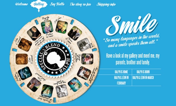
Ralph Van Rentergem has an extraordinary old paper-based circular gallery that slightly protruding above a background.
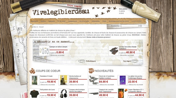
Vivelegibierdeau has a conventional scrapbook look with a lot of paper images that stick out from under the content layout.
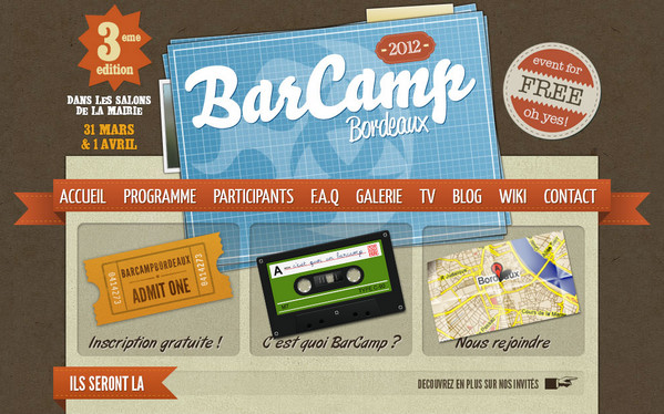
BarCamp has clean and accurate header that draws attention by sandwich-like vector logo.
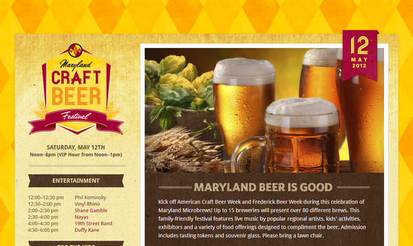
Maryland Craft Beer Festival charms users with neatly organized warm textures that beautifully complement and echoed with each other.
Reflection
Multilayered effect can be obtained in different ways. Method which is based on a scrapbook or collage style (which we’ve discussed above) is one of the most artistic and sophisticated, although it has its flaws. The main drawback is that if a website design is not well-thought and well-organized it will look messy and heavy. Moreover, era of flat design is coming, so proponents’ number of digital scrapbooking drastically decreases. But as we all know each style has its ups and downs, so, maybe, before long we will see a new rebirth.
Do you like this type of website design? Do such websites look modern and advanced to you? Do you find websites with layers conglomeration attractive and easy-to-explore? What example did you like the most?
