Best Website Designs from Spain: Full of Passion
Dynamic, vibrant, vivid, energizing, charismatic, nifty and stylish – the best website designs from Spain fascinate with a broad spectrum of feelings and moods. And this is not accidental, since everything starts with a cultural heritage that is truly unique, diverse and motley.
Spanish art has matured from numerous artistic movements and eras that are astonishingly varied: Romanesque, Muslim, Italian Renaissance, Spanish Renaissance, Golden Age of Spanish culture, period of Baroque, Rococo, Neoclassicism as well as directions like Cubism and Surrealism and that are just as high on the list.
Spanish artists are growing up under the enormous influence of this great abundance, so it’s not surprising that their considerable creative potential finds its way out in various spheres, manifesting itself in original ways.
Website designs listed below are perfect examples of that, so let’s take a look at them.
Best Spanish Websites
Alejandro Torres
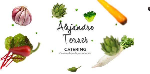
The team skillfully adds bits and pieces of nature to the landing page of the website dedicated to food catering. The floating in the air high-quality realistic mockups in tandem with clean white background produces the impression of purity and originality that is well-suited for such kinds of projects.
With Postcards Email Builder you can create and edit email templates online without any coding skills! Includes more than 100 components to help you create custom emails templates faster than ever before.
Free Email BuilderFree Email TemplatesMoon
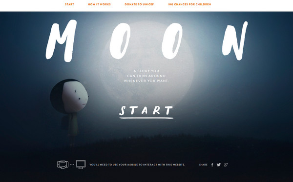
Moon is a mind-blowing website built on exceptional and vigilantly-executed visual storytelling experience that is aimed to foster public awareness of acute problems. Mobile/tablet users have an opportunity to rotate the story. The team skillfully presented serious issues through spicing up the project with a lovely artistic appeal.
Zione Ceramica
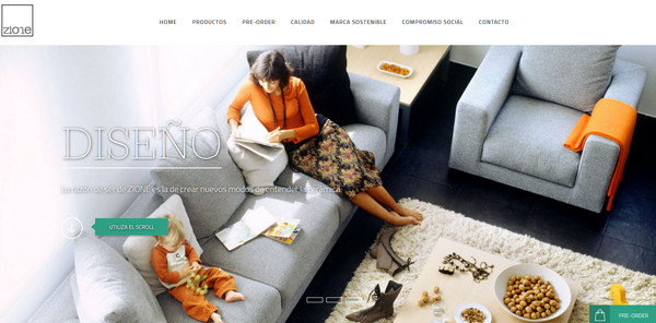
Zione Ceramica puts online audience in a pleasant mood with a series of fantastic exquisite images of interior designs. An elegant typography along with nifty graphics and optimal balance between copy and multimedia gives the website a look of refinement and brilliance.
Nutone
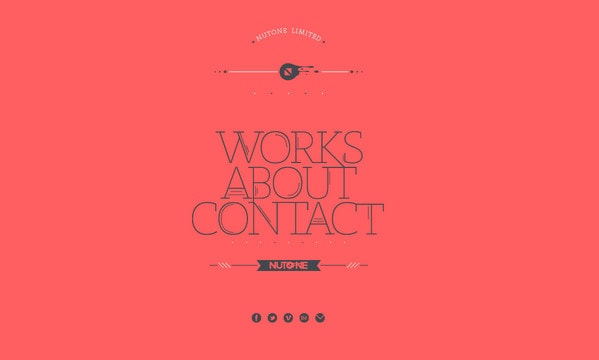
Less is more: The team is perfectly aware of how to achieve the greatest output from this concept. The minimalist website design effectively embraces all necessary sections, including “works,” “about,” and “contacts.” The design is built upon flat monochrome background, ultra-narrow decorative typography with a strong geometry note and some minor decorative elements.
Lois Jeans 2013
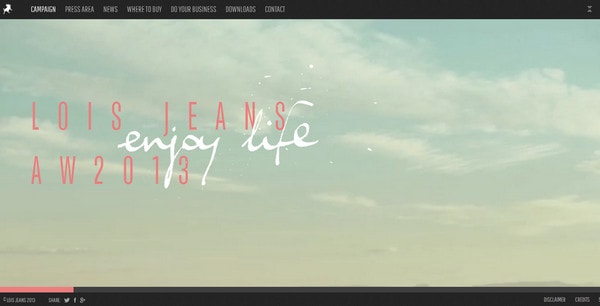
The website tries to echo the sentiments that come from real life adventures through subtly populating the project with dynamic videos and spectacular landscapes. Everything is wonderfully tied together through a charming hand-written typography and warm pastel coloring that adds a classy touch of lomography.
With Pulsetic you’ll be instantly notified the moment your website, API, or server becomes unavailable. Monitor uptime from multiple global locations and respond to incidents before your users are affected.
Create beautiful status pages in minutes to keep customers informed during outages and build trust with transparent communication.
Start Monitoring for FreeAlmatrichi
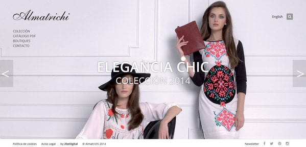
The website capably exudes an image of sophistication and refinement thanks to a bulk of gorgeous photos, polished subtle graphics, beautiful light coloring and elegant typography. It has a stylish look that is especially perfect for such kind of projects.
Gonzalo Perez
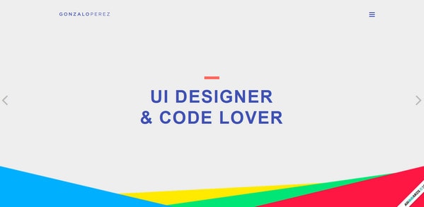
This personal online portfolio is marked by a beautiful riot of flat colors densely packed together that neatly prettifies the whole appearance as well as adds certain piquancy. The website leverages clean solid color backdrops and slightly muted image backgrounds, modern slide out navigation menu, sharp elongated typography and flat style elements.
Typeform
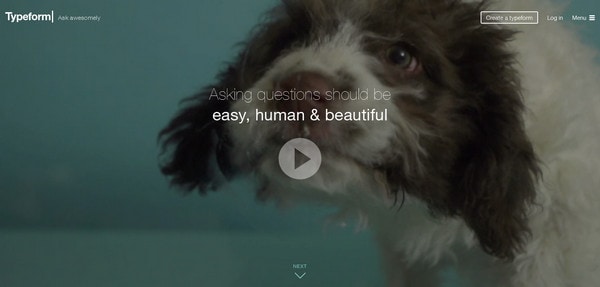
The home page is skillfully filled with videos and images that speak for themselves. The spectacular visuals are supported by neat type as well as complemented by stylish “ghost” buttons and nifty controls. The team also plays with font styles and weights in order to highlight key message.
Chris Tarasovs
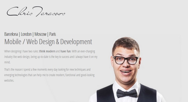
Chris Tarasovs goes for a more individual approach: the website simply sparkles with the artist’s magnetic and attractive personality thereby lulling people in trusting him with his charisma. This is a great example how a human touch can take a quite unremarkable website in terms of design solutions to completely new level.
Elespacio
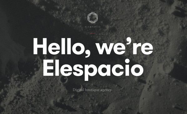
Here, images certainly take up the leading position, intending to speak loudly than words. The website is ably populated with picturesque gray scale photo manipulations that elegantly portray each main section.
Chef S
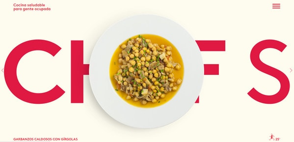
The website effectively accentuates the marvelous atmosphere through appetizing images of popular meals. For a dab of color, as befits majority such websites, the designer opts for a magnificent red tone that perfectly stands out from the background, grabs users’ attention and goes together with a main smooth pastel coloring.
Plastic Creative Studio
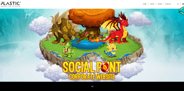
Plastic Creative Studio has a basic one-page website that is based on an ideal combination of horizontal stripe layout and color differentiation. As usual, the agency greets online visitors with a full-screen slider that fixes attention on the best works. The portfolio is fully responsive and thanks to modest design and conservative choice of decor provides mobile/tablet users with a pleasant experience.
Monday Music
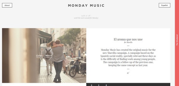
Monday Music affords a clean, neat and subtle appearance that is supported by polished graphics and wonderful color scheme. Thanks to well-thought-out and flawlessly-executed responsive behavior, the website looks nice on every device.
Henry Saiz
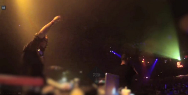
Sometimes, incorporating video background with a touch of a powerful personality is all it takes to make the website stand out from the crowd as well as engage online viewers with a profound and highly energetic atmosphere. The official website of Henry Saiz is a representative example of such approach.
Boffard
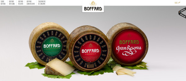
The website enjoys the advantages provided by a picture of the main products. It does not share the spotlight with anything else, since the landing page features nothing more than just a clean background and a classic text-based navigation. So this delicious shot is just doomed to strike the eye.
Conoce Valencia
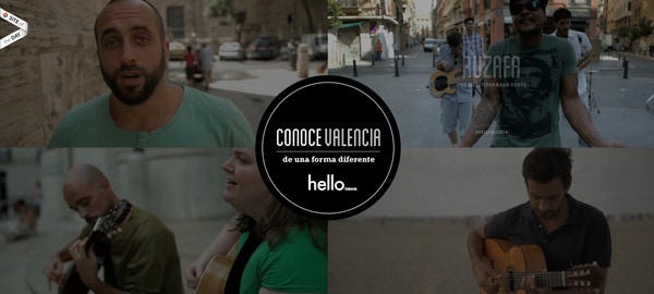
This is another top-line project that separates itself from others with a help of a series of fantastic real-life videos. Moreover, it can boast of a gorgeous typography, several design tricks, and of course, a sophisticated appearance.
Veni
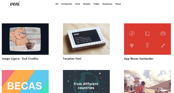
Veni maintains a simplistic feel thereby giving the portfolio pieces a truly dominant position. If you want to direct and fix users’ attention on your works, simply adopt this solution.
AGi Architects
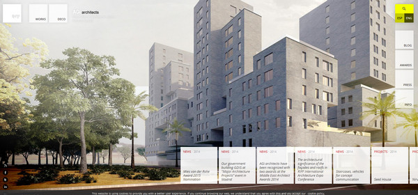
The website has a nice building appeal. The effect is achieved not only due to appropriate images but also thanks to numerous semi-transparent squares and rectangles that are scattered throughout the home page.
El Monstruo
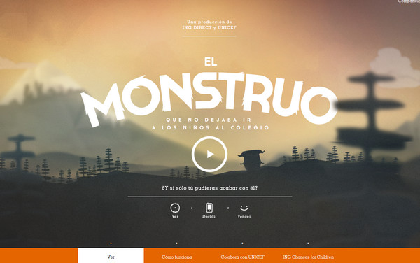
The project has been planned down to the last detail. The “monstrous” theme is perfectly executed through matchless illustrations, complementary decorative font and of course, awesome video. This is certainly a top-notch project.
Lois Jeans
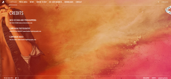
The landing page is marked by magnificent coloring and terrific watercolor-esque backdrop that gives the website a highly artistic appeal. The copy perfectly excels from the canvas, providing users with a great readability.
Conclusion
Projects simply radiate of energy and dynamics, though not all of them can boast of interactive elements, nice transition effects or animations. Choice of colors, blend of multimedia and copy, and creative touch certainly work wonders.
