4 Tiny Trends in Applying Animations
With interaction design showing up pretty much everywhere, animation is finally being perceived not only as a tool for entertaining visitors but as an instrument for improving the user experience. From tiny dynamic effects that enliven parts of the UI to huge animations that are used as means of communication, the internet is jam-packed with various solutions.
Although we are living in an era of experiments, several popular patterns can be traced. There are at least four types of dynamic effects that are commonly used by websites these days. Let’s dig in!
Elastic Animations
Elastic animation is getting more popular each day. It is short and elegant with an ability to draw attention right away. Successful reproduction relies on a skillful mixture of design, programming, physics and calculus. In some ways it may seem hard to recreate since physics is involved; but in fact, it can be easily done just using CSS, to say nothing about the specific tools like Velocity.js or WebGL. The most popular options are:
- A spring-like animation that quickly stretches and immediately compresses to the required shape, intensifying an opening of the components or slides in carousels. As a rule, it is one short action.
- A smooth liquid-like animation that floats, spreads and returns to its initial state acting as a focal point or accompanying detail. As a rule, it goes on and on, bolstering the general atmosphere.
When it comes to real implementation, designers have nailed both of them. For example, LatinoMedios and Oprette both employ elastic animation to spice up the basic slide-out menu. While the first goes for a sleek and fluid entrance; the second abruptly jumps into the path of the user’s eye.
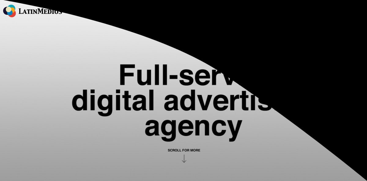
LatinMedios
With Postcards Email Builder you can create and edit email templates online without any coding skills! Includes more than 100 components to help you create custom emails templates faster than ever before.
Free Email BuilderFree Email Templates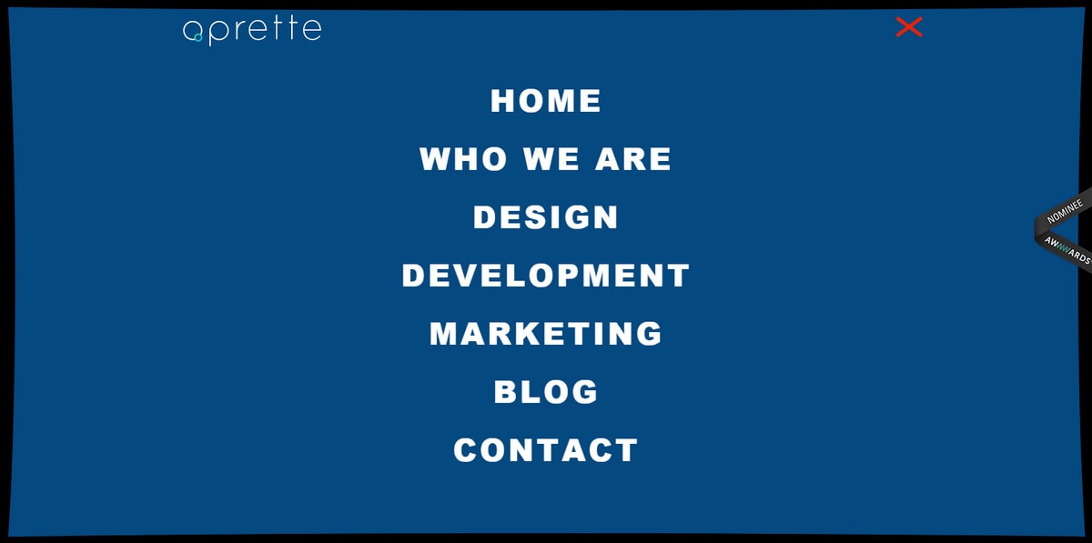
Oprette
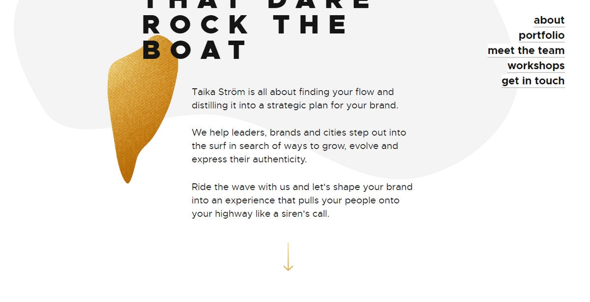
Taika Strom uses more advanced techniques. Here, the WebGL-powered liquid spot on the background follows the user along the way of exploring the homepage, thereby enriching the overall impression.
Transformable Logotypes
Taking several seconds, transformable logotypes seem like a waste of precious time and resources; yet, they can certainly make a difference. As a part of brand identity it combines both an informative constituent and an aesthetic delight. It is fleeting, but it catches the eye, cultivating in the minds of the users that even the slightest details won’t be overlooked.
There are several ways to employ the trend.
Be Playful
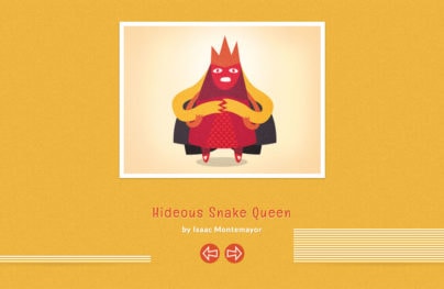
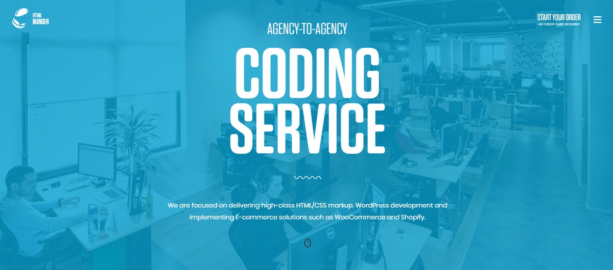
Consider the transformable logotype of HTMLBurger; it is just hilarious. Still, it performs two goals.
With Startup App and Slides App you can build unlimited websites using the online website editor which includes ready-made designed and coded elements, templates and themes.
Try Startup App Try Slides AppOther Products- As a mascot, it illustrates the nameplate supporting the brand identity.
- As a dynamic effect, it serves as a playful trick that adds extra fun to the project, promoting the cheerful atmosphere from the first seconds.
Go the Other Way by Staying Conservative and Serious
Unlike the previous example, Muriel Guillaumon leverages the trick to contribute to a more serious vibe. Here the metamorphosis is simple with minor changes in color and size; nevertheless, it nicely matches the overall theme and adds diversity to the general aesthetic.
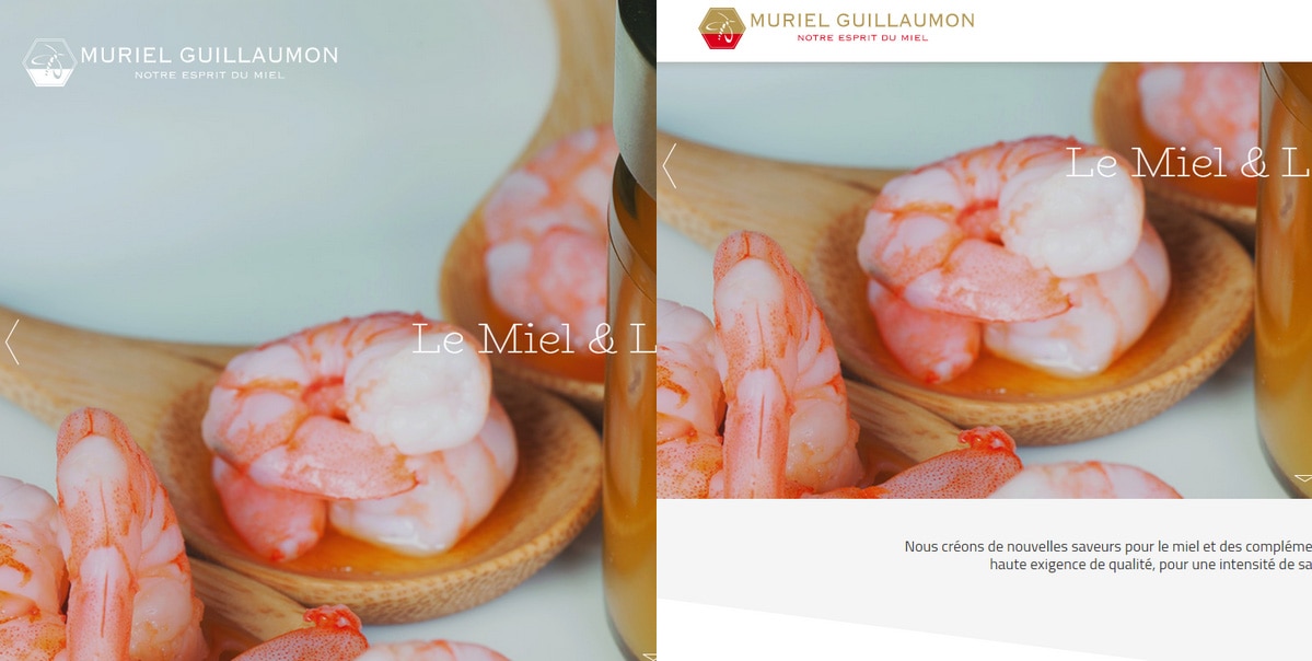
Muriel Guillaumon
Ditch Sophistication in Favor of Minimalism
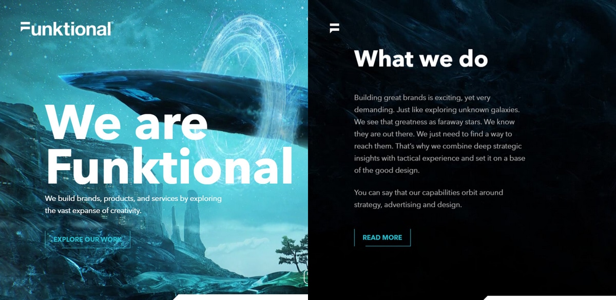
Enjoy the benefits of a minimalistic approach like Funktional does. The “welcome” version of the logotype is complete and sterling. However, when you start to explore the website, it is reduced to a minimum by ditching the lettering and leaving just the icon; yet, it preserves the brand identity.
Meaningful Loading Animations
It is time to say goodbye to boring spinners and counters. The best loading animations have sophistication and intelligence.
Truth to be told, loading animations stay in the shadow of the spotlight. Nevertheless, this did not stop it from evolving and transforming from a plain throbber into a refined tiny animation that is capable of performing important tasks. Animation is not only used to inform about the “preparation process” but it also enhances the user experience and even enriches the general aesthetics in some measure. It can be used to:
- Support brand identity
- Supply extra information
- Provide instructions
- Hold attention
- Entertain
- Impress
- Strengthen the first impression
- Create anticipation of a theme
The list can go on and on.
As for realization, much like in case of animations: you are spoiled with choices. You can use CSS, JavaScript and even “heavy artillery” presented by Three.js.
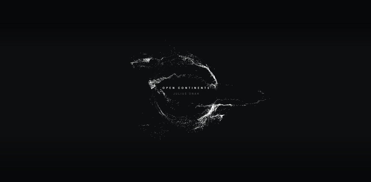
Inspect two examples: loading animation of Open Continents and Do you speak human. The preloaders differ in many aspects, but they have one thing in common: they take care of visitors from the start.
Open Continents’ loading animation is mind-blowing. It is a successful symbiosis of idea and realization. WebGL stands behind this masterpiece. Not only does it create a thrill of anticipation but it also allows visitors to enjoy the website letting them play with this mass of particles.
Open Continents
As for the second, its charisma lies in simplicity. The loading animation is portrayed as a dancing robot.

Do you speak human
The team has come up with fantastic detail in the interactive design. It is called to entertain visitors while they are expecting something to happen. What’s more, it migrates to the homepage animation, supporting coherency in the theme.
Despite the fact that this tiny stack of three horizontal lines lost its charm a long time ago, it is everywhere. So, it is only natural that designers try to find ways to breathe some fresh air into this hackneyed component. You do not need to reinvent the wheel to enhance the hamburger menu button; a simple hover effect can do the trick. Not only does it help the icon blend with the dynamic environment but it also improves the user-friendliness.
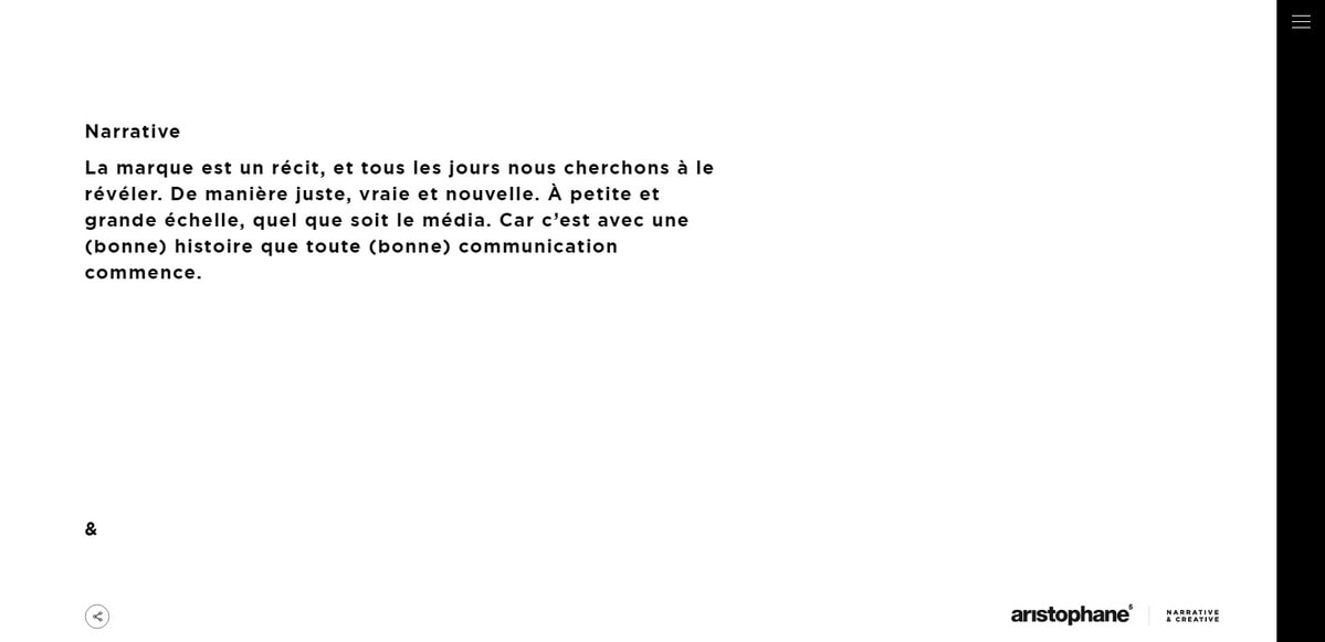
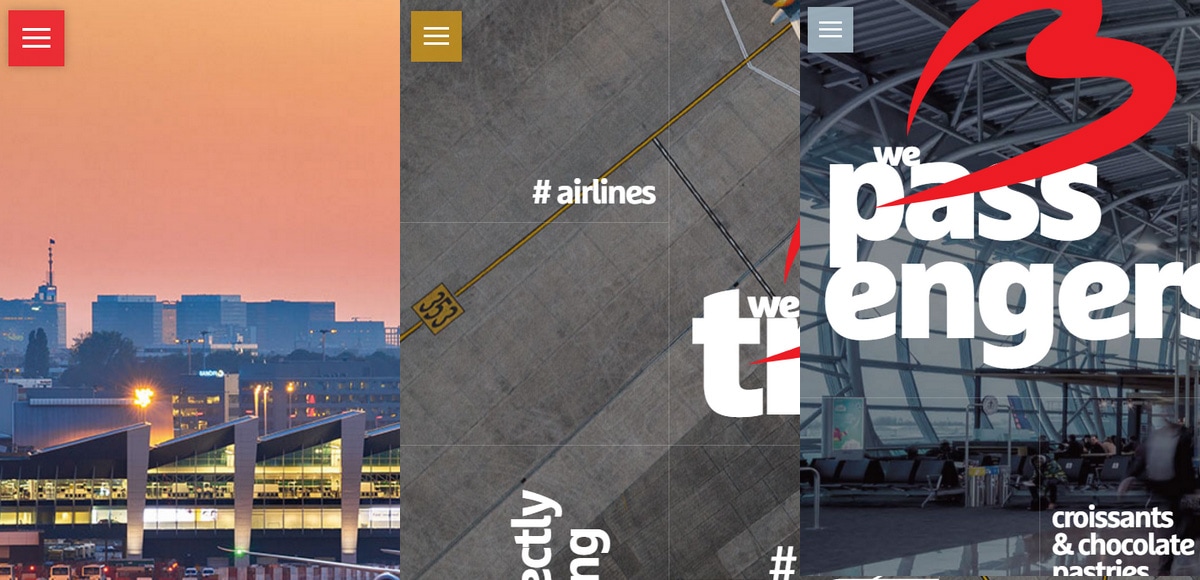
Take a look at Aristophane and Brussels Airport In Numbers.
The first leverages a hover effect for introducing minor changes in the icon’s design coming up with an interactive button. The team behind the second example focuses on the background, making it correspond with the color scheme chosen for each particular slide. As a result, the hamburger button serves as a tiny indicator.
Aristophane
Brussels Airport in Numbers
Conclusion
Not everyone sees animation as an opportunity to introduce improvements, yet still, the tendency of treating animation more seriously is evident.
With a well-thought-out dynamic constituent, your interface can reach new heights in terms of establishing friendly and healthy communication with the visitors. Everyone wants to have a website that is self-explanatory, ensuring that users indulge themselves with the content rather than move on to something else. And one way to achieve this is to begin with implementing such tricks.
What animations or dynamic effects do you implement in your projects? Do you find it important to enrich the UI with interactive details?
