How to Drive Transactional Email Engagement for E-Commerce
Whatever meaningful action a user takes – creating an account, buying stuff, changing preferences, resetting a password – should result in a notification that the interaction was a success. This direct response is crucial for a good user experience. A transactional email is part of this experience.
Transactional emails underlie automated processes throughout the customer journey. It is almost impossible to run a website or SaaS without them. Even though they are not commercial or Shopify marketing emails, they still should be one of your top priorities.
It’s essential to recognize that transactional emails and dunning emails fulfill different roles in business communication, and comprehending their distinctions is crucial for successful customer engagement. Transactional emails are automatically sent in response to specific customer actions and deliver crucial information or confirmations. On the other hand, dunning emails are more focused and are sent to address payment-related concerns or to remind customers about their monetary commitments.
Let us dive into the basics of transactional emails, consider best practices, and get inspiration from high-converting transactional email examples.
Essentials of Transactional Emails
Transactional email is a business-to-consumer communication with a significant business purpose. Triggered by a specific event, it pertains directly to a particular user action – or to be more precise, user interaction with the platform. It is essential throughout the user lifecycle.
Originally, transactional email was not used to generate additional revenue, since marketers have other types of emails for that. However, more entrepreneurs have started to see them as warm leads, or valid sales opportunities.
With Postcards Email Builder you can create and edit email templates online without any coding skills! Includes more than 100 components to help you create custom emails templates faster than ever before.
Free Email BuilderFree Email TemplatesThey are an excellent touchpoint for upselling, cross-promotion, social sharing, and more. Transactional emails can be used to build up momentum by increasing excitement and satisfaction for the recent user’s actions. Therefore, these days they do much more than intended. Skillfully enhanced with sales tricks and popular marketing features:
- Escalate engagement
- Drive traffic
- Boost up conversions
- Increase click-through rates
- Generate sales
- Reinforce brand
- Develop trust
- Scale personalized experience, and much more
Depending on the type of transactional email, you can adopt one or another strategy to achieve your goal.
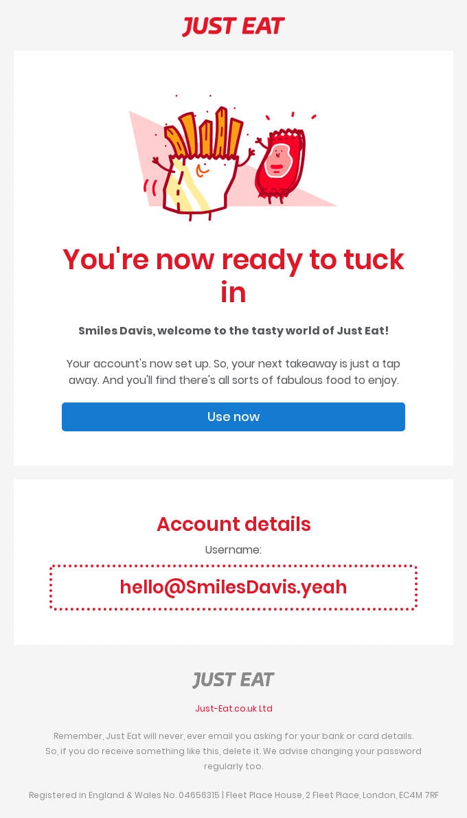
Welcome Email from Just Eat
Types of Transactional Emails
Transactional emails cover a wide range of notifications, alerts, reminders, and technical information that is vital for your recipient to manage the website, application, or SaaS efficiently. Programmatically generated and sent, they serve specific use cases. They can be triggered by certain actions and inaction. There are different types of transactional emails, the most popular are:
- Account creation email
- Account notification
- Social media update
- Order Confirmation
- Shipping notification email
- Delivery confirmation email
- Password reset email
- Product and Service Update
- Double opt-in email
- Welcome email
- Onboarding email
- Security alert
- Purchase Receipt
- Invoice email
- Thank you email
- Legal notification
The list goes on, though not all of them are used. As a rule, companies choose those newsletters that fit their product, strategy, and ideology.
Much like holiday emails and seasonal emails that have leaders in raising conversions like Black Friday emails, Christmas emails, or Halloween emails, transactional emails also have several types of newsletters that proved their validity and effectiveness for the brand development and promotion.
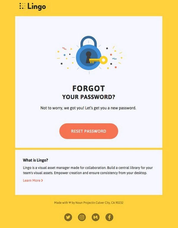
Forgot Your Password from Lingo
3 Transactional Emails to Not Miss
With a vast diversity of transactional email examples, it can be hard to make up your mind. There are three types of transactional emails that are fantastic sales opportunities. If you plan to take your email campaign to the next level by customizing automated newsletters, start here.
With Pulsetic you’ll be instantly notified the moment your website, API, or server becomes unavailable. Monitor uptime from multiple global locations and respond to incidents before your users are affected.
Create beautiful status pages in minutes to keep customers informed during outages and build trust with transparent communication.
Start Monitoring for FreeWelcome Email
Although the first email that a user gets from you is a double opt-in email with a confirmation link, the welcome email is considered to be a conversation starter.
It is vital since it is responsible for:
- Introducing your brand
- Reinforcing an overall impression
- Laying the foundation for a comfortable environment
- Cementing the first steps in developing client relationships
It also walks users through initials steps and gets them entrenched in the platform, and can usher them to a purchase.
As a rule, it includes an introduction, brand promotion, helpful information, and some pleasant bonuses like discounts. To cover successfully all these elements entrepreneurs create the entire welcome series that gathers under one roof “Thank You for subscribing” email, welcome email, onboarding emails, and sales pitches.
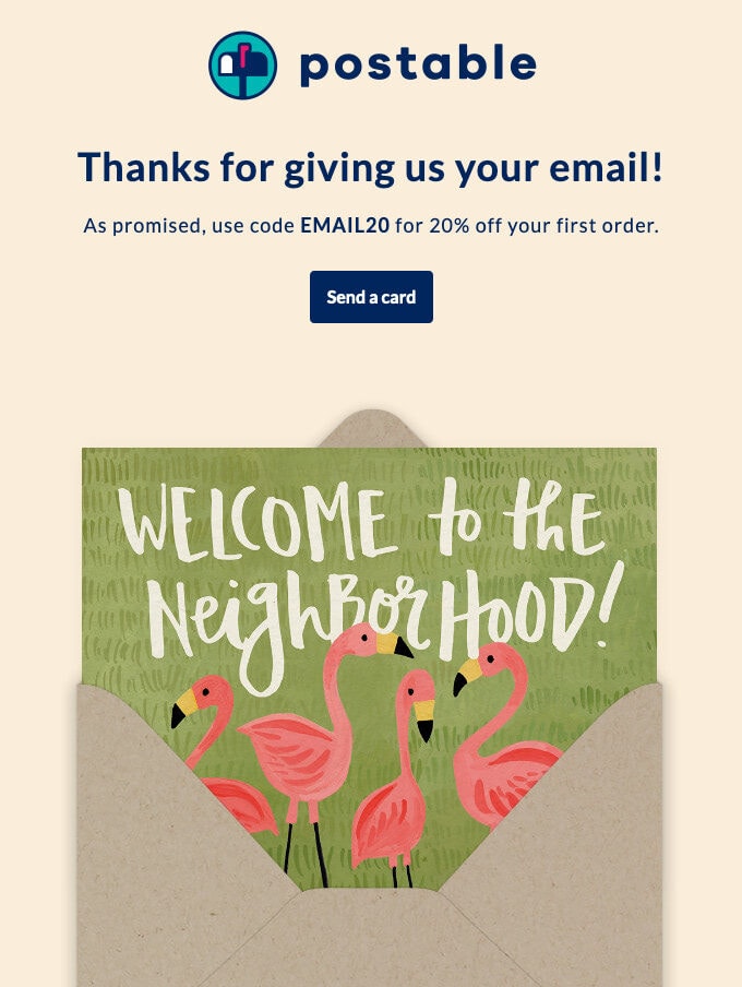
Welcome from Postable
Abandoned Cart Emails
The abandoned cart email is a powerful marketing tool for e-commerce projects. It helps recover lost revenue by re-engaging customers who added items to the shopping bag but failed to check out. As studies show, this warm lead saves revenue in majority cases as well as increases brand engagement.
As a rule, it includes user-centric copy with products left in the cart, a header with navigation, a footer with contact information, and shopping incentives to bring people back. Usually, it is a small discount, such as free shipping or a skillfully played subliminal message that establishes a sense of scarcity or evokes fear of missing out.
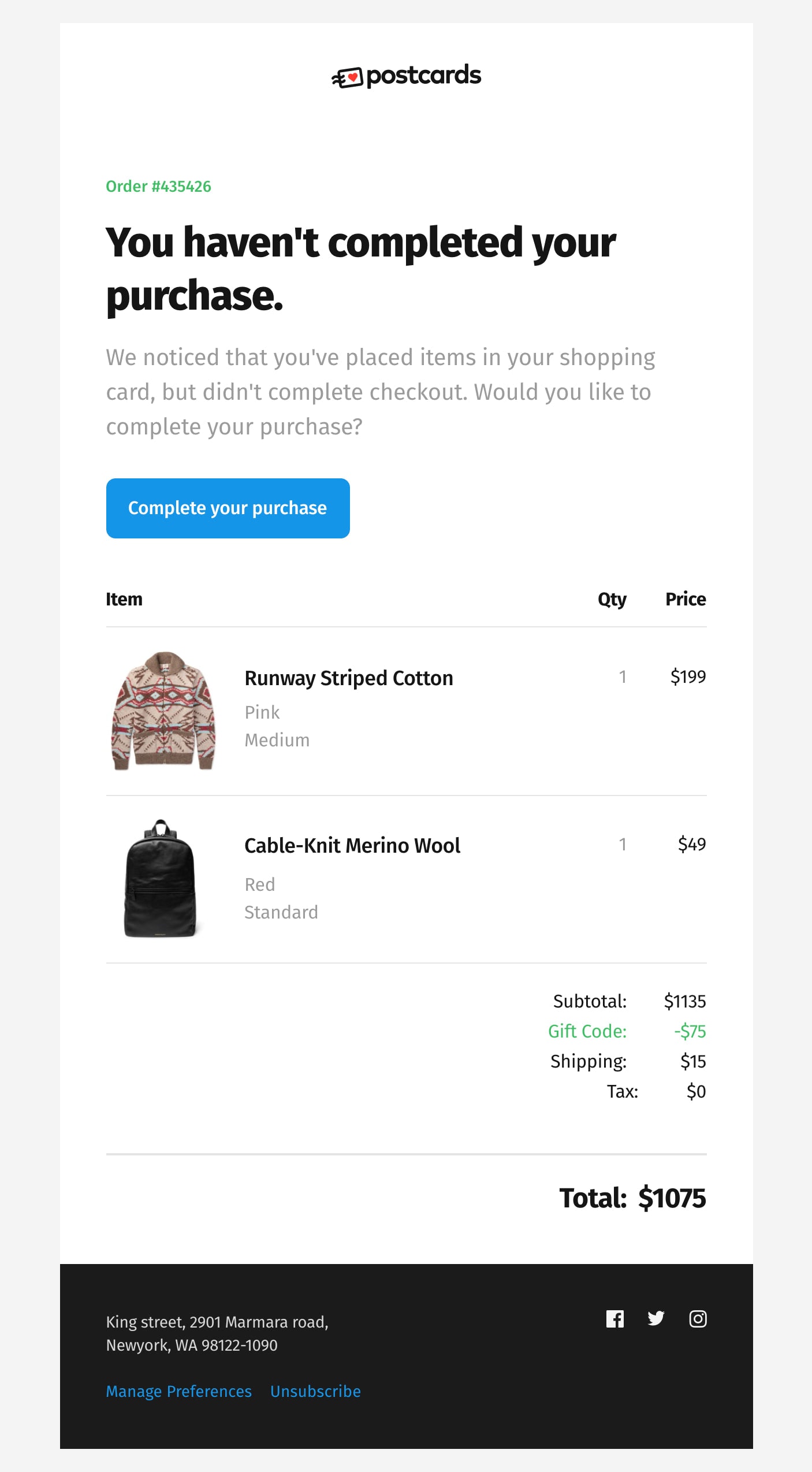
Abandoned cart email made in Postcards
Order Confirmation
Unlike abandoned cart emails that struggle to bring people back, order confirmation emails are warmly welcome by the user. This type of newsletter – that has one of the highest open rates – is not just a key element of customer retention, but it is also a perfect opportunity to maximize your client’s momentum and capitalize on future revenue.
Although you should not distract attention from the purported purpose of the email, you can benefit from cross-selling and upselling techniques, as well as referral and reward programs.
Therefore, this essential autoresponder should be more than a blindly generated copy. Make it personal, media-rich, and apply marketing tricks to drive extra traffic to the product.
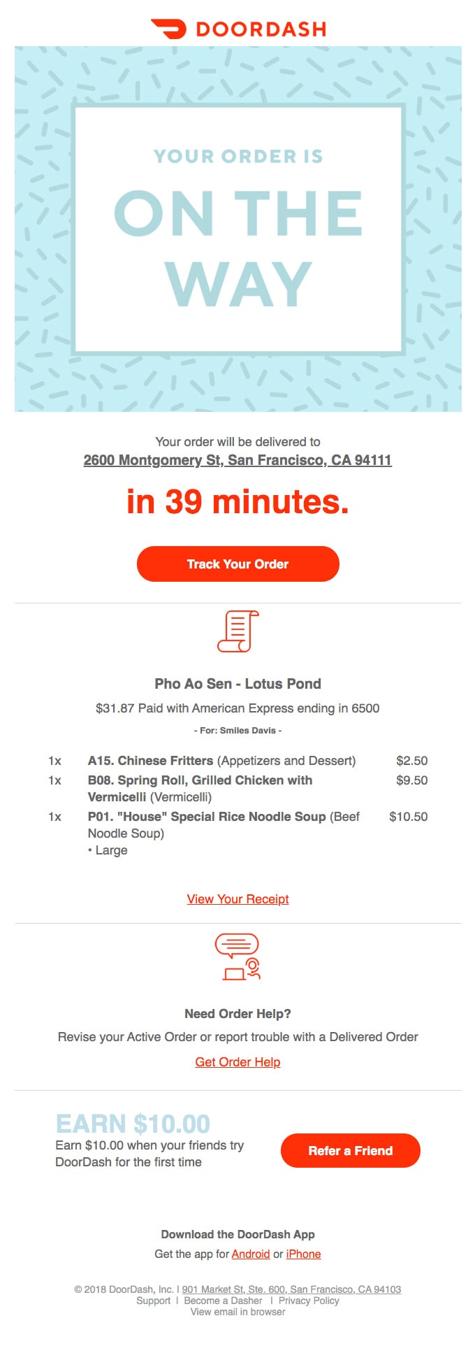
Order Confirmation from Doordash
How to Drive Transactional Email Engagement: Best Practices
In the right hands, transactional emails can become a powerhouse of user engagement. They can be easily converted from neutral “automated emails” into personal digital pieces that bring value, enhance ties with the clients, boost conversion rates, and raise revenue. Let us consider some best practices for driving transactional email engagement.
Subject Lines
When it comes to transactional emails, you do not have to be increasingly creative to stand out from the sales pitches in the customer’s inbox. The deal is they have high engagement rates since people are waiting for them in the first place. For instance, as studies show, order confirmation emails – one of the most common transactional emails – has an almost 80% open rate.
Therefore, you do not have to reinvent the wheel. Stick to these recommendations to ensure open rates are high as should be.
- Use a brand name. A nicely formatted “From” address can take your company to a new level.
- Use the recipient’s name in the subject line to make it more personal.
- Use emojis. If it fits your company’s ideology, use emojis to establish an emotional connection as well as add some visual cues to draw attention.
- Use preheader text to make the message more informative and impactful.
- Play marketing tricks. For example, if you send out an abandoned cart email with an extra discount or e-commerce incentive, announce that in your subject line. Something like that “You left goods in the cart and 30% Off” may drastically increase your open rates.
- Avoid the “no-reply” email address.
- Avoid such words as “alert,” “service,” “billing,” or “info.” They sound robotic and impersonal.
Compelling Copy
Chances are your customer may have more than one order or transaction in a short period. Therefore, a copy of your transactional email should be compelling. Things to consider include:
- Choose the necessary information to develop concise and straight-to-the-point content.
- Add brand elements: logotype, mascot, slogan, coloring, image background.
- Do not underestimate the power of visuals. It can be a simple picture used as background, photoshoots of the products left in the shopping cart, or even a team member avatar that makes the connection with the client more personal.
- Add helpful information: FAQ section, link to return policy, link to chat with the support team, etc.
- Highlight the next steps or additional instructions to complete the interaction.
- Make it clear when the action will expire, establishing time boundaries.
- Make call-to-action bright and prominent. Delineate its purpose by using action words.
- List the benefits of choosing your company or product.
- Use marketing tricks appropriate for the type of transactional email. If it is an abandoned cart email, use FOMO or shopping incentive. If it is a welcome email, add a bonus for newcomers. If it is a confirmation message, draw the client’s attention with the best sellers.
- Employ other channels. Add social icons to your profile or let your clients share the news with their friends through social share buttons.
- Provide contact information, physical address, link to the privacy policy, and link to unsubscribe from your list.
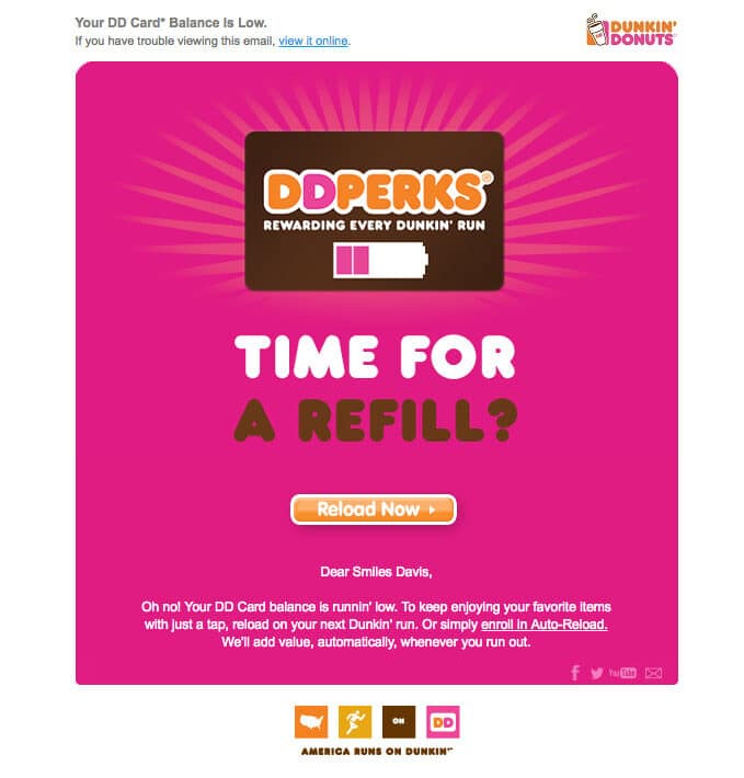
Transactional email from Dunkin Donuts
Personalization
You can get a plethora of information about your client. So why not use it to make everyone happy? More personalized content and experience are proven email marketing tactics to increase engagement.
The simplest way to adopt a personal approach is to add the name of the recipient to the subject line and copy. In addition, based on personal data, you can define the best time to send out emails within a proper time zone, or use images and products appropriate for the gender. You can even tout products based on marital status.
Personalization is a powerful marketing approach that is warmly welcome by the prospects. Therefore, do not miss a chance to maximize on this opportunity.
Custom Design
Custom design is the heart and soul of all the successful transactional email examples. It is the leading email design trend in 2025.
It opens vast possibilities for entrepreneurs. You can create a digital newsletter that not only highlights the brand but also dishes up information in a way that fits the marketing campaign.
Playing with the layout, components, visual cues, coloring, and even multimedia, you can create a product within a product that will produce an impact on the user. Also, it is much easier to pull marketing tricks and not scare clients away.
There are some important things to take into account when you build a custom design:
- It should be valid
- It should include additional information for AT technologies
- It should be the responsive email
- It should be mobile-friendly
- It should be cross-browser and cross-platform
- It should be thoroughly verified
To save yourself from bringing to life all these requirements single-handedly, you can use free HTML email template builders, such as Postcards. With its handy drag-and-drop editor that includes a hundred field-tested modules, you can easily pull off the design of every scale within minutes. And the best thing, it will look great across all the devices providing a consistent user experience without extra efforts from your side.
You do not need any design or coding skills to create a mind-blowing email newsletter with interactive features. Postcards may save you time and money, especially if you are serious about your email marketing campaigns and want to make the most out of them by sending beautiful brand-centric sales pitches every other week.
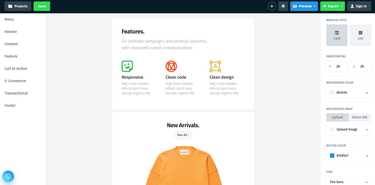
Transactional Email as Part of the Overall Marketing Strategy
It is vital to understand the needs of your customers and what type of communication your users prefer. Your overall marketing strategy should be built on that. It should take into account all emails even autoresponders like transactional emails. The latter is a perfect supporting tool that can reach clients from various points.
To make transactional emails valid players in the general game apply to them the best principles used for other types of digital newsletters.
- Employ a series of email newsletters to enhance an overall impact.
- Rely on a trusted email provider that offers all the necessary instruments for sending out error-proof triggered messages.
- Protect yourself with email authentication. Do not ignore security issues. Use DKIM to sign your newsletters as well as set up security protocols like SPF and DMARC.
- Go for a dedicated IP address over a shared one.
- Define the best time. Although transactional emails are generated automatically, you can still set a delay, or if you have a series of emails, you can choose the right day and time to send out the rest pieces.
- Monitor statistics. Analyze opens, clicks, bounce, unsubscribe rates so you don’t miss possible issues.
- Keep an eye on your email sender reputation and blacklists.
- Add an unsubscribe link to avoid spam folders and spam reports.
- Do A/B tests.
Privacy Issues
By default, companies do not need to obtain consent from the contacts to send out transactional emails. But you have to obey general laws and regulations (U.S. law, European Law, Canadian Law, and others) and respect your client’s privacy.
Therefore, it is highly recommended to ask prospects whether they want to receive this kind of email – especially those that are used to re-engage customers like abandoned cart emails. Whatever transactional email you send should include your contact information with a physical address and telephone number, link to manage preferences, and a link to opt-out from your subscription list.
Respect the rights of your clients, and you will build strong relationships with them. It is a policy that pays off handsomely.
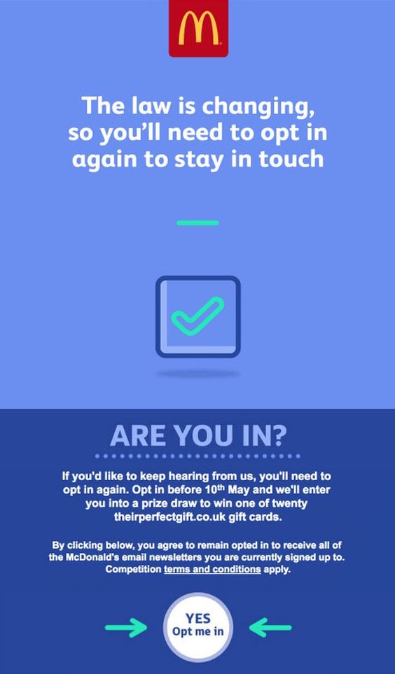
Legal Notification from McDonald’s
High-Converting Transactional Email Examples
Loeffler Randall has done a great job with the” Thank you” newsletter, providing an excellent post-purchase transactional email example.
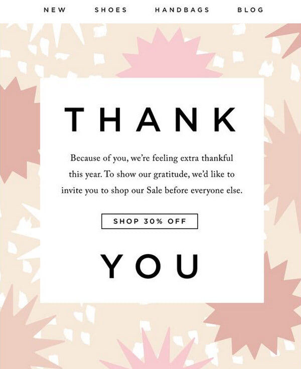
Thank You Email from Loeffler Randall
It skillfully combines simplicity and minimalism to focus the customer’s attention on the message. It features a carefully highlighted discount to keep clients in the loop. To drive even more engagement, you will find here a list of shopping incentives like “free shipping,” “free returns,” and a reward program.
The design is compact and straightforward, and the content is truly valuable. It is exactly what is needed to make people feel appreciated and drive extra traffic to the website.
Transactional email from Postable
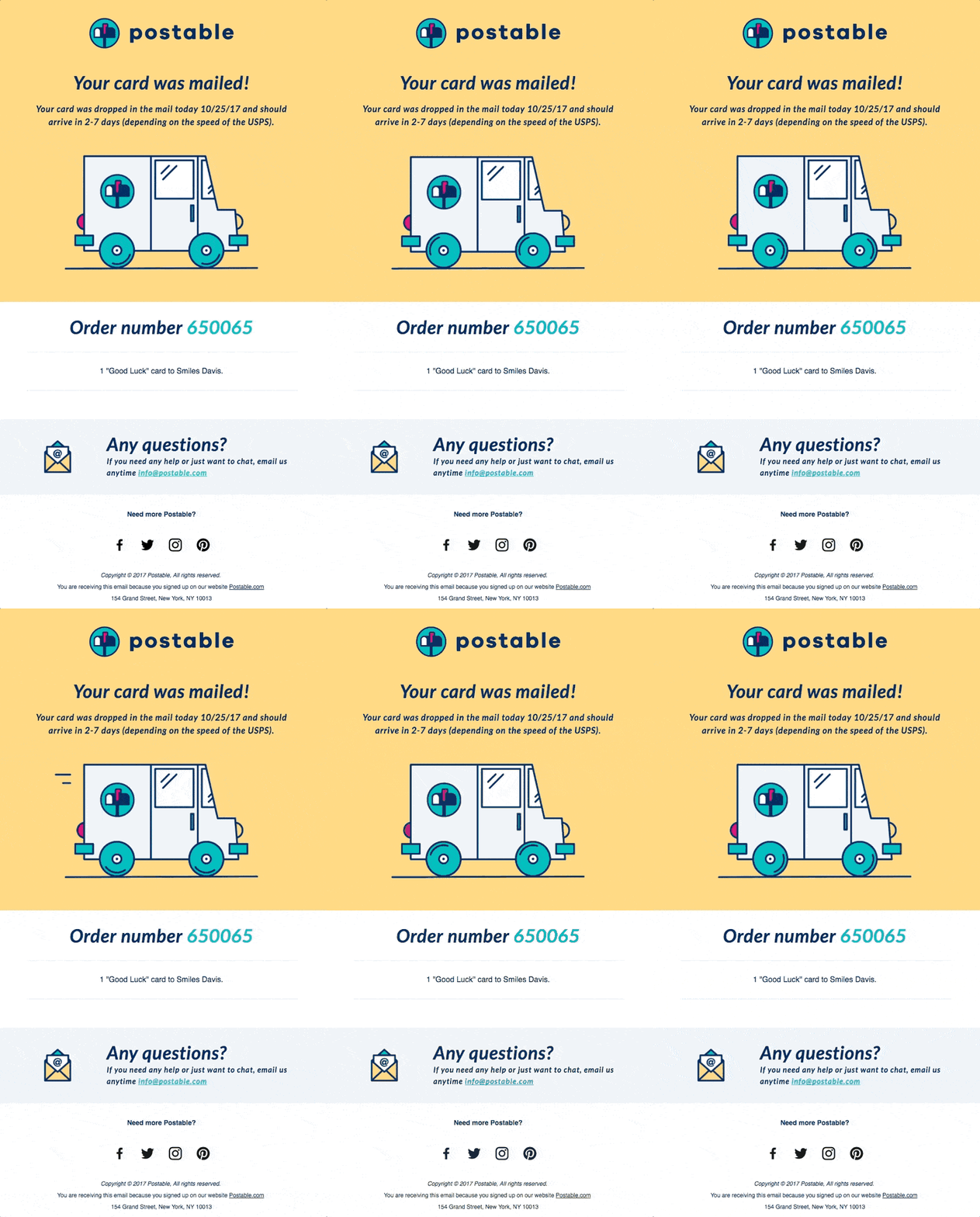
Postable has carved quite a niche thanks to a unique, playful personality and humorous approach. The company gives us a fantastic transactional email example that gets its beauty from the cartoonish atmosphere. The newsletter oozes positive vibes that instantly lightens the mood.
Although the design is attention-grabbing, content is still king. You see vital information right from the start. The team follows a pattern by using one giant picture and a small block of text that allow setting focal points quite effectively. They have also added animated gif to make the letter feel interactive.
This is another simple solution that effortlessly drives engagement and leaves a favorable long-lasting impression.
We Miss You from Sephora
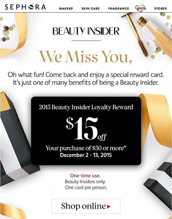
“We Miss You” is a popular transactional email example whose aim is to reactivate a user who’s been dormant for a certain period. When done right, it can bring back customers.
As a rule, such newsletters have a compelling offer, in this case, a reward card for “$15 Off.”
Note the discount is placed right at the heart of the design so it can’t be missed. There is a logotype to remind about the company, navigation with backlinks to the most popular categories on the website, a footer with all the vital information, beautiful background filled with popular products, and an eye-catching call-to-action button.
The email newsletter is compact, yet it has everything necessary to rekindle relationships with the clients and bring them around.
Welcome email from Charles Tyrwhitt
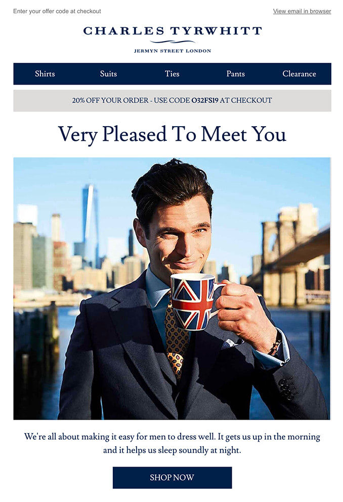
How can anyone resist this look? The welcome email from Charles Tyrwhitt is one of those transactional email examples that wins over clients with its powerful charisma and personality.
The clever combination of visuals and copy does its job well.
From the start, the email sets everyone to the proper mood and reassures customers that they have done the right thing by choosing this brand. By touting the benefits of the company and displaying a small collection of the best products, the team encourages immediate shopping without much pressure.
Note the footer area is quite extensive. The team concludes the digital letter with lots of helpful information as well as some good points to support the company.
Abandoned Shopping Cart Email from Asics
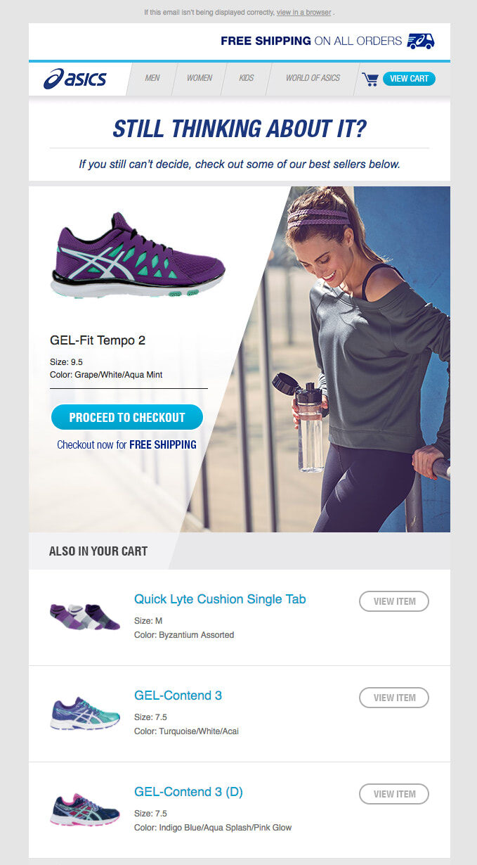
Abandoned shopping cart newsletter is the most popular transactional email example that is used to re-engage customers in e-commerce marketing. The team behind Asics knows how to capitalize with this warm lead generator.
Their email newsletter is rich in content that is skillfully dished up. Note how the team has chosen the favorite option and incorporated it into the hero area. This trick instantly grabs attention and rekindle interest. Other products are also included. They are presented in an organized list with images to strengthen the overall impact.
The copy is simple and straightforward, though most importantly, it brings value. In a shrewd move, they have included a block with bestsellers to encourage click-throughs and started the email with a free shipping announcement to compel user action right away.
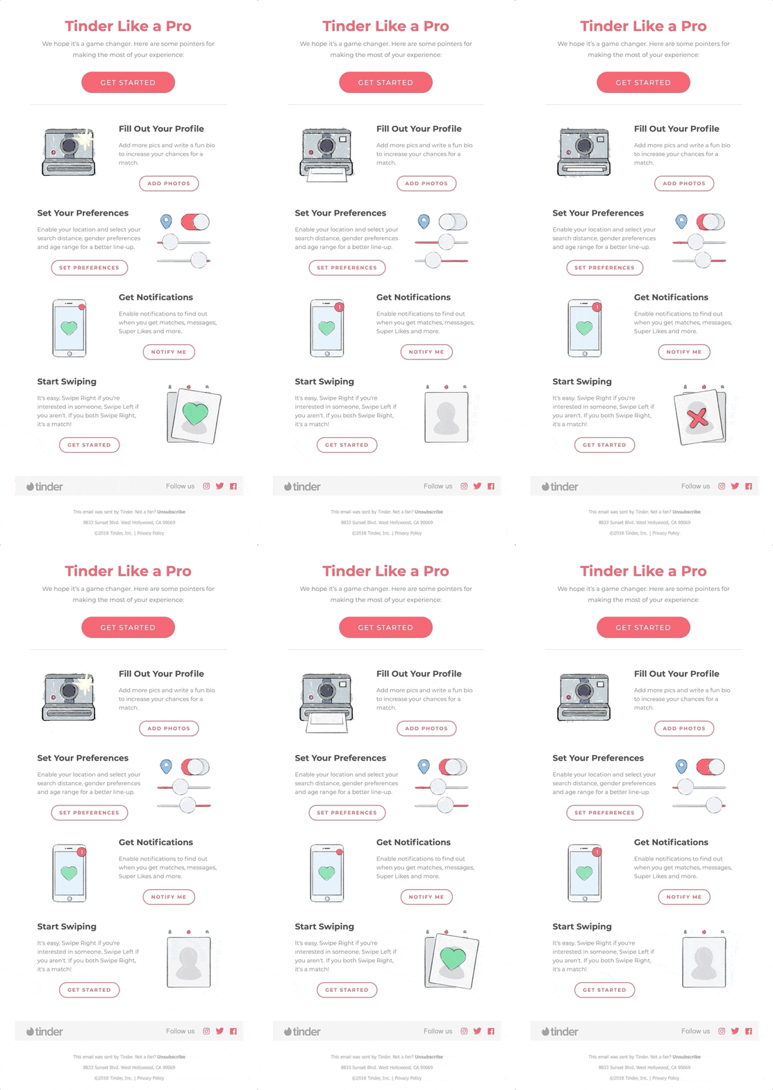
Tinder like a Pro
The onboarding email is a transactional email example that is often overlooked since entrepreneurs widely believe that welcome email is enough to get users on board.
Depending on your company and product, you may need more than one email to make people feel comfortable. For example, Tinder has a series of welcome emails that help people to get the most out of their platform.
The team of the popular online dating application uses a friendly language and animated gifs to create a cozy and relaxed atmosphere. The newsletter has one goal: alleviate anxiety by providing clear guidelines on basic functionality. And it certainly works.
Note the footer includes the unsubscribe link. This attitude towards protecting customers’ privacy adds extra points to the company.
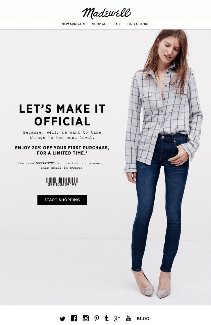
Let’s Make it Official
Madewell provides an excellent post-sign up transaction email example. It sticks to a minimal approach to throw a spotlight on the offer effortlessly. It includes concise copy with just several lines of text.
The shopping incentive was played right. It is unobtrusive and non-committal. Although the discount is small, it works. The strong call-to-action provides a quick getaway to a shop variety.
The newsletter is simple and somewhat formal, yet it certainly improves engagement by bringing valuable content to the fore.
Conclusion
Transactional email is a crucial element in the customer journey. It helps build strong relationships between the user and project, and in some cases, saves the situation by recovering almost lost revenue with the help of re-engagement techniques.
Although transactional emails are generated automatically, that does not mean you cannot adjust the process. Set the best time for subscribers to get the email, find the best subject line to increase open rates, and create a custom design.
Consider transactional emails as an opportunity to drive traffic and raise revenue as well as strengthen your customer relationships and improve user experience with the product.
