Delve into Sea Depths – Seascapes and Underwater World in Website Design
Natural motifs are quite common in website design. The designers generally prefer to employ various landscape images, scenery illustrations and country-style videos in order to add naturalness and purity to its projects. However, there are those who truly appreciate the nautical theme that also is not devoid of powerful emotions that easily arouse a range of positive feelings. Witnessing such an awesome scene in a regular website design is certainly something unexpected; it produces some kind of a dramatic effect that leaves its own unmistakable imprint.
There are different ways to realize this theme. It can be a simple shot of a seascape, a picture of an enigmatic underwater world taken by scuba diver, mind-blowing photo manipulation or breathtaking illustration of marine life. Each of the ways is able to add to the design something offbeat, exceptional and highly intriguing.
As for functional use, it can certainly vary. For example underwater scenery can unobtrusively entice the users to scroll down and explore the website, providing them with visual paths; whereas regular picture of a sea can serve as non-verbal backing for slogan, tagline or nameplate of the website. Everything depends on general conception.
Today we have collected various examples of using seascapes and underwater world in website design.
Underwater World in Web Design
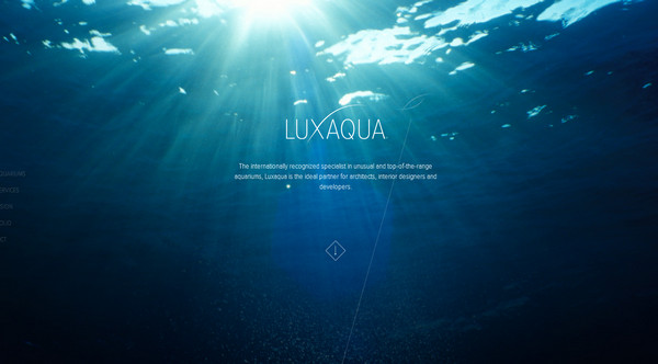
Luxaqua Design – The website is based on a vertical scrolling that pleasantly deepens us into magnificent sea depths. The whole design is constructed with a help of spectacular photos that laconically collaborate with a refined ultra-narrow type.
With Postcards Email Builder you can create and edit email templates online without any coding skills! Includes more than 100 components to help you create custom emails templates faster than ever before.
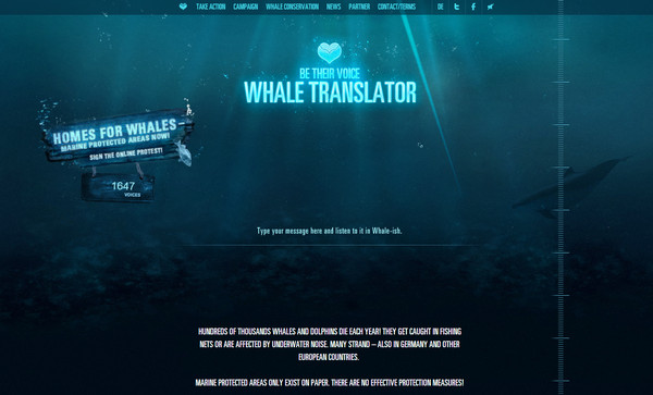
Free Email BuilderFree Email TemplatesWhale Translator – Much like the previous example, the designer leverages various fantastic snapshots of underwater world, which maintain a clean and fantastic aesthetics. Such choice of theme is aimed mainly to support the nameplate of the website.
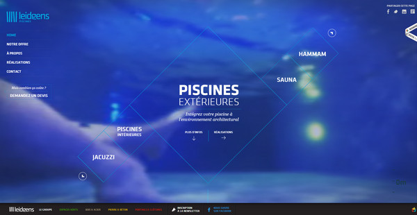
Leidgens piscines – Since the website is dedicated to selling swimming pools, Jacuzzis and saunas, it’s not surprising that the designer has decided to populate website with corresponding images and videos. The bluish coloring inherent to such theme is effectively bolstered by neat elegant white typography.
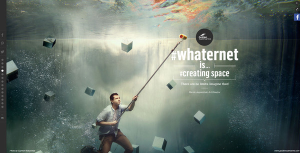
Whaternet is a topnotch digital agency that unobtrusively shows off its scope of creativity. The landing page is full of mind-blowing professional photo manipulations that not only feature various team members but also enhance slogans and taglines.
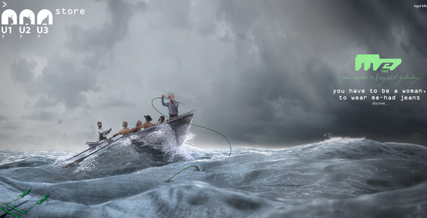
me-had – The company speaks completely through its front page that exhibits an astonishing photo manipulation where jeans texture plays a leading role. This clever idea helps to immediately give a notion about its products.
With Startup App and Slides App you can build unlimited websites using the online website editor which includes ready-made designed and coded elements, templates and themes.
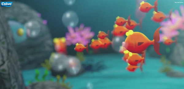
Try Startup App Try Slides AppOther ProductsCalvo is a promotional website that encourages users to get acquainted with its goods more closely with the help of a small HTML5 game. You will explore an underwater world together with a small funny fish.
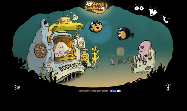
Siput Scuba – As the nameplate implies, the website belongs to 2 dive instructors that want to vividly and graphically demonstrate its skills and possibilities. They invite you to delve into their world of undersea adventure, and at the same time, get to know them better.
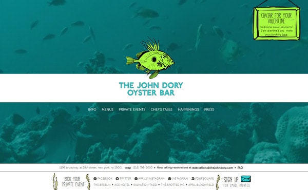
The John Dory is a fine seafood restaurant that allows the website design to speak for itself. The design features a pleasant video background that sets up the proper atmosphere. The hand-drawn graphics along with blog-style layout give the website an open and properly-balanced appearance.
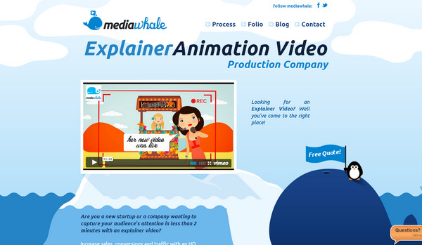
Media Whale – This is another typical example of the website that utilizes its design in order to support its nameplate. The nautical theme presented via a fully-illustrated layout unambiguously communicates the idea.
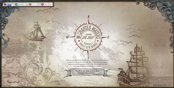
In Charted Waters – The website is simply soaked with an adventure vibe. The marvelous, old-style nautical illustrations accompany every section.
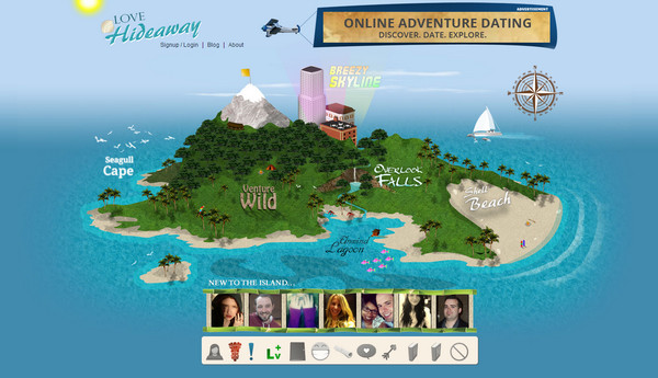
LoveHideaway is a dating website that quite effectively invites users to become members. The website is associated with fantastic adventure and exotic leisure due to its island illustration and nautical theme.
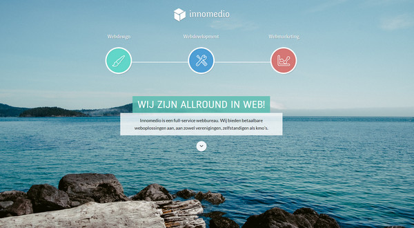
Innomedio has a neat and well-structured website design that greets online visitors with a subtle photo background that is intended to evoke feelings of serenity and decency.
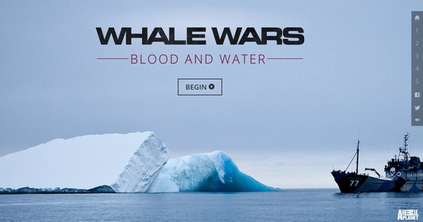
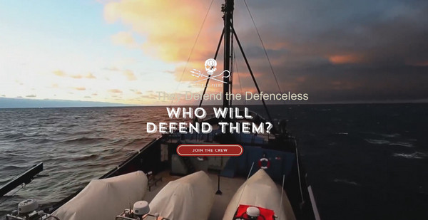
Whale Wars – Much like the examples 2, 3, and 9, this website utilizes exceptional seascape photos in order to instantly give a glimpse of what this site is about as well as effectively hold up the nameplate.
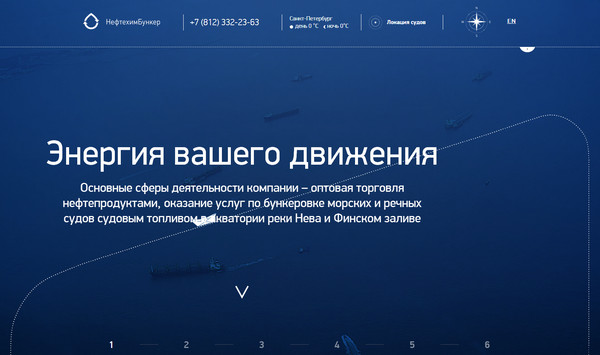
NH Bunkering – The website employs an approach of visual storytelling that helps to pleasantly guide you through main sections. As usual, the theme is not selected accidently, since the company is engaged in bunkering sea and river vessels a waterscape here looks highly appropriate.
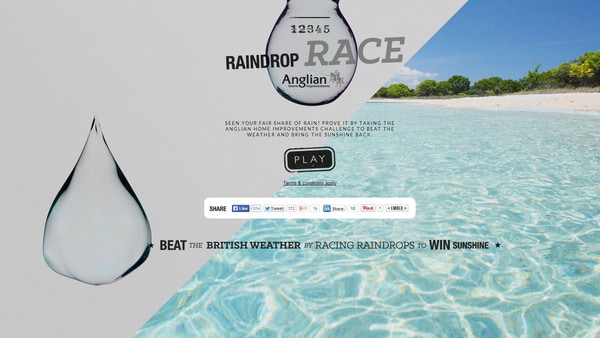
Raindrop Race – The website offers its visitors to play a small game that is aimed to advertise Anglian home improvements. The startling picture on the right showcases the future result that can occur thanks to promoted products.
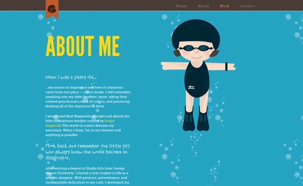
Michelle Lana is a creative and talented illustrator that skillfully demonstrates her skills via website design. She enforces you to totally immerse yourself into her online portfolio.
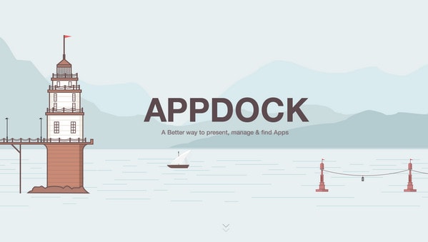
Appdock – Here the nautical theme is also used to emphasis the nameplate of the website. The clean and sleek seascape illustration matches the tone of the website perfectly well, and clearly exemplifies how finding necessary application in a sea of various goods can be easy and handy.
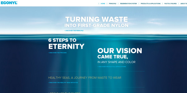
Econyl offers its online visitors, before familiarizing them with its activity, to dip into numbers and facts. The calm and subtle underwater background is an excellent foundation for such purpose.
Defend Seashepherd – This is another website in our list that represents a company dedicated to sea and ocean activities. Video background of the homepage remains passive yet looks extremely appropriate.
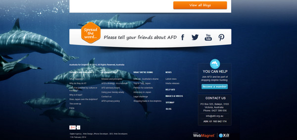
AFD – This charming website refers to dolphins and those who want to protect them. Use of the nautical theme here is more than obvious.
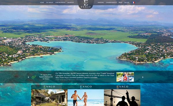
Evaco Group is a real estate company that sells luxurious property near sea. The spectacular seascape background is definitely aimed to stir users into action.
Conclusion
Though the underwater illustrations and nautical themes are usually used in specific web projects that present companies whose activity is somehow related to sea or ocean, there are some excellent examples how this solution can bring lots of benefits for those who has nothing to do with it.
Share with us other admirable examples of website designs based on underwater world theme.
