The Ultimate UX Design of: the Credit Card Payment Form
The Peak Point of eCommerce and SaaS – the Credit Card Payment Form
If you’re selling something online, you know it’s not the easiest thing to do. You need to find a prospective customer, present your product in a good light, drive her through a process full of forms and finally… collect her money. At every step you’re risking a sudden loss of your client. That’s painful.
There’s lots of things that can happen. The human attention span is extremely limited and vulnerable to distractions. The whole process is easy to complicate and tough to design. The last step in the process – the credit card payment form – is especially challenging. People won’t risk placing their credit card number in a badly designed or confusing form. The risk of losing money will be too great.
Minimizing the feeling of risk and avoiding confusion – that’s what you’re aiming at when designing a credit card form. That’s your ultimate UX Design task.
Wouldn’t it be sad to lose a customer at the last step of the selling process? You did everything else well and just the last tiny step somehow went wrong. The payment didn’t go through and the only thing that you can do is burst into tears.
We know that feeling
UXPin for a long time relied on PayPal as the only payment option. The speed of development and lack of bureaucracy were so tempting, we just couldn’t resist it. As it turns out, that was a terrible decision. We were constantly losing about 20% of our customers at the very last step of the process. The reasons behind this were obvious:
With Postcards Email Builder you can create and edit email templates online without any coding skills! Includes more than 100 components to help you create custom emails templates faster than ever before.
Free Email BuilderFree Email Templates- Lack of payment options (though PayPal is extremely popular in the US, many people refused to use it when paying for a subscription to our UX Design App).
- Confusing process of redirection to PayPal and terrible design on the PayPal side.
This forced us to redesign the whole paying process. The result was stunning. There’s still room for improvement, but the increase in revenue was immediate and high enough to justify all the costs.
The credit card payment form is a peak point of online selling. You want to make it right and I’ll show you how.
Help people succeed
I have good news for you: If your prospective customer reached the point in which she needs to type in her credit card number, she really wants to pay. That’s right – no strings attached. Somebody wants to give you money! Whether you take it, depends on your design.
Will you help your users succeed in their purchase, or rather make it really hard for them? It’s up to you.
If you ask for tons of optional information, therefore risking distraction, have unclear labels, or don’t inform what type of credit card you accept, your call to action is obscure and data transfer isn’t safe… don’t be surprised if many people will leave the process without completing the payment.
You’re not helping them. You’re creating additional obstacles.
Luke Wroblewski in his great book “Web Forms: Filling The Blanks” stated: “Any question you ask people in a Web form requires them to parse it, formulate a response, and then input their answer in the affordance you have provided on the form. Being vigilant about every question you ask allows you to remove questions that are not absolutely necessary, or can be asked at a better time or place, or can be inferred automatically. And the fewer questions you ask, the better the odds are of people completing your forms quickly and easily.”
Bearing that in mind take a look at the Amazon payment process and the payment form itself. Amazon knows that typing in a credit card number each time you want to purchase something is an obstacle, so they ask you to “add your card” to the account, so you can make a purchase with just one click.
With Startup App and Slides App you can build unlimited websites using the online website editor which includes ready-made designed and coded elements, templates and themes.
Try Startup App Try Slides AppOther Products
Amazon tries to be as simple as possible
They also minimized the information needed to just “Card number”, “Name on card” and “Expiration date” fields. In most cases they don’t even ask for the infamous CVV code (though how they manage to proceed with the transaction without the CVV is somehow mysterious).
Amazon tries to help their customers to go through the process as quickly as possible.
Do the job for them
Making the form simpler by reducing the number of form fields isn’t the only thing you can do on your way to the ultimate User Experience Design. Extend your help by doing part of the job for your customers.
Apple Credit Card Form
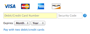
Apple in their Credit Card Payment Form detects the type of credit card you’re using and makes it a little bit easier as you don’t need to choose your type from a traditional list. The responsiveness on the form is also important as it helps people focus attention. When you start to type your credit card number the right icon will remain colorful, while the other will fade into gray scale.
You should also notice that Apple offers the option to pay with two debit/credit cards. That’s great and rare customer care. If you’re selling expensive gear – you should have this option in place!
Gumroad choose the same way of pointing out to the user that they know what kind of credit card you’re using.
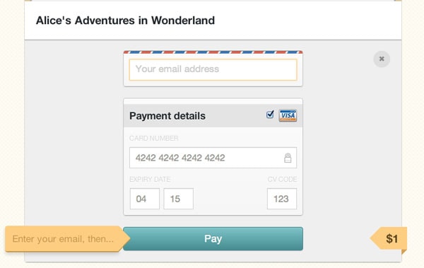
Technically it’s rather simple. Credit card numbers are created in a consistent way. American Express cards start with either 34 or 37. Mastercard numbers begin with 51–55. Visa cards start with 4. And so on. This information can be used to detect what type of credit card someone is using simply by looking at their credit card number.
Captain Obvious strikes back
To make your form unobtrusive you need to make it obvious. If you have form field labels without any explanation, some of your clients might feel confused. They might not understand the CVV code, or the reason you’re asking their name (what if they’re using their company card to make a purchase?).
Alleviate the pain by adding short prompts and examples next to labels.
Take a look at the simple form created by the Threadless team. Its great design is hidden in the details.
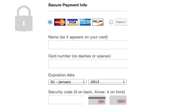
Threadless Form does a good job of making things obvious
Let’s consider the form fields:
- Name (as it appears on your card) – leaves no doubts about what you demand to be typed into the form.
- Card number (no dashes or spaces) – gives people information about the required format. Of course it would be much better if the form itself could accept any format of provided data, but still it’s much better than letting people fail and scaring them with error messages.
- Security code (3 on the back, Amex 4 on the front) – the image clearly shows where you are supposed to look for the security code. This is also the first Credit Card Payment Form that tells clearly that on American Express cards the security code is on the front not on the back of the card and that it consists of 4, not 3, digits.
Can you see how the Threadless team deliberately made the form easier? They tried to prevent customer confusion, which may result in a higher Conversion Rate.
The trick is that you want to be only as obvious as you have to be. Not all of your customers will need extensive help. You might consider hiding any extra help under a question mark icon. Too many prompts and explanations might just create a cognitive overload, which is always risky.
Make them feel safe
When people are reaching for their credit cards, you want them to feel safe. If you fail to provide a safe-looking environment, your credit card payment form will be a disaster. Unless you have a great reputation, such as Apple and Amazon, you want to indicate that you take great care of the safety of your customers.
Take a look at UXPin’s design.
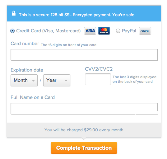
We’re pointing out to our customers that we’ve invested in the 128-bit SSL encrypted protocol to secure their sensitive data. We want them to feel as safe as possible. We’ve also taken extra care over the overall visual design.
Visual design has an extreme importance when it comes to a feeling of safety. If you look like a fraud site, you’ll be treated like a fraud site and hardly anyone will find the courage to trust you with their credit card number.
Make sure they know the price
Probably the silliest mistake you can make is to force your customers-to-be to go back and forth to your service to check how much money they will send you by typing in their credit card number. Always inform your users how much you will charge them.
Buffer App does this in a great way.
Buffer let you know that you’re about to subscribe to the service and give you also an option to pay upfront for a year.
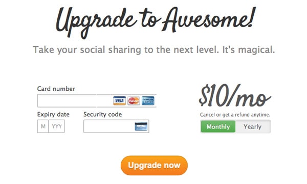
Their great, relaxed copy makes you sure that there are actually people behind it, not vicious cyborgs. It also gives customers a feeling of safety.
Step-by-Step Tutorial
Let’s use the knowledge that we’ve gathered above and go through the process of designing a perfect Credit Card Payment Form, shall we?
I’m using UXPin – The UX Design App to quickly create this user interface, but to recreate each step you can use your own weapon of choice.
1. Basic Structure
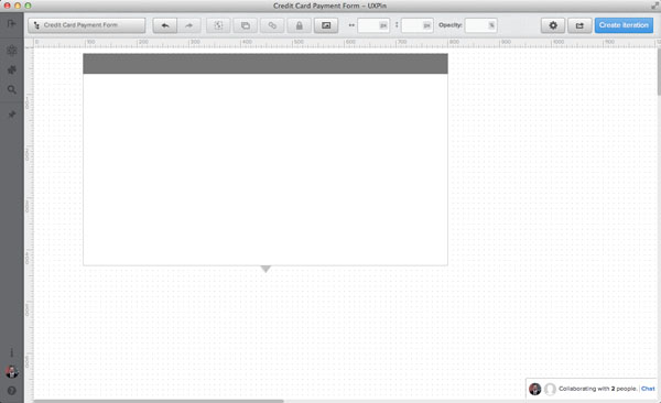
I always like to start with a basic structure of the interface in mind. Bare boxes represent general content pieces and space that will be filled with UI elements. This allows me to really stay focused.
2. Headline and Call-to-Action
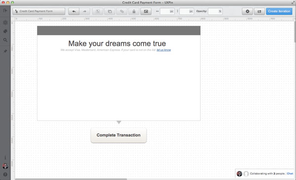
In the next step I form a headline and a call-to-action. Both elements are vastly important and shouldn’t be underestimated. In the headline, I’m looking for something emotional, but not too catchy. After all, we want our users to go forward smoothly.
Take a look at the sub-headline, “We accept Visa, Mastercard, American Express. If your card is not on the list, let us know.” With this statement – I’m informing my customers about accepted credit cards, but at the same time, I’m offering much-needed support.
If your customers are using credit cards that are not supported, you really need to know about it.
A call-to-action should be precise. Don’t try general things like “Continue”, “OK”, “Done” – these kinds of phrases don’t create a context for the whole process and may confuse your customers. They will also fail at creating a sense of urgency and… well, just a call-to-action.
3. Safety Indicators
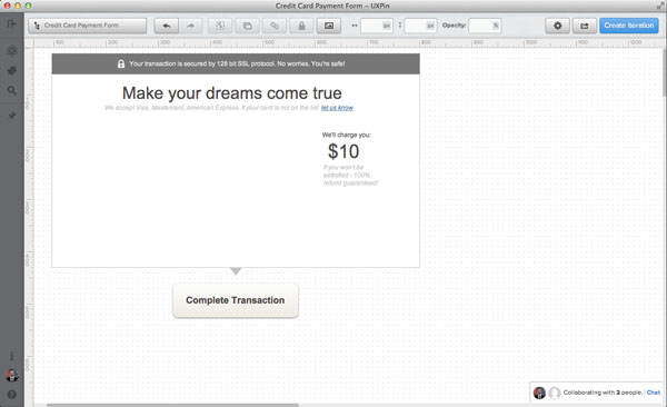
A couple of paragraphs above we were discussing the importance of safety and price in the credit card form. Let’s put that into practice!
Take a look at the precautions that I took to make sure the payment process will go smoothly:
- At the top, I inform my customers about the technical safety provided by the SSL protocol. That’s forming a positive frame around the whole form.
- I want to now make sure that nothing worries my customers at the moment of purchase. I not only inform them about the price, but also I let them know that a refund is possible.
4. Form Fields
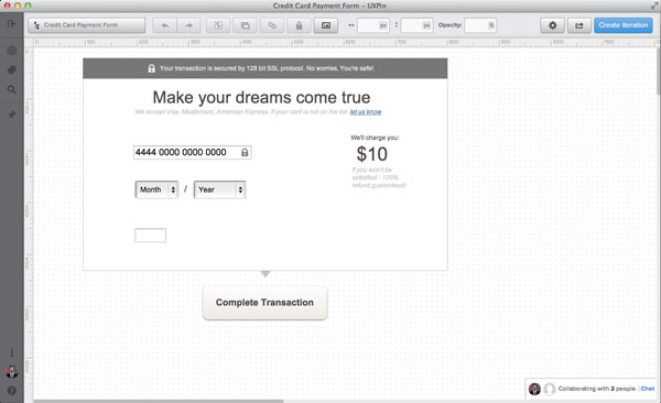
Next, I place important form fields. I’m assuming that due to a backend transactional mechanism I don’t need to know my customer’s name to proceed with payment, but I need the CVV code. That’s a popular pattern.
I’ve decided to place an additional “lock” icon in the form field, to indicate that all the data is safe.
By putting “/” between two selects of the Expiration Date, I’m addressing the mental model created by credit cards. This is the format of data used on most credit cards in the world.
5. Labels and Prompts
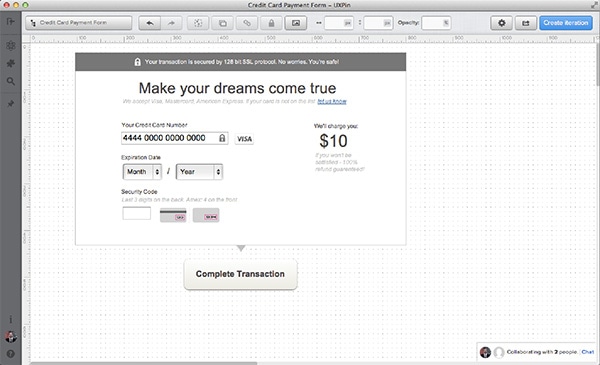
Finally, I place labels and all the important prompts. I’ve decided to use the mechanism of the auto-detection of a credit card number. I want my form to respond quickly to user input, so I designed a place for a credit card icon at the right of the Credit Card Number field.
The Security Code is always a tricky field, so I’ve secured it with a textual prompt “Last 3 digits on the back. Amex: 4 on the front”, as well as icons showing where to find the code
