Make These Changes to Meet Web Design Accessibility Standards
Accessibility is a key function of any web design or app strategy. New government accessibility regulations in the UK mean that all public sector websites created on or after Sept. 23, 2018, must be accessible. Mobile apps must be accessible by June 2021.
Design is a crucial component of any website or app, all too often we see organizations get carried away with the aesthetics and see accessibility as a small focus, when in fact, there are a lot of features that need to be considered! Especially with 1 in 5 people in the UK being considered as having some sort of disability.
In this article, we will explore accessibility requirements; why they are important; the pros of accessibility; and features to consider to become more accessible online.
What is Accessibility?
Accessibility is the design of products, devices, or services that can be used by as many people as possible. This includes those with disabilities, such as impaired vision, motor difficulties, learning difficulties, or deafness.
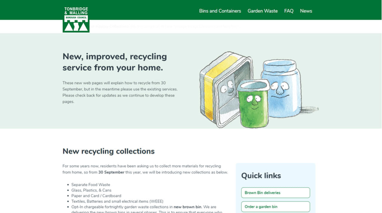
This means much more than simplifying the design. Creating a platform that is accessible means considering all aspects and ensuring that your brand is adaptable to those who need it. Making all functions including your content, design, navigation, and layout flexible is key in creating an accessible platform.
Why is accessibility important in the public sector?
Public sector organizations (government-operated services) are affected by regulations, as these essential services need to be available to anyone, including those with disabilities. In the case of some services, the people who need them most may find it difficult to access online or through an app.
With Postcards Email Builder you can create and edit email templates online without any coding skills! Includes more than 100 components to help you create custom emails templates faster than ever before.
Free Email BuilderFree Email TemplatesPros of accessibility
The main advantage of successfully designing an accessible platform is making your app or website available to all, but there are many other benefits.
- Avoid discrimination: If your website or app has been developed to assist everyone, then you have created a platform that does not discriminate. Most businesses do not deliberately discriminate against individuals, but some organizations simply focus on visuals rather than fundamentals. This is crucially important for public sector organizations. By concentrating on the design, they can exclude specific functions or methods of communication vital to ensure access for some groups of people. Creating a platform that not only meets regulations, but is also adaptable to meet everyone’s needs, will avoid discrimination.
- Brand reputation: An accessible website or app can boost your brand’s reputation because it will appeal to wider audiences, which will end up driving more traffic. Likewise, accessibility can make you stand out from competitors as it demonstrates that you accommodate all users. This can be a beneficial marketing tool for your organization.
- General usability: By having an accessible platform, you are increasing usability for ALL users. In the process of developing an accessible design strategy, you will discover usability problems that you may have not known about initially. It will also benefit those who access your content via mobile, as well as older and technologically inexperienced audiences who may struggle with online pubic sector services. It’s these users who will look to adapt features on your platform to make it easier to use.
Features to think about
Let’s talk about what you need to do to meet the guidelines and how you can create an accessible design strategy.
Here is a list of elements that need attention:
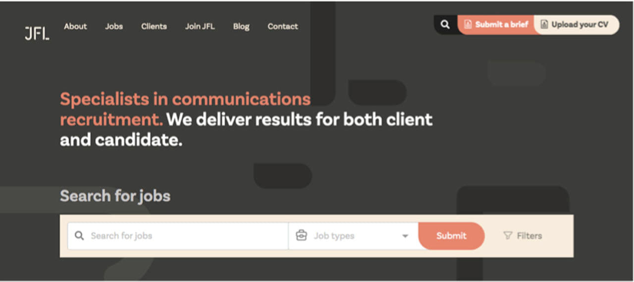
- Layout: Be sure to have a clear, simple layout. A cluttered design may cause confusion. Users must be able to react to the size of features, making them bigger if required, so having a responsive layout is vital.
- Color: A well-thought-out color palette is required to assist those who may be color-blind. Don’t solely rely on color to identify key elements of your interface. If this is the case, include text to assist these areas so that all users can fully interpret the information displayed and navigate smoothly.
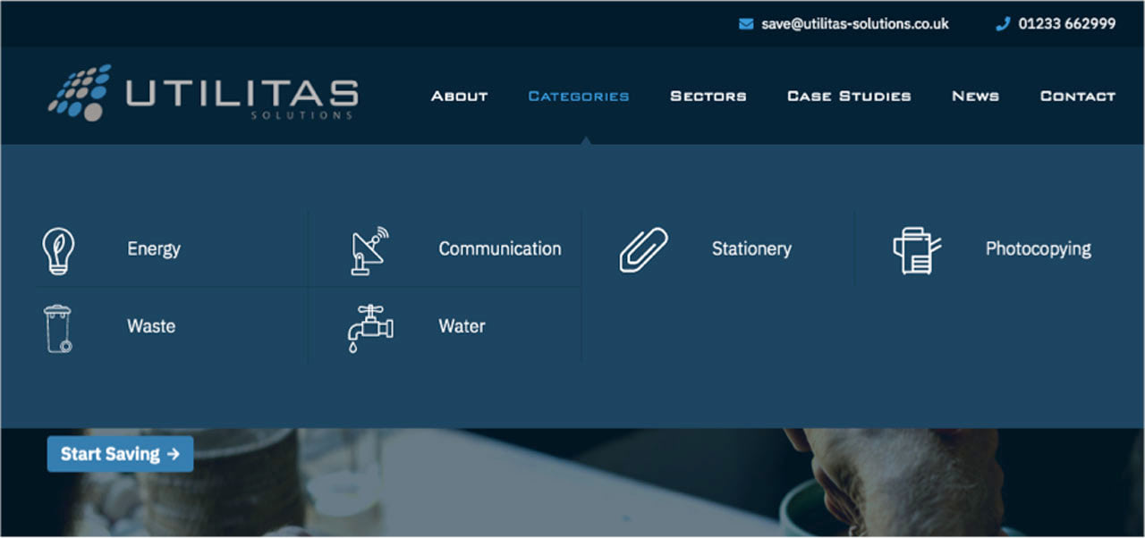
- Navigation: Clear indicators and short task flows enable smooth navigation. Buttons must be consistent, especially call-to-actions, and clearly labeled. Menu bars and search boxes should also be positioned in a similar format to logically guide users through your platform smoothly with no confusion.
- Keyboard accessibility: Consider those who are unable to use a mouse. This means designing the site so that users (if needed) can navigate using only the keyboard. For instance, using various buttons including the arrows, space bar and enter. This is especially important for those with mobility difficulties.
- Messaging: Messaging must be carefully thought out. Some users may have reading difficulties, so you must think about the formatting of text. Speak in plain English, don’t use long sentences or paragraphs and stay clear of italics and uneven spacing. Also, think about color and font, is it legible?
- Audio and video: Interactivity should be included, where appropriate, in any design strategy. It’s important to remember that including either audio or video requires the use of accessible features, especially for platforms in the public sector. Users must be able to pause/stop, adjust volume and control captions. Subtitles are also a good idea for accommodating deaf users as well as including text versions of audio files. Do remember that the new public sector regulations will not affect live/pre-recorded audio and video published before Sept. 23, 2020.
Test, test, and more testing
Once you have outlined clear objectives and designed your accessible platform, the next step is to test. There are various approaches to do this, including automated accessibility tools that will help you spot errors, though there are also simple steps you can do yourself before investing in these tools. For instance, unplugging your mouse and navigating yourself around the site using only the keyboard will help test keyboard accessibility and increasing the size of your text up to 300%, will show you if your platform is accessible to those with impaired vision.
Human trial and error is another method of testing. Test the platform with your target audience, those with and without disabilities, and see how they react to content. They will be able to prove if an accessible feature is not working. You can then go back to the features that didn’t work and think of alternative solutions.
To Summarize
Inaccessible public sector platforms affect millions of users throughout the disabled community and prevent them from using public sector services online. Everybody has the right to use the internet independently and it is designers’ jobs to help make this happen.
As learned, there is a lot to think about when it comes to accessibility, however, don’t view the new regulations as a constraint. Take it as an opportunity to reach a wider audience and create a positive brand that can associate with everyone.
With Pulsetic you’ll be instantly notified the moment your website, API, or server becomes unavailable. Monitor uptime from multiple global locations and respond to incidents before your users are affected.
Create beautiful status pages in minutes to keep customers informed during outages and build trust with transparent communication.
Start Monitoring for Free