Make a Statement Using White Space in Design
We all know white space is a good design element to use within websites or apps.
The use of space is one of the tenets of design theory and helps you create visual focus, contrast and organization. When used well, white space — places without other elements in the design, though not always white in color — is the key to pulling everything together with a seamless visual flow.
White space is a design element that can’t be ignored. Here are 19 websites which make amazing statements with the help of white space.
White Space in Web Design
Melanie F
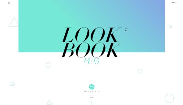
As you scroll through the landing page for Melanie F’s look book you can easily notice that the design uses white space well. The top of the landing page has the header with plenty of space around it. The colorful header background, the heading and logo are all well spaced out, making the first statement of this landing page pretty impressive.
Urban Influence

With Postcards Email Builder you can create and edit email templates online without any coding skills! Includes more than 100 components to help you create custom emails templates faster than ever before.
Free Email BuilderFree Email TemplatesUrban Influence is branding agency located in Seattle, Washington. The career page is interesting as it doesn’t have a simple list of available jobs or perks. Instead, there are blocks for each department and corresponding available positions. The content has a lot of space around it making it easy to scan and more visual than a typical jobs page.
Trippeo
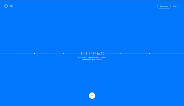
Trippeo is a new mobile app for tracking expenses. When you first land on the page you are greeted with a simple message explaining Trippeo and a arrow directing you to scroll. There is very little going on this landing page, but as you scroll notice that all of the different elements are spaced out well – especially if you look at them within the different sections.
We Are Adaptable
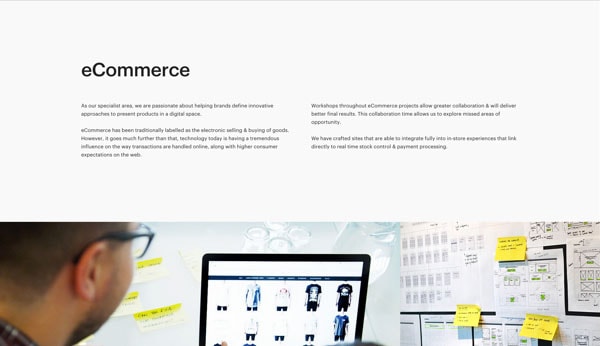
We Are Adaptable is a creative agency specializing in various areas like user experience or e-commerce. As you scroll, you can see they have given each of the four of their specializations ample space. There is a short text description per approach followed by great photos of the team working.
Gogoro
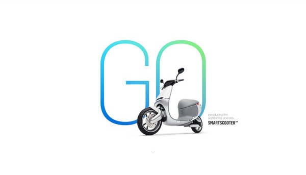
Gogoro is a landing page for a new eco-friendly scooter. The landing page is spectacular as it captures attention very easily – the scooter is front and center. There is very little around this image to take away from such grand introduction. Using white space in such a way is sure to bring attention to the presentation.
Over
With Startup App and Slides App you can build unlimited websites using the online website editor which includes ready-made designed and coded elements, templates and themes.
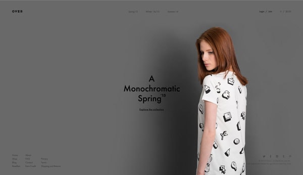
Try Startup App Try Slides AppOther ProductsOver clothing line uses a minimalist look, but it works well. You’re greeted with a simple photograph of a model that captures your attention. Sure there is a logo, navigation and a few other helpful links but your attention goes toward the modeled clothing because there is nothing else to distract from it.
Mathais Sterner

Mathais Sterner’s portfolio is to the point. He doesn’t beat around the bush; his about page is direct. There are three main text sections and plenty of white space to help you read through the bits of information.
Dog Studio
Here we have another portfolio of a digital agency which has a simple home page, but it’s nicely spaced out. The use of white space allows a visitors to easily take in the bits of information as they scroll. Not to mention the overall design go this website is killer!
Thierry Ambraisse
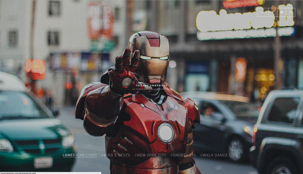
Thierry Ambraisse is a photographer who knows how to make an impression when you enter his website. You’re greeted with a slideshow background that demonstrates his work. There is nothing on top of it to distract you. There are a few elements on the home page, like the navigation or the small logo in the center, but it’s nicely tucked away.
VO2 Group
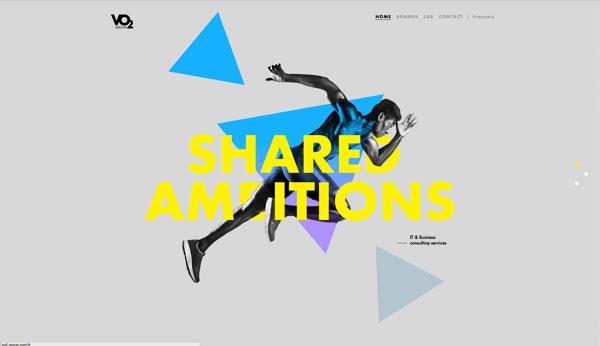
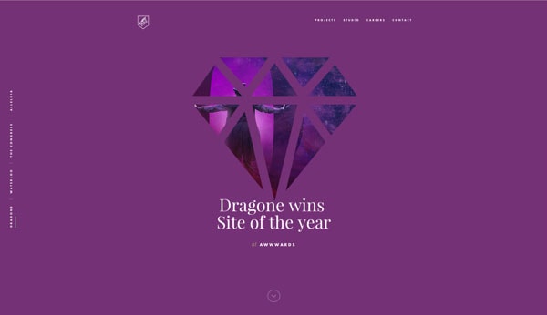
Another example of a big artistic header, this time by VO2 Group. They have a few elements on the home page header section, all grand in color and size. Because there aren’t too many things in that section it doesn’t feel cluttered because the few there are well spaced out. Thanks white space!
While We’re Young
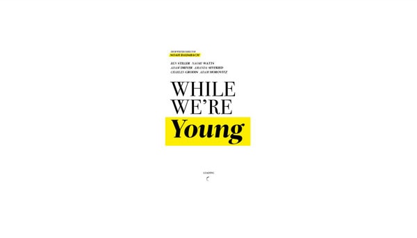
A website for Noah Baumbach’s new movie has a lovely introduction. It has a big title with a list of actor names and that’s it. The title is truly big, but it isn’t cluttered.
Spring Polar

Here we have a short landing page for a program – The Femme Fatal by Spring Polar. There are a few elements throughout the page. Each varies in placement and size so white space plays an important role in making the page easy to look at.
Blossom Type
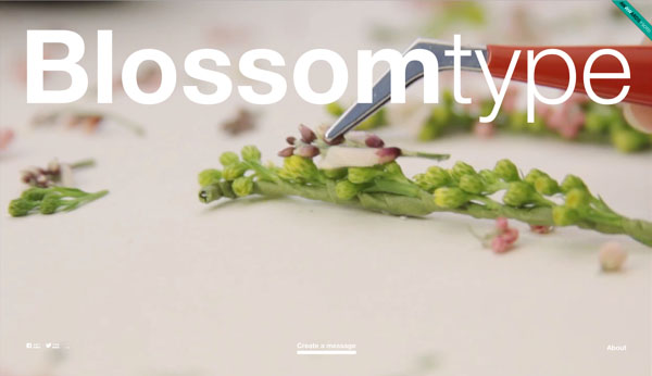
This is a fun website with a giant logo. It works because there isn’t much else going on with the landing page. There are also a few small links toward the bottom, also with plenty of spacing.
Quentin Morisseau
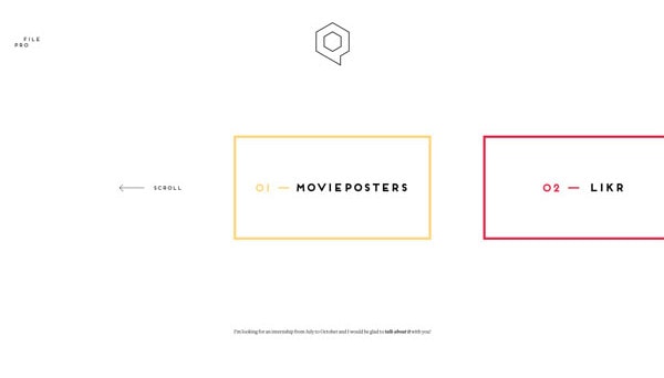
The graphic design minimalist portfolio is a great example of white space usage. Different projects could have been stacked on each other but instead they were spaced out, creating a much different experience.
Stupid Studio
Stupid Studio’s header section is my favorite in this gallery. They definitely created a unique and creative way to tackle a header. Notice how the description section is well positioned with very little around it. That’s white space and that is what makes the header so easy to digest visually.
Urban Walks
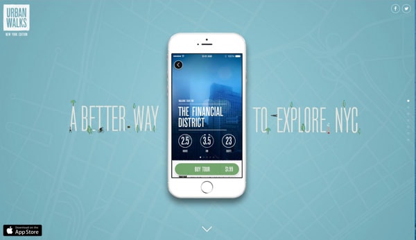
There are plenty of elements coming and going as you scroll through this website design, but the way they are placed around the centered iPhone make the scrolling experience enjoyable. When there are fewer elements they are bigger and less apart while the opposite is true if there are more elements around the iPhone.
Fiber Sensing
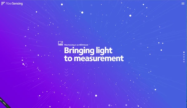
Such an amazing amazing website; the first impression is to wow you. I can guarantee that if there were more elements cramped into that intro section it wouldn’t have been anywhere near as impressive. Clutter is a pretty terrible thing.
Nua Bikes
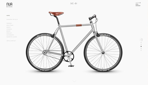
If you’re into bicycles you’ll enjoy this online show. On the home page, you get to see a big view of a featured bike with little going on around you to distract you from the display. Sure, there is navigation to the side but it’s small and out of the way. The bike is center of attention.
Alexander Engzell

The personal portfolio of a creative director Alexander Engzell greets you with an amazing typographical quote. It wouldn’t have made the same impression if there were other elements around. Instead, it’s there all alone and other information waits for you below. White space is a clever way to make an impression with visitors.
Conclusion
White space is not something we can easily forget. Use it to create a grand design and to make a statement. Each of these 19 websites designs were created in a way that made white space a priority. How do you use white space in your projects? Share your ideas with us in the comments.
