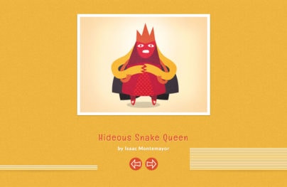
Website Designs based on Solid Single Colored Background
Background has always been one of the most important features of website design. Being responsible both for body and content distinction, this core attribute gives enormous amount of possibilities. Background appears to us in various guises; it can be spectacular shot, amazing fictional image, artistic illustration, seamless textured/patterned canvas, video cover-up, or time-tested neat monochromatic background. The latter is going to be our present topic for discussion.
Solid color background is an excellent match for those websites that are obsessed with detailed or busy interfaces. Also, it is one of the main components of minimal style. Although it seems that monochromatic plain background is incapable of attracting visitors, it can easily set onlookers’ eyes on vibrant color and polished appearance. Of course, such type of background is aimed to:
- Make text more discernible;
- complement foreground elements;
- add neatness and accuracy;
- achieve balance;
- bring alive minimal style;
- distinguish multiple areas.
So, it is definitely carved out quite a niche for itself in website design, largely independent of current trends.
In a showcase below you will find awe-inspiring website designs, where single colored background makes more sense than busy one, conclusively proving that it is possible to make website look appealing by simply using couple of colors.
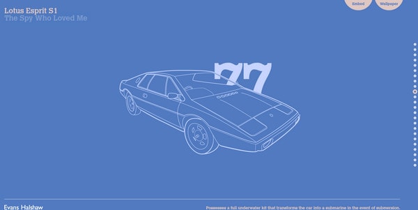
Bond Cars is an auto-themed website that familiarizes users with a great variety of James Bond’s cars, representing them in chronological order. Every section gets its own color and outline illustration of epic automobile.
With Postcards Email Builder you can create and edit email templates online without any coding skills! Includes more than 100 components to help you create custom emails templates faster than ever before.
Free Email BuilderFree Email TemplatesDSPG has rather oddish but really eye-catching design. Website is based on bicolor palette. Blue outlines look slightly blurred sometimes.
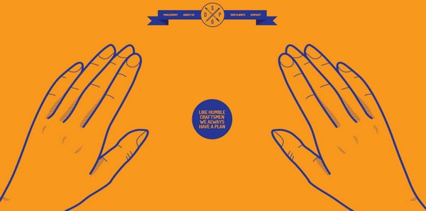
Design Embraced skillfully leverages parallax effect, which is hidden in the inner pages. Every page has its own bright solid color background.
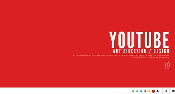
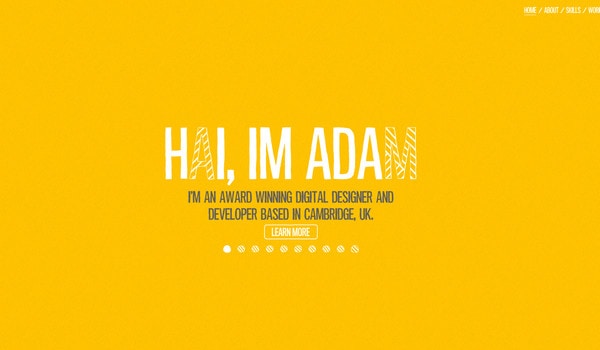
Adam Hartwig welcomes onlookers with monochromatic full screen slider that promotes owner via catchy headlines placed on colorful slides. Every subpage utilizes slightly noised, one-colored background.
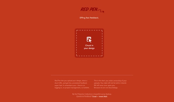
Red pen principally leans on minimal style, demonstrating all data in a single page, which completely fits on the standard screen.
With Pulsetic you’ll be instantly notified the moment your website, API, or server becomes unavailable. Monitor uptime from multiple global locations and respond to incidents before your users are affected.
Create beautiful status pages in minutes to keep customers informed during outages and build trust with transparent communication.
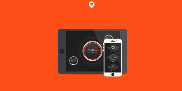
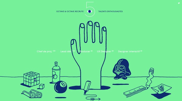
Start Monitoring for FreeOctave and Octave derives substantial benefits from its eye-catching audacious colors and striking illustrations.
Vanderson Arruda beautifully utilizes concept of a draggable interface. Each section has deep background, slim neat typography and white graphics.

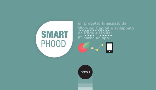
Smart Phood has a lovely busy appearance. Website is based on standard vertical parallax, and showcases data on various single colored backgrounds.
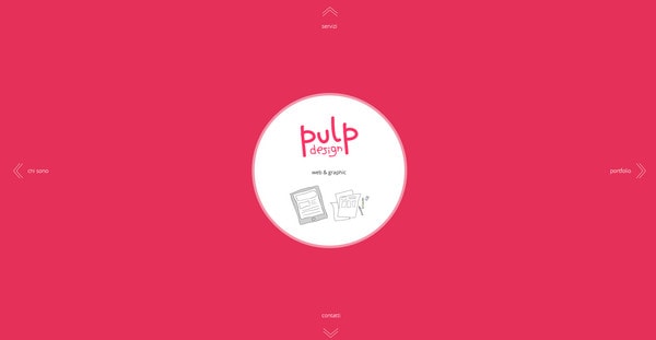
Pulp Design wonderfully makes use of only 2 colors: saturated pink and all-purpose white. Each functional area fully follows its direction.
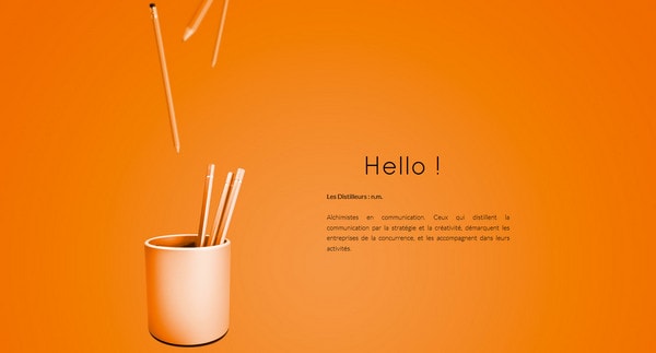
Les distilleurs ably utilizes power of vivid colors. A gentle radial light is employed into the background in order to pull together a charming and captivating design.
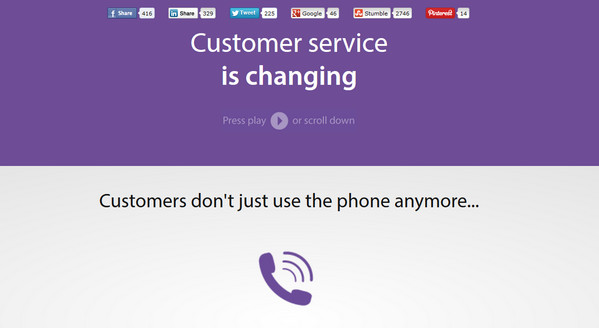
Desk has an adorable distinctive stripe layout with refined violet as a core color.
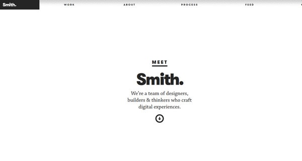
Smith looks absolutely clean and neat. Balanced black-and-white color scheme in conjunction with compactly arranged and centered data adds website vastness and comprehensiveness.
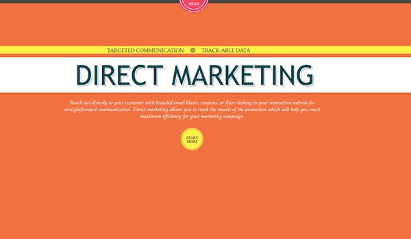
Marketing Ecosystem depicts content line by line, utilizing solid color differentiation. Designer has picked up the colors so that they splendidly complement each other.
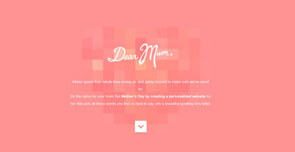
Dear Mum has schmaltzy, girlish vibe that is supported by pink background, graceful white handwritten type and heart with a geometric touch.
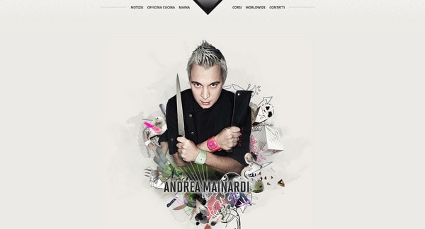
Andrea Mainardi uses soft grey and noised black background in order to easily distinguish bunch of foreground elements with characteristic cooking appeal.
Legwork Studio skillfully establishes cheerful and slightly humorous atmosphere. Designer leverages clean monochromatic background in order not to clutter up the site with extra graphics.
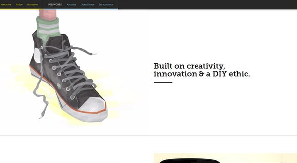
Nineswiss easily allows users to walk through comprehensive portfolio, which is represented by means of huge slider.
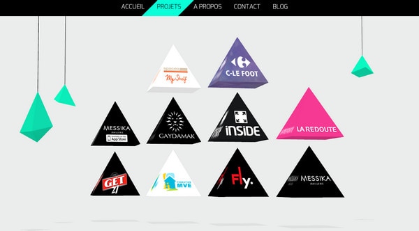
Yann Kozon instantly draws users’ attention to fantastic 3-dimensional poly-inspired scene. Pristine light grey background perfectly stresses foreground highlights.
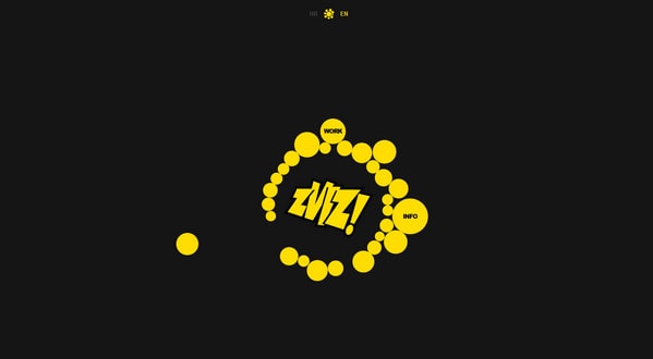
Zviz has gentle and unconstrained circular vibe that is chiefly achieved by dynamic fully animated menu in the center.
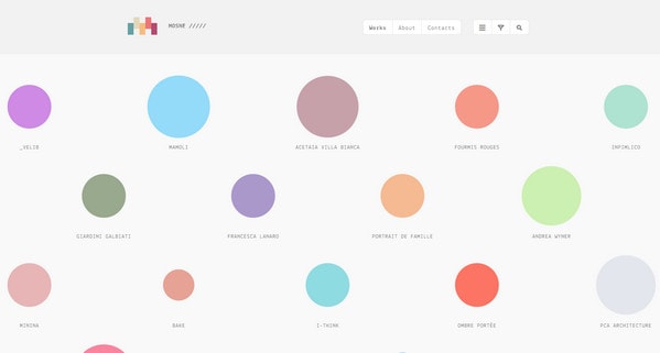
Mosne heavily relies on neat combination of different shades of gray that makes the content the star. Designer uses unconventional approach of showcasing collection of his artworks.
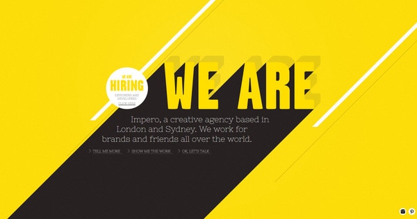
We are IMPERO. The first thing that catches the eye is relatively huge, rough, retrospective typography. Website is grounded on 3 color scheme, nicely mixing together white, black and yellow.
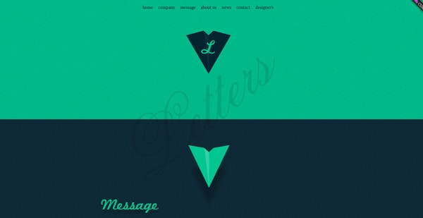
Letters, Inc. decorates its website with stylish flat graphics, ambiguous 3-dimensional illustrations, sophisticated color palette, cursive elegant font, and offbeat navigation panel.
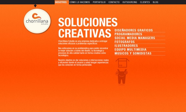
Chorrillana displays content in an appealing manner. Home page with a glaring optimistic background and regular white type looks warm and tidy.
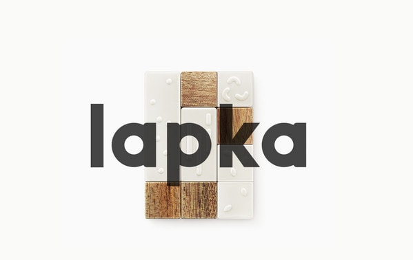
Lapka has recourse to minimal approach and excellence of visual aspects, thereby including only high-quality detailed photos and smooth clean background.
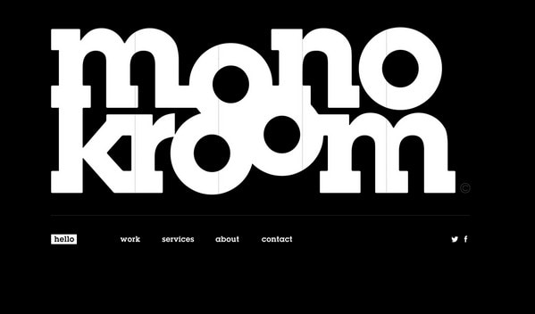
Monokroom offers great modest website design that takes full advantage of classic black-and-white color combination. Enormously huge lettering on a home page instinctively grabs users’ attention.
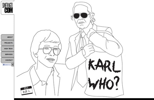
SomethingTo Com uses white as a core color, making website look neat and impeccably clean. Amazing fashion-inspired outline illustration adds to appearance extra charm.
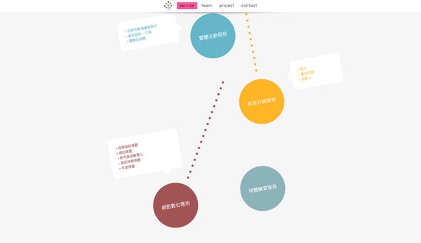
Jiouhe takes parallax effect to the next level, demonstrating data via graphical diagonal paths. Plane, circular, colorful elements blend perfectly well with a monochromatic background.
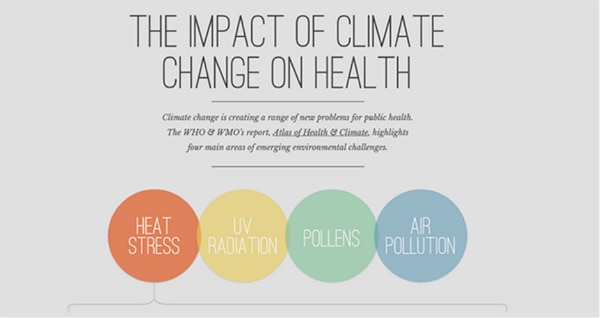
Under the weather. Grey single colored background is really popular among designers. It easily sets apart foreground elements and makes website look polished and pure.
Reflection
One of the advantages to use single colored background is that it doesn’t distract users’ attention from content and necessary elements, so you can freely adorn you website with various ornaments, use regular font or make your functional components, such as navigation, widgets or sliders, simple and plain. Ultimately they will still be prominent.
Can you add other benefits of using solid color background? Do you feel monochromatic background can hurt design sometimes? Why or why not? Share your thoughts via comment section.
