Cosmopolitan Touch – Website Designs featuring Urban Landscapes
Recently we have showcased a collection of remarkable landscape themed website designs that leverage awe-inspiring outdoor images filled with purity and originality of a Mother Nature. Nevertheless, an organic vibe inherent in such embellishments doesn’t work out with every solution. For example, photos of mighty skyscrapers, business centers, breathtaking settings and elegant architecture would be definitely more appropriate for companies dealing with real life stuff.
Generally eye-catching cityscapes stand as an epitome of human civilization, so they easily evoke feelings of advancement and urbanization, recreating strong and powerful atmosphere in a website.
Check out our collection of dramatic website designs that effectively utilize urban photography and have a lovely cosmopolitan touch.
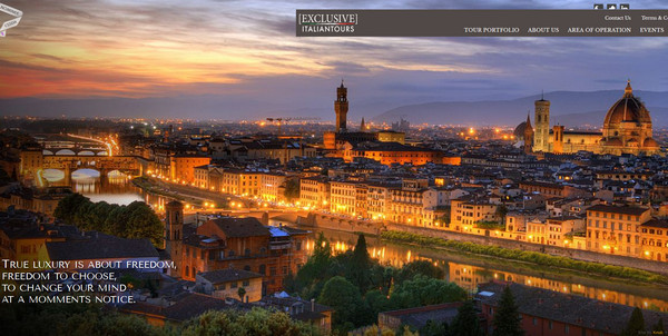
Exclusive Italian Tours. Website gets a feel of a luxury mainly from loads of thrilling vibrant professional shots that simply beckon you to visit fascinating Italy cities.
9 Design Street features spectacular aerial photo background, which is complemented by tightly packed together logo, tagline and vivid call-to-action button.
With Postcards Email Builder you can create and edit email templates online without any coding skills! Includes more than 100 components to help you create custom emails templates faster than ever before.
Free Email BuilderFree Email Templates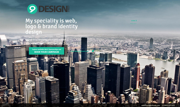
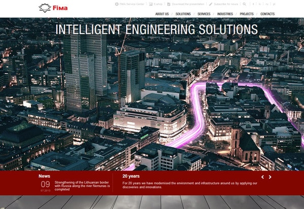
Fima. The front page showcases a full of life, night cosmopolitan image with a bright, luminous road that characterizes the movement and symbolizes intelligent solutions. Casual thin white typography co-works with a busy background.
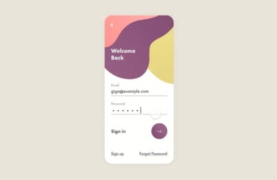
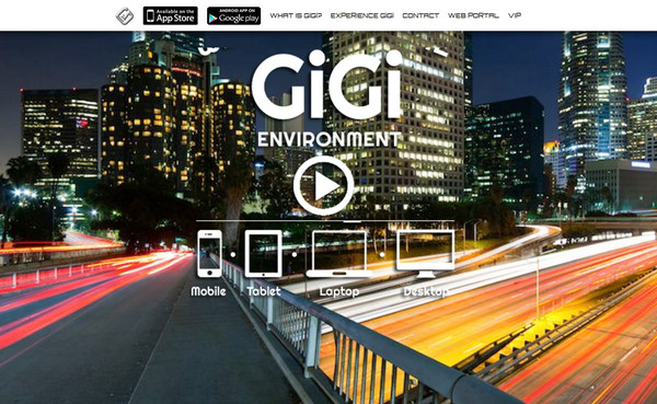
GIGI Secure Messaging is another bright website that exhibits a vivid image of lively town. A bold and slightly bulging tagline along with neat relatively huge device icons perfectly stands out from such a chaotic explosion of colors.
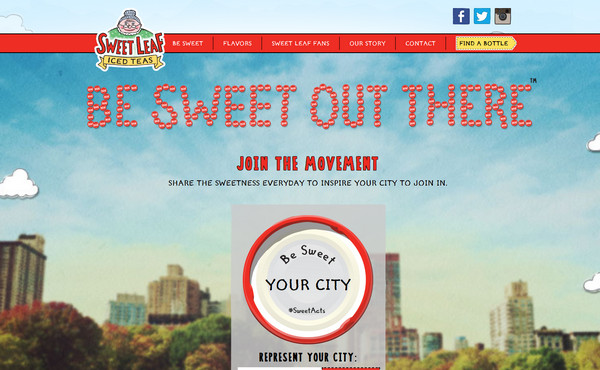
Sweet Leaf Tea has a unique and truly memorable design. The landing page portrays slightly blurred urban image that serves as a good basis for peculiar typography of a tagline, fonts with a human touch that are widely-used throughout the whole design, and a bundle of offbeat graphics.
A.W.M. Web Agency. Website includes an amazing full-screen photo slider that instantly sets urban atmosphere by means of picturesque shots of famous city centers. Black and white content widgets make website look fresh, clean and neat.
With Startup App and Slides App you can build unlimited websites using the online website editor which includes ready-made designed and coded elements, templates and themes.
Try Startup App Try Slides AppOther Products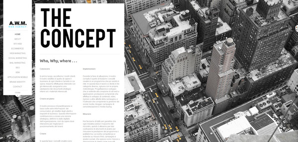
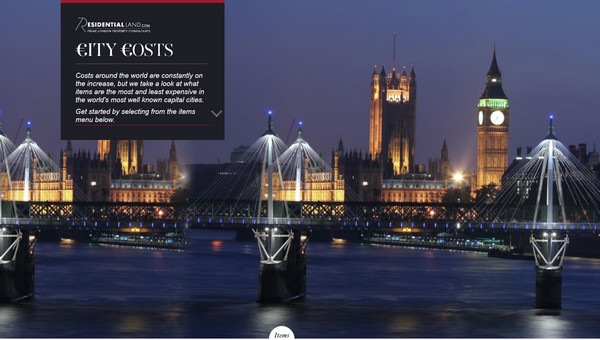
Cost of Living Index. Website effectively familiarizes visitors with statistics concerning cost of living index. It ably demonstrates various aspects that are accompanied by rather simple chart but truly spectacular image of a well-known city.
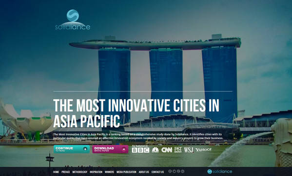
Solidiance is another eye-catching and quite informative website dedicated to innovative cities in Asia. Every inner page is based on a vertical parallax and exhibits a bunch of phenomenal urban photos.
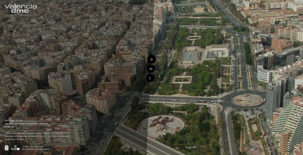
Valencia DMC also utilizes technique of a vertical parallax in order to guide the users’ eye from one descriptive section to another. The landing page contains wide slider that is full of marvelous pictures that are wonderfully bolstered by refined slightly transparent navigation.
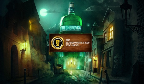
Official website of Becherovka has an enigmatic and pictorial introduction page that forces onlookers to plunge into an old-timey Czech world, which is thoroughly soaked with traditions.
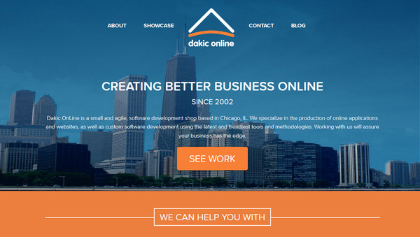
Dakic Online LLC. Website is a direct opposite to previous example; it features calm and powerful image of a modern industrial city with a clean blue sky. Combination of blue, orange and white color works well for this website.
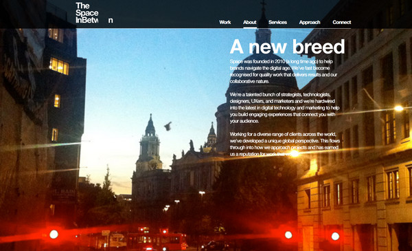
The Space InBetween is an image-driven website that displays several professional photos. Designer makes use of a simple white typography and dark low opacity boxes in order to naturally draw users’ attention to content.
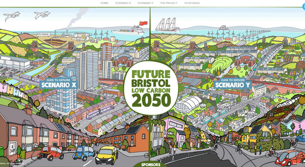
Future Bristol Low Carbon 2050 is an artistic take on urban style design. The website points out 2 different anticipated developments of a city with a help of a high-detailed illustrations, providing an opportunity to vote for a loved option.
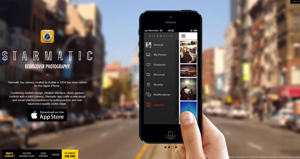
Starmatic. Website skillfully promotes valuable photo-related iOS application. The front page features blurred image of a brisk downtown that is nicely complemented by clean outline tagline and narrow iPhone themed slider.
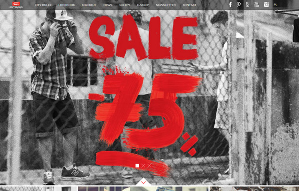
Cropp is an e-commerce website with a slight grunge appeal that is marked by amazing set of urban photos. A grid-based layout allows keeping things in order.
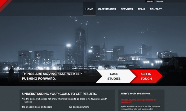
Spade has a beautiful urban header that showcases night lights of a metropolis. Designer leverages a three-color palette, skillfully blending together dark grey, bright red and discreet white.
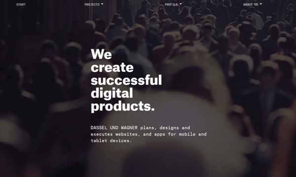
Dassel und Wagner. Although, website design doesn’t include marvelous cityscapes, it shows slightly darkened image of the main feature of any big city – a vast rush-hour crowd. Compactly arranged bold white slogan together with ultra-narrow digital font makes the main page look quite roomy.
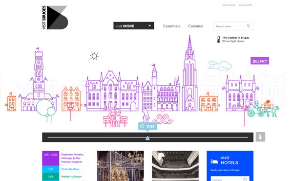
Visit Bruges. Website looks clear and modest with a lot of white clean space. An interesting animation breaks the molds of solid color background, representing refined outline illustration of a borough.
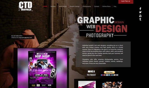
CTD Graphicx has a dark website design with a cryptic darkened image background that displays narrow alleys.
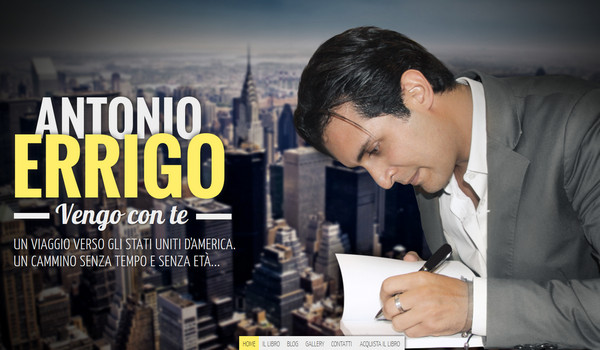
Website of Antonio Errigo employs a couple of urban photos that ably work in tandem with foreground components such as welcome message, content areas and various widgets.
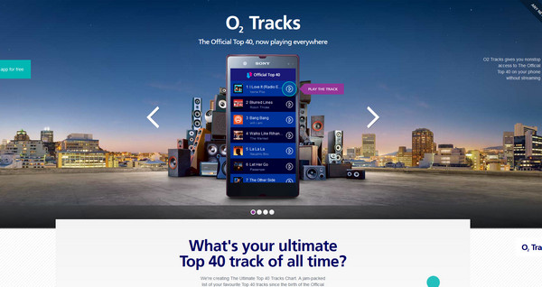
O2 Tracks. Designer wonderfully utilizes image of the city at night as a background for a slider in order to add special urban feeling.
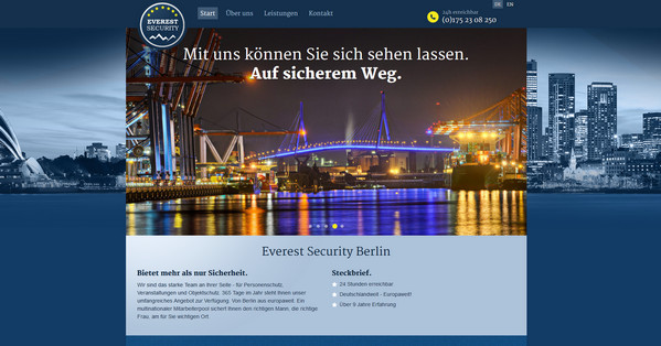
Everest Security. Designer leverages blue as a core color since it naturally associates with a trust and loyalty. Bluish full-screen image of a cityscape enhances businesslike appeal of a website.
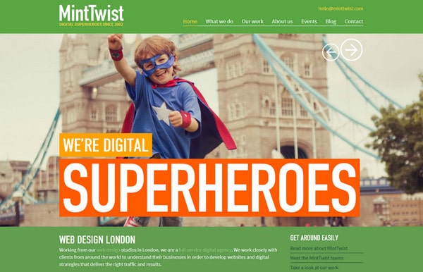
Mint Twist is a bright and joyful website. It uses a large burst of vibrant colors, ably highlights witty tagline, and has a lovely Metro 8 style touch.
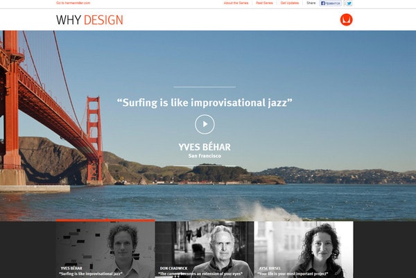
Portfolio of Herman Miller includes a bulk of amazing and engrossing videos that briskly explain different mottos.
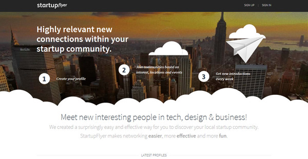
Startupflyer has a wonderful cloud touch design. The main header exhibits an aerial photo with a lovely halftone effect. Image of a contemporary city center instantly draws the eye to neatly executed working steps.
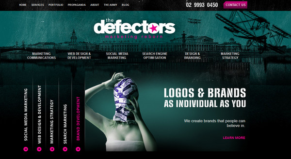
The defectors. Website has a strong grunge appeal: dark green color palette in conjunction with illustration of an industrial city has a clear allusion to the military theme. Dark background easily sets apart rough digital typography.
Reflection
Website designs, which are based on a cityscape theme, have a lovely urban appeal. A lively cosmopolitan vibe brings benefits for various agencies that want to make their websites look more efficient and serious. Enthralling and powerful photos of metropolis effectively establish businesslike atmosphere on a website.
What do you think about utilization of urban photography in website design?
Feel free to leave us your thoughts.
