Wireframing and Prototyping a Mobile App
We live in a mobile decade. No questions here. According to Business Insider already more smartphones than PCs are sold annually. By the end of 2015, most probably, there will be more smartphones in use than, so-called, feature phones (or dumb phones, as we might call the old lousy devices). That’s an exciting growth!
And well…let’s just remind ourselves of the hottest acquisition of 2012 so far. Yep – Instagram, a mobile app, has been acquired by Facebook for a stunning 500 million dollars.
What does this mean for us – UX Designers and, in fact, all the other people working on digital products (PMs, developers, testers, visual designers…)? We need to consider mobile design with absolute seriousness and extra care.
We need to be where our users are and they are in a mobile world right now.
Our users, our clients, our companies – they all need, or will soon need, great mobile apps. We must be ready for this challenge
Mobile Design Rules
Mobile design and web design vastly differ. I learnt this the hard way, by designing a lame mobile app a couple of years ago. I thought that I just needed to stick to iOS guidelines and other than that, it was exactly like designing another website. Well… it’s not.
With Postcards Email Builder you can create and edit email templates online without any coding skills! Includes more than 100 components to help you create custom emails templates faster than ever before.
Free Email BuilderFree Email TemplatesThough everything that we discussed so far in this course applies to mobile design, to be efficient it has to be pushed to its limits. The mobile environment somehow pushes design principles to the extreme. The context of use always matters – but in the mobile world is absolutely crucial. Focus on the main task is an important trait of every great design – well with mobile just don’t try to do it any other way. Ergonomics always matters – with mobile you need to count the average size of an index finger-tip.
The mobile world is an extreme environment for designers. And this is probably why it’s so exciting for us. It just requires more.
Let’s gather together the most important principles in a set of rules. I’m not trying to create comprehensive guidelines for mobile design, as that is a topic for a separate book, rather than a short article (read, for example, the great Tapworthy: Designing Great iPhone Apps by Josh Clark). The rules below are something that will get you started and, hopefully, will stick with you for all your mobile designs in the future.
1. Context rules
Mobile devices are extremely dependable on their context of use. Let’s say you’re about to design an app that is supposed to assist people while shopping (comparing prices, managing shopping lists, etc.). The main context of use of your app will be inside the shop. You must expect your environment to be crowded (and therefore ”shaky”) and your users will probably have only one free hand to use the device. This should affect your whole design.
Some things definitely should be bigger and easy to hit with a thumb, some smaller and ”out of the way”, etc.
While designing a mobile app navigation you always need to take the context into account.
2. Main task dependency
Smartphone apps are task, rather than browsing, oriented (in contrast to tablets). This means that people will take out their e.g. iPhone from their pocket when they need it to perform a specific task and they will hide it as soon as the task is completed. If your app slows them down, they will toss it out of their mobile quickly.

With Startup App and Slides App you can build unlimited websites using the online website editor which includes ready-made designed and coded elements, templates and themes.
Try Startup App Try Slides AppOther ProductsYou need to design for the flow of activity. If I want to check-in in a specific location I need to do it quickly by hitting a distinctive button and choosing a place (Foursquare does this quite well). If I want to take a picture and send it to friends I want to do it immediately (Instagram mastered this functionality).
Smartphone users usually won’t have time to browse through a rich range of functionalities. They want to perform a specific task and you should provide the help needed.
The success of your app depends on the way you designed the main task. If it’s:
- clearly visible
- understandable
- limited to a maximum of three steps (less is better!)
You got it :).
3. Ergonomics matters
Fitts law and other principles of ergonomics lie at the heart of every good design. Again, though, in mobile design taking care of ergonomics is ”a must be” for an app.
If you don’t consider the average index finger-tip size (1,5 – 2 cm which equals 45-57 pixels) and thumb size (the thumb is much wider! An average 2,5 cm, which equals about 72 pixels), you may design something totally unusable. If you don’t care about the way the human palm is built and what is easy to reach with the fingers while operating a smartphone – your app will certainly lose.
Ergonomics is your ”to be or not to be”.
4. Use OS guidelines
Whether you design an app for an iPhone, iPad, Android smartphone, Android tablet, or Windows 7 device – you must remember to follow principles specific to the platform.
E.g. Android devices have hardware buttons for basic navigation, while iOS (iPad, iPhone) devices lack them. iOS have the specific construction of a main navigation tab-bar, which might seem odd on Windows 7 and Android devices.
There are literally tons of differences and you’ll end up designing most of the app right from the beginning for every OS.
You absolutely must read the official guidelines, especially the Apple Human User Interface Guidelines, which is a comprehensive source of information on mobile design.
Here’s your reading list:
- Apple Human User Interface Guidelines
- Android Design Guidelines
- UI Design and Interaction Guidelines for Windows Phone 7 (pdf)
and less popular platforms:
- UI Guidelines for BlackBerry 6.0 Smartphones
- UI Guidelines for BlackBerry PlayBook
- UI Guidelines for BlackBerry 4.x, 5.x Smartphones
- Symbian UI Wiki
5. Make it beautiful
You probably noticed that popular mobile apps look beautiful. Yes, today’s mobile design world is a beauty contest. You might lose it completely if you don’t take care of the visual design aspects.

Users care deeply about the look of their apps, because they are personal belongings. They carry them in their own pockets and the sense of ownership is stronger than when it comes to web or desktop applications. How many times have your friends shown you some mobile apps with a show of excitement in comparison to desktop apps?
Learn these rules by heart and use them in every mobile design project that you participate in. Hopefully they will guide you through the meanders of this important design world.
Now get ready to get even more practical and learn some designing techniques.
Paper prototyping
Paper prototyping is especially useful in the mobile design environment, as both media are extremely tangible. Using a mobile app is a deeply physical experience. You’re interacting directly with a touchscreen – its responsiveness and the app architecture are decisive when it comes to the experience.
Paper prototyping can quickly simulate interaction with mobile design. You can quickly reach for a paper prototype of an app and interact with it via touch. That’s a great method for the early stages of design and for quick & dirty tests with users.
Have a look at how I’m paper prototyping an iPhone App (firstly creating a context for the whole story by defining the problem and designing a persona) using UXPin Mobile Kit:
https://www.youtube.com/watch?v=alFcdwCRL2Q
When you’re done with paper, you can move to the digital world and prepare documentation that will be used during the development process.
In my experience there are generally two efficient ways of documenting a mobile design. Both can be used simultaneously, as they serve different purposes. Let’s have a look at them.
Screen to screen documentation
When the primary purpose of your documentation is to represent design ideas to the whole team, the best thing you can do is to prepare Screen to screen documentation. This is an easy-to-browse-and-read form of documentation that has served me well in all my mobile design projects.
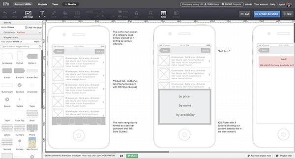
The Screen to Screen documentation idea is to represent pieces of an app on separate pages of documentation, showing all the important states of an app with the appropriate descriptions.
On the picture above we can see the Category Screen of an app. The first screen on the left is the main screen for this type of content. Further on the right there’s another state for a Category screen and another, etc. I usually put three screens in a row for convenient browsing.
The description on the right of every screen makes it easy for the whole team to understand specific parts of the design. Write anything that you consider helpful and let your teammates comment on the description as well as on the screen.
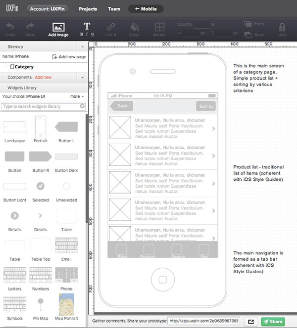
As I mentioned I always start with the main screen on the left. There are two reasons for this:
1. It gives the whole page some order and my teammates can read it easier.
2. I can create my own components from elements of an app that will be repeated throughout the design. It’s kind of like my own widgets library for this particular project. To give you an example: the top bar will be used on most of the screens. Thanks to the components, if I need to change it, I’ll do it in one place. It might save my life since I might repeat the top bar dozens of times in this documentation.
On the screen above: the top bar, tab bar and list of products are components. To create them in UXPin App you just need to select elements on the workbench, right-click them, and select ”create new component”. Your new components will appear on the left in the ”Components panel”. You can drag&drop them to place them in your design, or click to edit them (the change will appear everywhere where you used the edited component).
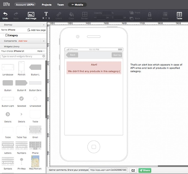
“Screen to Screen” documentation should be quite thorough. You might notice that in the first example, even the state with an alert box has been documented. Small pieces of design such as this alert box might really slow down the development.
To make sure that you covered all the important states – do several ”Cognitive walkthroughs” through your design. Choose a particular scenario and persona that you described earlier (e.g. in the paper prototyping stage) and go step-by-step through screens that you’ve designed. Any missing state? Add it now.
You might do this exercise together with your team. That might be an inspiring collaboration.
P.S. You might consider adding a number to each screen, which will certainly help your teammates refer to a specific place in the documentation.
Prototyping and testing
The second efficient way of creating mobile design documentation is rapid prototyping. As we discussed in the first part of the course, prototyping aims at simulating an experience and it’s ideal for quick user tests.
In the early stages, especially in mobile design, it’s vastly important to ”feel” the design. To do that your design should be viewed on the target device.
How to do this without wasting a week?
It’s actually quite easy! Let’s go through the creation of the prototype step by step.
1. Go back to your “Screen to Screen” documentation
It will be much quicker if you actually build on the design that you’ve already prepared. You can use all the screens from this static documentation and make them interactive in about half an hour.
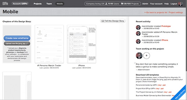
2. Open UXPin App in a new tab and create a new wireframe
This new wireframe will serve as a base for your prototype. You can keep this in the same ”project folder” in your UXPin account, so the whole team will be able to keep track of all the documents.
3. Copy states of the app to a prototype
Since UXPin allows you to copy wireframes between pages, you can easily copy any necessary element by simply selecting it and pressing ctrl+c (cmd+c on MACs) and pasting it to the wireframe in a new tab via the well-known shortcut ctrl+v (cmd+v on MACs). Thanks to this intuitive feature you won’t need to start from scratch.
4. In a new wireframe remove all the “iPhone body” backgrounds
Since we want to prepare the prototype ready to be viewed on an iPhone, you don’t need any iPhone bodies. Just mere content of an appropriate size (remember about 320×480 is the size of an iPhone screen). The result of this phase should resemble the one from the screen below:
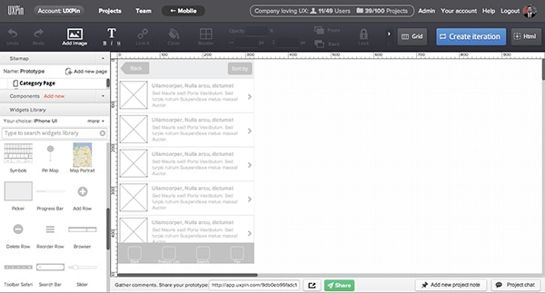
You should repeat this step on every screen that’s a part of the interaction you wish to simulate. Adjust every screen in the top left corner of UXPin workbench.
5. Create click dummies
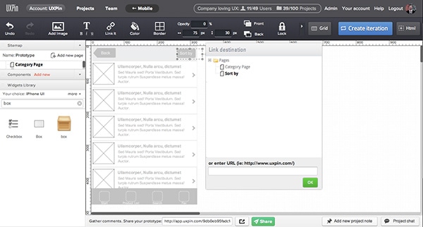
Drag&drop a box from the widgets library and set its opacity to 0%. Link the element to the appropriate screen. Set a box above the whole clickable area (as in the example below – I’m linking a button in the top bar). Thanks to this – you’ll be able to interact with the interface on an iPhone.
6. Create links on every important piece of the interface and every screen.
You’re creating a prototype so you want your simulation of interaction to be as realistic as possible. Thanks to links you’ll be able to interact with your design through touching the screen of an iPhone. It’ll let you feel the app and check if it fits your design criteria.
7. Open your wireframe in an iPhone browser. UXPin App will auto-set the width of the screen.
UXPin will detect the size of your design and adjust it to the size of an iPhone screen. Thanks to the links that you’ve added interaction with the prototype will be possible.
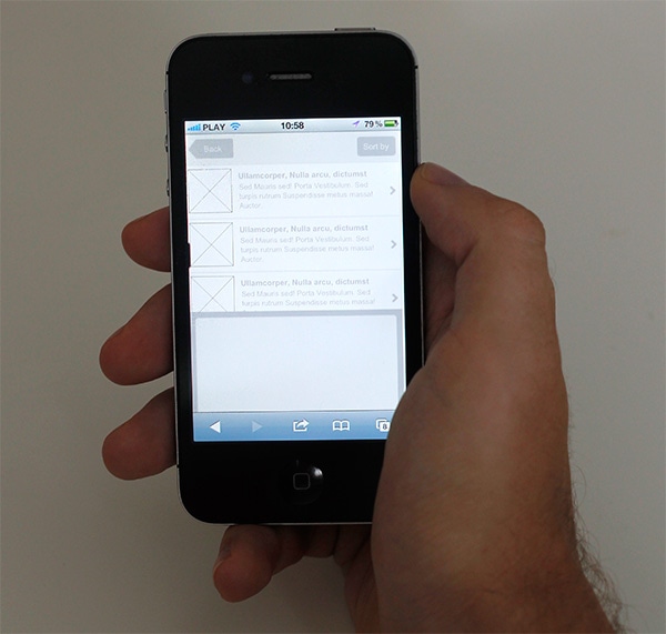
Congrats you’ve just created a prototype that you can use to quickly test your ideas and get an approximation of the real feeling of the app.
Well done!
Sum Up
All right! We went through the basic rules and documenting techniques specific to mobile design. You’re ready for these new times and challenges.
Fingers crossed for your next mobile project!
