Black Website Examples: The Dark Side of Web Design
In terms of color psychology, black is associated with mystery, aggression, evil, authority, elegance and strength. It can convey a broad range of feelings and emotions, covering both bad and good, and producing a high effect. It is widely used in various spheres. However, what kind of impact does black color have on black website design?
Today, we try to look into the matter and to understand its influence.
When it comes to creating user interfaces, designers struggle to derive from black color its powerful features that are able to enrich the project with elegance, sophistication, authority, inscrutability, mastery or strength.
Teamed with sharp and potent typography, high-tech abstract animations, complementary objects, matching secondary colors, black reveals its possibilities at full capacity, improving both an appearance and general feeling of a website significantly. It adds depth, saturates and enhances other hues, naturally highlights important points and hides imperfections and weaknesses. Designs that leverage “the total absence of light” as the primary factor, always stand out from others. In addition, correctly implemented, it significantly affects online viewers, leaving its imprint.
Take a look at 20 fresh website designs that make the most out of black.
Black Website Examples
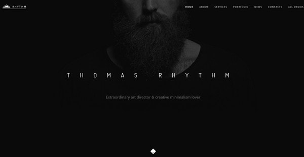
Thomas Rhythm
With Postcards Email Builder you can create and edit email templates online without any coding skills! Includes more than 100 components to help you create custom emails templates faster than ever before.
Free Email BuilderFree Email TemplatesThomas Rhythm has a first-rate personal portfolio that naturally exudes an image of refinement and of the extraordinary. Here the prevailing black website color adds a creative edge to the look, giving the website a fantastic and visually-appealing touch.
Roidna
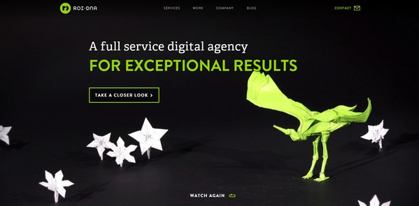
Roidna leverages several vibrant and eye-catching hues that help elements to become focal points, and, as a result, capture the whole attention. The neon greenish elements (logotype, ghost button, tagline, contact link and part of a main image) stand in a sharp contrast to the black background, naturally inviting users into the project.
This Was My Best
This Was My Best is a high-end review website that uncovers an artist’s best works. A traditional black and white color scheme lets typefaces, complementary objects and, of course, portfolio items pop out from the canvas and to arouse curiosity, recreating a nifty and subtle appearance.
YnY
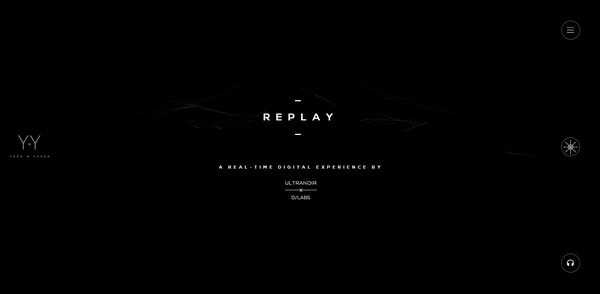
Much like the previous example, here a combo of two fundamental colors is aimed to build the whole aesthetic, making the website look fantastic, elegant and exquisite. Moreover, the tandem helps to make the copy and graphics look distinctive, even despite its relatively small size and ultra-narrow lines.
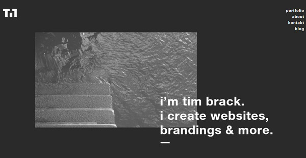
Tim Brack
With Pulsetic you’ll be instantly notified the moment your website, API, or server becomes unavailable. Monitor uptime from multiple global locations and respond to incidents before your users are affected.
Create beautiful status pages in minutes to keep customers informed during outages and build trust with transparent communication.
Start Monitoring for FreeTim Brack excludes everything unnecessary from the front page of his portfolio in order to naturally direct users’ eyes to his works. The clean, black website background, plenty of white space and beautiful white lettering assist in putting emphasis and laying accents.
Self-Destructing Book
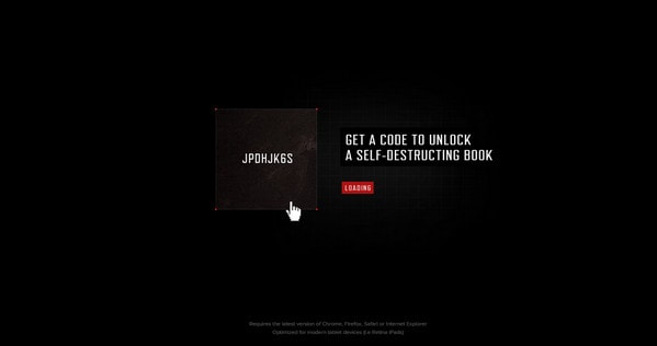
Self-Destructing Book is a fantastic project that instantly drums up interest. Here the black color allows the needed atmosphere of high-tech and brutality as well as enhancing the look of a small content block in a pair with a matching animation.
We Make Awesome
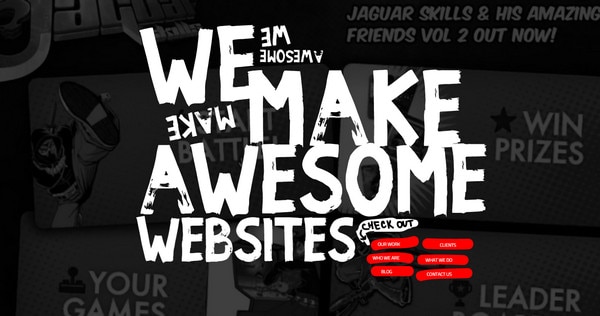
Black tinting is used to elegantly overlay lush images of the portfolio and providing foreground elements such as a tagline and navigation menu with a firm foundation. In addition, such choice of color tones goes perfectly well with a rough and sharp grunge typeface and complementary red.
Brio
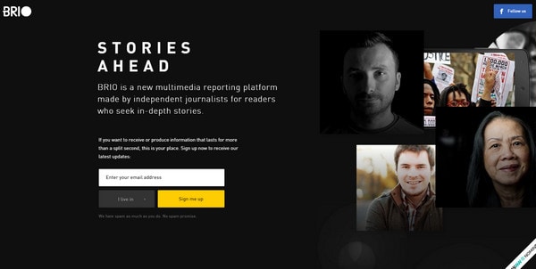
The homepage of Brio painlessly stresses the “welcome” block, email box and some photos, thanks to startling contrast between the background and foreground. The black adds a note of modesty.
Eau de Design
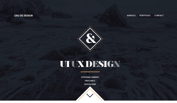
The horizontal stripe layout teamed with a black and white color palette is harmonious and amazing. Splashes of vibrant orange enhance the design as well as accentuate some elements. Furthermore, the moderate coloring is well-suited to components powered by subtle motion.
Video Mapping Loops

Thanks to solid black backdrop, the main tagline becomes an undeniable eye catcher. In addition, by stripping away all the graphics, visuals and animations, the artist manages to strike an optimal balance that allows users to scan the copy naturally.
FS Millbank
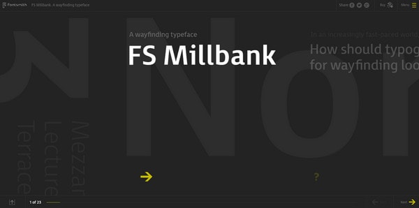
FS Millbank is an excellent example of how to draw attention to the new typeface family. The website intrigues and beckons with its peculiar and startling design, where the minimalism runs the show. The designer skillfully injects bits of yellow color in order to reinforce the interface laconically.
Raphael Malka

Raphael Malka opts in favor of the conservative way of leveraging ornamentation and coloring, going for a more minimalist design. The landing page of his personal portfolio that consists of a trendy designer traits such as ghost button and hamburger navicon delivers a wonderful experience.
Music
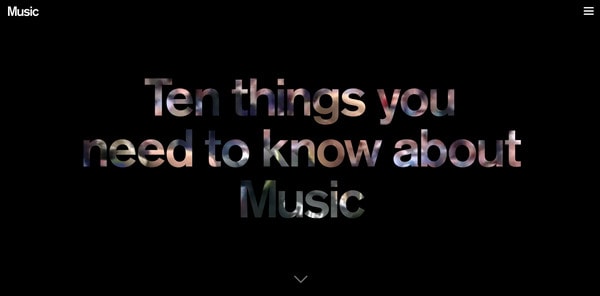
A dark canvas naturally throws the spotlight on the lettering placed in the heart of the page. A relatively massive typography, skillfully used as a mask, laconically lifts the veil of mystery from the video, holds the attention and arouses interest.
Bind Film
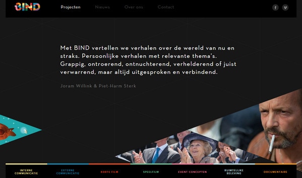
Here, black underlines the content and images throughout the whole page. Not only does it bring visuals into focus without hassle and bustle, but also it nicely works with a riot of colors featured in the navigation menu and logotype.
Dream and Reach
The dark semi-transparent screen that smoothly overlays the home page saves users from excessive visual impact as well as gives two call-to-action buttons a perfect, firm base. The muting technique covertly indicates interesting stuff presented on the website.
Mix Event
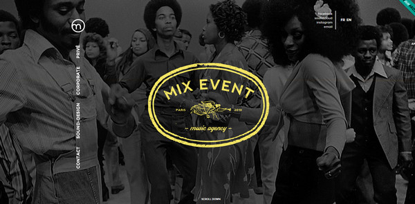
Mix Event exhibits a racy and intriguing photo background that charges the atmosphere with the musical vibe, although the snapshot is featured in grayscale. The solution allows people to interact with the project more efficiently and easily highlight gorgeous and sophisticated badge style centerpieces.
Authentic Form and Function
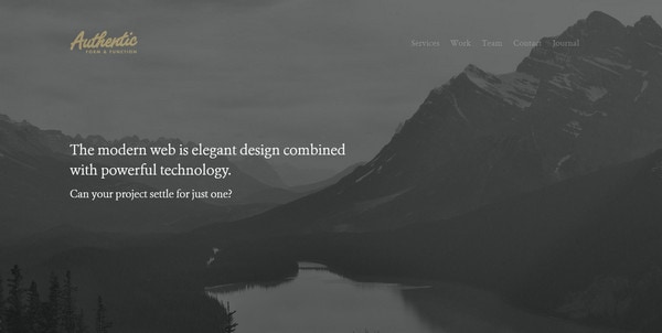
Here the artist succeeded in delivering an authentic and a beautiful rustic general feeling through a picturesque monochrome photo background with a scenic landscape. The latter underlies almost every section and nicely interacts with whole-colored canvas.
Trif
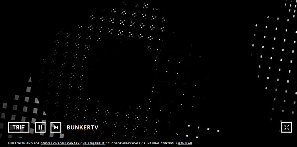
Trif has an offbeat, enigmatic and highly intriguing front page that plays without pauses a series of abstract and ambiguous short videos and animations made in black and white color scheme.
Romeo Fragt Julia
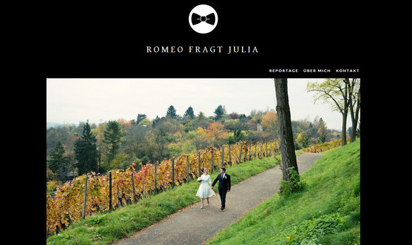
Although the designer goes for a quite poor user interface in terms of graphics, typography and iconography, it neatly exhibits photos, which improve the situation dramatically. The black canvas sets apart splendid images, transforming them into a main visual driving force.
Serapian
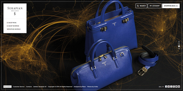
Black always holds a special place in fashion. Numerous couturier fairly often resorts to this powerful color. So that it is evident that the web designer gives preferences to a clean, primitive dark canvas in order to vividly highlight the beauty of luxury bags.
Conclusion
Although, at first sight, it may seem that such a gloomy and mysterious color as black cannot bring positive emotions; however it is able to convey powerful feelings that considerably improve the UI. It effectively adds sophistication and provides a stately sense of elegance and modesty, to say nothing about its innate ability to hide flaws.


