How to Design a Profile Card Interface with Sketch App 3
Last month we introduced ourselves to Sketch App 3 by learning how to mock up a credit card detail app screen and export the necessary assets, which can later be used in Xcode when building an actual iOS application. If you didn’t catch the tutorial or you’re not very familiar with Sketch 3, here’s a quick summary.
Sketch App 3 is a design tool made by Bohemian Coding. It arrived on the market around the same time that Photoshop users became increasingly frustrated with the complex UI and Fireworks announced that it would be discontinued, so if you’re a user interface designer and a Mac OS X user (sorry Windows), head on over to the Bohemian Coding website and download a free trial of Sketch App 3.
As I mentioned briefly, Sketch is very useful for creating, organizing and exporting UI assets, but even when the final design is not expected to manufacture any, we can still use Sketch to create mockups as a POC (“Proof Of Concept”).
Is this a waste of time? No.
What Will We Be Making?
In this tutorial, we’ll show how to design a modular profile card using only the simplistic intuition of the Sketch App interface, and even though we won’t be using any of the assets in an actual website design, we’ll experience first-hand how much time can be saved by extending our ideas onto a digital canvas before we create the real thing. You are of course welcome to adapt this design to suit a mobile application; I’ll refer to that more later on.
Here is a screenshot of what we’ll be making. It’s not too complex, but the lessons that you’ll learn will help you develop the design if needed.
With Postcards Email Builder you can create and edit email templates online without any coding skills! Includes more than 100 components to help you create custom emails templates faster than ever before.
Free Email BuilderFree Email Templates
Here are some comparative notes about Sketch vs. sketching.
- A hand-sketched version is quicker and allows us to reiterate various alternatives quickly.
- It also allows us to concentrate on the user experience without worrying about styles.
- However, a digital template (or archetype, prototype) will offer more aesthetic value.
- With Sketch, we can copy the styles of a layer as CSS into the clipboard.
So which way is best?
Both. Prototyping is incredibly important to any design workflow, and not only can we reiterate quickly by hand, but we can take our best ideas and extend them onto a digital canvas for further validation. Once a mockup is validated, it’s blissfully easy for a developer to left-click and copy the styles (as CSS) to their clipboard. Sketch helps build a bridge between designers and developers.
Lets begin.
Create an Artboard
Press “A” on the keyboard and draw out an artboard. In the right-hand sidebar (also known as the inspector) you’ll notice that there are settings that have become available. When you’re focused on a layer this will house the styles for that layer, but since we’re focused on an artboard the available settings differ slightly. Give the background a color first — this won’t appear in the export but we’ll use it to help us see the widget better, since the widget will be rather light and won’t be apparent on the default white background of Sketch. Much to my dismay, Sketch doesn’t currently offer a way to switch to a darker UI.
Now lets create the following styles in our artboard:
- X: 0
- Y: 0
- Width: 3000
- Height: 3000
In the left-hand layers sidebar, double-click on this new artboard and rename it to “Artboard” — we’ll make it a habit to conveniently rename our layers as we move forward with the tutorial.
With Startup App and Slides App you can build unlimited websites using the online website editor which includes ready-made designed and coded elements, templates and themes.
Try Startup App Try Slides AppOther ProductsStart With the Base
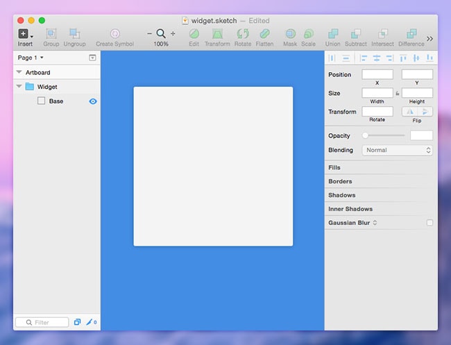
Press “R” for Rectangle this time. Just like we did with the artboard; draw it out, rename it to “Base” and make sure that the inspector shows the following styles:
- Width: 300
- Height: 300
- Radius: 3
- Fill: #F4F4F4
- Shadows: 20% black, 0, 0, 10, 0
- Borders: untick and trash any borders
Layer Masks to the Rescue
Further into this tutorial, we will encounter an issue when we insert a full-width image. We will require the cover image to also have a top-left and top-right radius, but since there is no way to add radius to an image in Sketch App we will need the Base to act as a mask. With CSS we can accomplish this with overflow: hidden, or even add border-radius: 3px to the image, but in Sketch we’ll need to left-click on the Base layer (from the sidebar) and select Use as Mask.
After that, click on Group from the top menu and rename it to “Widget.” Grouping helps Sketch App align to layers correctly and you should do it often. Here’s what you should have so far:
Sketch Plugins
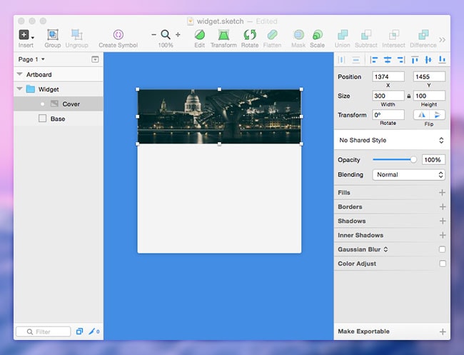
So far, nothing exciting. For this next step however, I’ll show you how to use the Sketch Toolbox to insert random images into the artboard. Placeholders don’t have to be annoying; instead we’ll use the Day Player Plugin to generate images of a specified width and height. We’ll do this twice, once for the cover image and again to create an avatar.
Lets start by installing the Sketch Toolbox. Once that’s installed, search for the “Day Player by tylergraw” and click the install button. We can navigate to Plugins in the Mac Toolbar to access settings for the utilities that we’ve installed.
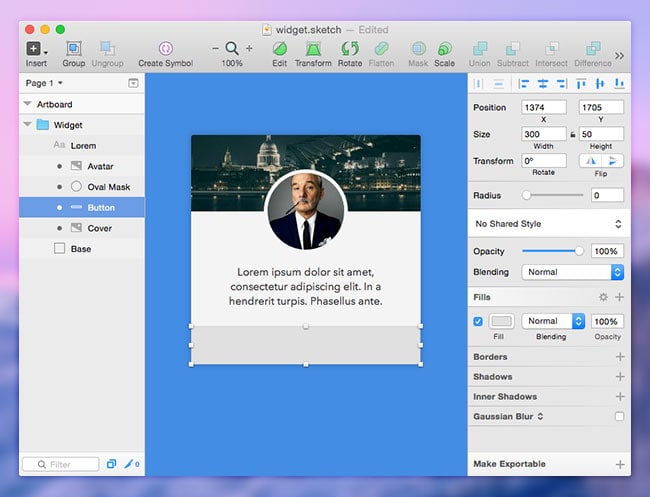
In this case, select Day Player → Unsplash.it and create a 300 x 100px image. For this to work we’ll need to select the Widget group in the layers sidebar so that Day Player knows where to insert our image. You might have noticed that the image has rounded corners already, this is the intended result of the layer mask underneath which is represented with a bullet next to the layer’s name. We should call this layer “Cover.” In the following screenshot, observe how the different types of layers (artboard, group, masked, non-masked) are represented in the layers sidebar.
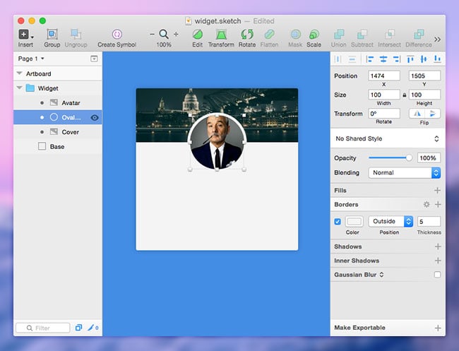
Lets try again and create an avatar. Draw an oval shape to act as another mask if we want our avatar to be circular. Press “O” and then hold “Shift” while drawing out a circle and stop when the dimensions reach 100 x 100px. Remove the Fill, make sure the Border is “#F4F4F4, Outside, 5”, and then drag the oval (we’ll call this “Oval Mask”) until it auto-snaps to the vertical center of the widget and its half-hanging outside of the cover image.
Repeat the Day Player Plugin with Fill Murray, create a 100 x 100px image and drag it to the same coordinates as the Oval Mask. In the layers sidebar, left-click on Oval Mask and turn it into a layer mask if you haven’t already. You also should rename this layer “Avatar.”
Add Text
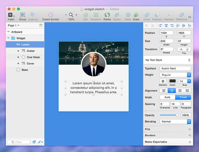
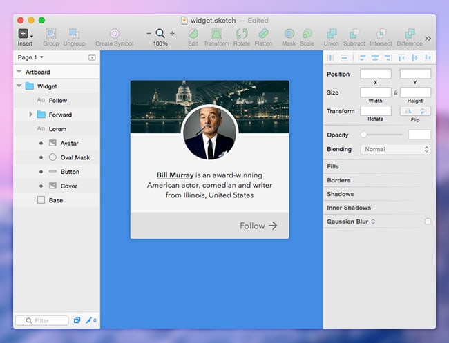
Press “T” to insert text and draw out the content area. We’ll aim to incorporate the user’s name and location into the bio; we’ll save space while still including the relevant information and drawing focus to the interactive elements with text formatting rather than spacing. If you don’t feel like making up your own data you can use this dummy text:
“Bill Murray is an award-winning American actor, comedian and writer from Illinois, United States.”
In the inspector sidebar, the styles should read:
- Width: 240
- Font/Typeface: Avenir Next
- Weight: Regular
- Color: #333
- Size: 14
- Alignment: Centre
Drag the text box until it snaps to both the vertical center of the widget about 20px below the avatar. Highlight the user’s name, change the Weight to “Demi Bold,” then click on options and change the Decoration to “Underline.” Not only is the name more apparent now, but it also tells the user that it will link to more information.
Tip: If the layer does not appear then it’s possible that it’s being masked. If this happens, left-click on the text layer in the layers sidebar and select “Ignore Underlying Mask.”
Design the Call to Action
Since the bio text is center-aligned, a follow button that is also center-aligned might be initially confused with body text. Not only that, but negative actions such as “back” are commonly situated on the left. By choosing to interact with the widget the user is attempting to do the quite the opposite, move forward. A right-alignment with a forward arrow will illustrate that, or alternatively an icon that represents “follow” if the widget isn’t intended to take the user offsite.
Tip: Remember that this card design can have many different uses. It could be an embeddable widget used offsite, a single screen in an app, or just one simple module in a website design. Perhaps we’ll want to create a unified design across platforms!
If we were coding this website (or app) we would add to the user experience by taking the user to a new webpage or switching out the forward icon for a “tick” upon successfully following the user. Depending on your use-case, remember to use icons descriptively.
Press “R” to create another Rectangle with 300 x 50px dimensions and drag it to the bottom of the widget — the Fill should be “#E0E0E0” and don’t forget to rename the layer to “Button.”
Navigate to File → New From Template → Material Design. In the newly opened artboard, you’ll see some useful icons under “System Icons” — you can copy these icons into our .sketch mockup and use them freely, but the icon you require deeply relies on your use-case of the card module. If I wanted to use this card as an embeddable widget that navigates the user offsite, the forward arrow might be most appropriate. (If you disagree, leave your thoughts in the comment box below and we’ll debate!)
You will have noticed that the icon is black with 54% opacity — this is fine and we’ll leave it like that. In fact, tap “T” to create some text (“Follow”) that matches it and correctly align it with the icon. Avenir Next, 16 will work splendidly, and you should have something like this:
Now we can use this mockup to build a real version.
Extract Styles as CSS for the Web
If you left-click on the text layer (for example) and select “Copy CSS Attributes,” you’ll end up with something like this in the clipboard:
/* Developers will love this feature: */
font-family: AvenirNext-DemiBold;
font-size: 14px;
color: #333333;
line-height: 14px;
Export Image Assets
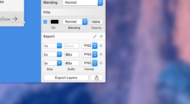
If you want to use any of the layers in an actual application it would be as easy as selecting the layer in the layers sidebar and clicking on “Make Exportable” in the bottom-right corner. You’ll be able to specify the file format, the resolution, and even a suffix for the filename – this is one of Sketch App’s most critically acclaimed features.
Tip: Hold CMD to select multiple layers to export all at once.
Conclusion
While we have reiterated over the things that we learned in the last tutorial (styles, templates, exporting, etc), we learned some new tricks such as how to use layer masks and the Sketch Toolbox.
If you’d like to experiment with Sketch Toolbox some more, here are some useful extensions that I would highly recommend.
- Send to Slack will let you send screenshots of your Sketch App designs directly into a Slack channel for your colleagues to observe and offer feedback on.
- Content Generator Sketch Plugin is similar to Day Player, except that it will offer random dates, text and locations, which would be very suitable for a more complex modular widget.
- Aeiconizer will automatically resize artwork into the correct sizes for an iOS app icon.
- CSS Buddy allows you to style layers with CSS, which is quite suitable for web designers transitioning into Sketch App or web developers needing to make minor changes.


 siter.io
 pulsetic.com
 static.app
 mailpost.io