How to Use steps() in CSS Animations
I am guessing that many of you have found steps() to be confusing when using it in CSS animations. I wasn’t sure how or why to use it at first and searching seems to produce two main examples: A typing demo by Lea Verou and an animated sprite sheet by Simurai.
These examples are genius and really helped me begin to understand this special little timing function, but they are such prominent references that it was hard to imagine how to use steps() outside of the context of each demo. On the text side of things, steps() are often used to replicate a typewriter effect, as was pointed out by Alex Ivanovs in his CSS tricks article.

Slides: HTML Static Website Builder
So, I really got into steps() and built a few animated demos to help those that might be as confused as I was in tackling this elusive beast.

Intro to Steps
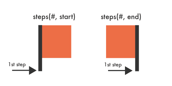
steps() is a timing function that allows us to break an animation or transition into segments, rather than one continuous transition from one state to another. The function takes two parameters — the first specifies the positive number of steps we want our animation to take.
With Postcards Email Builder you can create and edit email templates online without any coding skills! Includes more than 100 components to help you create custom emails templates faster than ever before.
Free Email BuilderFree Email Templatessteps(<number_of_steps>, <direction>)
The second parameter defines the point at which the action declared in our @keyframes will occur. This value is optional and will default to “end” if left unspecified. A direction of “start” denotes a left-continuous function and our animation’s first step will be completed as soon as the animation begins. It will jump immediately to the end of the first step and stay there until the end of this step duration.
A direction of “end” denotes a right-continuous function and directs the movement to stay put until the duration of the first step is completed. Each option essentially moves the element from a different side and will produce different positioning for the same animation.
Here’s a visual:
Impact of Fill Mode and Iteration Count
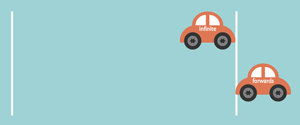
Before we get started it’s important to understand how a different fill mode or iteration count will impact steps(), like the use of “forwards” or “infinite,” for example. If we have two cars with the same animation duration and the same steps() values, but one is directed to continue infinitely while the other the fills forward, the perceived end point of these two cars becomes very different, even though they start out from the same y-axis point.
The use of “forwards” commands the animated element to extend the styles from the last @keyframes of your animation to play beyond the duration of the animation and retain that state. Combining it with steps() in the animation makes the action appear as if the initial motionless state is not counting towards the total sum of steps, as it should with “end”, or that the car is taking an additional step beyond your steps() declarations, depending on how you look at it.
This sounds a bit messy but we will break it down in the demos. The main thing is to be mindful of how these variations will impact your intentions and number of steps. Here are some infinite versus forwards cars:
With Pulsetic you’ll be instantly notified the moment your website, API, or server becomes unavailable. Monitor uptime from multiple global locations and respond to incidents before your users are affected.
Create beautiful status pages in minutes to keep customers informed during outages and build trust with transparent communication.
Start Monitoring for Free
.contain-car {
   animation: drive 4s steps(4, end) infinite;
}

.contain-car-2 {
  animation: drive 4s steps(4, end) forwards;
}
Now, let’s take a look at some more code and try to make sense of this bit of trickery.
Steps Demos
You can take a look at the demos here, which consist of:
- A pure CSS clock
- Some energy efficient pure CSS cars
- Advancing bear paw prints
- A pure CSS progress circle
CSS Clock

A clock is ideal for demonstrating steps(). We need the clock’s hands to rotate, but not in smooth and continuous movements. Using steps() will allow us to create a motion mimicking that of hands on a real clock.
There’s a bit of math involved when using steps(), but it’s not too painful. We want the second hand to to rotate 360 degrees through 60 steps and to complete the animation within 60 seconds.
.second {
  animation: tick-tock 60s steps(60, end) infinite;
}

@keyframes tick-tock {
  to {
    transform: rotate(360deg);
  }
}
The clock’s animation declaration breaks down to 1 step per second.
For the minute hand, we can assign the same @keyframes, but need different timing. We will multiply 60 by 60 to get our animation duration. Our hand will move once every 60 seconds, 60 times to complete a full 360-degree rotation.
.minute {
  animation: tick-tock 3600s steps(60, end) infinite;
}
And there it is!
Disclaimer: Don’t rely on this clock to carry out your daily activities because, you know, it’s a CSS clock.
CSS Cars
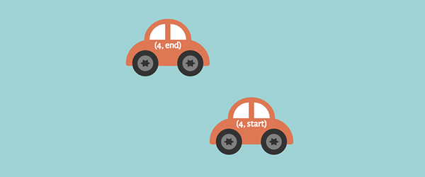
CSS cars demonstrate the difference between using “end” and “start” within our steps(). “Start” causes a car to move right away and stay until the duration of 1 step is complete. It will appear as if the “start” car is positioned further right than the “end” car, but if you add an animation delay to the second car you can see that both cars originate from the same y-axis point.
“End” causes the animation to essentially complete the designated time of 1 step before the animation begins its action. By the time our first car gets moving, it is on its second step so the cars have no chance of moving in sync. The white borders in the demo represent the start and end points of the animation.
.contain-car {
  animation: drive 4s steps(4, end) infinite;
}

.contain-car-2 {
  animation: drive 4s steps(4, start) infinite;
}

@keyframes drive {
  to {
    transform: translateX(640px);
  }
}
Bear Prints
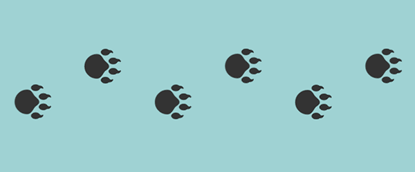
Another way to better understand steps() is to take it quite literally and create actual steps. For this example we will be using bear paws. This demo uses one image consisting of six bear paw prints. This image is covered by a <div> and we want to move that <div> with steps() to reveal the paws in a way that mimics actual prints being left behind.
Without using steps() for this the <div> would move to the right in one fluid movement, which is not the effect we are going for. We want each paw to appear whole and at once.
As mentioned, there are six paw prints. We need to animate our <div> to move the full length of the image (675 px) while revealing one full print at a time.
.cover {
  animation: walk 7s steps(7, end) infinite;
}

@keyframes walk {
  to {
    transform: translateX(675px);
  }
}
Our <div> will move to the right 675 pixels in 7 seconds through 7 steps. This works out to each step being about 96 pixels wide. “End” means that our animation will stay in its initial state covering all the prints until the first 1 second step is completed.
CSS Progress Circle

In this demo we are using “start” with our animated opacity change. When we change opacity in animations we can use steps() to complete this action in clearly defined stages. Using “start” makes a percentage of the color visible immediately even though its initial opacity is “0.” A value of “end” in this instance would start us off with an invisible circle.
The change will happen in five steps within 5 seconds, equaling one stage per second.
.circle {
  animation: fill 5s steps(5, start) forwards;
}

@keyframes fill {
  to {
    opacity: 1;
  }
}
Our percentages are also moved with steps().
.percentage {
  animation: load 4s steps(4, end) forwards;
}

@keyframes load {
  to {
    transform: translateY(-380px);
  }
}
All the percentages are located in the same <div> which we are moving up 380 pixels. Our initial “20%” exists in the circle from the beginning, so we need to move the <div> to expose the 40%, 60%, 80% and 100% through four steps.
Again, using “forwards” here impacts the number of steps we use in a different way than “infinite” does in the previous demos. If we changed this to “infinite” we would miss our “100%” completely because “forwards” is commanding it to go an extra step outside of what is listed within our declared steps().
Walking Through Steps
The steps() timing function can be really tricky to understand, but pretty handy once you get the hang of it. The CSS function allows us to chop our animations into clearly defined stages, or speed things up to create smooth movements.

Hopefully these demos inspire you to use steps() effortlessly in your CSS animations. Happy stepping!