Email Design Accessibility: Why It Is Important to Improve It
We are fighting for equal rights for all people. This extends to a comfortable online environment for users with various disabilities.
Thanks to assistive technologies, the vision-impaired can check inboxes, visit websites, and watch videos. To aid them, we should create an AT-friendly digital space, where email marketing is an integral player.
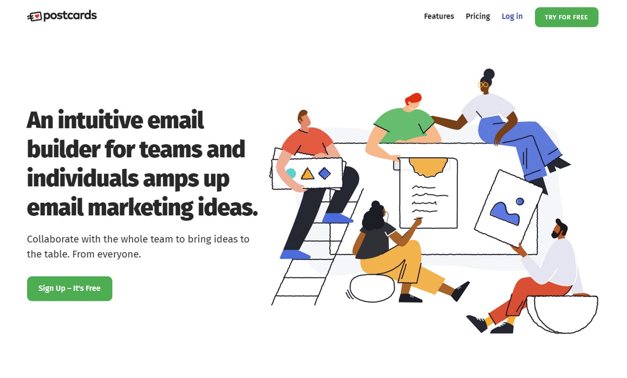
Popular ESPs and goliaths of the industry have already advocated this issue by opting in favor of newsletters that are easily reachable by a broad spectrum of users. Tools like Postcards (a professional HTML email template generator made with email design accessibility in mind) and WCAG (Web Content Accessibility Guidelines) deal with this situation efficiently. Therefore, there are no excuses to avoid email design accessibility.
Why Email Accessibility Matters
This year, the ADA (Americans with Disabilities Act) celebrates its 30th anniversary. This law was created to remove physical barriers and give the same opportunities to all people. In the 90s, it applied to real life. Today, as we rely heavily on the internet to shop and communicate with others, it covers the digital universe as well.
Not only do pandemic and legal enforcement bring this issue to the forefront. There are some other reasons why email design accessibility matters.
- Any kind of disability, even a temporary one, makes it hard to interact with email. Therefore, you won’t get a proper response on your strategy and campaign, to say nothing about driving traffic to the landing page.
- Almost 1.3 billion people worldwide live with some form of impairment. It is a colossal share of the market that you overlook.
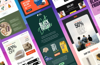
- Inaccessibility in email design may lead to a disappointed, frustrated, or angry customer. For example, if you do not provide your images with ALTs, people whose email readers ditch all kinds of visuals by default won’t see your smart pictures, backgrounds, and accompanying material. Therefore, you will lose the click, the sale, and damage or ruin your relationships with the contact.
Email accessibility matters on all levels. It is increasingly vital for your business to thrive, to say nothing about its unintended benefits. Therefore, it should be taken into account each time you create a digital newsletter.
With Postcards Email Builder you can create and edit email templates online without any coding skills! Includes more than 100 components to help you create custom emails templates faster than ever before.
Free Email BuilderFree Email TemplatesIt does not require much effort or sacrifice. All you need to do is adjust your code slightly and check whether the email design provides the best user experience.
Let’s dive into the basics of email design accessibility to see how you can easily change your email design.
Best Practices for Email Design Accessibility
Accessibility touches all aspects of the digital newsletter, starting from the subject line and ending with footer social media icons. However, it does not mean that you have to change every inch of the design. In most cases, you will only need tiny adjustments. Let’s consider best practices for email design accessibility.
Create a Simple Yet Expressive Subject Line
Everything begins with the subject line. It should be eye-catching and memorable for good deliverability and open rates. If you want to secure email accessibility, it should be informative.
You can use emojis since they have alt text that is visible to screen readers by default. Keep these tips in mind:
- Never replace words with emojis.
- Add emojis to the end of the sentence.
- Do not use more than two emojis.
- Never use emoticons because they are considered punctuation marks by screen readers.
The ideal subject line in email accessibility should be straightforward yet witty with a dose of emotions supported by one emoji at the end of the phrase.
Use Semantic Code
Using semantic code is a standard when you create websites or mobile applications; however, email design also benefits from this guideline. When you use the proper markup for describing blocks and sections, AT can easily read them. The properly-structured reading experience allows the listener to navigate through the page smoothly.
Create proper semantic code to improve email design accessibility is pretty straightforward. It is not rocket science. Make sure these essential things are enforced:
With Pulsetic you’ll be instantly notified the moment your website, API, or server becomes unavailable. Monitor uptime from multiple global locations and respond to incidents before your users are affected.
Create beautiful status pages in minutes to keep customers informed during outages and build trust with transparent communication.
Start Monitoring for Free- All titles are enclosed in corresponding <H> header tags. If you need to create an information hierarchy, <H> tags are mandatory. Note, the color, font style, and weight are not sufficient to tell the screen reader that this sentence is a header.
- All paragraphs are enclosed in <p> tags.
- Buttons are inside <button> tags.
- All open tags have closing tags.
- The document includes <HTML>, <head>, and <body> tags.
If you do not want to mess with code, you can efficiently address this issue with professional instruments like Postcards. This free online HTML email template builder helps email marketers create digital newsletters with valid semantic code without a hitch.
Add HTML Language Attribute and Content-Type
The HTML language attribute tells screen readers and other programs to display or pronounce content in a specific language. It is easy to define – all you need is to specify the lang attribute – but it makes a huge difference. Thanks to this simple fix, the reading device does not use the default settings to confuse pronunciation. Instead, it reads everything in a native language.
One important thing to note. Traditionally, the lang attribute is specified in the HTML element. However, sometimes email clients remove it. Therefore, repeat it in <body> element as well. If you use several different languages inside one email, you should use this attribute with a corresponding language code before each block to give screen readers clear instructions.
Another thing to define inside your code is content-type. It specifies character coding and tells screen readers which type of characters to use. Again, it may save your email from misinterpretation caused by jumbled text produced due to the wrong usage of character sets. To be safe, use UTF-8.
Stick to Logical Reading Flow
Logical reading order is a hidden pitfall that many email designs can’t nail. What you see is not what you get when it comes to assistive technologies.
Two main things cause this pitfall. First, it is the table that underlies every email design. The screen reader processes data from left to right. Therefore, if you have a two-column layout where the first column contains content, and the second column contains navigation or ads, the user may get a messy message.
The way out is to stick to a one-column layout and widely-acknowledged structure such as header-content-footer. Alternatively, you may use a two-column design if you have just one row or provide screen readers with cues to handle it properly.
Responsive behavior may cause problems in the logical reading flow. When you re-position the layout to accommodate big or, on the contrary, small screens, you may create mixed reading paths. Therefore, exercise caution when you use flexible structures.
Use Proper Font Size
Due to the sheer diversity of screen dimensions, font size has become a serious issue. A decade ago, 12 points were enough for your text to be perfectly readable; today, this number is 14 to 16 points.
Depending on screen dimension, you may use different font sizes. For instance, the general practice is to use a 14-point font. However, people perceive text on cell-phone screens differently. Therefore, it is highly recommended to use at least a 16-point font.
What’s more, the font family dictates its own rules. For example, sans serif typeface looks excellent in 14-point size. However, if you opt in favor of subtle calligraphy or quirky hand-written option, you may need a bigger size to make all letters legible and easily perceptible.
That’s not all. The font size may depend on the amount of text that you display. For example, text-heavy designs may benefit from larger font sizes.
Last but not least, along with accommodating various screen sizes, you should keep in mind that fonts affect emotions and the decision-making process. For example, too large fonts can easily make your email look childish that can turn subscribers away. Therefore, before choosing a typeface, make sure it meets all the requirements.
Ensure Perfect Contrast Between Foreground and Background
All email marketers are perfectly aware of color’s ability to influence a user’s perception of the design. However, along with color psychology, you need to consider color contrast as well, since, without proper balance between foreground elements and background, you risk ending up with a bad user experience and frustrated subscribers.
Color contrast is one of the most significant issues when it comes to safeguarding email design accessibility. Vision impairment is a common thing that occurs in all ages. Even people with perfect vision may experience problems while reading your text. Therefore, an optimal contrast level is mandatory.
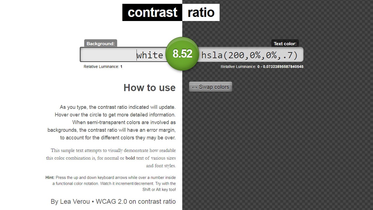
According to WCAG 2.0, the ideal color ratio is 21:1, which corresponds to black text on a pure white background. However, since it is not always an option (marketers adore using red, yellow, green in their designs), it is highly recommended to provide a 4.5:1 ratio for standard-sized text. If you use a larger font size, you can lower this ratio a bit: 3:1 is sufficient. To test your design and determine whether it provides the required contrast, try out Contrast Checker, Contrast Ratio, or these fantastic color accessibility tools.
Finally, do not bet everything on color since some people just can’t see them. Therefore, if you want to make the element stand out from the reading flow, you should always use supporting stylistic options like font’s weight or size.
Contrast Ratio
Set ALT Text for Images
Perhaps one of the most popular fixes when it comes to guaranteeing email design accessibility is to set ALT text for images. It is widely known but still overlooked. There are two pretty good reasons why you need alt text.
- Alt text provides information for people with vision impairment. Without it, they just are unable to understand what’s there.
- Alt text comes in handy when email readers do not support visuals or subscribers have turned visuals off intentionally. In these cases, alt text will clear things up.
Therefore, if you do not use professional instruments like Postcards that include ALT text by default, you need to make sure that your <img> tag has it.
Note, ALT text should present the content and function of the visual. It should also not start with the words “image of” since the screen reader will say it anyway. Style this text to make it blend into the scene.
Finally, if you use images purely for decorative purposes, you can omit alt text since it creates redundancy and does not add valuable information.
Set ARIA Attributes
ARIA (Accessible Rich Internet Applications) was created specifically for adding extra descriptive information for screen readers. Being invisible, it does not impact design, layout, text display, or responsive behavior. It is a hidden piece of information that only assistive technologies can read.
Originally, ARIA was created for websites and mobile applications; however, email designs also enjoy its benefits. For example, you can take advantage of such aria attributes as
- role=” presentation”
- role=” article”
- role=” img”
- role=” listitem”
Additionally, you can use aria-hidden=”true” to hide redundant elements. For example, spacers, shadows, or decorative features may be hidden with this trick.
Another good use of aria attribute is setting a role to ” presentation” on tables that underlie digital email design. This way, you will tell screen readers that it should not be treated as a data table. Instead, it should be read as a standard text element. This makes exploration of the email enjoyable and navigation effective and smooth.
It is highly recommended to use a role attribute to define blocks inside the layout. Although super handy HTML5 tags such as <header>, <footer>, <section>, or <article> were introduced several years ago, email clients still do not support them to a full extent. Therefore, to ensure overall consistency in email design, you may use role attribute, for example, like this role=” header.”
One thing to note is much like all new or relatively new HTML and CSS features, ARIA attributes are subject to inconsistency. Sadly, some email clients do not support them, while others interpret them in an unexpected way. Therefore, when you use ARIA attributes, always exercise caution. Test your digital newsletter to determine whether it works as intended and whether it provides a proper email accessibility level.
Write Easy-To-Read Well-Formatted Copy
Not all people are educationally inclined. Therefore, not everyone will quickly get all the terms that you may use to show off. If you create an email newsletter for a broad audience, your language should be simple and jargon-free.
When in doubt, check your text with the Flesch-Kincaid Reading Ease test that can be found right in Microsoft Word. Your score should be between 60 and 70 to ensure that a vast crowd gets everything that is said.
Also, make sure your tone is friendly and inviting to reinforce a close connection with subscribers.
Using simple words and a friendly tone in your copy is not enough to create good readability and ensure email accessibility in this area. You need to make your copy look digestible as well.
- Do not use long sentences.
- Break long paragraphs into small portions.
- Use headings and subheadings.
- Use italic or bold style to emphasize the key points.
- Use bullet or numbered lists to identify key points or facts.
- Add space between logical divisions. Each paragraph should be easily delineated. Make the design airy but not too spacious.
- Use optimal line-height. Ideally, it should be of 1.5 times the font size to make reading comfortable.
- Optimize font size and characters per line.
- Use space between blocks of text.
- Use an evenly spaced typeface that looks good on small and big screens.
Stick to Conventions
Although we want our brands to stand out, email design accessibility can be boring. And that’s good. You eliminate chances of being misunderstood.
Some elements of your design should behave and look as expected. Widely-approved UI elements are only getting worse from out-of-the-box approaches.
Links are a perfect case in point. Generally, they are blue and underlined. However, when somebody tries to step away from canons, making them grey or italicized, people feel confused. They may ignore them completely.
The same goes for buttons. People expect them to be rectangle-shaped or have an outline. If the button looks like a link, it does not get the required dose of attention and may deliver the wrong message.
Therefore, when you ensure email design accessibility, remember that crucial things like links, buttons, navigation, and contact information should look and behave as expected.
Include a Plain Text Version and a Web Version
A plain text version can be a real lifesaver if a rich HTML email newsletter fails to work correctly. It includes only core content, thereby bringing value to a broad spectrum of users. While it may be deprived of wow factor or brand’s charisma, it still has a personal touch that may enhance relationships with the users.
The web version is the same rich HTML email yet presented in a web browser, which offers better HTML and CSS compatibility. It is also easier to add than the plain-text email. Therefore, in no time, you will give the subscribers a reliable alternative where screen readers easily get the most out of the email design.
What Should You Avoid?
Along with recommendations and best practices that help enhance email accessibility, there are things that you need to avoid since they may easily ruin your efforts. To keep your progress safe and ensure email accessibility stay away from such things as:
- Center-aligned paragraphs
- Justified paragraphs
- Thin or overly decorative fonts
- Flashing content or vibrant animated gifs since they may cause photo-sensitive seizures
- Links to harmful content
- Redundancy
- Icon-based bullets for lists
- Vague link text like “Click Here”
- Title on links
- Text in images
- Image-based buttons
- em, percentage, or “unitless” values
- Jargon, abbreviations, or acronyms without clear explanations
- Vibrating color combinations, especially in blue and red hues
Test Email Design Accessibility
Testing email design accessibility involves a dozen things.
- Make sure the email is fully responsive and works consistently at all popular screen sizes.
- Make sure the email looks great across all browsers and email clients.
- Test your email without visuals. Does it bring value and deliver the required message?
- Test your email design in zoom. People with vision impairments may use zoom to make symbols more legible. Therefore, your email design should look great when considered under a magnifying glass.
- Test your email design using a keyboard. Is reading structure logical? Can users reach all the interactive elements?
- Test interactive elements. Make sure they are all tappable and clickable. Your navigation and a button should have a proper size so that users can hit them, especially on the small screens. According to Apple’s guidance, the tappable area should be a minimum width and height of 44 pixels. Ideally, it should be 72 pixels.
- Test emails using VoiceOver. Those who have an iPhone can easily do it by merely activating VoiceOver in Settings.
- Do the blurry-eye test.
- Test images for color blindness. Again, you can use the iPhone by activating greyscale testing or use other professional tools.
- Test color ratio.
- Test the plain-text version and web version.
- Check your email through all-embracing professional platforms like UnSpam.email. Along with running your newsletter through blacklists, conducting thorough email spam tests, showing email design in all popular devices, platforms, and OS, it also makes a full accessibility check. This in-depth report will help you to improve accessibility and the entire campaign.
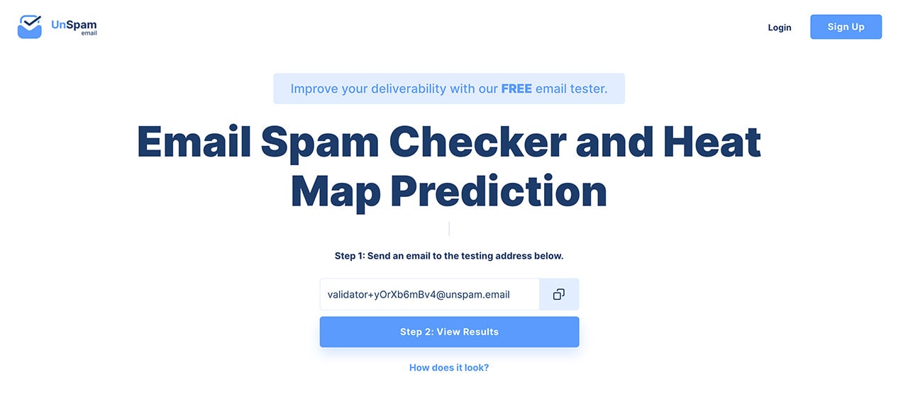
Unspam.email – Test Email Newsletter
Unspam.email is an online tool that can help you check emails for whether they will be judged as spam instead of landing in someone’s inbox. It also offers a heat map prediction system designed to ensure you create the best email newsletter campaigns.
It uses a selection of accurate data about where subscribers are looking at your emails and how they tend to read them.
Examples of Email Accessibility
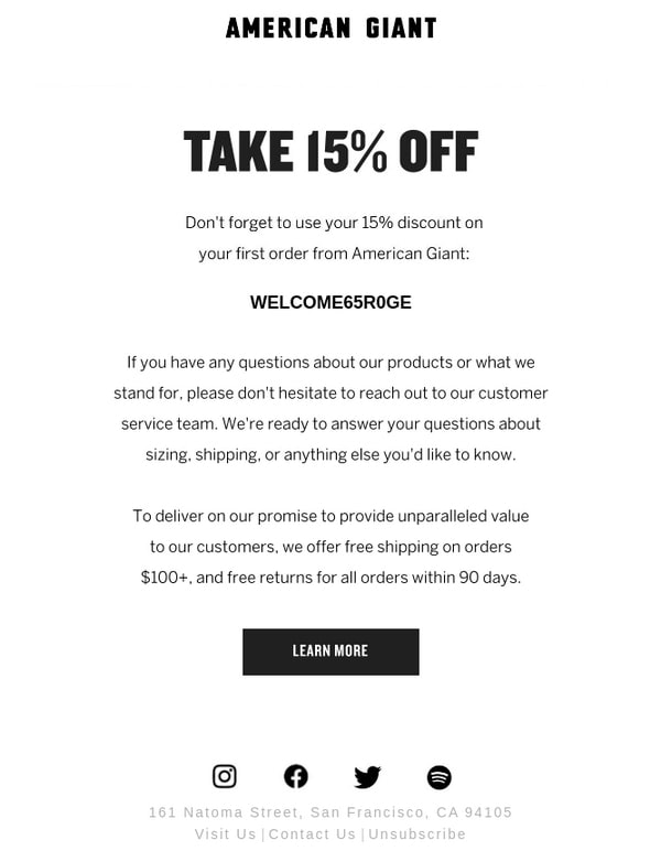
Email Design from American Giant
The marketing team behind American Giant provides an excellent example of email accessibility. Although it is not perfect since the team has centered paragraphs that makes it difficult to read for some people; otherwise, they nailed it.
The team opted in favor of classic black-and-white coloring that secures the best contrast ratio. They did not use images, focusing only on crucial information, and used a generous amount of whitespace. As a result, all the paragraphs are skillfully delineated. Plus, they have a defined character set and specified alt text for images.
Simple, practical, and accessible.
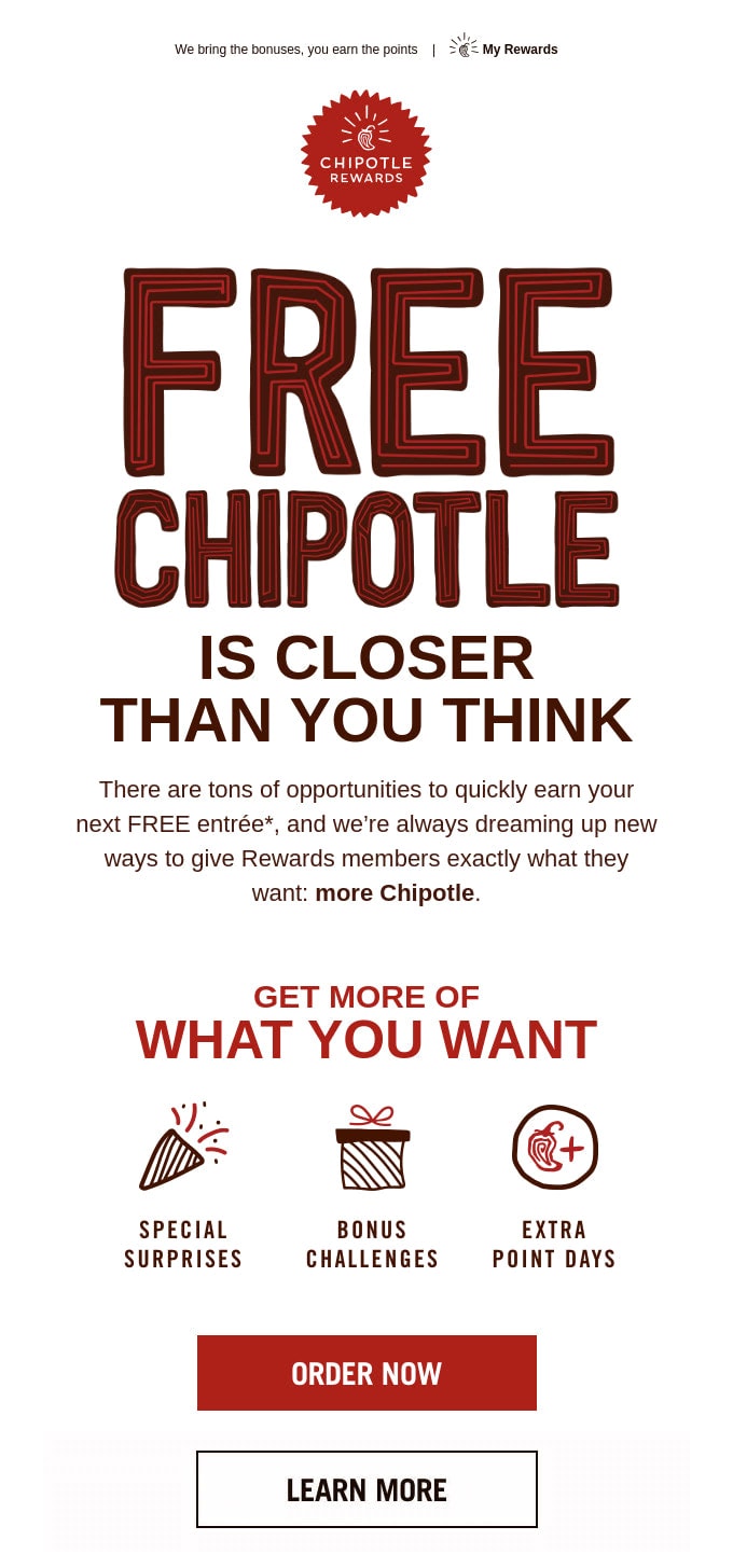
Email Newsletter from Chipotle
Another good example of email accessibility can be found in email marketing campaigns run by Chipotle.
Much like American Giant, the team did a perfect job of making their message reachable to most people out there. However, this time the email design looks more decorative.
First, they used a one-column structure that provides logical reading flow.
Second, they have hit the optimal contrast ratio using a white background and black and red colors that stand in sharp contrast to it.
Third, they have used neutral typeface for copy and decorative typeface for the header, which, thanks to large size, can’t be missed. Titles are well-structured; therefore, screen readers can easily navigate them.
Finally, they provided alt text for images. Although these visuals have important information engraved in, users with disabilities can still get it thanks to alternative text.
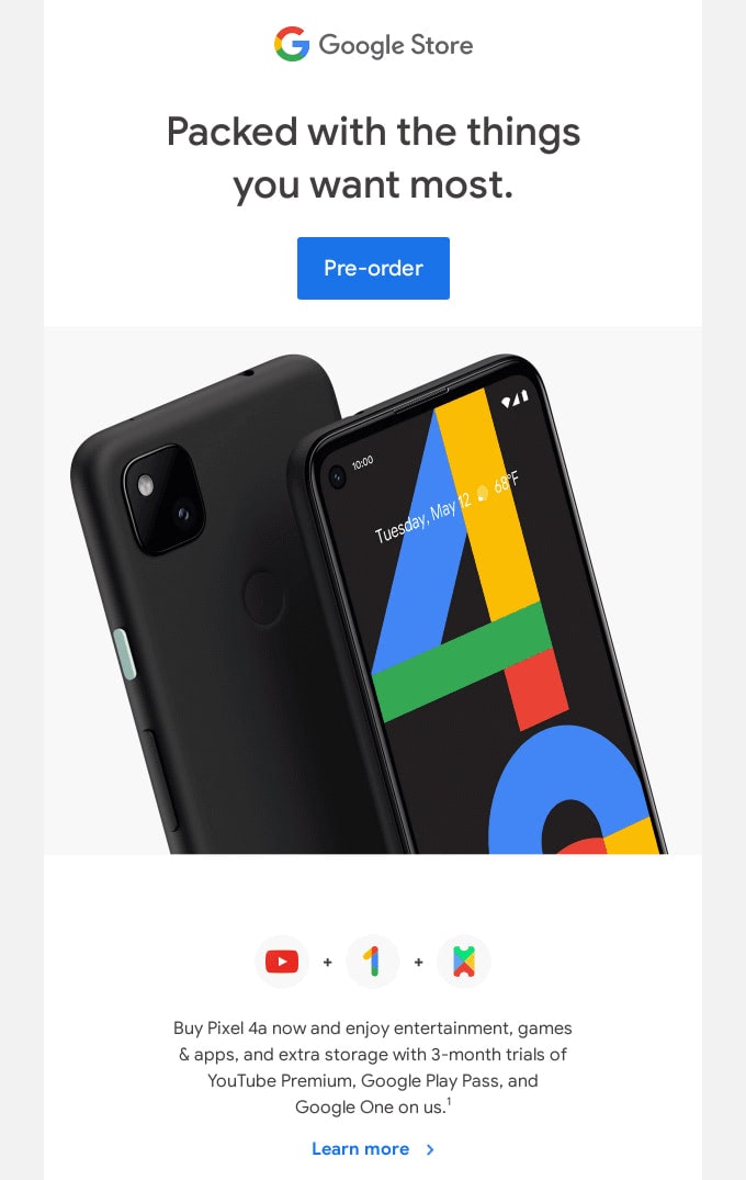
Email Newsletter from Google
As the leading company on the web, Google could not help but advocate email accessibility through its digital newsletters.
Their email design will surprise you with its informative part that is accessible to everyone. The team covers a lot of content. Thanks to proper structure, significant gaps, excellent formatting, neutral typeface, and well-thought-out headings, everything works. It does not look content-heavy or messy.
Note, the team has skillfully used two and even three-column layouts to accommodate all the copy and visuals. The deal is every line is a single table; therefore, screen readers moving from left to right deliver the right logic to the user.
On top of that, they have specified alt text for all images and included text to voice recording and transcript for the hearing impaired.
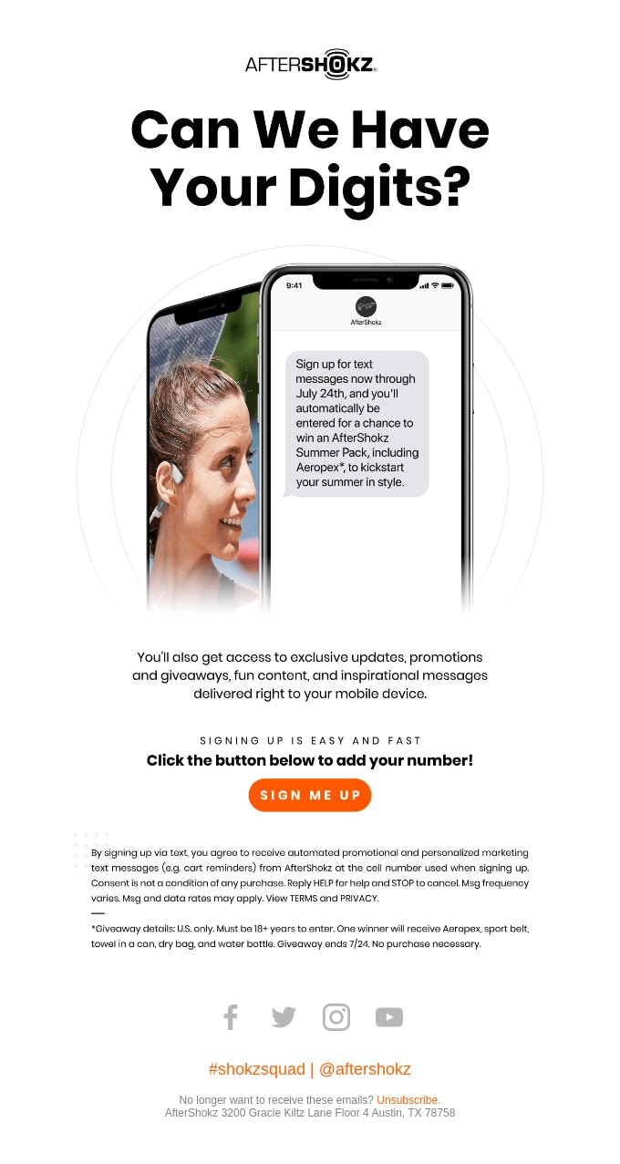
Email Design from AfterShokz
The team behind AfetrShokz has taken on the same approach as American Giant to nail email accessibility. Their digital newsletter is relatively modest in terms of stylistic solutions. It is just a compact design with vital information that follows the best practices.
First, the team used a one-column structure.
Second, they created a perfect contrast between background and foreground, making text and buttons stand out.
Third, they chose a neutral typeface to make characters legible across various screen dimensions.
Fourth, headings are well-structured, and paragraphs are easily digestible.
Finally, the image in the hero area has an alt text; therefore, users who rely on AT get the offer.
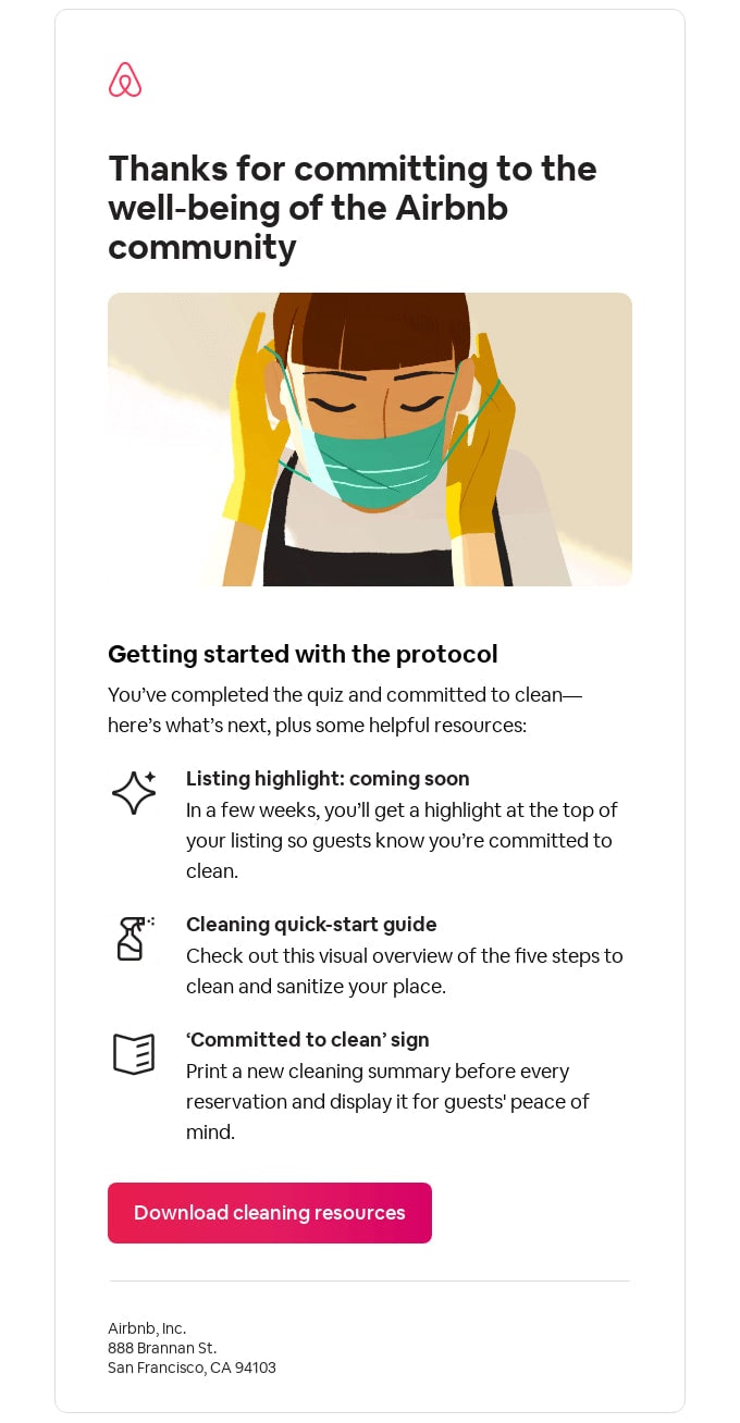
Email Newsletter from Airbnb
This is another digital newsletter in our collection that adopts the same technique to ensure excellent email design accessibility. We can see such best practices put into action as:
- Paragraphs are left-aligned.
- Each block of information is placed inside its table.
- Images and icons do not have alt text since they are purely decorative.
- The call-to-action has a huge tappable area.
- The color ratio is ideal.
On top of that, the team has taken care of some tiny yet vital elements. For instance, they have defined meta content-type and lang attributes.
This is a classic example of a purely informative digital newsletter that delivers messages to a broad audience simply by using email accessibility tips featured in our guide.
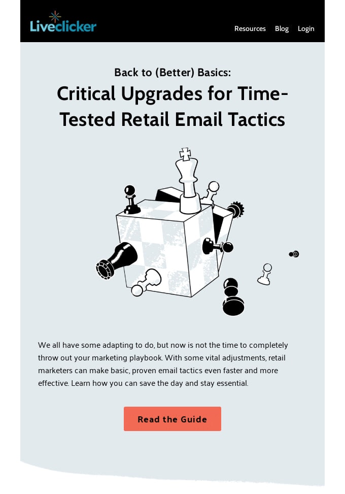
Email Design from Liveclicker
Liveclicker proves to everyone that even a rich media solution can meet email accessibility requirements. Their e-blast has an illustration, photos, and textures. Nevertheless, it still provides users with a comfortable reading experience and AT with all the necessary information.
The team has adopted such best practices in their newsletter as:
- High color ratio for text and buttons.
- Decorative images and graphics without alt text to avoid confusion.
- Headings enclosed in corresponding <H> tags.
- Carefully delineated and left-aligned paragraphs.
- Buttons with descriptive captions.
- The legible typeface with a well-chosen line-height.
- Proper meta content-type and lang attributes.
Smart.
Conclusion
Ensuring email design accessibility does mean to avoid placing barriers in front of people.
Almost 15% of the world’s population some type of disability. Add people facing temporary disabilities, like a hand injury for instance, and you end up with a massive crowd that your company overlooks. In terms of conducting successful email marketing campaigns, it is unacceptable.
The great thing is creating accessible and inclusive email designs is easy. It comes down to some simple changes that most people can do. Spend some extra time adjusting your standard newsletter according to the tips featured in our guide.
These small changes will make a big difference for your company and the entire digital world. When the wall of exclusion does not exist, everybody wins.