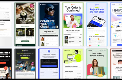
Email Design: The Ultimate Guide with Examples
We are talking a lot about how to create successful email campaigns, featuring guides for every occasion: transactional emails, re-engagement emails, seasonal emails (as summer emails, fall emails, winter emails, spring emails), holiday emails, etc. Here, we are looking at one of the most critical email marketing details: email design. At the heart of each campaign, it should be treated with respect.
Since email marketing is not going anywhere soon, and great expectations lie in store for it, it is vital to understand the basics. Let’s dive into email design, consider essential elements, find out how to build a modern high-converting digital newsletter, and get inspiration from real-life examples.
Why Email Design Matters
We are living in a world with a tremendous amount of information. You can’t expect your audience, no matter how engaged with your brand, to read everything. People do not have time for that. They scan rather than read.
You still need to deliver information. Add to this short attention spans that most adults have, and one small chunk of text is not enough to plead a case. It is here where custom email design comes to the rescue.
With various stylistic solutions, you may transform regular scanning into intelligent scanning and bring home the right message. You can play with reading flow and create a path to feed the audience with information vital for your campaign to thrive.
With Postcards Email Builder you can create and edit email templates online without any coding skills! Includes more than 100 components to help you create custom emails templates faster than ever before.
Free Email BuilderFree Email TemplatesThat’s not all; there are some other good reasons why email design matters.
- It can advocate brand identity.
- It can engage the audience with the brand.
- It can resonate with the target audience.
- It can capture the audience’s attention.
- It can produce a wow effect.
- It can leave a long-lasting impression.
- It can turn users around with marketing tricks.
- It can foist goods.
Custom email design offers a robust foundation for building on and realizing various marketing strategies and tricks.
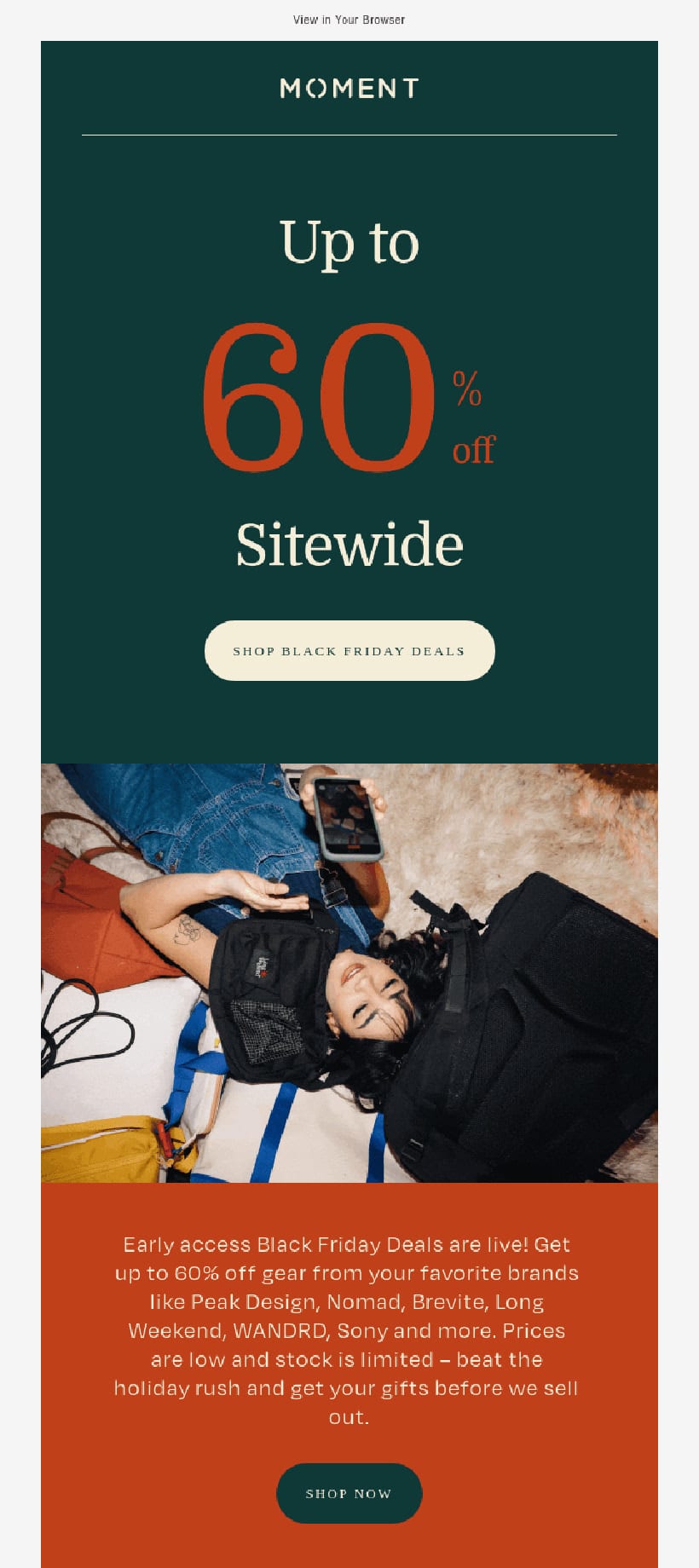
Moment
Create Email Design with Postcards Email Builder [Video]
Postcards email builder is a tool for designing emails that is easy to use and comes with a number of pre-made components to make the process faster and easier. It lets you make different kinds of emails, like promotional, e-commerce, news, and transactional ones.
Postcards makes it easy to make professional-looking email newsletters in just a few minutes. It has an online editor, a project manager, a responsive design, and unlimited features.
Three Main Types of Email Design
Each email campaign requires its type of email design. For example, if you want to send a personal letter from the CEO, you can use plain text email; however, if you’re going to promote best-selling products, you certainly can’t do without rich HTML email.
Let’s consider three common types of email designs along so you can decide which fits your strategy best.
With Pulsetic you’ll be instantly notified the moment your website, API, or server becomes unavailable. Monitor uptime from multiple global locations and respond to incidents before your users are affected.
Create beautiful status pages in minutes to keep customers informed during outages and build trust with transparent communication.
Start Monitoring for Free- Plain Text
- Rich HTML Email Design
- Interactive & Amp Email Design
Plain Text
Plain text email does not need any introduction. It has a simple format. Usually, this kind of email is used in personal correspondence. The pros of using it are:
- Feels personal
- Includes only vital information
- Accessible
- Responsive and mobile-friendly
- Simple to create
There are two main disadvantages. First, it lacks a wow factor. There is no impressive hero area or interactive features that will make it stand out from the crowd. It is just a simple, plain dull digital sheet of paper with text.
Second, it is challenging to play marketing tricks since everything is on the surface. All you have in your arsenal is just text and simple formatting that makes it hard to push customers in your direction.
Rich HTML Email Design
Rich HTML email design looks exactly like a mini landing page. It has a unique structure, images, coloring, beautiful typography, and other extravaganzas. They are made with HTML and CSS. The main pros of this type are:
- Impressive
- Flexible
- Include all sorts of information: images, animated gifs, dynamic effects
- Well-organized and formatted
- Can be accessible
- Can be responsive and mobile-friendly
There are two main disadvantages. The first one lies in an inconsistent display. Email readers, as well as browsers, may display it with some bugs. On top of that, depending on the screen size, your design can be distorted.
The way out is to stick to fully responsive and mobile-friendly solutions and use safe CSS styles and HTML structures that ensure excellent compatibility across devices, email readers, operating systems, and monitors.
The second flaw is that you need design and coding skills to pull it off. Not all modern techniques like Flexbox and Grid work for email. You are stuck with tables that are tricky to handle.
There is a way out. Use an HTML email template generator, Postcards. It has a simple drag-and-drop playground with beautifully designed modules. So that you do not have to code everything from scratch. Just bring your idea to life with the help of more than 100 handcrafted field-tested units that behave great across all devices and email readers.
J.Crew
Interactive Email Designs
Interactive email design is a relatively new kid on the block. It implies the utilization of real JavaScript-based interactive details. It is increasingly impressive and engaging. Unlike other types, it has an influential wow factor that can win over any crowd. Along with AMP emails, it dares to become our new future.
However, there is a significant and barely insurmountable obstacle. For now, the majority of email readers do not support JavaScript. Therefore, you are left with just a small segment of the market that can enjoy it. The same goes for AMP. Although the framework is pretty solid and reliable, it is still not supported by all email readers.
As a way out, you can fake interactivity using animated gifs and CSS-powered dynamic effects, or you can use interactive features that are supported. Alternatively, you can send a fully interactive email provided with a browser version and a less-impressive fallback.
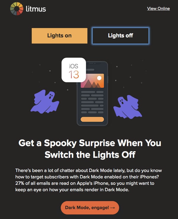
Litmus
Last but not least
Depending on your email campaign’s goal, each category can be broken into other types of email design, such as
- Holiday Email Designs
- Seasonal Email Designs
- Informative Email Designs
- Promotional Email Designs
- Re-engagement Email Designs
- Transactional Email Designs
- Behavioral Email Designs
Key Features of Email Design
Email design can be broken into several key elements that form the pleasant aesthetics and enjoyable user experience. Each of these elements plays an important role in a show. Let’s consider them closely.
Copy
Content is king. However, this king requires a proper entourage to shine. Follow these tips to make it happen:
- Avoid walls of text. Break big blocks into small chunks.
- Use headings of various levels.
- Make alignment consistent.
- Use center alignment for headings, not for text. According to accessibility requirements, it is preferable to use left align text since it is more legible.
- Do not use the decorative typeface for a big block of text.
- Add visuals such as images, icons, and even emojis emails to support the statement as well as make the reading experience pleasant and memorable. You can also add videos, yet be aware that not all email readers can play them.
Structure
A well-thought-out structure ensures a solid foundation for all marketing tricks that you want to pull. Without it, your email design will fail. Therefore, be ready to spend some time on it. Consider these useful tips.
- Separate logical divisions of the layout visually. Even though designing emails differs from web design, nevertheless, they still have many things in common. And with AMP gaining popularity, the audience expects to enjoy mini landing pages in inboxes. Therefore, everything should be well organized and structured. At least, it means that header, central part, and footer should be easily seen.
- Use header for showing brand identity, a link to the browser version, and menu.
- Use email footer for showing contact information with full address and telephone number, helpful links, social media icons, and other ways to reach the support team. It is also here where you need to add an unsubscribe option.
- Stick to a one-column layout. The main reason for that is it makes it much easier to get the information while scanning. Second, it is easier to adapt to various screen sizes, especially when it comes to mobile devices and tablets. Finally, it does not have mixed reading paths making it fully accessible for AT.
- If in doubt, stick to a 600px width layout. Add gaps on sides to prioritize content unobtrusively.
- Use card layout to present information in a clean, organized, and attractive way.
- Alternate textual and visual information to make the reading flow smooth.
- Be careful with white space. Adding room for breathing is essential. However, too spacious email design may ruin the entire user experience. Therefore, make sure the amount of white space creates harmony and contributes to the balance between text and visuals.
Headings
If you want to caption the block of text and give a brief description, you will need headings. Do not use color, typeface, or decorative features for that. Use a heading. Do not overcomplicate things. When it comes to reading, the simpler, the better.
More so, headings are essential for two reasons. They create visual focal points that people who scan or skim can quickly get and headers are essential for AT since they announce a new information block, dividing the reading flow into logical divisions.
Mango
Links
Links should be links. As a rule, links are blue and underlined. If this convention does not fit your color scheme, you can play with stylistic options. However, do not overdo it.
Remember that links should be compatible with AT. Do not make them redundant and overly decorative. They should stand out from the reading flow and be easily accessible through the keyboard.
Calls-to-action
Call-to-action buttons are among the most critical elements in the designing email since they are magnets that open doors to landing pages. They stand behind good CTR. Therefore, they should be prominent.
Peak Design
They should have some traditional design elements. For instance, they should be perfectly outlined. A rounded rectangle is the best solution.
Another important thing to note is the language inside the button. It should have action words to provide context and explain to users what you want them to do. Do not use generic phrases. Make the button specific so that people understand its purpose. It should echo with the offer and be the logical culmination of the story. Personalize your CTA to tailor it to a specific recipient or a segment of subscribers.
Visuals
Visuals are a regular thing. Even though some email readers turn them down, nevertheless, in the majority of cases, pictures will reach the audience.
Images, illustrations, patterns, textures, icons, animated gifs, and even emojis: email design teams use all the weapons in the arsenal. They help engage the audience, hold the user’s attention, and keep everyone interested in the brand, to say nothing about making an impression.
To make them work for you, follow these tips:
- Strike a balance between visuals and text.
- Use visuals to support the content. If you strongly rely on an image to deliver information, make sure it will cater to all people.
- Use human illustrations without ideal shapes to make the email design look tolerable.
- Use abstract or absurd illustrations that give food for thoughts and make the email design look up-to-date.
- Use high-quality photos that look great across all devices.
- Create custom images and iconography to add a touch of personality.
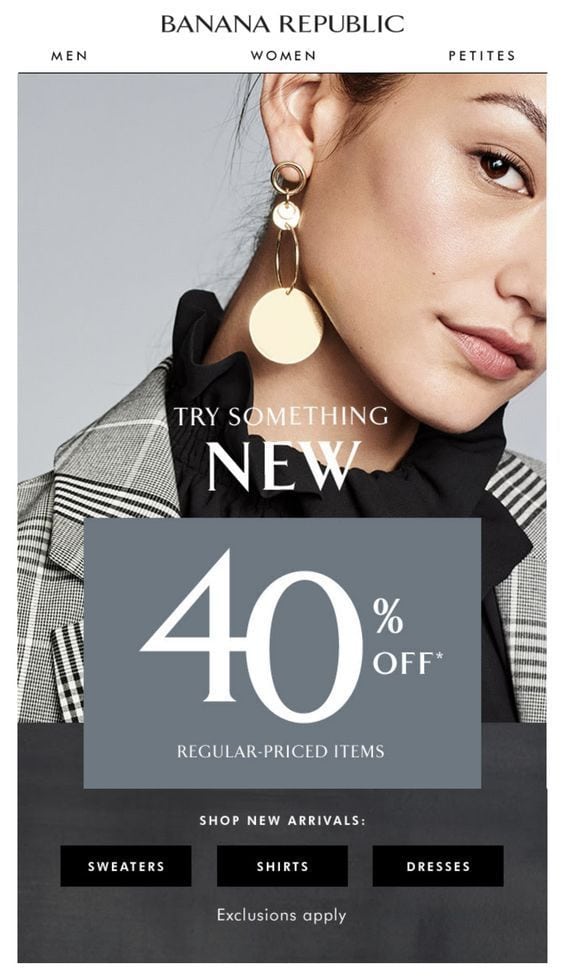
Banana Republic
Color
Each color gives an emotional experience.
- Green elicits peace.
- Blue elicits trust.
- Pink has a female vibe.
- Brown is associated with stability.
- Yellow exudes cheer and friendliness.
- Orange has an energetic punch.
- Red gives an edge to appetite.
You can easily benefit from color psychology in email design. Depending on the customer’s gender and age, current situation, tone, and value of your brand, you may benefit from one or another type of color palette.
For example, pink is excellent for the female audience, whereas blue is great for startup and serious businesses. For action-oriented elements that aim to drive conversions, you may use green, blue, red, and yellow. Though be careful with red since it is also associated with negative actions like danger.
In addition, your color choice may be influenced by the type of email campaign. Holiday and seasonal email designs should be aligned to the occasion. For example, Black Friday emails have black in their core, whereas Christmas newsletters have green, red and white. In those particular cases, these colors generate another gamut of emotions.
Typography
Thanks to Google, we can use various typefaces not only on websites but also in email designs. However, it does not mean you should. Email typography should be carefully chosen.
The main reason you should keep an eye on typography in email design is that it has a considerable influence on aesthetics, user experience, and readability in a small space.
Font families have hidden meanings and bring their gamut of emotions. For example, serif fonts look more elegant and sophisticated while sans serif fonts feel more casual and rustic.
Follow these tips not to ruin everything with the typeface.
- Use sans serif fonts for long text.
- Use custom fonts for headings.
- Stay away from overly decorative typefaces. Use them only for headings where font size allows each character to be legible.
- Use the right size. The general practice recommends setting a font of body copy to the 14-16px size and headings around 20-30px.
- Use the right space between lines. The rule of thumb, it should be 1.5 times bigger than the font size.
- Use the right space between characters. It is crucial for font faces with decorative nature so that each symbol looks legible and understandable at first glance.
- Do not mix more than two fonts. It is customary to use one font for the headlines and another one for text. You can use the third option when you want to add a decorative touch or align the email design with the upcoming holiday giving the overall aesthetics an extra festive flair.
Kate Spade
Brand Identity
Brand identity is your face in the real world and digital expanses. Email design should not be an exception. It should advocate your company and turn regular users into the brand’s evangelists. Besides, it should instantly identify the email in the crowd and separate it from the others. Therefore, such a thing as a logotype is imperative.
Logotype can be enough for most cases; however, when it comes to cultivating strong relationships with the customers and making them feel like they are a part of something big, you need a little more assistant.
It is here where you may take advantage of other brand identity elements. It can be a brand’s coloring, typeface, slogan, or even signature of the CEO placed right at the bottom. The trick is to make the email design look like a reliable, trustworthy, brand-certified tool for communication between the company and subscriber.
How to Write an Attention-Grabbing Pre-Header
An attention-grabbing pre-header email is crucial for improving your email open rates. It serves as a preview, setting the stage for your email content and encouraging recipients to click.
What is a Pre-Header?
The pre-header is like the meta description of a web page, offering a sneak peek at the email’s content. When viewed in the inbox, it’s the text that follows the subject line.
Tips for Crafting a Compelling Pre-Header
- Be Concise and Clear:
- Aim for a length of 40-50 characters to ensure it fully displays on most devices.
- Use straightforward language that complements your subject line.
- Add Value:
- Highlight key benefits or offer a glimpse of a special deal.
- For example, “Unlock exclusive discounts now” is more enticing than “Check out our latest offers.”
- Create Curiosity:
- Pose a question or make an intriguing statement.
- “Are you ready for a game-changer?” piques curiosity, prompting recipients to learn more.
- Personalize It:
- Personalization can increase relevance and engagement.
- Use the recipient’s name or reference their behavior, e.g., “John, don’t miss our summer sale!”
- Test and Optimize:
- A/B test different pre-headers to see which ones perform better.
- Analyze open rates and other metrics to continuously refine your approach.
Examples of Effective Pre-Headers
- “Limited-time offer—save 20% today!”
- “Discover your new favorite outfit inside”
- “Top 10 travel destinations for 2024—find out more!”
- “Don’t miss out on these new features, Jane”
By implementing these strategies, you can craft pre-headers that not only capture attention but also drive higher engagement and open rates.
How to Craft a Strong Subject Line for Emails
Crafting an effective email subject line is crucial because it determines whether your email gets opened or ignored. Here’s how to ensure your subject lines are compelling and engaging:
Be Concise and Attention-Grabbing
Your subject line is your first opportunity to capture your recipient’s attention. It needs to be short and to the point. Aim to convey your message in as few words as possible without sacrificing clarity.
- Example: “Limited Time Offer: 50% Off Shoes!”
Highlight the Value
Tell recipients what they stand to gain by opening your email. Make the value proposition clear and enticing.
- Example: “Unlock Your Exclusive Access to Free E-books Now!”
Create Curiosity
Pique their curiosity by hinting at the contents without giving everything away. Encourage them to open the email to learn more.
- Example: “Discover the Secret to Flawless Skin”
Use Personalization
Personalize your subject lines by including the recipient’s name or other personal details. This makes the email feel more relevant and engaging.
- Example: “John, Your Special Discount Awaits!”
Test Different Approaches
It’s essential to experiment with different styles to see what works best for your audience. A/B testing can be valuable here.
- Humor: “Don’t Open This Email (Just Kidding)”
- Urgency: “Hurry! Sale Ends Tonight at Midnight”
- Question: “Ready to Triple Your Productivity?”
Keep Mobile Users in Mind
Many people check their emails on mobile devices, so make sure your subject line is readable on smaller screens. Aim for 40 characters or less.
- Example: “New Menu Items You Must Try!”
Avoid Spam Triggers
Stay clear of words and punctuation that commonly trigger spam filters, such as “Free,” “Buy Now,” and excessive exclamation marks.
- Avoid: “!!!ACT NOW!!!”
By incorporating these strategies, you’ll craft email subject lines that not only grab attention but also encourage recipients to open and engage with your emails.
Trends in Designing an Email
Be relevant and modern is a recipe for success. Whatever campaign you are running, you have to meet the current requirements and speak the same language as the audience. It means that you should be aware of popular mainstreams and apply them to align your email design with the new realms. Let’s consider three main trends in this area.
Animated Gifs
Dynamic email design is gaining more and more popularity. People crave a diverse and non-static experience. Animated email gifs are one of the safest ways to meet this need.
They are used to entertain readers, reinforce the statement, and of course, compel users to visit the website and buy stuff by skillfully pulling off marketing tricks.
There are several decisive advantages of animated gifs.
- Email readers support them.
- You can assign ALT text so that assistive technologies can read them.
- They are responsive and mobile-friendly.
- There is a sheer diversity of ready solutions. Coming in all shapes and sizes, you can find short and long sequences that will ideally fit your campaign.
- They go perfectly well with CSS-based dynamic effects.
- They are easy to create.
Email Design with Animated gif
Interactive Features
Micro-interactions are a massive trend in website design. It has finally reached the email design sphere as well.
More and more brands try to engage the audience and drive conversions with the help of interactive features. Microsite within consumers’ inboxes is a type of experience that entrepreneurs want to achieve.
Although current email readers are not ready to handle fully interactive newsletters, you can still adopt some tiny details that make the user experience exceptional. CSS animations, hotspots, switchers that change design: there are some exciting and inspiring solutions that are pretty workable.
AMP Emails
Along with a trend of using interactive features in email design, AMP emails is also rising to power. It is a growing trend that promises both marketers and users an exciting user experience inside the mailbox.
AMP for emails is a framework. It aims to add support for dynamic content and interactivity, designing the email to a whole new level. It is all about engaging, interactive, and actionable email experiences.
It should help email marketers to serve dynamic real-time content, let subscribers complete actions from inside the newsletter through a dozen available components like forms, selectors, etc. and offer a rich user experience. It even suggests that you can create games. Sounds fantastic?
However, support for AMP emails is poor. It just does not work in every inbox. In addition, not all ESPs support AMP; it means that you need to find a way to create one by yourself. Performance tracking in AMP emails is uncertain. Without statistics, you will be unable to analyze the campaign and improve it, which is terrible for the overall marketing strategy.
There is a lot to be done before AMP email hits its stride; however, its potential and growing popularity are evident.
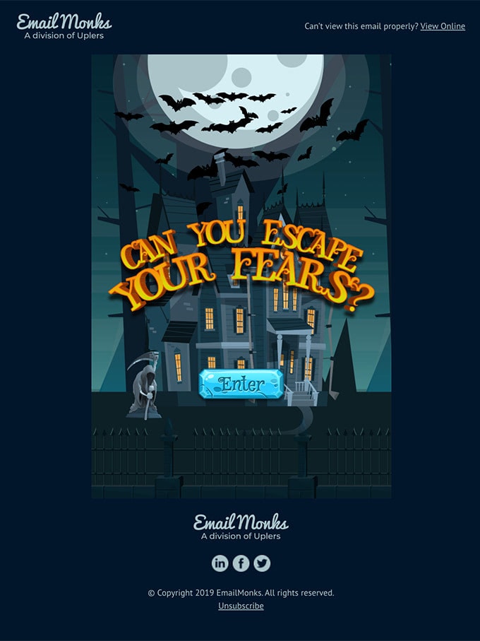
EmailMonks
High-converting email design is a goal for every brand. Let’s consider some general practices on how to create one for your next campaign.
- Focus on the message. The rule of thumb, one message – one email. Therefore, if you want to deliver more information, then use a series of newsletters. Reading content-heavy design is complicated. It won’t bring any actual value. Therefore, focus on one message and make it clear.
- Prioritize content. Keep it short and concise because people have a short attention span. Put important information to the top since it is the most viewed part. Also, accentuate important details through headings, bold typography, color, and space.
- Format text. Use headings, bullet lists, paragraphs, indentations, and alignment to make copy quickly scannable and easily digestible.
- Use an inverted pyramid model to deliver the point. It is simple yet effective. It works exceptionally well for an email with one message. Though, you can safely use it for a newsletter with several messages: just apply it individually for each goal.
- Align email design to holiday or season to play on a positive gamut of emotions.
- Never hide the “unsubscribe” button. Always provide an easy way to opt-out. This will help cultivate good relationships with the customers and keep your subscription list clean and healthy.
- Always add links to the privacy policy, support team, and social media to give customers an instant way to reach your company.
- Make it on-brand. The email design should be an extension of your company. You can align the newsletter to the design of the landing page. This way, you will reach a consistency in the experience that helps to increase trust and credibility.
- Make the design responsive and mobile-friendly to improve email retention across all devices. According to statistics, people adore checking their emails via cell-phones and tablets on the way home. Therefore, your email design should accommodate all the popular screen sizes.
- Make it accessible. It is not only about providing additional information for assistive technologies. It is about providing a comfortable environment for all groups of people. It means that even people who have a bad internet connection should be taken into account. Accessibility covers numerous aspects, including responsiveness and mobile-friendliness.
- Do split tests. Whatever impressive email design you have, it may still fail because it won’t resonate with the target market or particular segment of subscribers. There could be several reasons for that: your colors may not work, images are too dull, the typeface is eligible, or people may not understand you correctly. Therefore, always do A/B tests and analyze the results to modify your CTA, colors, images, layout, and even tone to find the solution that best resonates with the market and converts the biggest number of customers.
J.Crew
How to Create Email Design with Accessibility in Mind
As we have said already, accessibility is of enormous importance. Not only should websites provide a comfortable user experience for all groups of people, but also email designs. The great thing is it is relatively easy to achieve. Consider these simple tips to make your digital newsletter inclusive.
- Create an optimal contrast. According to specifications, your email design should comply with level AA standards. It means that the contrast ratio should be at least 4.5:1.
- Use safe colors. Avoid red and green to communicate the meaning since people can be color blinded. Avoid red and blue since they do not play well together.
- Create a balance between visuals and text.
- Do not solely rely on images. Avoid text in images.
- Use whitespace to create a comfortable reading flow.
- Stick to a reasonably large font size. It is highly recommended to set the font for body copy to 16px so that letters are legible on small screens.
- Set ALTs for images. If images are purely decorative, then omit ALTs.
- Set roles for tables so that email readers know how to treat them properly.
- Use animated gifs with caution since blinking and flashing may be very bad for a particular group of people.
- Avoid center-aligned and justified paragraphs.
- Avoid content-heavy designs.
- Make buttons clickable and easily tappable.
For more information check out our article Email Design Accessibility: Why It Is Important to Improve It.
Popular Ways of Creating Design for Emails
Predictably, the first way to create email design is to do everything by yourself. Much like with the website, you need to create a wireframe, draw the design in Photoshop or Sketch, and code it with HTML and CSS. That sounds like a lot of work. Well, yes. On top of that, creating everything from scratch requires both design and coding skills that looks like a job for real professionals.
Though do not worry. There are two time-proven and pretty enjoyable ways out.
Ready-Made HTML Email Templates
The first way out is to use ready-made templates.
There is a ton of hand-crafted email templates that can be used for personal and commercial purposes. They fit various occasions and can benefit any campaign. They are an excellent option for those who are not picky about the design and are ready to mess with code to change dummy content and introduce some adjustments to fit the brand identity.
Check out our fantastic email templates to get a head start in your next campaign.
Drag-and-Drop Email Builders
The second way is more progressive. Drag-and-drop email builders are lifesavers. You do not need design and coding skills since you have a collection of hand-crafted modules right at your fingertips and an intuitive playground to let your imagination run wild.
You can create any email design by choosing the desired component from the collection and arranging it the way you see it. You can alter all details, including color, background, typography, and images. It is handy, cost-effective, and time-efficient.
Drag-and-drop builders can be found in ESPs. Almost every popular provider offers customers a playground for building a template from scratch by dragging and dropping elements. However, there are some flaws.
First, they are limited in terms of modules and functionality. Second, they lack full compatibility. Third, they are pretty generic since as a rule there are no stylish features or interactive elements.
To overcome these issues, you can try third-party email builders, like Postcards.
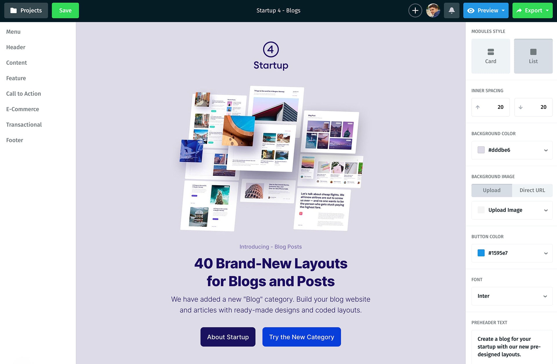
Postcards comes with 100 stylish field-tested modules (menus, call-to-actions, e-commerce elements, hero area, footers, transactional components, lists, etc.) that are responsive, mobile-friendly, and browser compatible. It also offers a direct preview, cloud image hosting, project management, and version history. On top of that, you can export the result right into Mailchimp email templates, HubSpot, or HTML/ZIP. Neat.
High-Converting Email Design Examples
Let’s consider some good email design examples taken from the popular brands so that you can get some helpful cues on how to realize everything said above in a real situation.
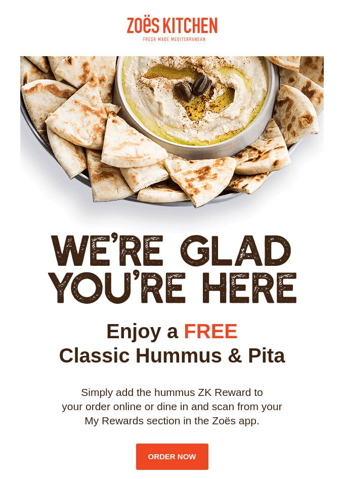
Promotion Email Design from Zoes Kitchen
The first one in our collection is an email design from Zoes Kitchen. It is a classic promotion newsletter with one message that benefits from an inverted pyramid model and minimal styles.
The first thing that strikes you is a huge yummy image that ignites appetite. The second element is an announcement of the offer that plays on emotions evoked by the hero area. In the end, there is an eye-catching call-to-action button that directs readers exactly to the selling page.
Note, the team uses a beautiful custom typeface for the title. Thanks to the immense size, all the letters look legible. Also, this typeface reinforces the restaurant theme.
The email design is compact yet straight-to-the-point and eye-pleasing.
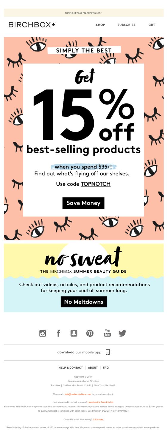
Birchbox
The email design from Birchbox promotes best-selling products and maximizes the current marketing campaign. Predictably, the brand uses an offer with a discount to drive traffic to the website and generate leads.
Although the newsletter has two messages: offer and guides, nevertheless, the first one is skillfully accentuated. Therefore, it gets the lion’s share of attention.
Note the design. The team plays with a vibrant pattern and overly decorative font. However, everything works here. The pattern is used as a background, whereas typeface is set to a large size and used only for headlines. The offer has a solid foundation thanks to a generous amount of white space and a relatively big size. Therefore, decorative elements play their initial role without interfering with the offer.
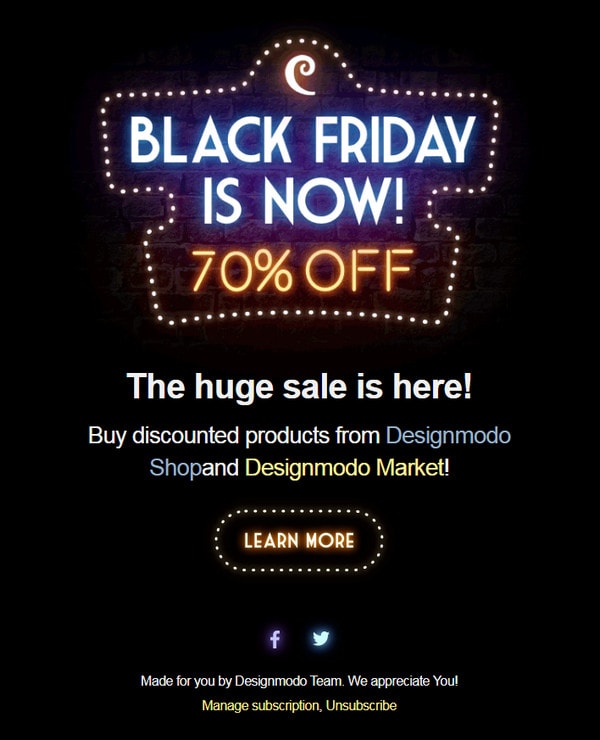
Designmodo
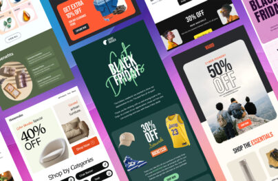
Black Friday is a golden retail opportunity that nobody wants to miss. Although the event speaks for itself and does not need any special introduction, it is still highly recommended to play along with it and bring the festive atmosphere to the customer’s inboxes to capitalize on the event. Designmodo, with its unique BFCM email design, shows this in practice.
The newsletter is minimal, yet it has it all. There is a fantastic offer that occupies the upper part to catch the user’s eye instantly. There is a prominent call-to-action that you want to tap immediately. And, the terms of the sale are clarified, so everything is fair and square. Again, we can see an inverted pyramid model in action.
As for an atmosphere that gets everyone into a festive mood and compels customers to visit the website, the team has nailed it. Beautiful black mode screams about the most significant retail event of the year. The blinking offer draws attention to the discount and gives the design an outstanding dynamic vibe. The coloring and graphics stand behind a beautiful festive aesthetics.
Everything is perfect.
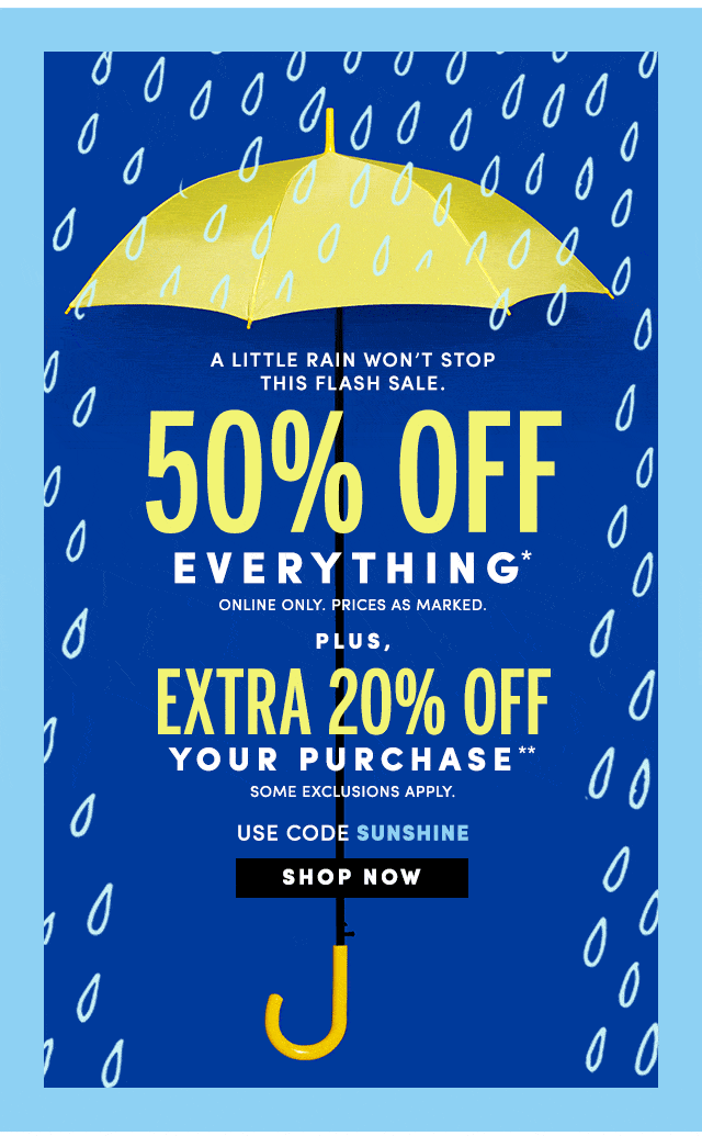
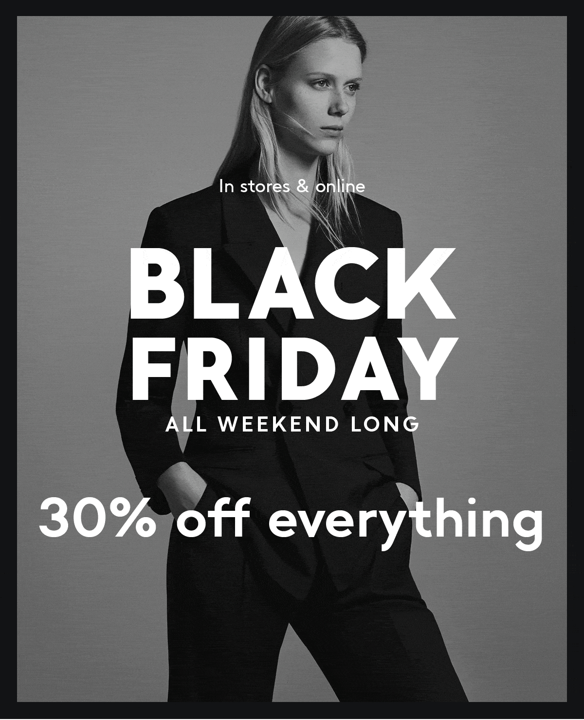
J.Crew Factory
J.Crew Factory is famous for treating the target market with original email designs. It is a strategy that pays off. This newsletter is a case in point. It drives traffic to the website without much effort.
This email design is about a flash sale. All you can see here is an offer and its terms. Again, the team employs an inverted pyramid model, where skillful play with typography and formatting does all the heavy lifting. On top of that, the team sticks to the golden rule: one message – one email. Therefore, there is no confusion. Everything is crystal clear.
Note the design; the team uses a powerful blue and yellow pair that creates a positive gamut of emotions with a businesslike hint. The primary typeface is sans serif: the numbers look exceptionally good and monolithic. The animated gif used as a background is the icing on the cake. The newsletter is exceptional.
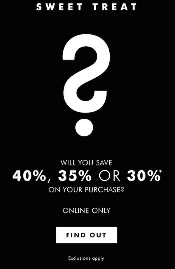
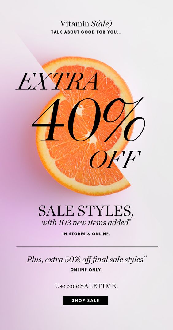
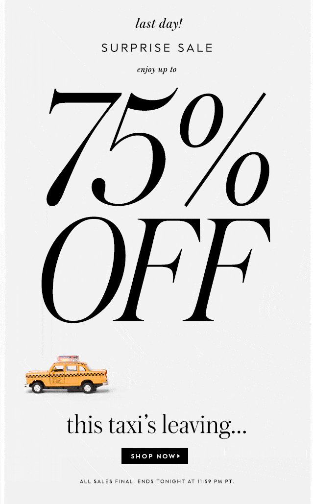
Mystery
Mystery email design is one of the most powerful marketing tricks. Can you resist the temptation of hitting this button and find out what waits for you? I bet you can’t. The team is brilliant in this campaign. The newsletter is increasingly oversimplified, but it skillfully tugs the heartstrings of the user. Question mark on the top and the announcement of mystery discount that ranges from impressive 40% to well-received 30% instantly appeal to human nature.
Note the design. It is increasingly minimalistic: lots of white space, a small block of text, classic black-and-white coloring (that, by the way, ensures the best color contrast you may have), traditional typography, and simple shapes. Here, everything works toward the primary goal, aka generating leads.
Adobe
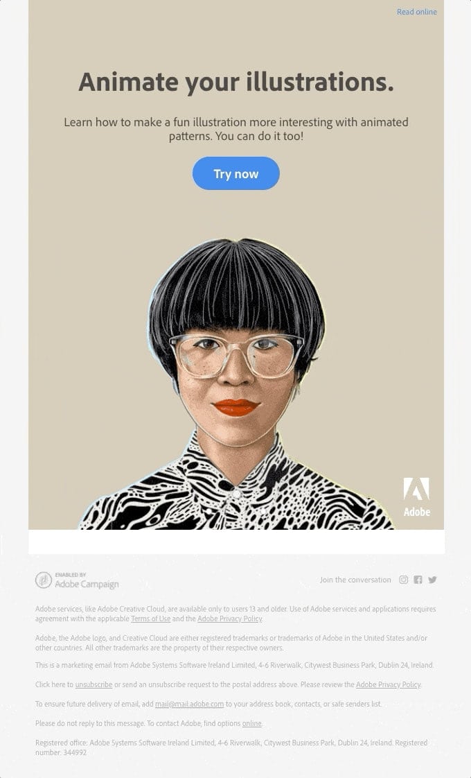
Unlike the promotion email design from Zoes Kitchen, this one does not have any special offer or discount. It is a more informative email rather than a marketing one. All it does is advocate the new feature of the product. Yet it does it brilliantly.
It is a compact newsletter design with minimal stylistic solutions. However, it is enough to make a statement and promote the brand-new option.
The team gets straight to the point right from the get-go.
They do not clutter the email with unnecessary information.
They stick to accessibility requirements providing the main image with alt text, thereby covering various groups of people
Most importantly, they demonstrate the new functionality in action with an animated gif.
There are just three focal points that readers with short attention span get: “Animate Your Illustrations,” call-to-action “Try Now,” and an animated gif. Smart.
Bonobos
Much like the previous email design, this one also takes advantage of one of the biggest trends, animated gif. However, unlike Adobe’s newsletter, where it plays a supporting role, here it runs the show.
The animated gif cycles through different patterns. Sticking to a comfortable pace, it promotes the diversity and the beauty of the new collection. The idea is brilliant. It instantly ignites interest, luring readers in. Although it is not recommended to rely solely on visuals nevertheless, with alt text, you can make it happen.
Note the overall composition. The team employs a clean black background that gives way to the bright animated gif. The call to action is a big white rectangle that draws the attention unobtrusively. The text block is quickly scannable so you can get an actual message within seconds.
This email design represents minimal modern solutions where the wow factor is achieved with an animated gif.
Well-played.
Conclusion
Whatever grandiose strategy you have, without a well-thought-out email design, it will fail. Email design plays a crucial role in the success of your campaign. It is not just a simple poster-like solution with an offer; it is much more than that. It should echo with your brand, unobtrusively accommodate marketing tricks, bring value, and resonate with the audience. More so, modern tendencies dictate it to have beautiful aesthetics and a great user experience. Therefore, it requires your undivided attention and the best email design tools in the market.
Follow our guide and get inspiration from real-life examples to design an email that will convert users into real leads.