Adding Social Proof to Your Website with Client Logos & Press Mentions
One huge concept that many designers overlook on their landing pages is social proof.
This can come in the form of user reviews, testimonials, or bigger companies vouching for your website. You can accomplish this in many ways but one web design trend I’ve seen a lot is recommended logos and press mentions.
It’s a very small idea but can go a long way towards building trust with your visitors.
Let’s look into this trend and see how you could apply this to your own projects.
Add Brands That Everyone Knows
First and foremost, you need brands that people trust. That’s the whole idea behind social proof.
You want to add logos onto your page that people recognize and will say “if they use this website then it MUST be good”.
With Postcards Email Builder you can create and edit email templates online without any coding skills! Includes more than 100 components to help you create custom emails templates faster than ever before.
Free Email BuilderFree Email TemplatesTake a look at the SatisMeter homepage and see if you can find the “happy customers” logo section.
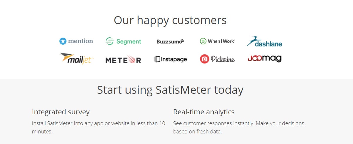
How many of those companies do you recognize? You may not personally use any of them but I’d argue that you know at least a couple.
The value of a well-known logo is that it grabs attention. If you claim to have customers from big brands like Walmart that’s even better than smaller tech companies.
Just make sure your claims are truthful and not made-up. That can get you into some trouble.
One other example I really like is this landing page for Digital Painting Academy.

If you scroll down you’ll see they don’t promote companies that have used the site. Instead they mention instructors/teachers who have worked with larger companies.
Those companies include game studios like Blizzard, or animation studios like Warner Bros.
With these kinds of brands visitors will be pre-sold on the idea of learning art from a Blizzard concept artist. And that’s exactly the kind of social proof you want.
With Pulsetic you’ll be instantly notified the moment your website, API, or server becomes unavailable. Monitor uptime from multiple global locations and respond to incidents before your users are affected.
Create beautiful status pages in minutes to keep customers informed during outages and build trust with transparent communication.
Start Monitoring for FreeMake Them Clear Yet Unobtrusive
When you’re adding these logos onto your page you certainly want people to see them.
But you don’t want them to be annoying or to interrupt the user experience. It’s a careful line to walk to make this happen but it works out very well.
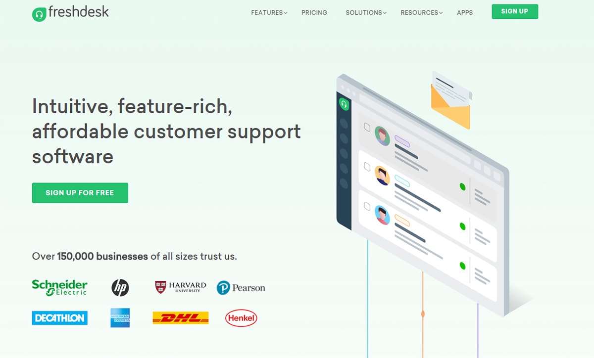
On Freshdesk they have a little block just above the fold with a list of brands that trust their services.
You’ll notice the logos are pretty small but still definitely recognizable. Hewlett-Packard and Harvard University are two notable examples.
If you want something a little larger you can design a full horizontal section of the page just for logos. Digital Ocean does this on their homepage.

Notice the logos don’t take up a massive amount of space on the page. But they’re still definitely in view as you scroll.
Find a way to strike a balance with any logos you add into your design.
Blend The Logo Colors
One way to find a nice balance with your layout is to add logos that blend in.
Many websites restyle logos so they match the color of the page or the background. For example Invstr uses a dark purple section for the “press mentions” logos and the logos are colored monochrome to match.

This way they blend naturally into the page and don’t stick out like a sore thumb.
Yet as you’re scrolling by they’re still clearly noticeable. A great balance to hit if your page uses simple colors.

On the InVision homepage they use greyscale icons to blend with their neutral colors.
This is pretty simple to accomplish in Photoshop if you find a PNG/SVG of each company logo online.
Just import that into PS and change it to grayscale, then export for your page. Simple!
You’ll find a very similar example on the Campaign Monitor landing page.
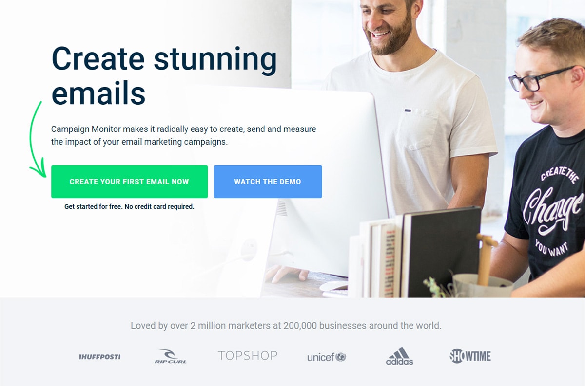
What you do with these logos and how big they are will remain up to you.
Just find a way to blend them into your page and you’ll surely wind up with a great looking design.
Add Press Mentions
For most of this post I’ve recommended brands that either pay for your service, recommend your service, or work closely with your service.
But another way to approach social proof is to add press logos whenever your company gets mentioned on a big news site.
Take for example the GiftRocket page near the footer. You’ll find a bunch of press logos from sites like Mashable and Bloomberg.
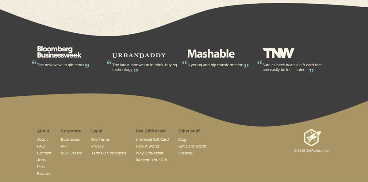
This type of social proof can radically affect people’s perceptions of your website. If Mashable cares enough about your site to mention it inside an article then you know it’s doing something right.
Crello has something similar with a list of website logos and the header text “Featured On”.
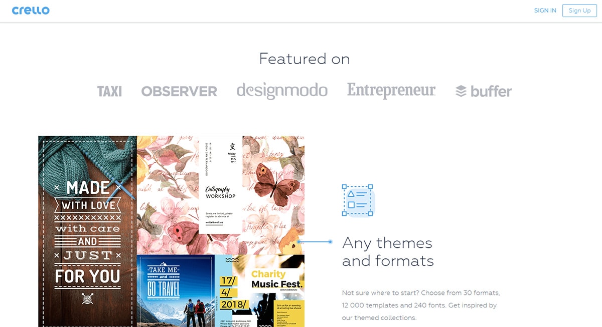
One thing they do right is linking directly to the article that mentioned Crello.
This is a great way to prove to visitors that the news site actually wrote about the product. I’d say this is almost mandatory if you want to add press mentions onto your page and build trust.
Also notice how Crello uses the blending technique I mentioned earlier with all these logos as grayscale. Smart move.
Keep an eye out for this kind of strategy on startups or landing pages you visit.
You’ll be surprised how many designers add logos of news sites, big businesses, or investor logos for adding social proof into their design.
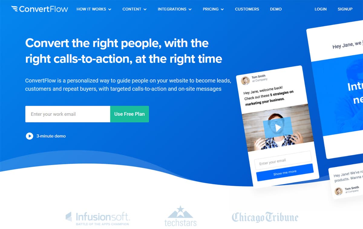
If you have similar relationships with larger companies I absolutely recommend doing the same.
And it doesn’t hurt to reach out to editors and see if any will cover your new project. Just don’t be annoying about it—many writers get these kinds of requests on a daily basis.
Moving Forward
I hope you can see why social proof would be so powerful. It’s one of the best additions you can make to any page for improving trust and ideally your conversion rate.
Take these ideas with you into future web projects and see if you can work some logos into your own landing pages.
