Examples of Hidden Menus in Website Design
Use of a Navicon is a web design trend that forces us to take a look at navigation menus, their place in design and role in user experience. Although the concept does not diminish its significance and importance of navigation, it can provide designers and developers with more creative freedom.
Navicons vary depending on the project, though the majority gives preferences to the more stylish, simple, mobile-inspired three-line icon that looks sleek and subtle in almost every environment. The small icon can be used to hide both small and complex, content-heavy menus.
Enhanced by extra dynamic features for accompanying opening process or tiny catching effects, the primitive glyph can improve the design. What is more, not only can it be equally applied to various types of navigation — clearly conveying the message — but also helps to solve issues in terms of responsiveness and facilitate integration with mobile websites.
The list below consists of fresh examples of website designs that make a choice in favor of hidden menus paired with navigation icon.
eWebDesign
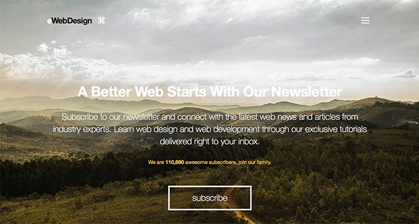
In this example, we see a great image background and parallax effect. The menu icon is coated in the right corner of hero header and it opens a very detailed navigation menu to other sections.
With Postcards Email Builder you can create and edit email templates online without any coding skills! Includes more than 100 components to help you create custom emails templates faster than ever before.
Free Email BuilderFree Email TemplatesSampedro
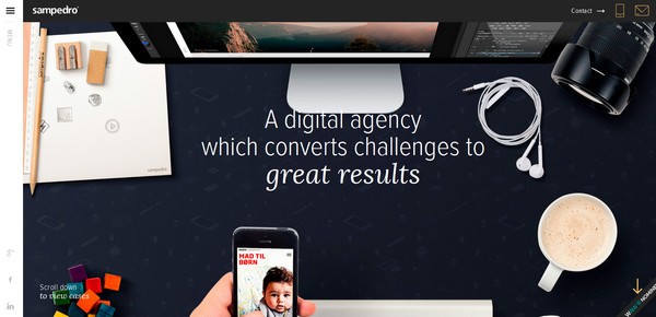
With a trendy hero image placed on the header section and a witty slogan, nothing should distract user attention from this appealing and powerful tandem. Hidden navigation is an ideal solution that unobtrusively shifts emphasis from navigation to complex background.
Chapoleone
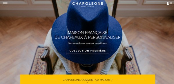
Chapoleone counts on a splendid photo background that exudes an image of luxury and exquisiteness. Here comprehensive navigation will destroy the whole impact, so slide out menu hidden behind a small glyph placed in the upper left corner fits like a glove.
Maecia
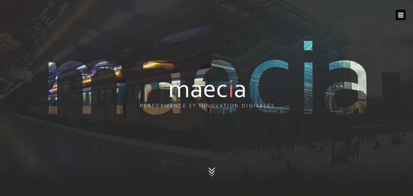
Maecia entices any rubberneck into the project with its alluring dynamic and sophisticated background. In order to not let online visitors get confused and lost, the home page includes a hidden navigation that opens on the first click of the mouse.
We are Empire
We are Empire shows that the minimalist design based on a classic coloring and plenty of white space can look fantastic and intriguing. Here, hidden navigation is a perfect match that finishes off the whole look.
With Pulsetic you’ll be instantly notified the moment your website, API, or server becomes unavailable. Monitor uptime from multiple global locations and respond to incidents before your users are affected.
Create beautiful status pages in minutes to keep customers informed during outages and build trust with transparent communication.
Start Monitoring for FreeBrand Junkie
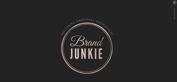
A gorgeous circular retro style logotype catches the eye from the first seconds, dragging all the attention on itself. The navicon is ideally blends with the environment, so it is hard to find it right away, though after several seconds it finally strikes the eye.
Intelart
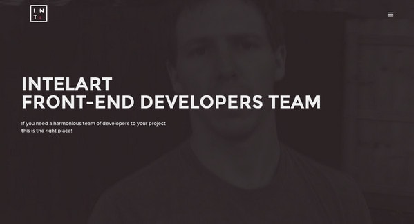
Intelart has a fantastic dark front page that boasts of an ideal contrast between background and foreground. Here, the seamless hamburger button that marks the upper right corner ideally echoes with the logotype and typography, pleasantly revealing a sophisticated photo-based navigation.
Monograph
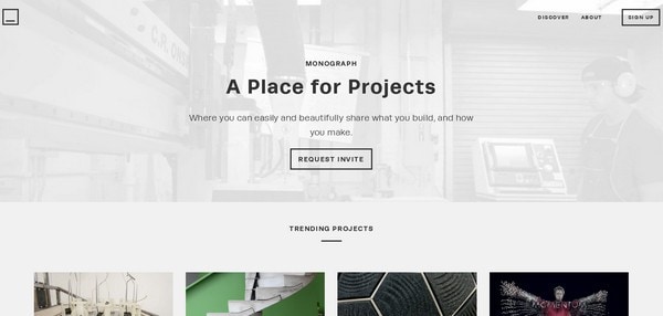
Monograph features a navicon that does not look at all like a habitual three horizontal stripes button, though such interesting realization helps it to become an integral part of the environment, ideally matching the composition.
Camp David Film
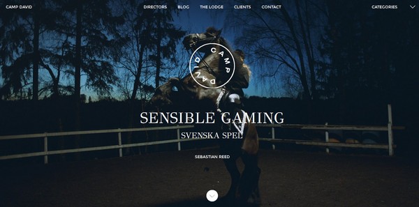
Although the primary navigation takes its rightful place that is in the header, however, the team wisely hides the secondary navigation. The latter lets explore the project through categories, saving lots of space and giving extra room for showcasing spectacular photo.
Michael Villeneuve
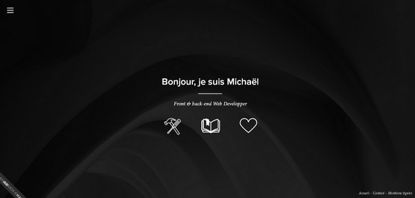
Michael Villeneuve opts for a more simplistic feel that undoubtedly plays into its hands. Combining together nifty contour graphics, visually-appealing tiny animations, and clean solid color backdrop enables to create an amazing and unique user experience.
Exit Film
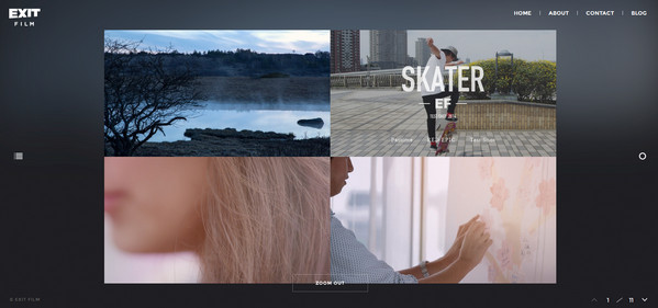
Exit Film is based on a centered layout that is considered to be a fresh whiff in the web design trends. The hamburger button occupies a central position and stays in perfect harmony with an unorthodox page setup.
La Ligne Rouge
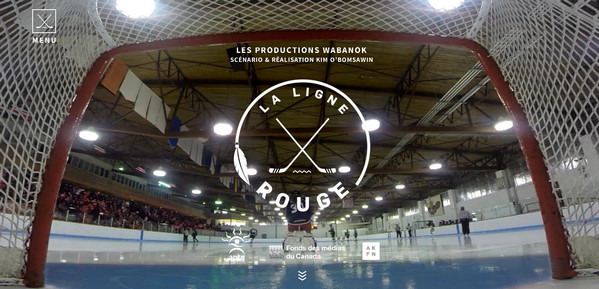
Here, the navicon is aimed to complement the whole design as well as strengthen the impression. Featuring well-crafted hockey steaks that excellently echo with the logotype, the button fits into the home page and makes its important contribution.
Xander
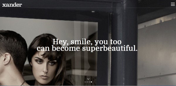
Online audiences certainly won’t suffer from the absence of the primary navigation and won’t feel sad and boring mainly thanks to picturesque photos, demonstrated through the full-screen image slider. The hidden menu is an excellent choice.
Tannbach
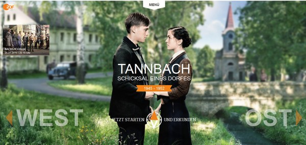
Though the utilization of hamburger button lets you become a part of the mainstream, yet you can always resort to the time-proven way of hiding menu under a simple drag-to-use panel. Tannbach uses such a solution. Nevertheless, it does not lack in interactivity or exquisite. The front page looks matchless due to spectacular photo background skillfully marked by some dynamic navigation elements.
Cofa Media
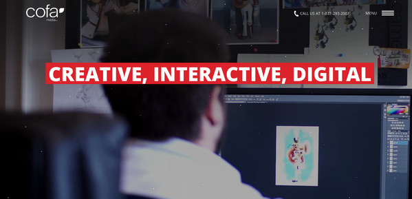
Cofa Media attracts users with its intriguing video background that depicts the workflow of the agency. A slightly elongated hamburger button subtly uncovers the main navigation that takes up the whole screen for better user experience.
Alt_Cph14
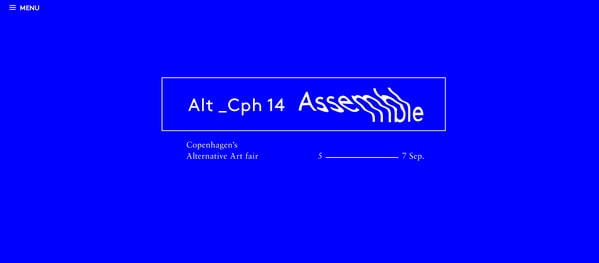
Alt_Cph14 has one of a kind look that certainly captures the attention. The digital-inspired design spiced up with some matching glitch effects, and distinctive blue monochrome backdrop creates a vivid impression. The simple and primitive hamburger button goes perfectly well with the whole theme.
Ball&Claw
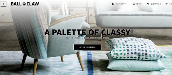
Ball&Claw shows off an exquisite interior bolstered by refined graphics, subtle typography and classy color scheme. The navicon is perfectly tuned with the home page design, giving its touch of elegance.
Hooch Creative
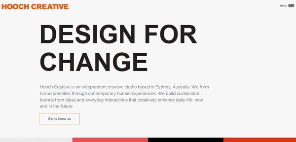
Getting rid of all visuals from the front page enables the copy to shine off, occupying a leading position. The tagline certainly has a massive visual weight in such an unremarkable environment. The menu icon serves as a subtle compliment.
Sam Dallyn
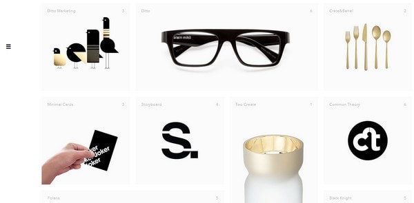
Sam Dallyn capably directs users’ attention to its portfolio pieces. The grid style, centered layout certainly does its job perfectly well, stressing the visuals enormously. Everything looks refined and sophisticated, even tiny hamburger button that is barely noticeable on the left sidebar closely corresponds to the design line.
The First 50 Years of Bose
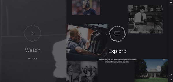
The front page is neatly split into two sections that are activated by mouse click and charged with animated controls. The hamburger button, which provides online readers with a solid and contrast panel, stays slightly invisible for a naked eye, yet quite essential for the whole composition.
Demodern
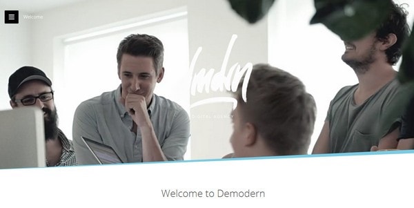
Demodern has a distinctive and eye-catching navicon that stands in a sharp contrast to the video backdrop thanks to a black canvas. Moreover, it has a lovely geometric nature that lets the menu neatly match the home page design and provide users with an excellent readability.
Conclusion
Navicons perfectly complement and enrich different website designs. Whether it is a portfolio, where the aim is to focus attention on the work, or regular company website, where the copy holds the reign, it certainly occupies a particular niche.


