Best Website Designs from Japan
An atmosphere of harmony, integrity and serenity is highly prevalent in Japanese-based website designs.
Even if the project gets its flawless appearance from extravagant visuals or is driven by ultra-modern features or dynamic effects that should add some chaos and upset the consonance, it still strikes the perfect balance between content and design. This results in an impression that every element is an integral brick of the composition.
This togetherness and placid look can be related to urban understanding of zen that establishes a peaceful and relaxed atmosphere. Such projects, with almost an ethereal general feeling, offer a truly exquisite user experience.
These 20 fresh examples from talented web designers/developers should provide you with clear idea of particularities inherent to Japanese sites.
Best Japanese Websites
Kenji Saito
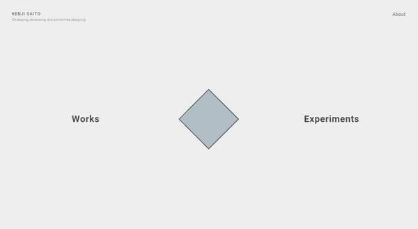
Kenji Saito shows visitors the whole power hidden in HTML5/CSS3/JS. The personal portfolio of this skilled developer is filled with fantastic experimental works that can convince anybody that the artist is “like a duck to water” in this area.
With Postcards Email Builder you can create and edit email templates online without any coding skills! Includes more than 100 components to help you create custom emails templates faster than ever before.
Free Email BuilderFree Email TemplatesExit Film
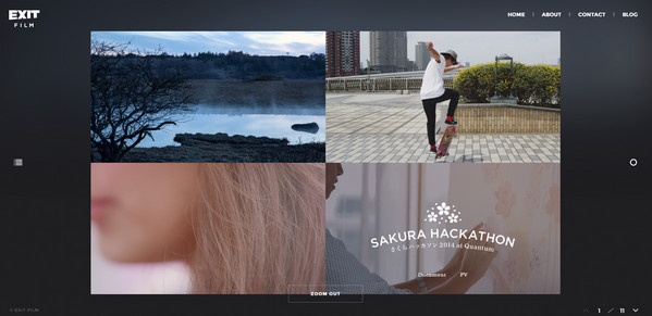
Exit Film is managed to put four short videos on the radar screen of regular users in non-intrusive manner. The elegant fixed centered layout teamed up with a dark solid background, tiny graphics and delicate typography gives a strong visual impact and at the same time, doesn’t overwhelm visitors.
Satoshi Kuroda
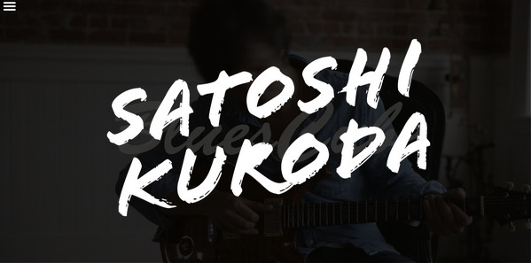
The first thing that you notice is splendid brush typography that beautifully excels from the backdrop. Not only does the lettering highlight the creative nature of the artist, but also serves as a powerful decorative element that finishes off the whole appearance.
Kenji Endo
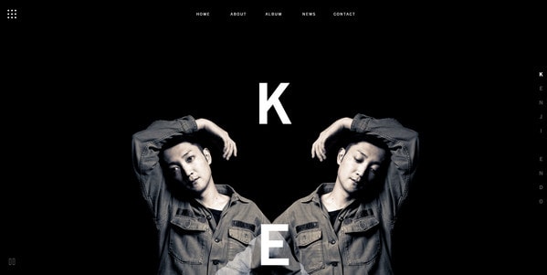
The official website of Kenji Endo capably shows the artist. The classy color combo of black and white builds the aesthetic, blessing the project with an eye-popping and memorable look. In addition, spiced up with some tiny complementary effects, the website causes positive vibrations.
Gakuten
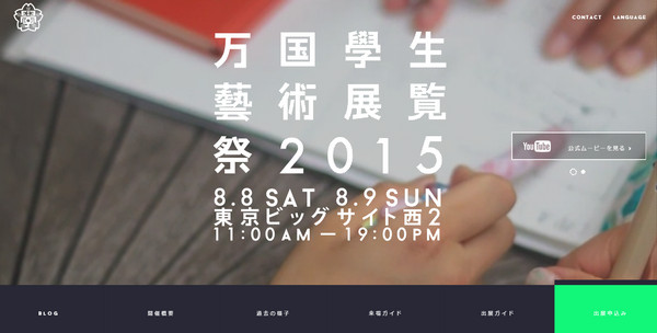
Gakuten is a summer art festival that imposes its bright personality on its official website, tightly connecting it to the event. The home page, as it should be, presents spectacular photos, team members and crucial information for those who want to take part in the event.
With Pulsetic you’ll be instantly notified the moment your website, API, or server becomes unavailable. Monitor uptime from multiple global locations and respond to incidents before your users are affected.
Create beautiful status pages in minutes to keep customers informed during outages and build trust with transparent communication.
Start Monitoring for FreeSanga Ryokan
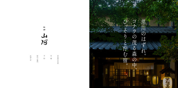
Sanga Ryokan has a magnificent online portfolio with a powerful Japanese atmosphere. While the design of the landing page is slightly reminiscent of yin and yang due to a skillful background differentiation, the realized technique of modular scrolling lets users scan each column individually, beautifully splitting the website in two parts.
Hys-inc
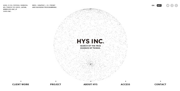
Hys-inc goes for a more clean, pure and pristine appearance that certainly strikes the eye and easily contrasts foreground elements. The artist balanced graphics, content and animations neatly in order to enrich the website and clearly demonstrate its sphere of expertise.
Koto-bana
If you are in search of some pioneering concepts or innovative ideas delve into this website. Koto-bana is a fantastic gallery that is able to give a significant boost to your inspiration. Using modern techniques, it draws flowers from words. It is interesting and engaging.
Lexus
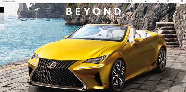
Beyond knocks your socks off with its mind-blowing photo background that sets the tone to the innovative one. The online magazine skillfully combines serenity of seascape and luxury of Lexus car, featuring a truly dramatic picture that like a magnet attracts visitors’ eyes.
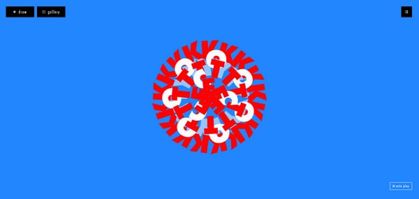
Don-guri
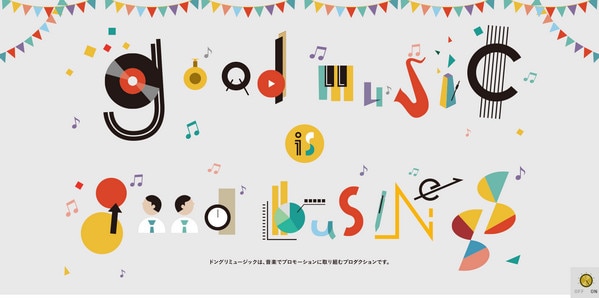
Don-guri offers an excellent way to waste several minutes. The music-inspired project charges the atmosphere of your office with positive emotion, lightens the mood, takes your troubles away and certainly makes your day. It charms not only by its original idea but also by bright and joyful realization.
Hanatsubaki
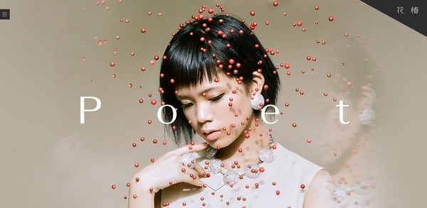
An impressive photo manipulation gives the website a sense of personality and exudes an image of stately beauty. Although the custom photography takes the central stage, the perfectly-balanced design is based on an agreed tandem between angular blocks and modest coloring for a strong effect.
Howlt
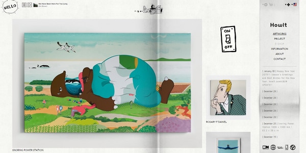
The designer skillfully mixes together doodles and animations that easily separate the personal portfolio from the others and allow it speaks for itself. The cartoon theme throws the spotlight on the artworks without a hitch as well as adds to the website creativity and artistry.
Fabrik
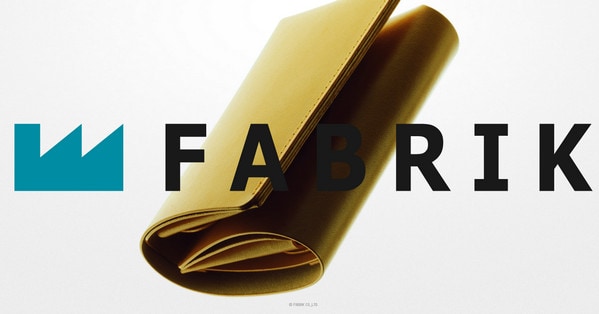
The artist prefers to go straight to the point and demonstrate the fabrics in the best possible light with the help of gorgeous close-up images. Thanks to light coloring, rigid layout and plenty of breathing room, the product has naturally become the focal point.
Kobaphoto
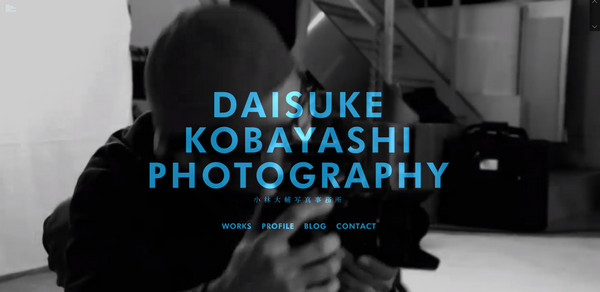
Kobaphoto is a personal portfolio, where images speak on behalf of the photographer. Typography and navigation do not distract from the masterpieces, smoothly shifting the focus to the visuals.
Don-guri Magazine
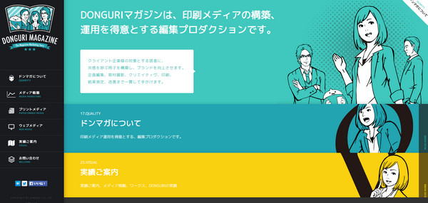
This is another project from don-guru team in our collection that deserves attention. It makes the most out of one of the most iconic elements of modern Japanese culture – anime. It does not include vibrant animations, however it is made in a juicy and distinctive style that certainly sparks interest.
Letters
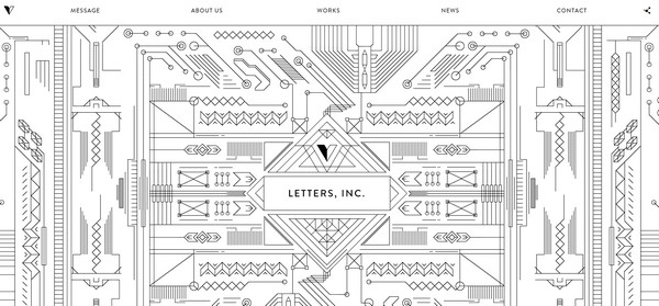
The monochrome, delicate line style graphics enlivened by tiny accompanying effects brightens up the home page of Letters.inc. The similarity with grotesque posters of “Great Gatsby” adds to the landing page a note of exquisite beauty.
Ondo
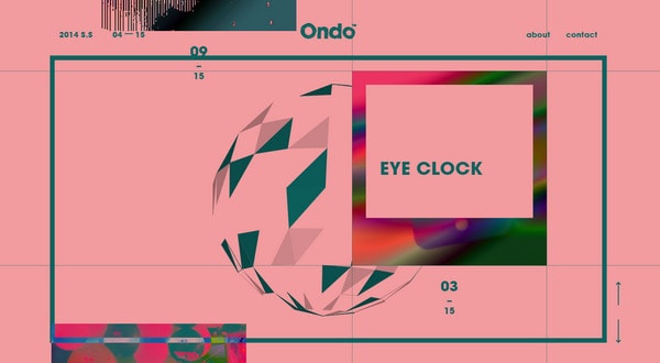
Ondo has a home page design that certainly stays off the beaten track. Unconventional color schemes, fancy animations and peculiar components evoke mixed feelings, which are able to carve out a niche in users’ minds.
Midori Aoyama
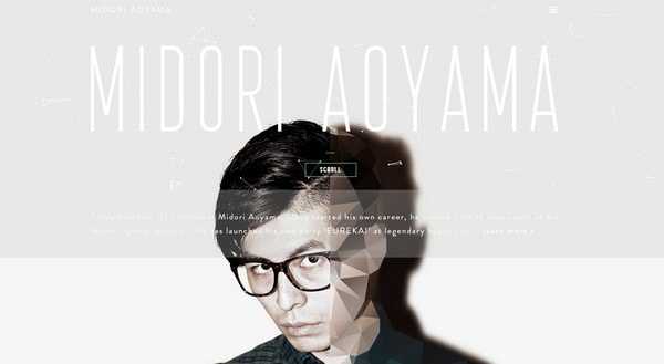
Midori Aoyama charged his personal portfolio with a high-tech energy. Each element contributes to the theme: delicate typography, ghost buttons, vivid backdrop and even self-portrait with a beautiful low poly illustrated touch.
Herbal Bises
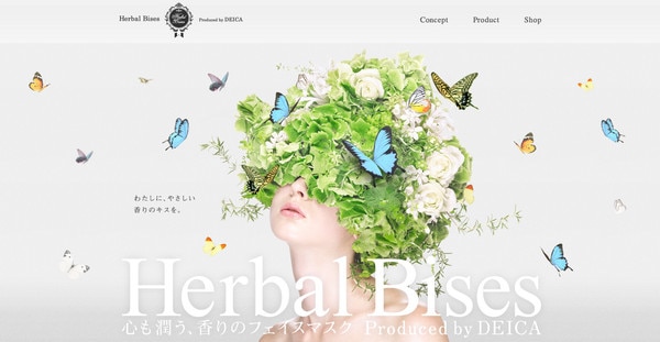
The home page of Herbal Bises is marked by an incredible photo manipulation that reflects an undeniable sense of naturalness. The lavish centerpiece not only gets the whole attention but also maintains a harmony and enriches the design.
RedBull
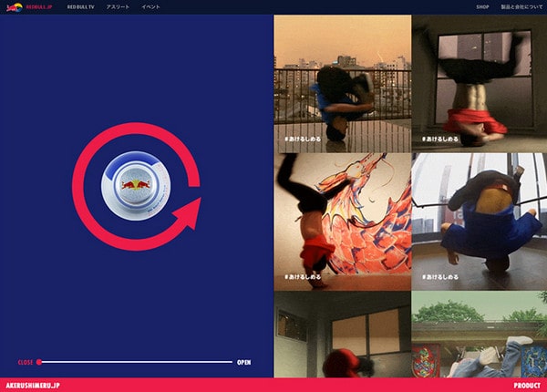
The artist turns to modern solutions in order to effectively handle multimedia, liven up the content, strengthen the brand and provide the website with an incredible user experience.
Conclusion
Japanese artists feel absolutely comfortable with high-end techniques and current trends. While a sense of compositional coherence and harmony saturates every project, the user experience takes these projects to the next level.


