How to Create a Responsive Image Slider in jQuery and CSS3
Difficulty: Intermediate
Estimated Completion Time: 30 mins
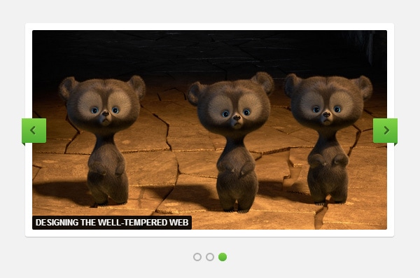
Today we will code a responsive image slider from the Impressionist UI. We will code it using the FlexSlider plugin for the functionality and style it using CSS3. I hope you will enjoy it and find it useful for your projects. Lets get started!
STEP 1 – Markup
The slider html markup is very simple. We’ll create a <div> with the class “flex-container”, then inside of this <div> we will add another one with the class “flex-slider”, in this div will be placed all the slider controls. To finish we will create an unordered list to add all the slides. Each slide needs to be inside of a list element.
<div class="flex-container">
    <div class="flexslider">
        <ul class="slides">
            <li>
                <a href="#"><img src="img/slide1.jpg" /></a>
            </li>

            <li>
                <img src="img/slide2.jpg" />
            </li>

            <li>
                <img src="img/slide3.jpg" />
                <p>Designing The Well-Tempered Web</p>
            </li>
        </ul>
    </div>
</div>
Next we’ll include the jQuery library and the FlexSlider plugin. To load the slider include the following code, you can set the settings there too, for more setting visit the plugin website.
<link rel="stylesheet" href="css/slider.css" type="text/css">
<script src="https://ajax.googleapis.com/ajax/libs/jquery/1.8.1/jquery.min.js"></script>
<script src="js/jquery.flexslider-min.js"></script>

<script>
$(document).ready(function () {
    $('.flexslider').flexslider({
        animation: 'fade',
        controlsContainer: '.flexslider'
    });
});
</script>
STEP 2 – Basic Styles
First, we will add some reset styles to clear all the margins, paddings, etc. and keep consistency trough all browsers.
.flex-container a:active,
.flexslider a:active,
.flex-container a:focus,
.flexslider a:focus  { outline: none; }

.slides,
.flex-control-nav,
.flex-direction-nav {
	margin: 0;
	padding: 0;
	list-style: none;
}

.flexslider a img { outline: none; border: none; }

.flexslider {
	margin: 0;
	padding: 0;
}
Then we will hide the slides to avoid jumping of the images during the page load. We will also set some styles for the images.
With Postcards Email Builder you can create and edit email templates online without any coding skills! Includes more than 100 components to help you create custom emails templates faster than ever before.
Free Email BuilderFree Email Templates
.flexslider .slides &amp;gt; li {
display: none;
-webkit-backface-visibility: hidden;
}
.flexslider .slides img {
width: 100%;
display: block;
-webkit-border-radius: 2px;
-moz-border-radius: 2px;
border-radius: 2px;
}
To finish this step we will add some styles to clear the floats from the slides.
.slides:after {
content: &amp;quot;.&amp;quot;;
display: block;
clear: both;
visibility: hidden;
line-height: 0;
height: 0;
}
html[xmlns] .slides { display: block; }
* html .slides { height: 1%; }
STEP 3 – Container Styles
For the container, we will set the background color to white and add a small shadow using the CSS3 property “box-shadow”. Then we will add 10px padding and the rounded corners.
.flexslider {
	position: relative;
	zoom: 1;
	padding: 10px;
	background: #ffffff;

	-webkit-border-radius: 3px;
	-moz-border-radius: 3px;
	border-radius: 3px;

	-webkit-box-shadow: 0px 1px 1px rgba(0,0,0, .2);
	-moz-box-shadow: 0px 1px 1px rgba(0,0,0, .2);
	box-shadow: 0px 1px 1px rgba(0,0,0, .2);
}
I’ve set a minimum and maximum width for the slider. You may need to change it or remove when implementing on your project. We will set the zoom property to 1, this will avoid resizing on mobile browsers.
.flex-container {
	min-width: 150px;
	max-width: 960px;
}

.flexslider .slides { zoom: 1; }
STEP 4 – Next and Previous Arrows
For the next and previous buttons we will add a green CSS3 gradient, set the width and height, etc. To align the buttons vertically, we need to position them 50% from the top and add a negative margin, half of the button width.
.flex-direction-nav a {
	display: block;
	position: absolute;
	margin: -17px 0 0 0;
	width: 35px;
	height: 35px;
	top: 50%;
	cursor: pointer;
	text-indent: -9999px;

	background-color: #82d344;
	background-image: -webkit-gradient(linear, left top, left bottom, from(#82d344), to(#51af34));
	background-image: -webkit-linear-gradient(top, #82d344, #51af34);
	background-image: -moz-linear-gradient(top, #82d344, #51af34);
	background-image: -o-linear-gradient(top, #82d344, #51af34);
	background-image: linear-gradient(to bottom, #82d344, #51af34);
}
The arrows will be added using the “:before” pseudo-selector. This pseudo selector allows us to include some content without adding a new tag in the html. To create that ribbon effect we will use a border trick to easily create shapes using only CSS, this shapes will also be included using a pseudo-selector, “:after”.
.flex-direction-nav a:before {
	display: block;
	position: absolute;
	content: '';
	width: 9px;
	height: 13px;
	top: 11px;
	left: 11px;
	background: url(../img/arrows.png) no-repeat;
}

.flex-direction-nav a:after {
	display: block;
	position: absolute;
	content: '';
	width: 0;
	height: 0;
	top: 35px;
}
To finish the buttons will add the rounded corners, position them to right and left and add the “triangles” that will make the ribbon effect.
.flex-direction-nav .flex-next {
	right: -5px;

	-webkit-border-radius: 3px 0 0 3px;
	-moz-border-radius: 3px 0 0 3px;
	border-radius: 3px 0 0 3px;
}

.flex-direction-nav .flex-prev {
	left: -5px;

	-webkit-border-radius: 0 3px 3px 0;
	-moz-border-radius: 0 3px 3px 0;
	border-radius: 0 3px 3px 0;
}

.flex-direction-nav .flex-next:before { background-position: -9px 0; left: 15px; }
.flex-direction-nav .flex-prev:before { background-position: 0 0; }

.flex-direction-nav .flex-next:after {
	right: 0;
	border-bottom: 5px solid transparent;
	border-left: 5px solid #31611e;
}

.flex-direction-nav .flex-prev:after {
	left: 0;
	border-bottom: 5px solid transparent;
	border-right: 5px solid #31611e;
}
STEP 5 – Slider Controls
The slider controls are the little circles at the end of the slider that allows you to click on a slide. We’ll position this container at the bottom of the slider. Then we will create the circles using the “border-radius” and “box-shadow” property. For the active slide circle we will remove the box shadow and add the same CSS3 gradient that we used on the buttons.
.flexslider .flex-control-nav {
	position: absolute;
	width: 100%;
	bottom: -40px;
	text-align: center;
	margin: 0 0 0 -10px;
}

.flex-control-nav li {
	display: inline-block;
	zoom: 1;
}

.flex-control-paging li a {
	display: block;
	cursor: pointer;
	text-indent: -9999px;
	width: 12px;
	height: 12px;
	margin: 0 3px;
	background-color: #b6b6b6 \9;

	-webkit-border-radius: 12px;
	-moz-border-radius: 12px;
	border-radius: 12px;

	-webkit-box-shadow: inset 0 0 0 2px #b6b6b6;
	-moz-box-shadow: inset 0 0 0 2px #b6b6b6;
	box-shadow: inset 0 0 0 2px #b6b6b6;
}

.flex-control-paging li a.flex-active {
	background-color: #82d344;
	background-image: -webkit-gradient(linear, left top, left bottom, from(#82d344), to(#51af34));
	background-image: -webkit-linear-gradient(top, #82d344, #51af34);
	background-image: -moz-linear-gradient(top, #82d344, #51af34);
	background-image: -o-linear-gradient(top, #82d344, #51af34);
	background-image: linear-gradient(to bottom, #82d344, #51af34);

	-webkit-box-shadow: none;
	-moz-box-shadow: none;
	box-shadow: none;
}
STEP 6 – Captions
We’re almost there, let just add some simple styles for the captions. Set the background color to black with a little bit of transparency using the rgba color mode. Then we will position it at the bottom of the slides.
With Pulsetic you’ll be instantly notified the moment your website, API, or server becomes unavailable. Monitor uptime from multiple global locations and respond to incidents before your users are affected.
Create beautiful status pages in minutes to keep customers informed during outages and build trust with transparent communication.
Start Monitoring for Free
.flexslider .slides p {
	display: block;
	position: absolute;
	left: 0;
	bottom: 0;
	padding: 0 5px;
	margin: 0;

	font-family: Helvetica, Arial, sans-serif;
	font-size: 12px;
	font-weight: bold;
	text-transform: uppercase;
	line-height: 20px;
	color: white;

	background-color: #222222;
	background: rgba(0,0,0, .9);

	-webkit-border-radius: 2px;
	-moz-border-radius: 2px;
	border-radius: 2px;
}
Conclusion
This is the end of this tutorial. I hope you find it useful and have learned something new from it. Feel free to use this slider on your next project or personal website. Don’t forget to follow us for more articles, tutorials and quality resources. Enjoy!


