Typography is Loud: Type-Focused Front Pages
We are no longer talking about typography only in the context of characteristics of the typeface such as size, weight and style that are aimed to display text; it means much much more.
It is an art with a broad range of possibilities, which not everyone is able to handle competently. In the right hands it works wonders. Paying attention to typography in website design never gets old and always stays relevant, and this year list of web design trends has proved this once more, featuring large type.
From websites with gorgeous typography to those that feature well thought out matches of fonts, typography is a powerful designer tool. Today’s collection is dedicated to trendy websites with fonts that are “loud.”
Stugoo
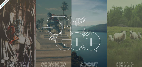
Using matchless typography is an excellent way to naturally call the attention to the logotype, spice up the page design and add a subtle touch of creativity. The massive, smooth splashy type inspired by water bubbles wonderfully collaborates with muted environment, giving the front page an elegant feel.
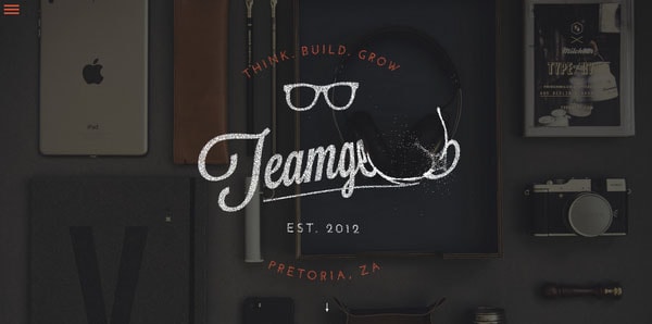
Teamgeek
With Postcards Email Builder you can create and edit email templates online without any coding skills! Includes more than 100 components to help you create custom emails templates faster than ever before.
Free Email BuilderFree Email TemplatesThe developer vividly demonstrates how to get the most out of fresh type techniques. Not only does the artist mark the front page with a top-notch stylish badge-style logotype, that looks manly without feeling brutish, but also enriches it with interactivity.
Rightmove
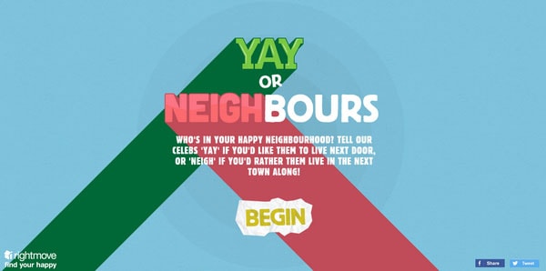
The website depicts marvelous cartoon-style typography that extends from the background. A fully illustrated environment ideally complements the tagline, putting the content on the center stage. As a result, the homepage evokes positive emotions and creates a friendly atmosphere.
St. Louis Browns
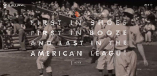
Typography with a semi-transparent appearance and coloring plays into the design of this website. Typography effectively accompanies a dramatic image background, blends with the composition, and at the same time, does not lose significance.
Thunderdome
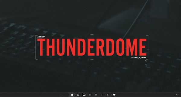
Thunderdome adopts a fresh take on minimalism, giving the landing page a neat, yet visually appealing appearance. A strong color scheme, plenty of white space, tiny solid graphics and a muted image backdrop enable a relatively massive tagline to stand out and “speak” loudly.
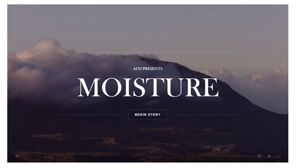
Moisture
With Startup App and Slides App you can build unlimited websites using the online website editor which includes ready-made designed and coded elements, templates and themes.
Try Startup App Try Slides AppOther ProductsThe website with its picturesque background exudes a stately image of natural beauty that produces an overwhelming impression. Despite such an overpowering effect, the main phrase catches the eye and becomes a centerpiece of the page. A solid, subtle font pairs with well thought out choice of weight and size lets text stand in a stark contrast to the canvas.
The Wanderlust Storybook
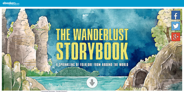
This is another example of website design that owes its magnificent appearance to a mind-blowing background. This time, ingenious lavish watercolor-esque illustration brightens the backdrop. Nevertheless, the tagline takes the lead position and conveys the necessary messagedue to the boldness of the type.
C2
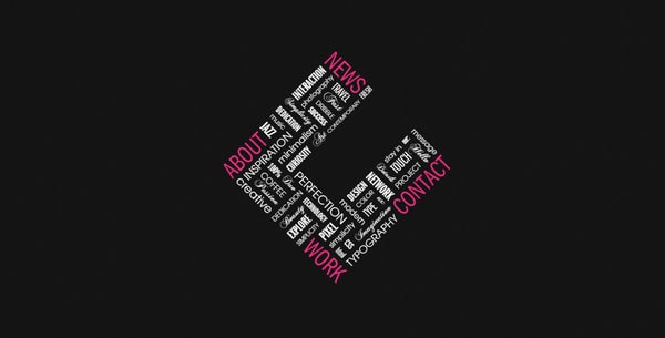
This agency demonstrates how to creatively kill two birds with one stone. The front page of C2 depicts a unique and elaborate arrangement of words that form a splendid typographic piece. It serves as an extraordinary navigation and at the same time as a logotype. Here the type gathers everything together like a puzzle and allows nav links to sound.
Ape Unit
Ape Unit skillfully takes advantage of minimalist concept, opting in favor of clean, monochrome backdrop, tiny navigation and, of course, a welcome message. The latter, thanks to emptiness of the page, stands out a mile.
RC
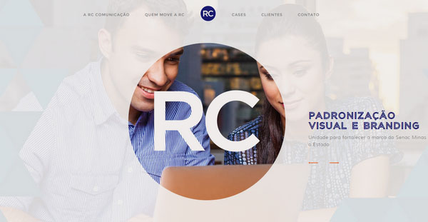
The artist leverages some tricks in order to enhance the typography and make it emphatic. Skillfully using light semi-transparent overlapping screen with an obvious focal point in the center, the author achieves the desired result.
Jean Baptiste Calzia
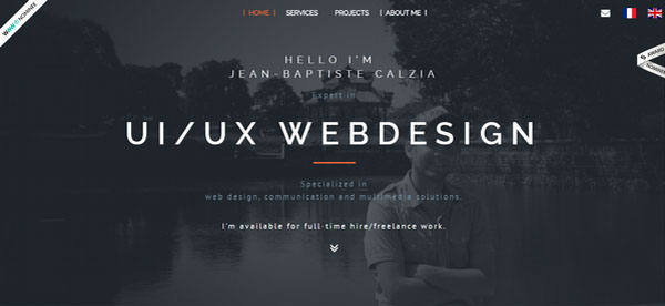
The designer lays great emphasis on the welcome message, making the type scream the greeting. Use of a classic color scheme in tandem with a dark background effectively stresses the content and reflects the point.
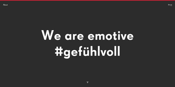
Pixelundcode
![]()
Much like the previous example, a black-and-white color palette does all the heavy lifting, elegantly highlighting the greeting and making the type almost shout at you. This time white plays the first fiddle, naturally separating the bold, huge, black tagline from the backdrop.
51North
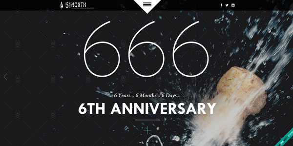
Ominous “666” just can’t pass unnoticed, especially when they take up a center position and create the whole buzz. Of course, the first thing that catches the eye is these three digits. However, rest of the content grabs the attention as well.
Liechtenecker
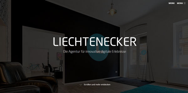
The home page strikes an optimal balance between a dark, subtle backdrop and smooth font. This factor lets the nameplate resonate. The artist achieves a subtle sense of harmony that leaves a favorable first impression.
Melanie DaVeid
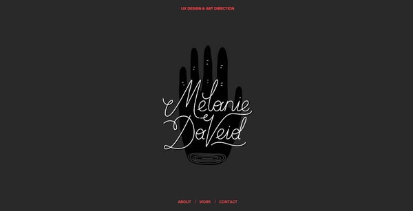
Not only can bold or massive type sound loud but also refined, sophisticated and ultra-thin can do the trick, of course, when correctly presented and surrounded by a proper environment. The landing page of Melanie DaVeid’s personal portfolio is a typical example of this. Sleek, delicate hand-written type simply resounds.
FiberSensing
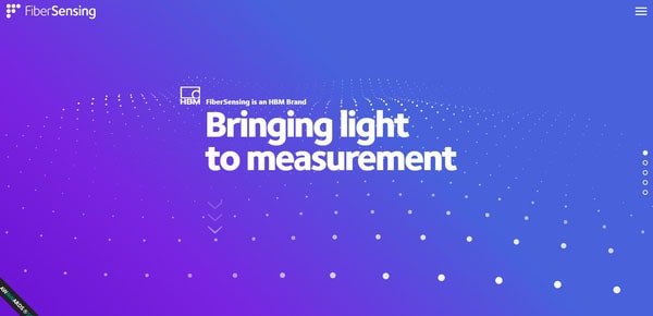
The front page capably balances an interactive background with static foreground, giving the website a fantastic and first-rate appearance. The designer succeeded in mixing a dynamic canvas, gradient and smooth solid type where the latter forces the tagline to look impressive.
Uni Sapon
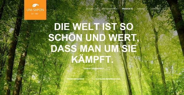
A spectacular landscape background gives enough prominence to the welcome message, clearly demonstrating that the regular typography can also do the trick. The typeface naturally maintains the user’s focus on a key statement and sounds just mighty.
The Crumpled Ball
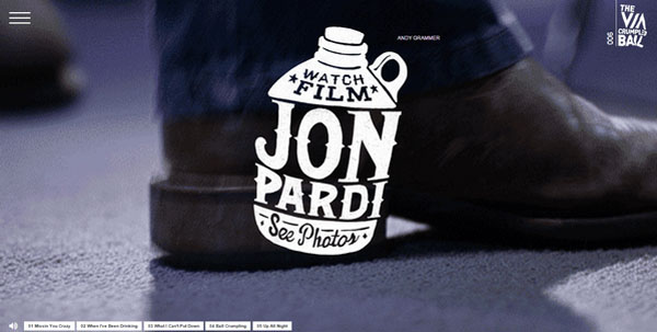
The Crumpled Ball has a serious personality produced by an outstanding badge-style logotype with a lovely retro touch. It shows the spirit and the attitude of the project as well as reflects the concept. Here each font is worth attention.
La Dogana Food
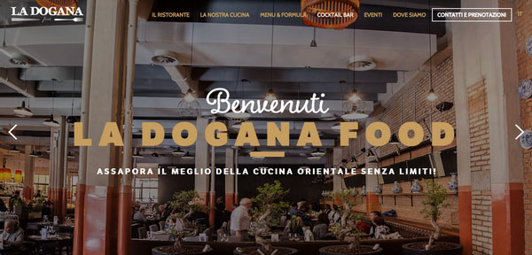
La Dogana Food goes for a more traditional route in order to make the type speak loudly. Soft, bold massive type enriches the homepage and looks straightforward to users.
The Dilla Dimension
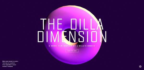
This example is quite controversial in our list since because of a dynamic, constantly moving background with a bright three-dimensional shape rendering the nameplate. However, one thing you can say for sure, it certainly grabs your attention.
Conclusion
Bold, grunge, massive, elegant, outline, sharp, hand-written, and of course, artistic: There are tons of ways to make typography appear to be loud without feeling overwhelming.
If you have another great example that fits into our collection, share it in the comments.


