Touch of Perfect Shape Website Designs Featuring Circular Navigation
A perfect, some say ‘divine’, shape of a circle always captured the attention of designers that got used to sharp, hard-edged rectangular forms of buttons, frames of images, and columns that are quite often can be found in website layouts. Generally, the round shape is used as an ornament that assists to provide a contrast or vice versa merges elements with the whole design. But with a rapid development of touch screen technologies this form has got new practical possibilities.
It is widely considered that a circular navigation can be easily and more quickly perceived and recognized by a human that is making it an optimum option for small mobile screens as well as for various responsive layouts. So nowadays, this kind of navigation has more than just a simple ability to decorate a website.
Today we take a glance at modern website designs that obtain substantial benefits from using circular navigations.
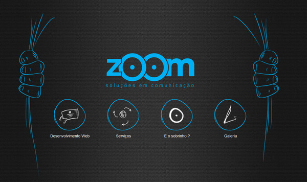
Zoom is a clean dark one-page website that is based on a 3-color palette and neat outline graphics. The latter nicely cooperates with patterned background with a slight scabrous touch. The small oviform navigation fits like a glove.
Ochre Media also resorts to using hand-drawn elements that give the website a bit of personal human touch. Sketchy achromatic icons, which properly placed on light grey circular backgrounds, perfectly set off from white canvas and easily accentuate attention on a main navigation.
With Postcards Email Builder you can create and edit email templates online without any coding skills! Includes more than 100 components to help you create custom emails templates faster than ever before.
Free Email BuilderFree Email Templates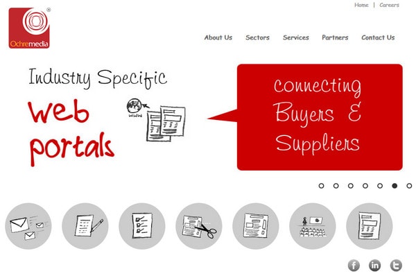
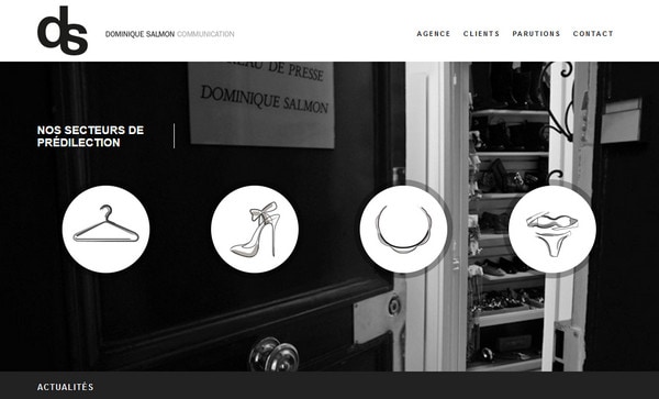
Dominique Salmon Communication has a nice fashion vibe that is substantially complemented by 4 huge circles with garment-inspired icons, which serve as sorting tags for the ‘Client’ section.
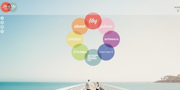
He and She Photography. The front page has a wonderful circular atmosphere. The designer utilizes circle not only as a main shape for logo and social media icons, but also for a basic menu, ably decorating it in all the colors of a rainbow, and adding a soft note of urban grunge effect. The intersecting semi-transparent circles with various fonts nicely supplement picturesque background.
Alcyon Communication’s home page looks refined and enigmatic due to skillful combination of low opacity layers and black-and-white color palette. The website easily guides the user’s eye to a light almost transparent circle – on the center of the screen – that serves as a background both for logotype and menu. A set of small regular white glyphs nicely collaborates with it.
Mosne. Here, the circles are the main part of the layout and functional mediums that help to select showcased projects. Made in muted colors, they wonderfully interact with a light clean background and attract viewers’ attention by means of small animations that imitate vibrations.
With Pulsetic you’ll be instantly notified the moment your website, API, or server becomes unavailable. Monitor uptime from multiple global locations and respond to incidents before your users are affected.
Create beautiful status pages in minutes to keep customers informed during outages and build trust with transparent communication.
Start Monitoring for Free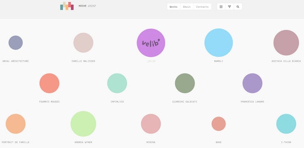
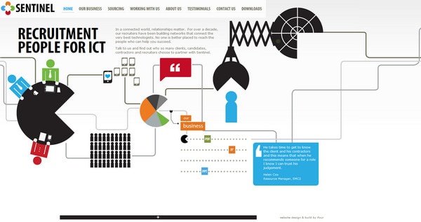
Sentinel. Here the menu takes up a whole space, and is based on interconnected with each other vector graphics. Each detached element leads to an inner page. Although menu items – that have a unique immediately recognizable shape of a ‘Pac Man’ – don’t have an original round form, it is still a part of a circle shape.
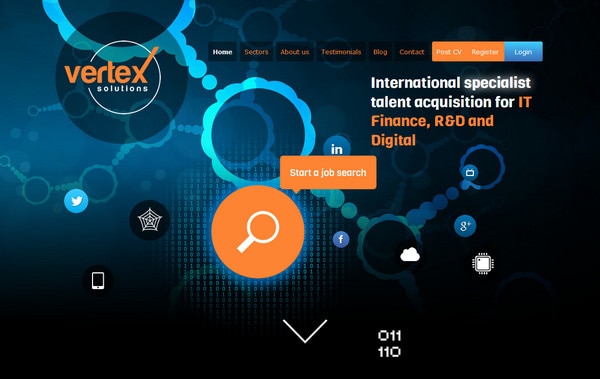
Vertex Solutions has an intricate and unique header that is aimed to provide users with an essential functionality. An offbeat illustration, which demonstrates a peculiar chain of circles, looks vivid and energetic due to a contrasting and bright blue-tone gradient, and also ably represents helpful links hued in complementary orange color.
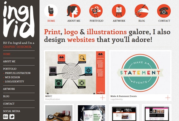
Ingrid Kool-Clarke gets the feel of a personality mainly from its exceptional menu and quaint logo. She capably displays main sections of the website through neat vector illustrations that are filled with symbolism.
Carbon Studio features a subtle and interactive menu that employs bubble-like and circular shapes in tandem with simple understandable icons. The blue-tone color palette in conjunction with a smooth liquid animation of the central circle firmly establishes a sense of serenity and appeasement.

Duotones has a tightly packed home page that comprises both visible and unobvious rectangular shapes. The use of quite huge outline circles helps to pinpoint essential links.
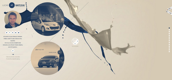
Lucas ‘NK’ Nikitczuk. Here, you can find circles all over the whole design. The designer leverages round social icons, set of tiny white circles for shifting between sections, and relatively huge circles that are personified by soft images for showcasing portfolio items.
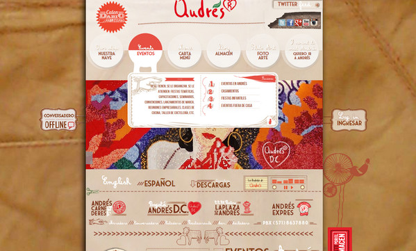
Qudres is a definitely design-heavy website that enthralls users with its rich variety of textures, graphical elements and numerous complementary letterings spiced up with illustrative doodles. Although the top navigation is not clearly apparent at first sight, it suited the whole composition perfectly.
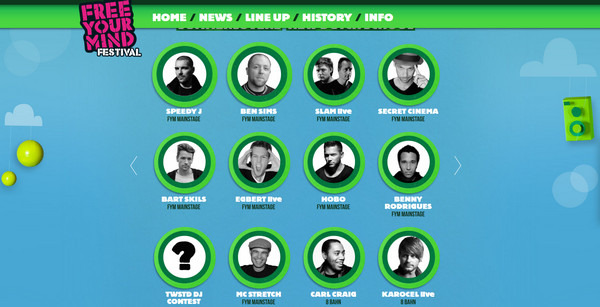
Free Your Mind Festival. Here, the designer utilizes a circular shape both as a medium for directing onlookers’ attention to participants of an event, and also as a tool that helps to fit pictures into design.
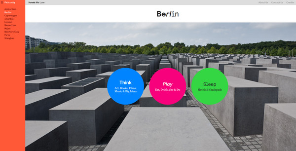
Hotels We Love. The website gives you an opportunity to choose various capital cities and explore them in 3 proposed ways. All the ways are represented in the heart of the front page. Each item is marked by its own big vibrant solid color circle that efficiently stands out on a splendid background.
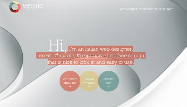
Sergio Pedercini uses an elegant circular menu since its shape perfectly complements an abstract and polished background with smooth lines.
Medialink is a gorgeous photo-based website that is driven by a parallax effect. The designer makes use of simple, barely noticeable set of circular navigation buttons in order not to distract users’ attention from images.
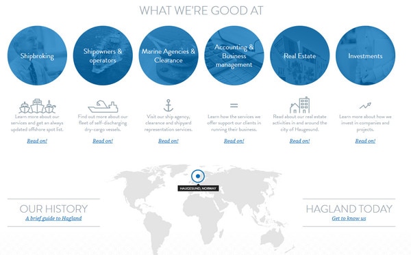
Hagland uses a regular circular navigation as an integral part of the skill section; it has a lovely maritime vibe and perfectly matches the tone of the website.
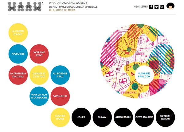
WAAW slightly abuses a round shape. The designer uses this form while creating the logotype as well as decorating the home page. The latter includes a dozen of colorful circles that adorn a humdrum white background.
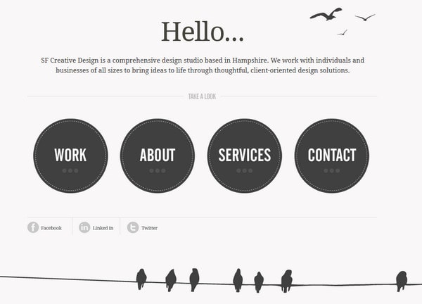
SF Creative Design is a decent and clean online portfolio. A minimal approach in conjunction with a neutral coloring provides users with only necessary information. The huge circles make people immediately notice the main menu.
Reflection
Being quite unaccustomed, a circular navigation does quickly grab users’ attention and focus it on selected areas. It has a number of advantages that help to enhance website, making menu – one of the most important and integral part of any website – look intelligible, noticeable, and easy and quickly to process.


