Diagonal Lines in Website Designs + Inspiring Examples
Generally, lines are inseparably associated with a direction, naturally guiding users’ eyes from one point to another. This concept is quite often applied in website design, where instruments that are able to create visual hierarchy and demonstrative paths are highly valued.
Vertical, horizontal, and, of course, diagonal lines serve this purpose perfectly well. Especially the last ones that aside from easily pulling the user’s eye from one point to another have several advantages over its customary and widely-spread relatives. Diagonal lines naturally break the orthodox layouts, generate tension, create a dynamic and even convey a sense of freedom.
Moreover being a part of the complex composition – whether it is a simple geometric combination or sophisticated artwork – they won’t get lost and will certainly help to obtain impressive results. This applies not only to plain thin lines that are used as decorations but also to oblique wide stripes and uneven blocks that embrace and represent content.
The collection below is aimed to showcase fresh memorable examples of website designs that fall under the influence of the elements with the lopsided feel and regular diagonal lines.
Websites Diagonal Lines Examples
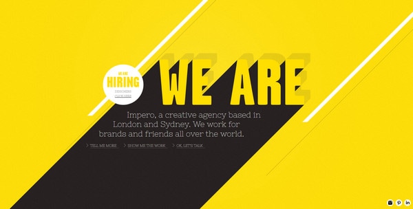
Impero is an interactive website with a nice positive vibe and minimal coloring. The designer leverages both wide and narrow diagonal lines that are aimed to create visual paths between various essential sections.
With Postcards Email Builder you can create and edit email templates online without any coding skills! Includes more than 100 components to help you create custom emails templates faster than ever before.
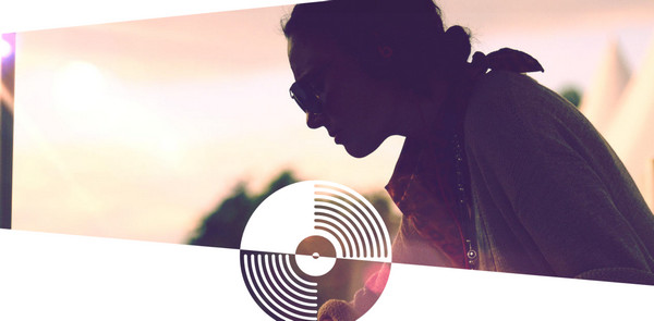
Free Email BuilderFree Email TemplatesUllevi Preparty Area. The designer wittingly makes use of lopsided images and sections in order to instill a slight sense of movement. The combination of warm soft full-of-life image backgrounds and lifeless solid color backdrops looks harmonious and quite offbeat.
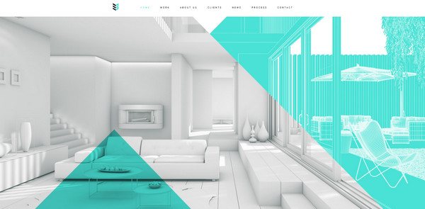
Case 3D. The website looks clean and tidy mainly due to lots of whitespace and minor dabs of bright neon color. The designer employs a triangle shape as a core decorative instrument, using it to brighten up not only the front page with several semi-transparent and colorful triangles but also the rest pages.
Networked Insights. The website conveys rather unbalanced feelings. There are a bunch of diagonal lines and distorted forms that are used not only for ornament but also for functional purposes. Thus designer implements curved rectangles as a base for various widgets in order to harmoniously fit them into the design.

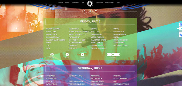
Wavefront Musical Festival has an appealing website that simply fascinates visitors by its enigmatic, dynamic and music-themed appearance. The website is based on huge full-screen photo backgrounds that have lovely halftone touches and clearly convey the atmosphere of the festival. The diagonal blocks in conjunction with egregious neon gradients make the design stand out.
With Pulsetic you’ll be instantly notified the moment your website, API, or server becomes unavailable. Monitor uptime from multiple global locations and respond to incidents before your users are affected.
Create beautiful status pages in minutes to keep customers informed during outages and build trust with transparent communication.
Start Monitoring for FreePaseo Itaigara. Here, the diamond shape runs the show, and, to be honest, it does it quite successfully. Rhombuses are literally everywhere. They are used as decorative instruments that enliven the bottom of the website with a modest mosaic effect; they play the role of huge optional navigation on the left; they serve as the main shape for buttons. In short, they definitely hold the theme.
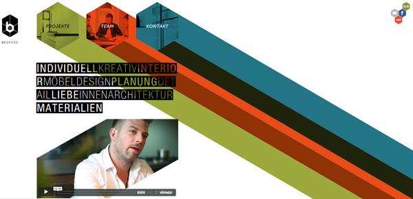
Bespoke has a unique and offbeat main menu that instantly grabs users’ attention. The set of 3 hexagonal forms with muted images in tandem with vibrant diagonal stripes ably plow a white clear monochrome background and supplement other integral widgets.
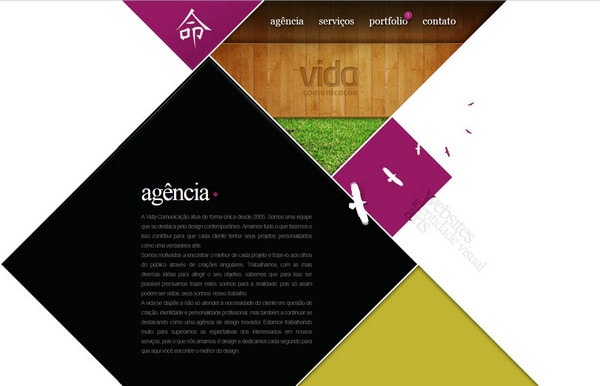
Vida Comunicacao. The website is another spectacular example of the proper utilization of diamond shapes that are densely packed together. All together they form a specific wide uneven diagonal line that stirs users into scrolling down and exploring the website.
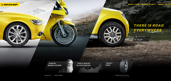
Dunlop. The diagonal forms are wisely implemented into the slider section in order to make it look more eye-catching and exquisite. The designer also employs oblique bright yellow rectangles to highlight areas.
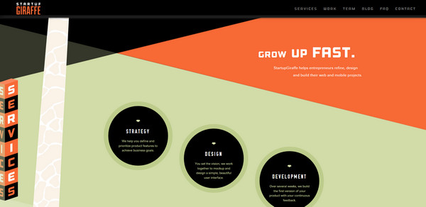
Startup Giraffe is a creative agency that amply demonstrates its potential by means of its unconventional original website. The latter looks absolutely clean and vector due to the properly implemented nifty flat style and restrained color palette. It includes a great deal of simple geometric shapes that give the website a beautiful lopsided feeling.
Timberline Tours. The unorthodox main menu breaks the molds of the front page, effectively bolstering the energetic image background. The thick diagonal lines are used to clearly separate menu items one from another.

V2 is an interactive website with a 3-dimensional effect. The website is based on a prudent two-tone color scheme and a bunch of various geometric shapes. The designer skillfully incorporates triangles, rhombuses, and rectangles that are supported by thin diagonal lines.
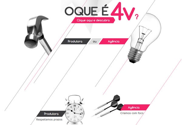
4V Connect is based on a white solid color background that allows emphasizing the content very effectively. The clean uncluttered website is capably populated with a set of ultra-thin lines that add to the website’s note of elegance and subtlety.
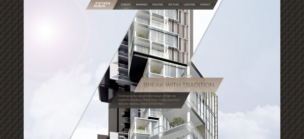
Fifteen Robin. The designer capably leverages several wide diagonal stripes that are intended to accompany every section. Thus, the first one has a lovely zoom effect that naturally brightens up an image background and adds to the website dynamics whereas the second one has a wooden textured backdrop and serves as a firm base for content.
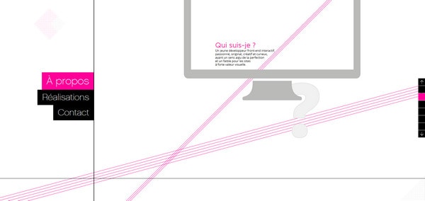
Gaston Bouchayer adopts a minimal approach that makes the website look neat, spacious, and appealing. The numerous thin pink lines here and there break the monotony of a pristine white background and perfectly collaborate with the rest monochrome graphics.
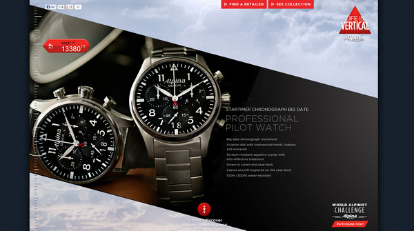
Alpina has a smooth photo-based background that includes a series of natural pictures. It is effectively coupled with dark diagonal in cuts that showcase professional photos of the goods with descriptions.
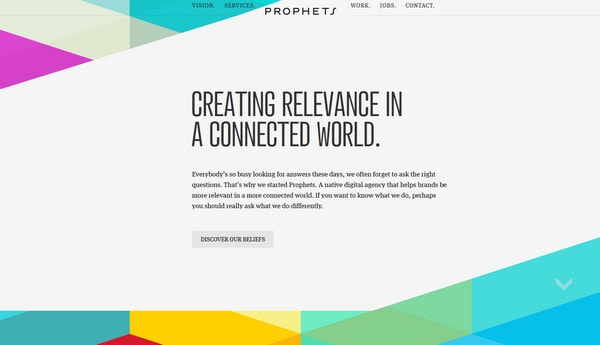
Prophets. The designer ably mixes together a clean light grey background and colorful polygonal ornament in order to enliven the home page of the portfolio. The geometric touches perfectly balance the whole design.
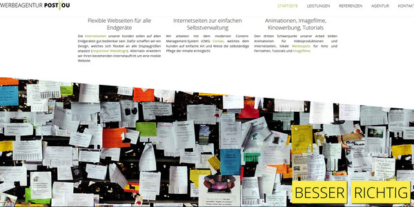
POSTYOU. The designer decides to divide the website into uneven cater-cornered sections that embrace the whole content and easily contribute to the mood.
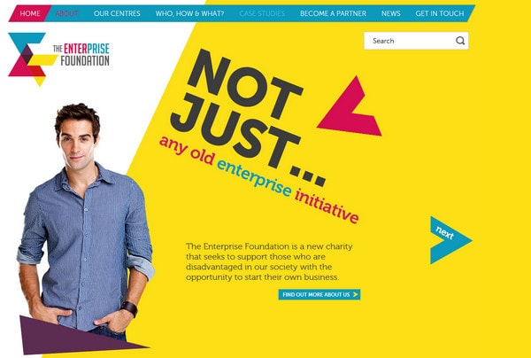
The Enterprise Foundation. The designer splits the main page into 2 unequal parts in order to create an outlandish asymmetrical feeling. Geometric logotype, massive rough arrows and sloping text perfectly complement each other.
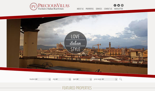
Precious Villas. The basic slider is only one component that has an unbalanced and askew appearance on the landing page. It contrasts favorably with the neatness and straightness of the rest design.
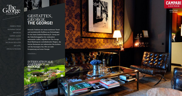
The George Hotel. The website is wisely divided into 4 functional vertical stripes, each of which has its own purpose. The second column instantly draws attention by means of its uneven appearance.
Reflection
Diagonal lines, stripes, and uneven shapes can be easily associated with asymmetry generally gives the website a unique sense of motion and dynamism.
These instruments naturally shatter the ordinariness and simplicity of a website, skillfully complicating the design.


