Effective 404 Error Pages: Best Practice and Examples
Every year the Internet is replenished by more and more sites with sophisticated designs that amaze us with its vibrant and extraordinary realization. A lot of advanced elements such as high-detailed illustrations, full-screen HD photo backgrounds, animations, parallax, etc. can be found in a modern website design. All these become possible thanks to new specifications of HTML5, CSS3 in cooperation with several programming languages. Whereas you can easily find spectacular landing pages, unconventional navigations, unusual sliders, there are still a couple of essential website parts that remain unnoticed such as contact forms or 404 error pages.
As for the latter, despite all the provided options, web designers intentionally neglect them. Although, being well-thought-out they can transform almost left visitors into newly arrived ones, making them stay on your site a bit long and in some cases eventually find what they are looking for.
Well-designed structure of Error Pages
In order to build a good 404 page, you should take care of several essential issues such as:
- provide users with alternative solutions, for example, integrated menu, home link, search box or list of useful resources;
- entertain them with mini-games, jokes, texts or captivated illustrations.
Boring, clean and clear background pages with a bunch of plain black links neatly arranged in columns won’t make any difference. Your page should have a zest.
To start with I suggest you take a look at our collection of really good examples of 404 Pages that covers interesting ideas and approaches of creating an attractive place.
Netiko uses hand-drawn rough illustrations with a hidden message and conspicuous explanatory text.
With Postcards Email Builder you can create and edit email templates online without any coding skills! Includes more than 100 components to help you create custom emails templates faster than ever before.
Free Email BuilderFree Email Templates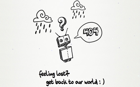
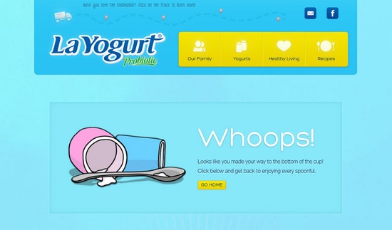
La Yogurt certainly grabs user’s attention with calm blue background and yummy illustrations. Moreover, it provides clear navigation system along with exuding home button.
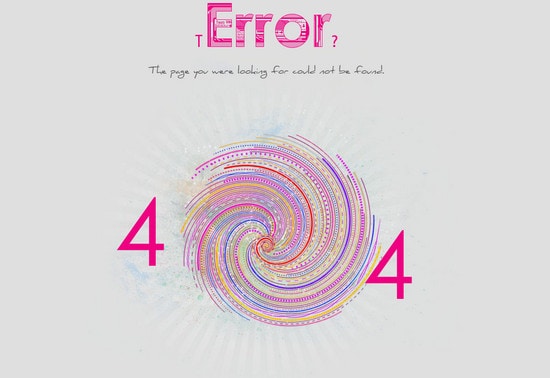
Ideal Hut charms with whimsical illustrations that actually gives the dynamics through the use of animated colorful ‘black hole’.
Soap Media highlights message of the lost result by means of properly done illustrations.
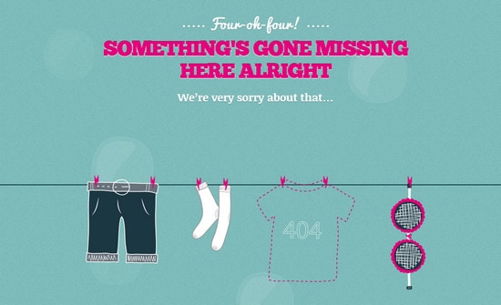
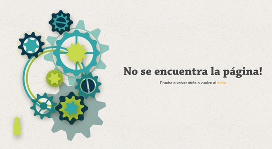
Webdesignerdepot utilizes only one, but really glaring and quickly-to-understand image of ‘something went terribly wrong’. I suppose with such a vivid picture even header seems to be redundant.
With Pulsetic you’ll be instantly notified the moment your website, API, or server becomes unavailable. Monitor uptime from multiple global locations and respond to incidents before your users are affected.
Create beautiful status pages in minutes to keep customers informed during outages and build trust with transparent communication.
Start Monitoring for Free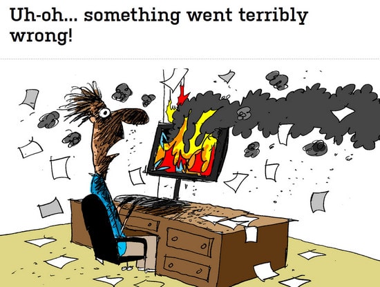
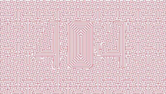
Piccsy does a good job of using only one geometric pattern and red color in order to create something truly unconventional and at the same time artistic.
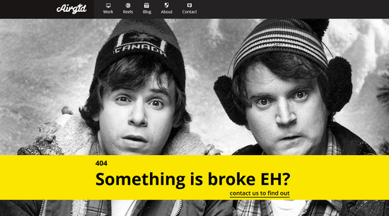
Airgid Media Inc keeps up with the modern trends by integrating full screen photo background that depicts bewilderment and incomprehension.
Eric Lagarda demonstrates technical side of the issue by means of truly itemized animation.
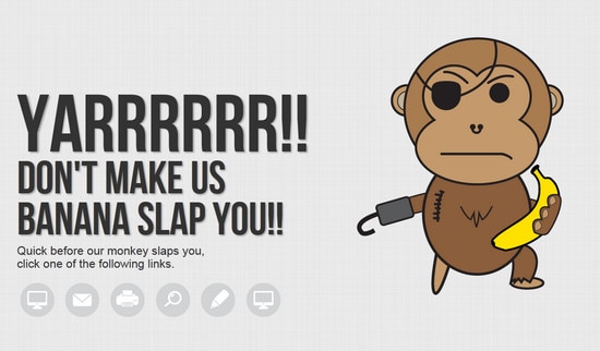
LLT Group use of idiosyncratic pirate-monkey illustration creates a menacing look that is perfectly complemented by circular navigation and funny threatening text.
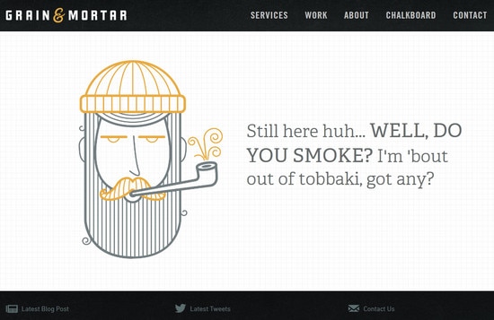
Grain and Mortar integrate outline images along with squared background, recreating the feeling of discreet design with clean and clear general appearance, in which is really difficult to get lost.
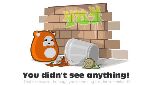
Ubooly has a really funny and cheerful picture of what’s happening, so that it looks hugely impactful. Basic navigation menu in the header and couple of widgets in the footer offers several lines of retreat.
Jorgeatgu breaks the monotony of the page by means of angled typography and some cool graphics.

Diesel offers clear escape routes in a simple easy-to-understand manner.
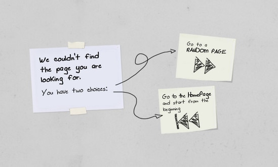
Saaspose imaginatively presents an image of missing page providing users with list of helpful resources.
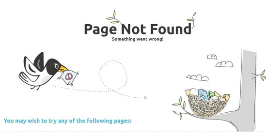
UK TV is centered around popular TV series urging you to check out online streams.

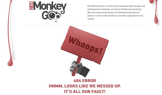
Red Monkey Goo principally leans on its mascot, major elements that are traced through the entire design and explanatory text with standard navigation menu.
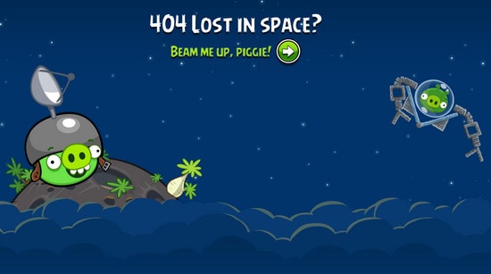
Angry Birds adds a lot of personality by using popular scene and characters from the game.
CaptainDash screams out minimalist style with a single monochrome illustration and several menu items that represented in a huge blocks.
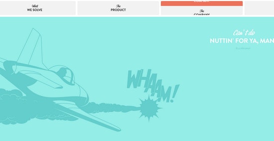
Noupe relies heavily on hilarious graphics along with search box and popular articles widget.

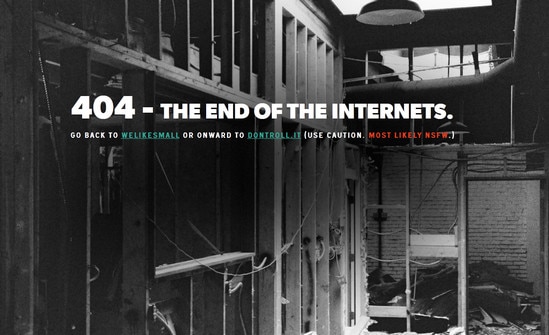
Welikesmall is another great example of using photo as a background for an error page. Such approach gives an opportunity to show both informative and emotional side of the issue.
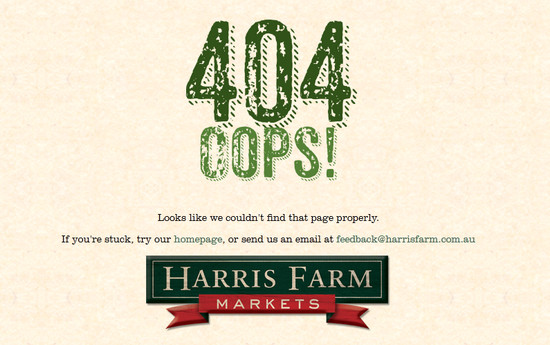
Harris Farm features rustic typeface with slight grunge touch. By using green color palette designer wants to help alleviate nervousness and anxiety of those who have not found what they were looking for.
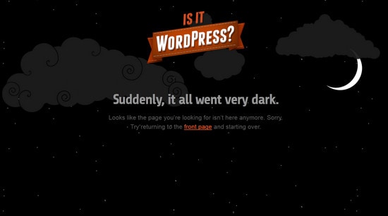
Is it WordPress exudes an image of darkness with only one bright element that plays role of the logo and home backlink.
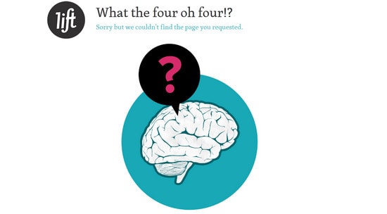
Lift Interactive meets its users not only with a univocal image, but also with footer full of widgets with useful information and landing page header.
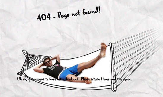
Ian James Cox is marked by subtle and delicate, slightly crumpled paper texture with handwritten title and invigorative photo.
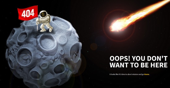
Cool Apps has a strong extraterrestrial feel with vibrant, rich in details illustration.
Pixel Stadium is based on a concept that non-existent pages were swallowed by a black hole. Such a scientific approach of explaining what is happening makes the page unique and attractive.
![]()
Page doesn’t exist….or does it?
As a matter of fact 404 pages notify the users that a page does not exist, but physically it can be used as a sterling website page and an integral part of the whole design. Moreover, you can easily transform it from the final page in the intermediate one thereby closing the circle on the main page.
So, what do you think of fully using Error pages? Do you find this approach helpful and necessary for everyone? Do you know any other good examples of 404 pages? We are looking forward to hearing from you.
