Dark Mode Websites: Web Design Tips, Examples & Best Practices
You open your laptop at night. The screen blasts white light into your face. Your eyes squint and you think: “This is way too bright.”
That’s exactly what dark mode prevents.
What started as a design trend is now something users expect because it makes late-night browsing easier on your eyes and helps you focus in low light.
In this guide, you’ll learn why dark mode websites have become so popular and how to design one so it works seamlessly alongside light mode.
What Is Dark Mode in Web Design?
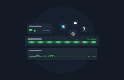
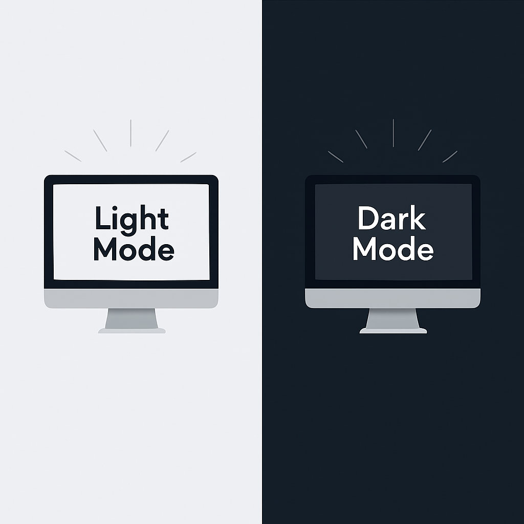
Dark mode is a design style where a website uses a dark background, usually black, dark gray, or deep blue, with light-colored text and elements on top. It’s the opposite of the usual “light mode,” where you see dark text on a white background.
You’ve probably used it on your phone or noticed it on websites like YouTube or Instagram because it’s so common now.
With Postcards Email Builder you can create and edit email templates online without any coding skills! Includes more than 100 components to help you create custom emails templates faster than ever before.
Free Email BuilderFree Email TemplatesAlthough a lot of people still stick with light mode, dark mode has quickly grown from a novelty into a real trend.
In 2024, YouGov of the UK surveyed more than 2500 people to find out how they prefer to use their smartphones. According to their survey, 29% of people prefer to use dark mode on their smartphones.
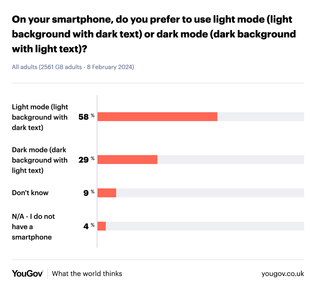
A few years back, there wasn’t even a concept of switching modes—websites and apps were only light, all the time. But this survey shows us that today, users are also choosing dark mode when it’s available.
Why Use Dark Mode Websites
You might think dark mode is a cool web design choice. But when your visitors try it, they’ll notice the following perks right away:
- It feels gentler on your eyes at night or in dim rooms compared to a bright white screen.
- It gives websites a modern, premium feel, which is why tech brands, portfolios, and creative websites often use them.
- It can save up to 67% of OLED (Organic Light Emitting Diode) power at full brightness because the brighter the screen, the bigger the savings.
- It reduces overall blue light exposure, which makes late-night browsing less disruptive to your environment.
Pros and Cons of Dark Mode Websites
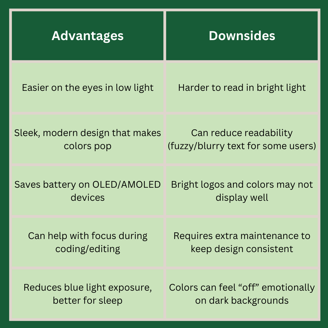
Here’s a quick comparison of both the benefits and disadvantages of having a dark mode website to help you decide if you should really have one:
- Dark mode is easier on the eyes in low light, but harder to read in bright light.
- It offers a sleek, modern design that makes colors pop, yet can reduce readability with fuzzy or blurry text for some users.
- Dark mode saves battery on OLED/AMOLED devices, but bright logos and colors may not display well.
- It can help with focus during coding or editing, though it requires extra maintenance to keep the design consistent.
- Dark mode reduces blue light exposure and is better for sleep, but colors can sometimes feel “off” emotionally on dark backgrounds.
4 Inspiring Dark Mode Web Design Examples
Here are four examples of dark mode websites that you can take inspiration from:
1. Qase

QASE’s dark mode features a deep navy background that gives the website a sleek, space-like feel. The purple and blue accents add a soft glow, which makes the design look modern and futuristic. Everything feels clean and sharp, which fits perfectly for a tech platform.
When you log in, you’ll see a toggle button to switch between light and dark modes.
With Pulsetic you’ll be instantly notified the moment your website, API, or server becomes unavailable. Monitor uptime from multiple global locations and respond to incidents before your users are affected.
Create beautiful status pages in minutes to keep customers informed during outages and build trust with transparent communication.
Start Monitoring for Free2. YouTube
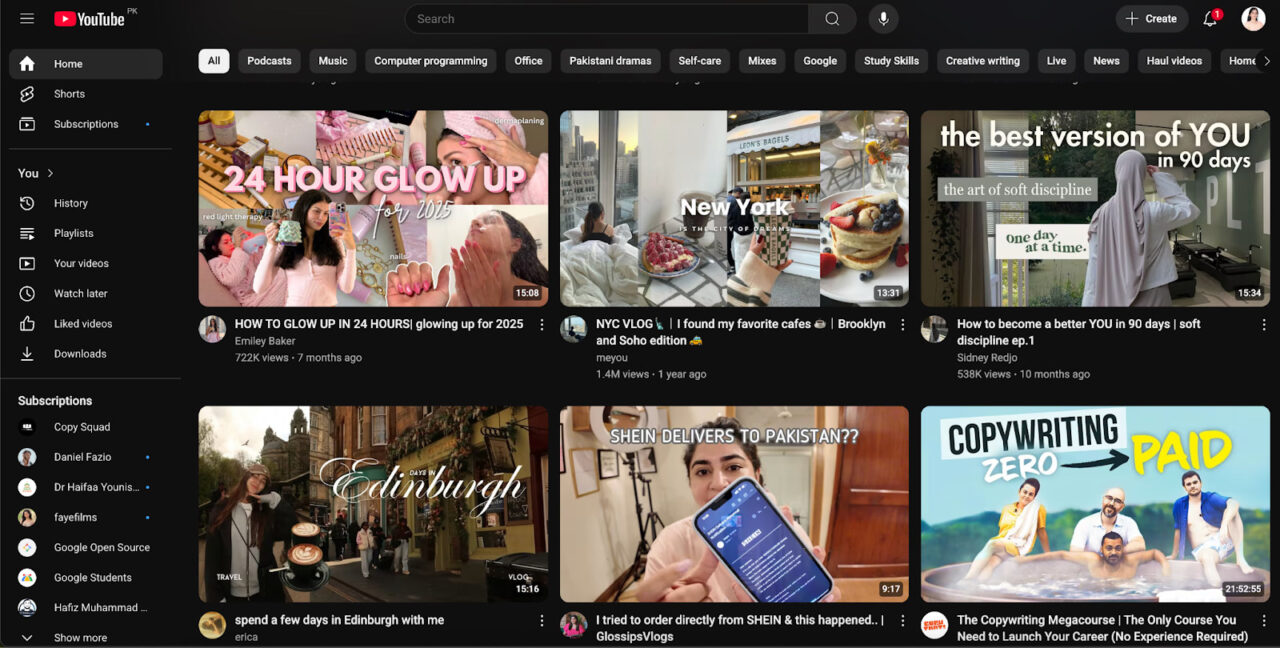
YouTube’s dark mode replaces the bright white background with deep gray and black. This makes the videos stand out more on the screen. It also feels easier on the eyes at night and keeps the interface simple.
But if you prefer light mode, you can switch back with one click from settings.
3. Wix

In dark mode, the Wix Studio Tab Chrome extension (not a website) uses a rich charcoal background, which looks pleasing to the eyes. Its colorful icons and cards make it quick to spot updates and links. This way, the contrast feels balanced.
4. Trello
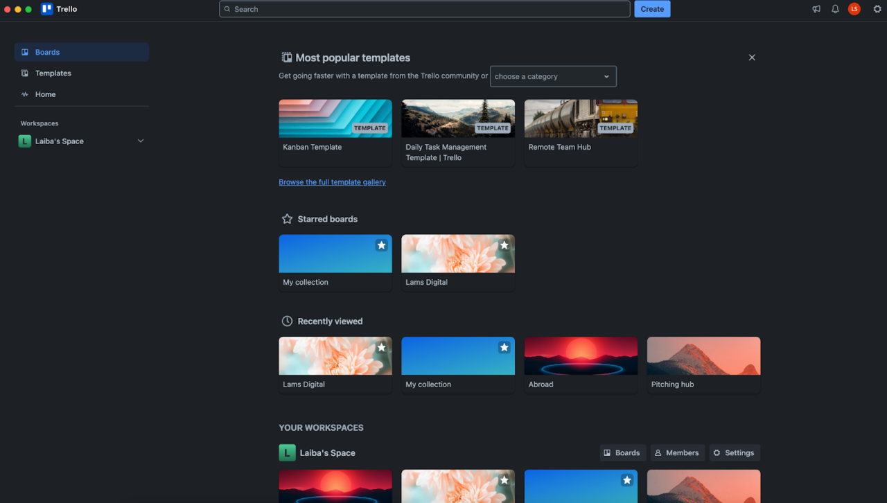
Trello’s gray background and light gray text look like a perfect combo. The bright accents guide your attention to important boards and buttons. And the neat layout gives the Trello workspace a minimalist feel.
How to Create a Dark Mode Website Step by Step
There are multiple options to add a dark mode to your website.
Some of the most common ones are using WordPress plugins (easier) or, if you’re more of an expert in coding, go for JavaScript and CSS options.
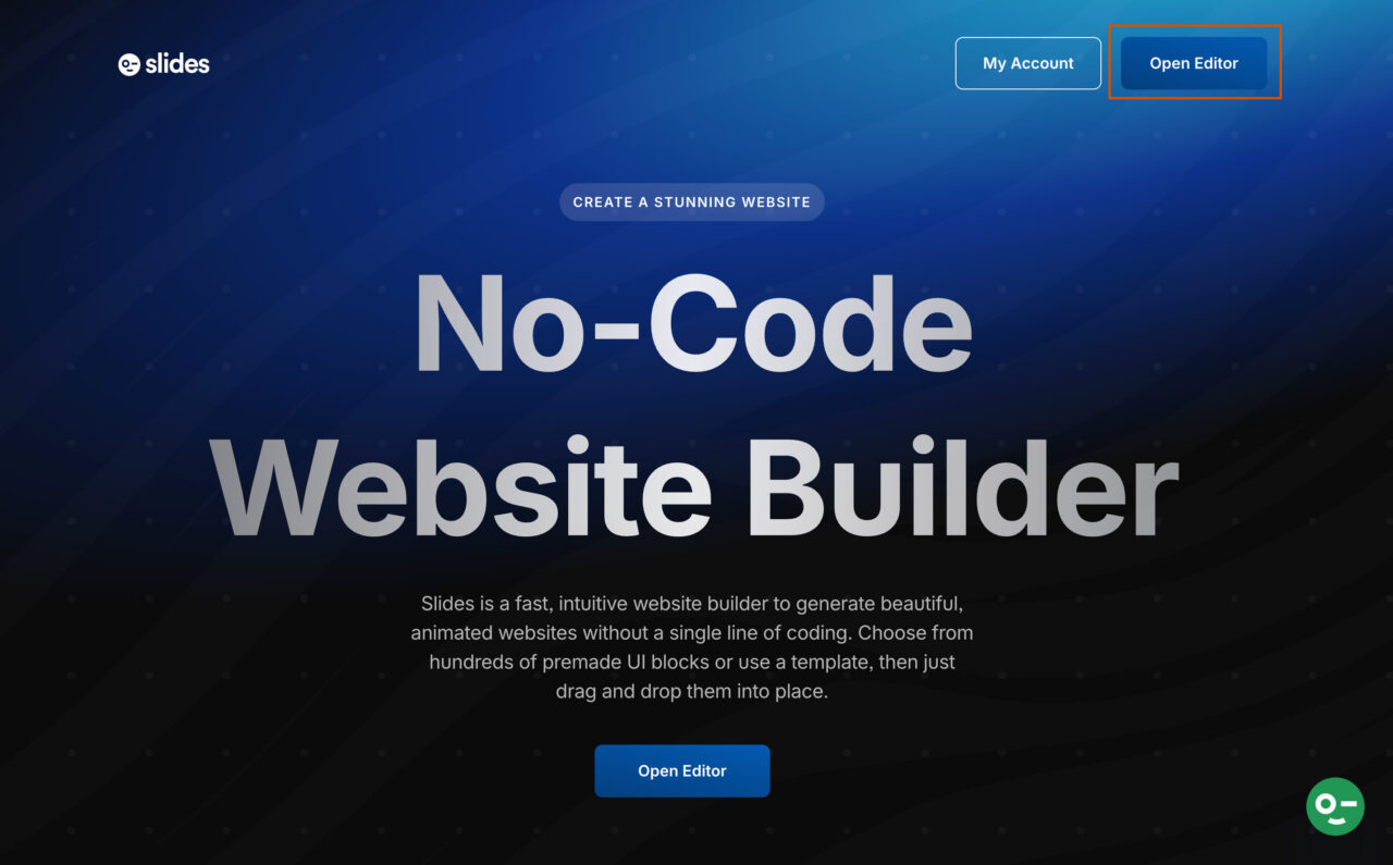
But if you want to avoid all this hassle and need a simple drag-and-drop option to get things done fast, use Slides by Designmodo, a no-code website builder.
1. Go to Desigmodo Slides, and click on “Open Editor.”
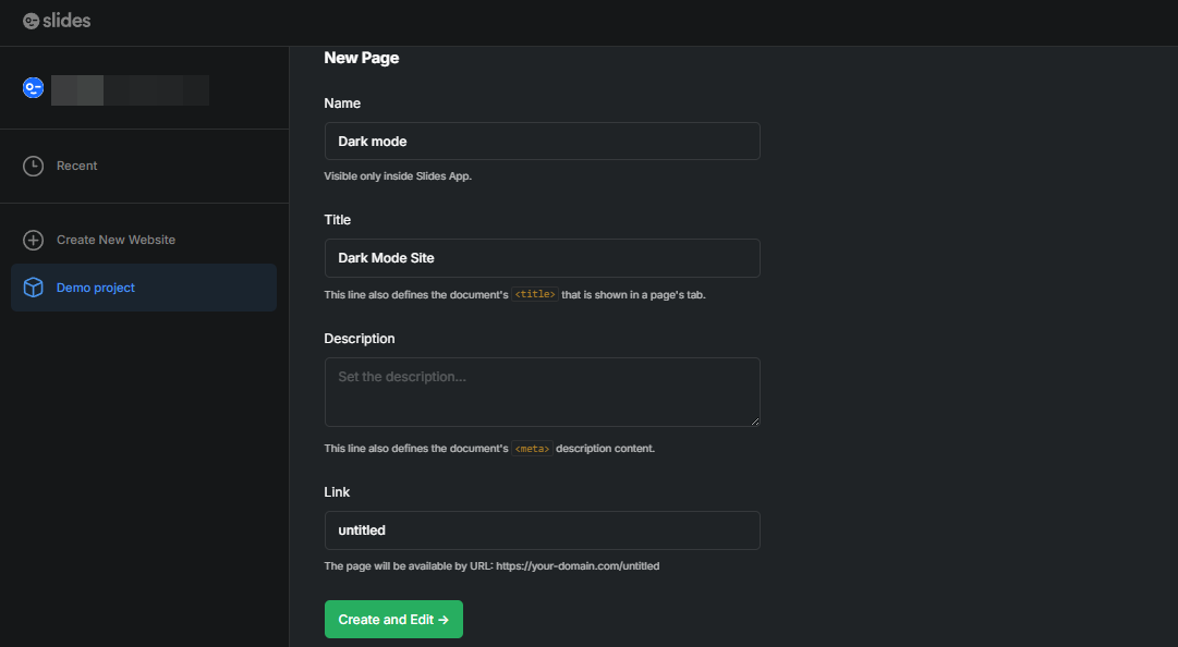
2. Head over to the “New Page” and add the “Name” and “Title” of your website.
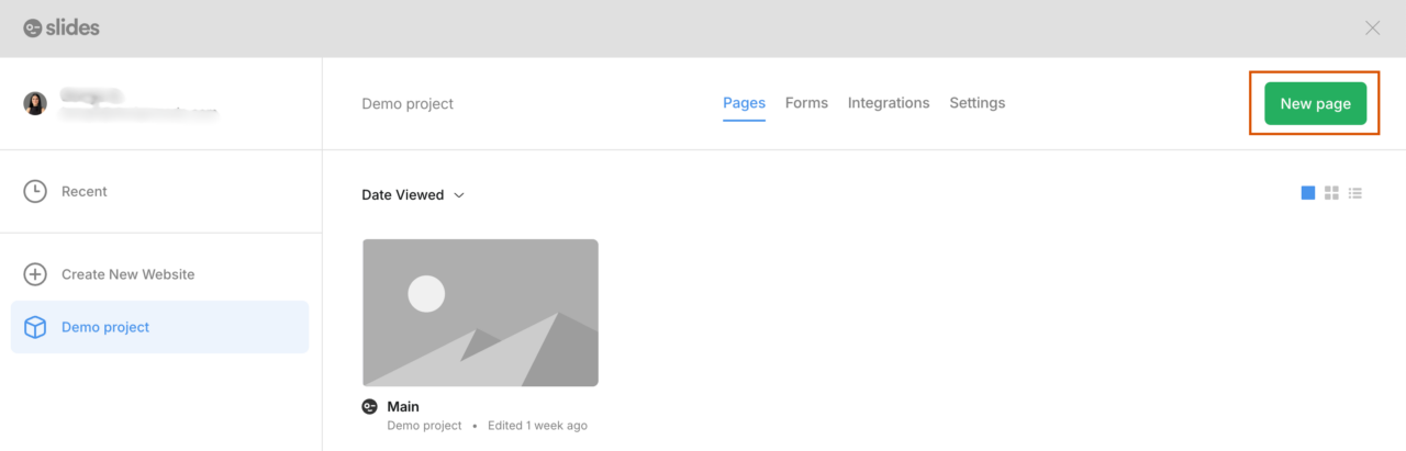
3. Then click “Create and Edit.”
4. In the Editor, you’ll see the “Add” option on the top bar. Click on it to see the drop-down menu.
In the drop-down menu, you can see:
– Slides
– Examples
– Templates
– Widgets.
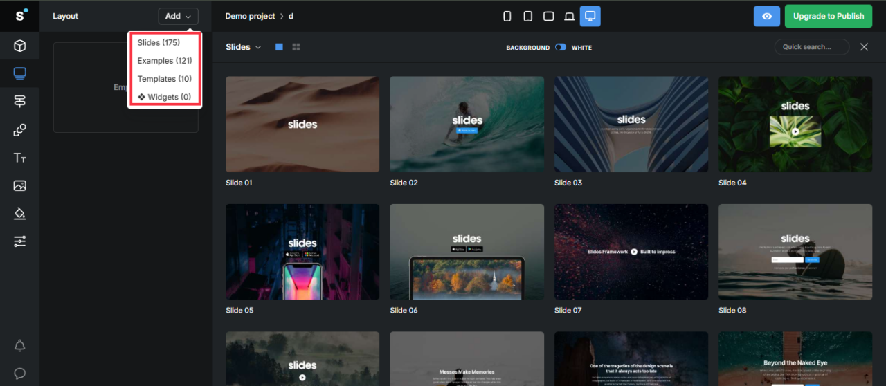
5. From the available options, choose your favourite design (I chose slide 27).
6. In the left panel, hover over the layout and click on the “Pen” symbol to start editing.
7. An editing panel will appear. Now, go to the “Edit” section and look for the “White Slide” toggle option. Turn it off, and your Slide will turn into dark mode.
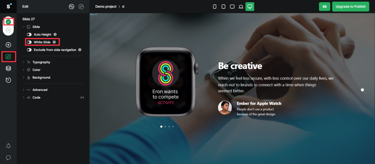
8. Click on the “green tick” to save the changes.
Now you can customize the whole website design (including text and visuals) according to your needs and publish it once ready.
Tips to Design a Dark Mode Website
Now that you know how to create a dark-mode website, here are some tips to follow along:
Don’t Use Pure Black Background
A pitch-black (#000000) background with bright white text might seem like the obvious choice but it may create a harsh contrast that can be tiring to look at. Instead, use dark grays (#121212) for backgrounds. This keeps your design gentle on the eyes and still visually rich.
Avoid Pure White Text
Bright white text on a dark background can create a glowing effect that makes it harder to read, especially for people with certain vision conditions.
Instead, go for off-white or light gray, and adjust the opacity for different text types such as:
- Important text: about 87% opacity
- Secondary or hint text: about 60% opacity
- Disabled text: about 38% opacity
Tone Down Highly Saturated Colors
Bright, neon-like colors may feel overwhelming in dark mode. They’ll “glow” against the background and make reading difficult. If your brand uses strong colors, try slightly muted versions so they still pop without blinding the viewer.
Don’t Change Your Brand Colors
You don’t have to invert your entire color palette for dark mode, but you may need to tweak it. Keep your main brand colors for important elements like buttons or your logo, but use toned-down versions elsewhere to avoid overpowering the interface.
Avoid Shadows
In dark mode, shadows disappear. If they’re just a bit darker than the background, you won’t see them. If you make them pure black, it doesn’t help much. And if you make them lighter, they look weird.
So instead, use soft highlights, gentle gradients, or slightly different shades to show depth. You can also give elements a faint glow in a lighter version of their color. It’s simple and works way better than shadows you can’t even notice.
Adjust Images For Dark Mode
Dark mode can change how your visuals look, so they need extra care. Here are some tips we recommend:
- Use muted or dark tones so images blend smoothly with the background.
- Avoid bright colors because they can be distracting.
- Adjust brightness and contrast so your images don’t look too bright or too dark. You can use light filters or overlays to make them fit better with the dark background.
- Use light-colored icons or graphics for clear visibility.
- Test in different lighting to ensure images stay readable and appealing.
- Review your image library and adjust or replace anything that clashes with the dark theme.
Let Users Switch Modes Easily
Design source: Mohammad Turk
Some people love dark mode all day; others only want it at night. Give users control with a clear, simple toggle so they can switch between modes anytime.
Test On Different Devices And Lighting
Your design should work just as well on a phone in daylight as it does on a desktop at night. So make sure to test in various lighting conditions and screen types to confirm it’s always readable and appealing.
Should You Add Dark Mode to Your Website?
Dark mode isn’t a must-have for every website, but it can make a big difference if your audience browses in low light or relies on mobile devices. The key is testing: make sure readability, color balance, and branding all work as well in dark mode as they do in light mode.
If you’re ready to explore it, review your website’s design and test a dark palette alongside your existing layout. Then, gather user feedback to see if it genuinely improves the experience for your visitors.
FAQs
Does Dark Mode Improve SEO?
Not directly. Dark mode is about web design and user experience, but a better user experience can lead to longer sessions and lower bounce rates, which may help SEO indirectly.
What’s the Difference Between Dark Mode And Night Mode?
Dark mode changes the whole look of your screen to darker colors with light text, which can feel easier on the eyes and even save battery on some devices. On the contrary, night mode softens the colors by reducing blue light and adding warm tones like orange or yellow. This makes the screen more relaxing to look at in the evening.
Does Dark Mode Always Save Battery?
It only saves power on OLED and AMOLED screens. On LCD screens, the energy savings are minimal.