Email Footer Design Examples with Actionable Tips Guide
What makes an email design transparent and intuitive for subscribers? What reinforces an overall impression with strong messaging? What allows companies to send regulation-compliant emails? The answer to these questions is the email footer.
An email footer is often overlooked. This is a big mistake that most startups and novice email marketers make.
Do you know that 63% of professional email marketers use the footer to promote their brand, with almost 50% of them bringing extra traffic to their websites? The email footer is so powerful that it can bring around subscribers, saving leads and increasing revenue. This small design element has a vast potential to level up email campaigns.
In this guide, we will explain the basics and importance of a well-designed email footer and go over what to feature to make it legible and valuable for subscribers. Finally, we will consider different strategies to implement footers and conclude with 10 creative examples to give you insights into how other brands make the most out of this small yet crucial email element.
The email footer, akin to the website footer, is the bottom section of a digital newsletter design. Some marketers see it as an email signature, while others refer to it as a brand business card. It serves navigational and informational purposes.
Traditionally, email footers contained information that was out of place in the main content. It supported the primary body copy or featured copyrights and brand identity. Modern trends have made it more sophisticated and varied. It may inform, entertain, enlighten, encourage, and even inspire. It is an important marketing tool that is vital to email campaign success.
With Postcards Email Builder you can create and edit email templates online without any coding skills! Includes more than 100 components to help you create custom emails templates faster than ever before.
Free Email BuilderFree Email Templates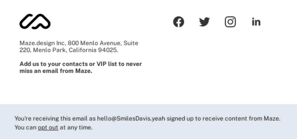
Email footer example from Maze
The importance of investing time, money, and effort in creating an effective email footer is not always apparent. It is just a tiny section at the bottom of the email design.
The email footer sets a precedent for companies to work in email channels legally. Businesses across all niches, regardless of the target audience, age, and product, that use email channels for distribution and communication have to obey laws declared in GDPR and CAN-SPAM Act.
These regulations set the rules and establish requirements for commercial messages. GDPR is created for companies to operate in Europe, whereas CAN-SPAM Act covers requirements for companies to operate in the United States.
Both are in place to protect consumer rights, create an extra layer of trust, and help the company conform to industry standards.
In practice, they demand companies to feature this information in every email sent to the subscriber:
- Physical address of the company
- Telephone of the company or mailing address
- Link to the company’s privacy policy
- Unsubscribe link
It is not required but highly recommended to add information about the person who communicates, links to active social media accounts, a link to connect with the support team, and information that can be crucial for viewers to understand the context of the newsletter better.
The best place to show this information is the email footer.
With Pulsetic you’ll be instantly notified the moment your website, API, or server becomes unavailable. Monitor uptime from multiple global locations and respond to incidents before your users are affected.
Create beautiful status pages in minutes to keep customers informed during outages and build trust with transparent communication.
Start Monitoring for FreeTaking the email footer seriously is crucial because it offers excellent business advantages. Primarily, it can be used to drive users into the sales funnel.
For instance, take the inverted pyramid principle popular with email designers. Although, as a rule, it is realized right in the header because it is the most viewed part, according to GoodUI, a repeated call-to-action button on the bottom of the layout may increase clicks and leads. Therefore, many marketing teams use email footers to feature the second call-to-action button to increase conversions.
Alternatively, they add an eye-catching promotional banner that amplifies the overall effect.
Third, regarding additional content, an email footer is widely used to supply subscribers with information without overwhelming them. It is the perfect place to add links to relevant content that you have created. For example, if you promote your new product, subscribers may benefit from links to recently published guides on how to use it.
Fourth, the email footer can be customized according to different target groups, taking personalization to the next level and driving more engagement.
Fifth, the email footer contributes to a comfortable environment for subscribers. The email designs are no longer plain sheets of text. Today they look like miniature landing pages; thanks to interactive features and animations, some have app-like behavior.
This similarity suits subscribers because it provides a familiar environment, shortening the learning path and providing quick access to crucial data avoiding irritation, confusion, and disorientation.
Consider this situation: Suppose subscribers want to get to the homepage, connect with the support team, or share their opinion through social media. You can quickly and efficiently address these issues simply by scrolling to the footer. This is the first place they will look because that’s how it is done on websites.
A well-thought-out email footer benefits the email campaign, strategy, and company. Let’s consider this next.
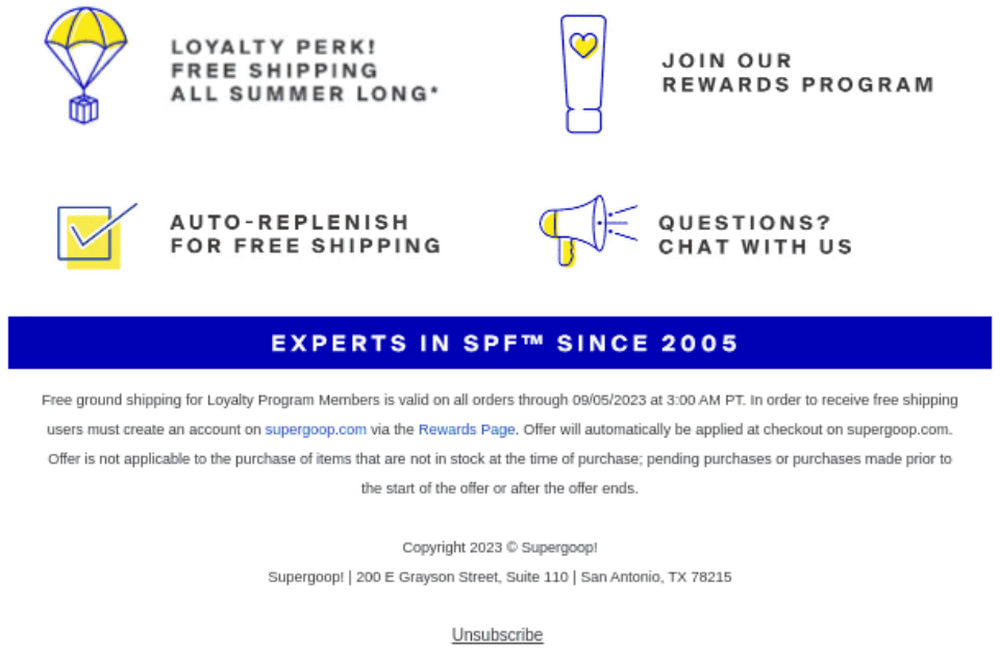
Email footer example from Supergoop!
A well-done email footer does numerous crucial tasks that benefit email campaigns, strategies, and companies. Some are obvious, while others may surprise you, especially if you are a novice email marketer.
- It offers meaningful communication.
- It inspires social media shares, thereby increasing followers.
- It adds value to the recipient’s experience.
- It contributes to brand alignment across all marketing platforms, promoting much-needed consistency.
- It reinforces the brand image.
- It inspires trust and levels up the company’s credibility.
- It encourages online communication.
- It improves customer service.
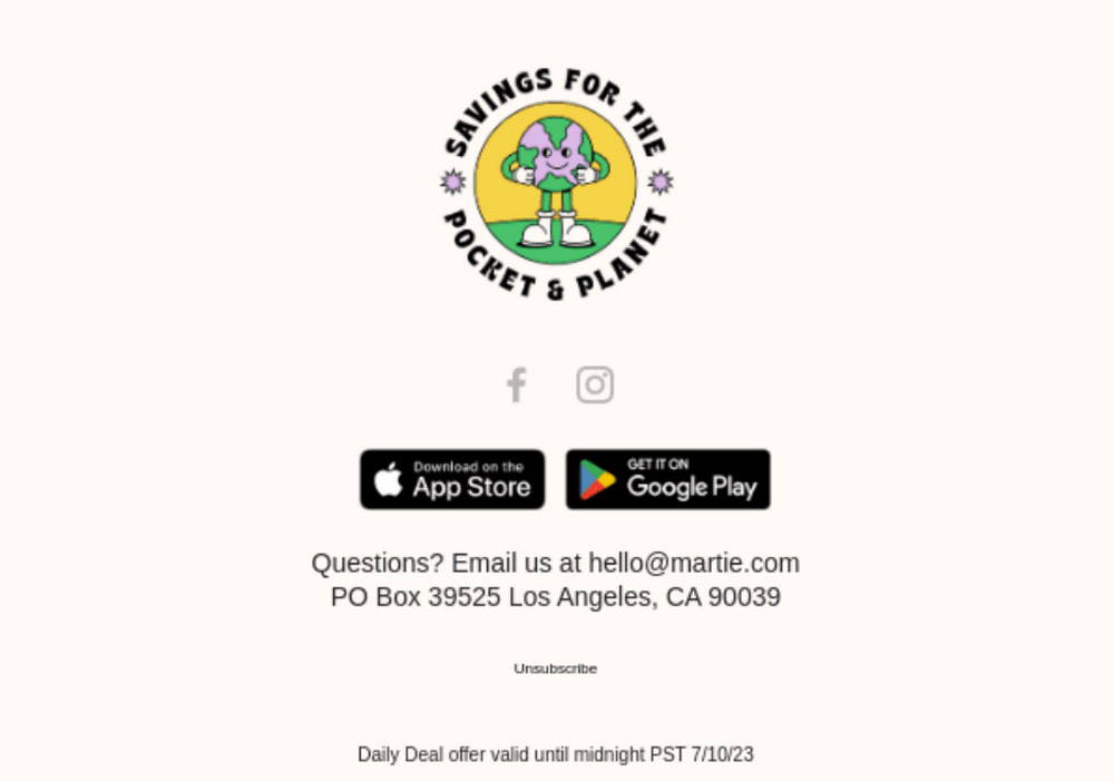
Email footer example from Martie
Email footers can do lots of tasks. Therefore, they come in all shapes and sizes, featuring all kinds of stuff. Let’s list the most common elements used to hit the essentials and benefit the email marketing campaign.
- Brand name, logotype, or slogan
- Unsubscribe link
- Physical address
- Mailing address
- Telephone number
- Company website with a direct link
- Trade association accreditations, awards, or stats that quantify the company
- Link to the current Privacy Policy
- View-in-browser link
- Link to an email preference center
- Links to active social media profiles
- Testimonials or reviews
- Rates or surveys
- Disclaimer
- Photo of the CEO or team
- Relevant content such as a guide, article, press release, or event
- Banners, offers, and discounts
When choosing content for the email footer, it is crucial to consider these two basic yet vital postulates.
The footer must include information to meet GDPR and CAN-SPAM act compliance (this includes the company’s physical address, mailing address or telephone, and unsubscribe link).
The email footer is not designated to provide a wealth of information. It should not create an information overload. Therefore, consider it as a summary or short epilogue.
If the situation is such that your email campaign requires you to include lots of information, you need to use the design to break it into digestible pieces, create an optimal readability experience and avoid confusion and irritation.
Speaking of email design, there are numerous strategies to adopt when creating an email footer. Depending on the amount of information to show, the type of email marketing campaign, and current goals, it can be a big multi-row block or, vice versa, an ultra-narrow line. Let’s consider the most popular approaches.
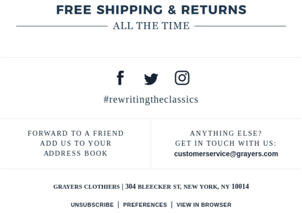
Email footer example from Grayers
There is no general recipe for what to show in the email footer to make it effective, simply because every email campaign requires its solution. For instance, a welcome email may include a photo of the CEO or a welcoming statement, whereas a promo blast may feature a discount or links to helpful articles and guides.
The truth is the email footer has the potential to be more than just a one-line signature at the bottom of the email design. It can be used to market the company, promote the product, drag subscribers into the funnel, and build brand identity. Consider the most popular use-case scenarios by breaking email footers into several general groups.
Technically, every email footer must be legal. This is relevant to all types of businesses and email campaigns. Your digital newsletter must feature data crucial for GDPR and CAN-SPAM Act.
However, you may expand the content by adding some other vital information. For example, you may include confidentiality disclaimers that add more protection for your business. Consult with an attorney to discuss the exact legal vocabulary and information.
These types of emails can be big or small, but they always talk business.
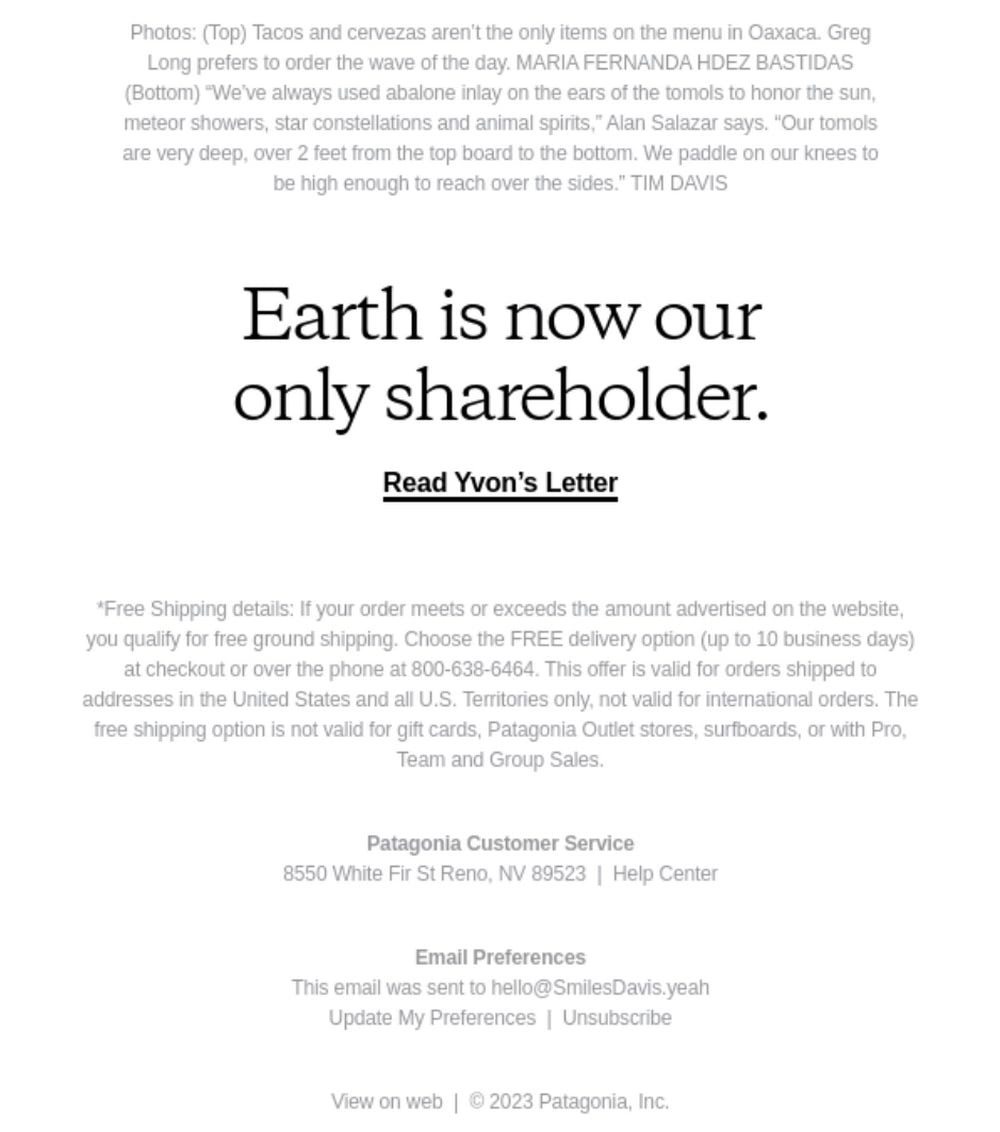
Email footer example from Patagonia
Branded email footers highlight company values, communicate what they stand for, and remind subscribers why they are fans. As a rule, they may feature these elements:
- Logotype, slogan, branded background, or mascot
- Awards, accolades, or proof of environment or community responsibilities
- Links to social media accounts and the main website
Show your business personality by showing the company’s mission and using the company’s voice through appropriate words and phrases.
Branded email footers benefit all email marketing campaigns, from promotion to retention.
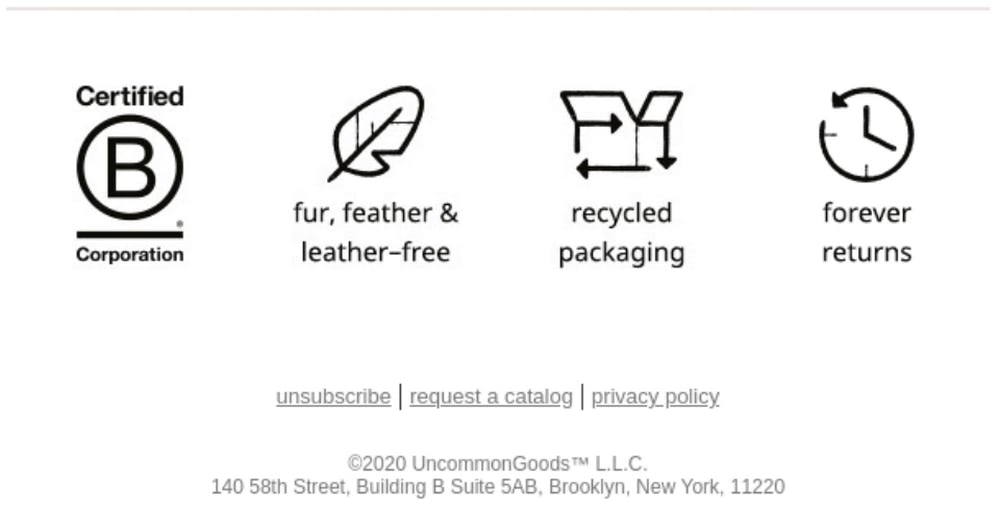
Email footer example from Uncommon Goods
Professional email footers look like traditional business cards. They might be dedicated to the company or show a person who acts on behalf of the company with all the contact information. This gives additional credit to the email, increasing trustworthiness. As a rule, it includes:
- Company name
- Name and position of the person within the company
- Corporate contact information
- Links to valuable and relevant content
- Photo or signature
This type of email footer can be primarily seen in inaugural email campaigns and welcome series.
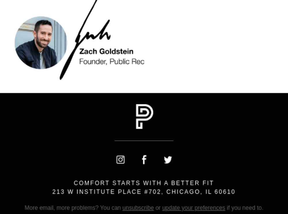
Email footer example from Public Rec
As the title says, this type of email footer is information-centric. It is one part of a big message or storytelling experience. It may include data that support the main content, clarify some controversial moments or specify or delimit the scope of rights and obligations. It may feature plain text, case studies, infographics, and links to relevant content. Whatever information you feel is out of place in the body copy may go there.
There are no specific criteria for using this type of email footer. It is universal and benefits various campaigns.
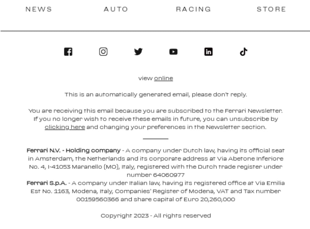
Email footer example from Ferrari
Promotional email footers are created to drive publicity to the company, nurture customers and maximize conversions. They may include all sorts of information; however, as a rule, you can see some of these components:
- Banners
- Call-to-action buttons
- Buttons to the App market and Google Play store
- Services and products
- Deals and offers
- Testimonials
- Events and webinars
The key feature of these email footers is that they are vibrant and eye-catching. They ignite interest and sometimes even play psychological tricks like FOMO or maximizing a sense of scarcity or exclusivity.
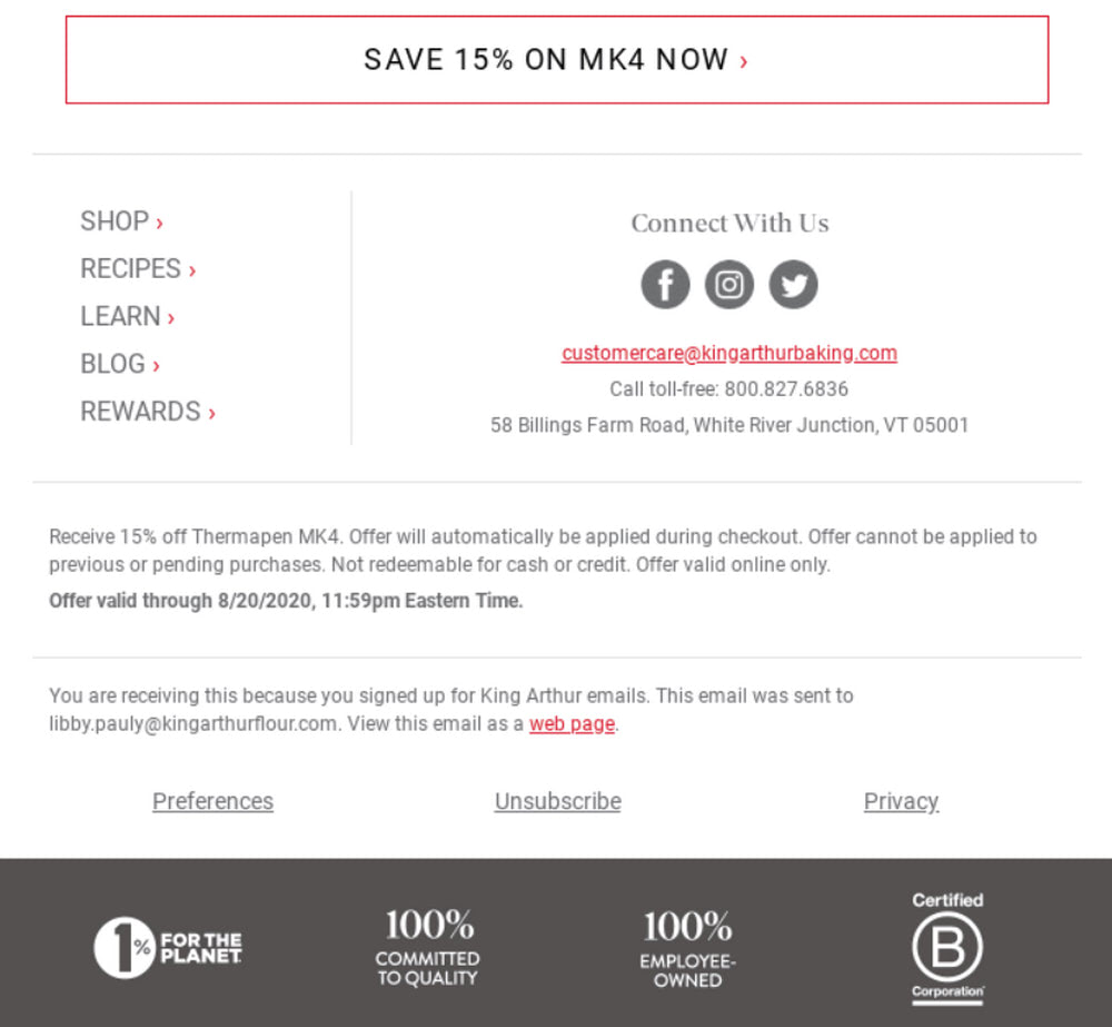
Email footer example from King Arthur Baking Company
Email footers can do many things: amplify key messages, support information hierarchy, boost brand awareness, or drive engagement. Producing the right impression, they leave a long-lasting imprint that strengthens the company’s image. But most importantly, they may support ongoing marketing campaigns, maximize efforts and achieve goals.
Consider these popular ways to use email footers in marketing strategies:
- Include vibrant banners to promote new products or advertise deals.
- Demonstrate a photo of the CEO or team member to increase trust and build transparent relationships.
- Add a thank-you note to nurture customers and generate new followers.
- Feature personalized discounts to bring back a customer or maximize conversions.
- Promote the company’s values to build brand awareness and generate leads.
- Include social media links to encourage social media sharing.
- Display links to the latest content to bring traffic to the landing page.
- Show client testimonials, accreditations, or accolades to qualify the brand.
- Request to share a review of the product to make customers feel important.
- Invite to participate in the survey to get real insights on improving the product.
Email footers have different roles depending on the email marketing strategy, but they are undeniable and crucial.
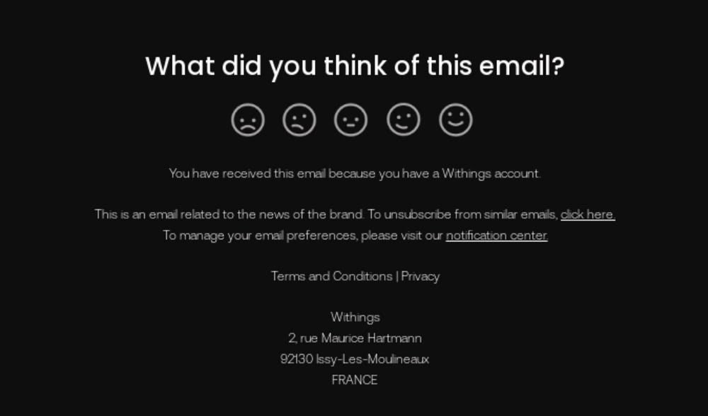
Email footer example from Withings
The basic steps for creating an effective email footer are the following.
Step 1 – Preparation
Before jumping to the design of the email footer, it is crucial to draft a plan.
- Determine what type of email footer you need to benefit your email campaign: informational, promotional, branded, or custom, a mixture of different traits.
- Understand what your visitors are looking for.
- Decide on the overall atmosphere, tone, and language.
- Find a place for legal information.
Step 2 – Pick the right content
Carefully choose information for the email footer. Remember, there’s no a lot of space. Less is more, but do not sacrifice the key message – this may cause confusion and misinterpretation.
Prioritize information hierarchy and order and ensure critical points, navigation, and unsubscribe link are highlighted to help viewers who scan rather than read find this information effortlessly.
Much like the body copy, the email signature template also can be customized to meet the unique needs and preferences of the customer. This can be done in two ways.
Make it customer-centric. Use the name or email address of the recipient, add a special offer, link to content that the subscriber favors, or show stats related to the customer’s activity.
Another way is to make it department-centric. This implies creating a unique signature for every department and type of email campaign. For instance, add a “thank you” note to every footer in the welcome email or feature the brand’s benefits or accolades when promoting a new product or service.
Step 4 – Design the layout
Email footers come in all shapes and sizes. Sometimes you need an ultra-narrow streamlined block; other times, you benefit from the vast multi-row section. Do not get stuck with stereotypes. The email footer design depends on the type of email campaign and the amount of information to accommodate.
The rule of thumb is to avoid information and visual overload. Remember that the email footer is a supporting device with a small amount of space. Stick to clean, monotone backgrounds, break the structure into several sections, add lots of whitespace, and exercise caution with typography.
The best way to create an effective email design is to use professional instruments like Postcards. The latter is a time-proven intuitive email builder that saves days of manual work. Coming with a plethora of hand-crafted templates, it meets various use-case scenarios. Just drag and drop the necessary components to the playground and edit them to your taste and needs within seconds. The best part is you do not need any technical or design skills: just bring your idea to life.
Postcards – Professional Email Builder
Accessibility matters, and the email footer should not be left behind. Follow these tips to avoid the most common oversights:
- Add alt text to images. If an image is purely decorative, then, on the contrary, omit the description.
- Write descriptive link text.
- Strike optimal contrast ratio: text, icons, and buttons should contrast with the background.
- Highlight the unsubscribe option.
- Choose an appropriate font size and style. Avoid decorative and fancy typefaces. Ensure letterforms are legible.
- Make tappable areas big. For instance, app store buttons and social media icons should be big enough so users can easily hit them on mobile screens.
- Ensure that the order of the content follows a logical sequence and reading path is correct in code.
- Double-check links and buttons to ensure they all have the correct and active URL destination.
- Use a stripe layout instead of tables.
Don’t forget to test your email signature with a screen reader using VoiceOver, Narrator, or a device of your choice.
Whether small or big, ensuring your email footer looks and works as intended across all popular email readers is crucial. It should also behave appropriately on small devices, providing mobile users with a comfortable environment.
So, what should you do?
- Preview your email footer on different screen sizes using Unspam.
- Determine inconsistencies and information that is curtailed.
- Validate email HTML code. If you develop your email footer in Postcards, you may skip this stage because it already complies with current web standards.
- Check the email footer to define the accessibility level.
Afterward, fix bugs or at least mitigate their consequences.
Unspam – Professional Email Checker
Step 7 – Do A/B tests
Tests are not over yet. Before sending, find the best option for your target audience. Believe it or not, even a tiny part of your email design, like the footer, can make or break a campaign.
For example, if you forget to add an unsubscribe button, you will lose trust with subscribers or, even worse, get spam complaints. Your information in the email footer and subscribers’ reactions matter.
So, what can you do? Create two options for the email footer and send it to the small target group. Assess the efficacy and decide what resonates the best.
These are the best practices shared by professional email designers to ensure the quality of email footers.
- Segment email signatures based on your target audience’s preferences, needs, sales, and marketing pipeline.
- Make the unsubscribe option easy to spot to help subscribers who barely engage with you to leave without destroying your sender’s reputation.
- Ensure the email footer makes sense with your business and your brand.
- Personalize email footer.
- Be inclusive. For instance, use correct pronunciation, include a flag of nationality, or acknowledge gender equality.
- Never make accessibility an afterthought.
- Use custom HTML cautiously because it may create barriers that sabotage accessibility.
- Design for clarity and simplicity.
- Never forget legal requirements and unsubscribe links.
- Provide visual and semantic structure to support scanning.
- Avoid visual overload. Sometimes brand logotype is enough to connect dots and remind your values. Do not overwhelm viewers with all visual identity elements at once.
- Never use color alone or emojis to convey a message; they lose meaning when read with assistive technology.
- Add enough space to accommodate all information (both textual and visual) comfortably.
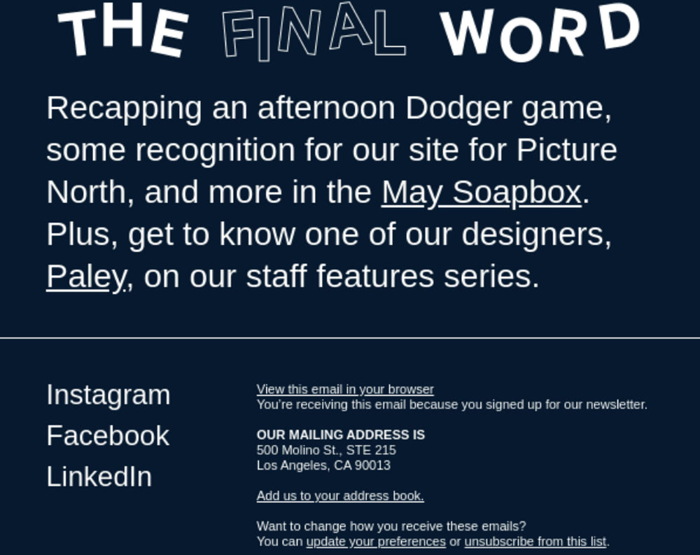
Email footer example from Funkhaus
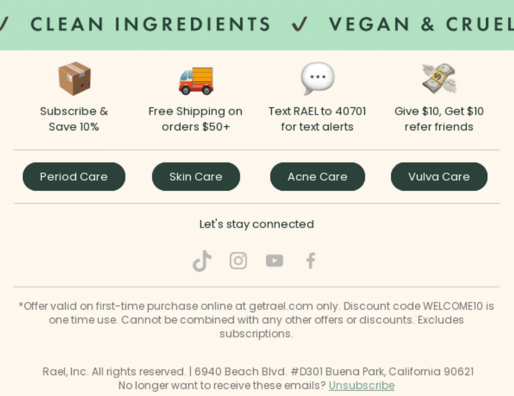
Email from Rael
Rael is a small yet promising startup that offers vegan, cruelty-free products. Their emails are centered around their ideology featuring nature motifs and corresponding atmosphere.
The footer is no exception. The design perfectly supports the theme strengthening the overall impression. Green and beige are powerful color choices that convey the proper gamut of emotions and create a solid foundation to play some psychological tricks.
For instance, you may notice an accreditation carefully incorporated into the theme – it qualifies the company, and ipso facto increases its credibility. On top of that, several offers promise some substantial benefits bringing actual value to customers.
As for essentials, the team nailed them. Navigation with all crucial links is in its place. A range of social media icons provides an alternative way to communicate. Whereas the disclaimer and all necessary information about the company are right at the bottom. Smart.
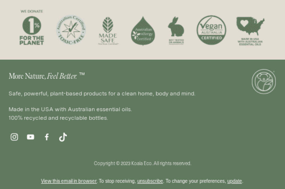
Email from Koala Eco
This startup works in the same niche, providing another digital newsletter made with cruelty-free natural motifs. You may find similarities in their email footer designs, but still, they are different.
Much like the Rael team, Koala Eco uses the same color scheme and sticks to a clean and neat approach to displaying information. However, they prefer to build trust by showing off their company’s impressive certificates. They also mention their donation program that makes their clients the ones who help to save the planet – smart move.
As for essentials, they feature social media links, brand visual identity elements, an unsubscribe button, a link to the preferences panel, and a link to view email in the browser for a better user experience.
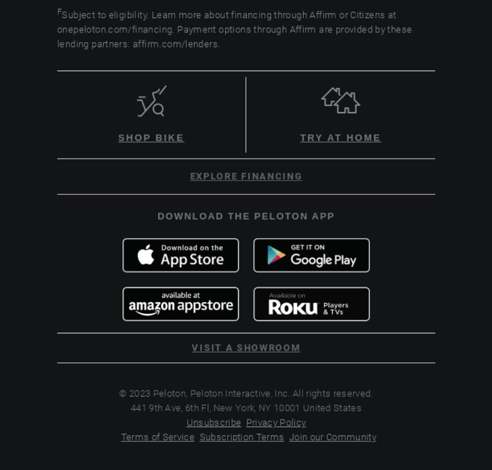
Email from Peloton
Peloton is a high-profile fitness brand that carved a sub-niche for a short period. Their digital newsletters are energetic and exclusive, much like TV advertisements, to support consistency across communication channels. Let’s take a closer look at the footer.
Following the classy approach of black and white, here email footer certainly looks exclusive. It offers a pleasant reading experience thanks to contrasting color choices, hassle-free backgrounds, well-balanced organization, thoughtfully-chosen graphics, and generous whitespace.
It sets the right tone for the content and provides access to such crucial information as:
- Disclaimer and a link to the financing page
- Links to the shop, homepage, and showroom
- Buttons to download the app on popular platforms
In addition, the team added traditional navigation that leads to crucial pages such as Privacy Policy, Terms of Service, Subscription Terms, Unsubscribe and Community.
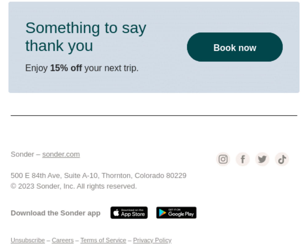
Email from Sonder
Sonder provides us with a clever email footer solution. It is pretty small and compact. However, it does its job perfectly well. It supplies subscribers with crucial information. This includes links to active social media profiles, direct link to the homepage, small traditional footer navigation, App Store and Google Play buttons, and legal information for GDPR compliance.
On the other hand, it supports the marketing strategy by featuring a clever promo banner that increases lead generation. The latter kills two birds with one stone: it shows an “appetizing” offer of a “15% discount” and a grateful note that wins over clients.
As for design, the team ditched all graphics and used a light color scheme to serve information unobtrusively.
Email from Alala
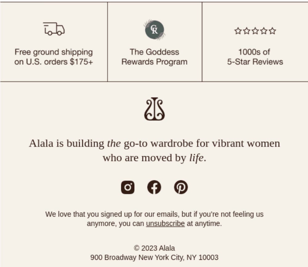
Email from Alala comes with another big multi-row footer design that, much like Peloton, shows lots of information thanks to proper organization and wise choice of color and decorative materials.
The content is well-thought-out. The team uses a footer to increase conversions step by step: first, they remind about fast free shipping, then they focus attention on the club program with a powerful title, “The Goddess,” and finally, they qualify their brand by showing a 5-star rating based on 1000’s reviews. Smart strategy.
Afterward, they play a brand identity card by capitalizing on the mission statement.
As for essentials, the team seamlessly included a physical address, unsubscribe links, and links to social media profiles, thereby providing transparency in communication.
Email from Grove Collaborative
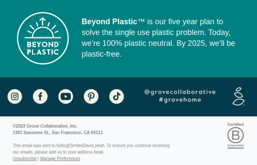
The email marketing team behind Grove Collaborative has decided to end their digital newsletter on a warm note by sharing their plans for the future. They did it smartly. Instead of describing finance or marketing goals, they revealed an intention to make the company plastic-free, contributing to the planet’s health and showing off their environmental responsibilities.
They found a place for essential information, such as the company’s logotype that leads to the homepage, social media icons, physical address of the company, and links to unsubscribe and manage preferences panel.
As for design, the team opted for a traditional stripe layout that easily accommodates information and naturally leads viewers from top to bottom.
Email from ActiveCampaign
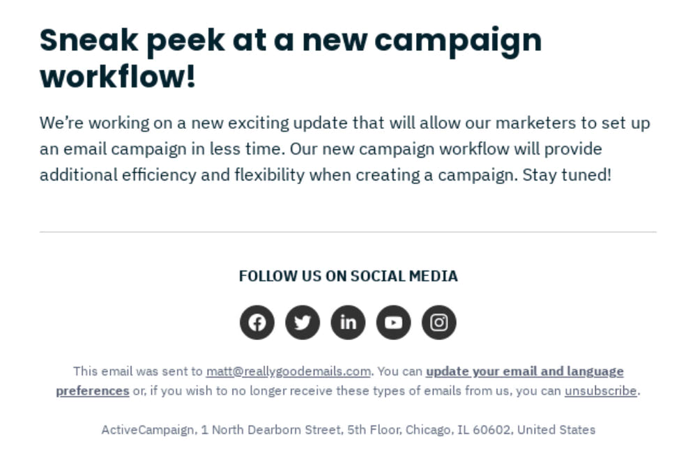
ActiveCampaign offers another good email footer example that reveals the company’s plans for the future with a marketing undertone. They feature a sneak peek at an update that will benefit all their clients.
This tactic drives engagement, nurtures clients, cements the company’s position in the market, and certainly wins over those who doubt whether to stay or leave.
Along with this, you may find the company’s physical address, links to social media profiles, and links to the unsubscribe page and managing preferences dashboard. As expected, the design is neutral: black text over white background with a generous amount of fresh air supported by thoughtfully picked typography and graphics – always a win-win.
Email from Something Sweet
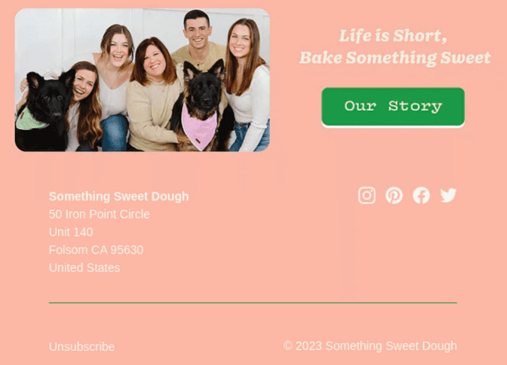
How about an ideal marriage of professional and personal touch? Although these approaches are difficult to imagine together, the team behind Something Sweet managed to do that.
The trick lies in using a team photo (professional touch) but with a warm and friendly atmosphere inside (personal touch). Just take a look at all these smiley faces – this is adorable. Also, the phrase that accompanies the photo breaks the ice and reinforces the brand’s image.
As for the standard pack of data necessary for the company to operate on digital expanses, it sits comfortably at the bottom, giving subscribers quick access to the unsubscribe option, social media profiles, and mailing addresses.
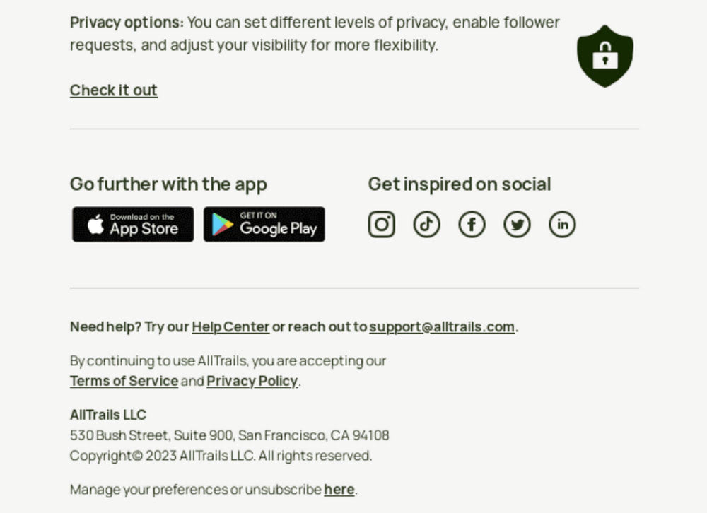
Email from AllTrails
Those of you who need a real-life example of a basic email footer without any marketing tricks will undoubtedly appreciate a digital newsletter sent by AllTRails. It embraces a minimal approach and prioritizes information about the company crucial to legally operating in Europe and the USA.
It’s clever. Note the context: phrases are carefully picked. They are audience-targeted and cultivate healthy relationships with customers. For instance, “Need help?” heralds a link to the Help Center and email address, whereas a link to the unsubscribe page is presented by “Manage preferences.” Their friendly language certainly wins extra points.
Also, the team includes social media icons and app store buttons that can be helpful for engaged subscribers.
As for design, you may have noticed a conservative typeface and simple yet eye-pleasing color scheme, which fits the overall design.
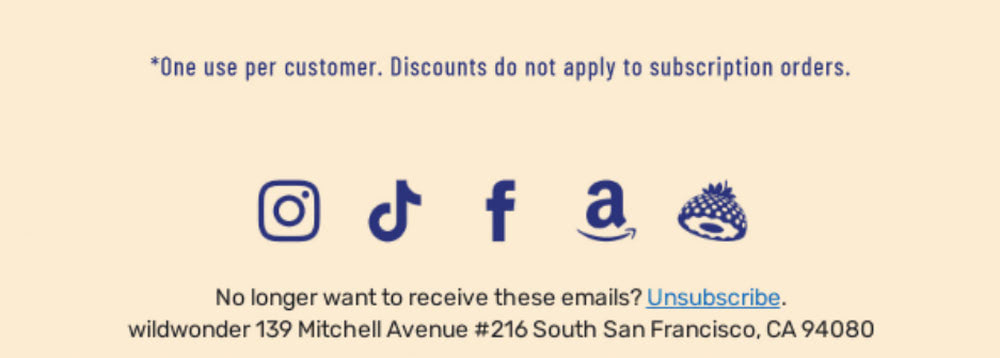
Email from WildWonder
If you seek an even more compact approach to email footer than the previous one, then a digital newsletter from WildWonder deserves your attention. It capitalizes on a capsule approach in every aspect: design, content, experience, and emotions. It is, so to say, a neutral solution with a general purpose.
It includes only a physical address and unsubscribe button to meet GDPR compliance, a short disclaimer to clarify the offer presented in the body copy, and social media icons. All the crucial information customers need is there.
As for design, the team uses a two-tone color scheme and some fancy icons that echo the overall theme.
Conclusion
The email footer is an afterthought for many young companies, but it is a mistake. Professional marketers consider it a powerful tool that fulfills numerous crucial tasks, such as amplifying conversions, driving engagement, leaving long-lasting impressions, and saving precious leads.
It must be taken seriously because it bears information crucial for a company to operate in digitally. It also ensures much-needed transparency in customer relationships and saves the company from being flagged as spam.
Creating an effective email footer can be challenging because it is vital not to overwhelm visitors. It should be informative and goal-oriented but at the same time, compact and brief. Our guide reveals the steps you must take to create a solid foundation. Improve it with best practices to create an email footer that benefits your campaigns and readers.
