The Emotional Side of UX: Turning Casual Visitors into Brand Evangelists
The web started off as a limited information medium and in its early years we had to focus our efforts on the functionality of websites more than anything else. There was little design and style in the very first websites. And it’s not that we didn’t have a sense of aesthetics, the technology just didn’t support it.
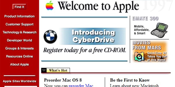
But as the web evolves — with 200,000 websites launched daily — it takes more than functionality to get found on the web. The good news is a bunch of websites have got it right and have remarkable web user experiences.
But there’s one more thing beyond positive UX that can create a stronger connection with users and that is emotion.
Studies have proven that emotion plays a significant role in human decision making, especially when it comes to purchase decisions. The websites we build are merely another sales channel, whether we’re selling physical goods, services, games or even ourselves as professionals. So why don’t we create a personality for those websites? Why don’t we infuse soul and emotions into the user experience?
With Postcards Email Builder you can create and edit email templates online without any coding skills! Includes more than 100 components to help you create custom emails templates faster than ever before.
Free Email BuilderFree Email TemplatesAlthough we have progressed in creating functional products with delightful UX designs, for many websites going further into emotional design may be an unaffordable luxury. Emotional design is not just a friendly tone and a couple of jokes. I don’t want it to sound bookish, but if you want to do it the right way, it requires research and a deep understanding of your target audience. Emotional design helps predict the way users will react to the humanized interactions.
How Do Emotions Impact User Behavior?
If you ask an Apple fanatic why they prefer iPhone to rival products which can have better specs, more features, longer battery life and even prettier looks, you probably you won’t get a rational answer. There is no rational answer. When we love or hate something we don’t tend to analyze ourselves, while there is actually a lot going on inside our brains.
To explain the connection between human feelings and product design, Don Norman identifies three levels of visual design in his book “Emotional Design.”
1. Visceral Level
It’s the first impression of a product. At this point users get a surface look of the website and are impacted by the general look and feel of it. On the visceral level, graphics and visual appeal matter the most. As Norman states in the book: “In the best of circumstances, the visceral reaction to the appearance works so well that people take one look and say “I want it”…This is the reaction the visceral designer strives for.”
2. Behavioral Level
Behavioral level functionality and performance matter above all. When you are delighted by the look of a product you expect it to perform just as smoothly. It’s important to ensure flawless usability of all features and the product as a whole in order to evoke positive emotions.
3. Reflective Level
This is the highest level of interaction when everything is about the meaning of the product, the message it conveys and the image of it. On the reflective level, minor flaws are usually overlooked as we get an overall impression of the product. At this point customer service may play a great role too, because it can soothe a painful experience or ruin a positive one.
With Startup App and Slides App you can build unlimited websites using the online website editor which includes ready-made designed and coded elements, templates and themes.
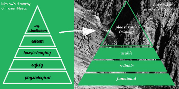
Try Startup App Try Slides AppOther ProductsLet’s take a look at the hierarchy of emotional design by Aaron Walter, which is inspired by Maslow’s hierarchy of human needs.
The idea behind Maslow’s hierarchy is that people need to satisfy such basic needs as hunger, thirst, health and safety before they can think of their self-esteem and greater goals in life. The same concept is applied to UX design, and according to new hierarchy products, should by functional (do what it’s designed to do), reliable (less errors the better), usable (easy to use and intuitive) and pleasurable. The latter is at the top of the emotional design hierarchy.
How To Build Emotion into UX Design
Emotional design can be implemented in many different ways, but often comes down to two strategies:
- Create a unique personality for the product that can stand for itself (e.g. Mailchimp’s Freddie von Chimpenheimer, a friendly chimpanzee ready to help deliver emails fast and easily)
- Make the user feel that there is a real person or team behind that screen who are caring, empathetic, attentive and ready to help
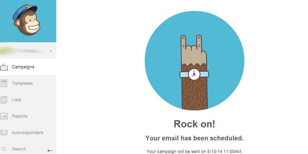
The choice depends on the knowledge of your target audience. In both cases, you can make use of the following tactics to breathe some soul into your digital product and evoke emotional responses from users.
- Get emotional with copy. Depending on the type of emotions you are trying to inspire (joy, surprise, exclusivity, belief, hope, etc) you can write in a specific tone, using corresponding words and phrases that come across as serious or casual.
- Rethink microcopy. It’s all about the details. Microcopy — form labels, button labels, error messages and notifications, anything used as default text — needs to be customized in order to relate to users.
- Be attentive and caring. This mainly refers to critical error pages, not search result pages, website downtime messages and any other frustrating situations when users need you the most. Try to soften annoying experiences and compensate somehow.
- Be polite. Don’t forget to say “thank you” and “sorry.” Include small, pleasant surprises and express your appreciation for users.
- Show your human side. People don’t trust machines as much as they trust humans. Make your product or service feel alive by sharing photos of your team and office, and testimonials and images of happy customers.
It’s important not to get too carried away and cross the line between being emotional and being weird. But even if you do, research and test again, continue experimenting until you find a near-perfect way to the heart of users.
