Websites Featuring Flat Illustrations – Best Examples
Although the year draws to a close, the flat style is still at the peak of its popularity, and is unlikely to leave us the next year. We have featured numerous informative articles regarding to this topic starting from Flat Design and Color Trends and ending up with helpful tutorials of how to master it, yet there is still a small loophole that we have missed – website designs featuring flat illustrations that have become extremely popular lately. So let’s delve into this issue a bit deeper.
Today we have considered not only websites that are based on polished vector drawings but also those that leverage plane graphics, and of course, modern icons with long shadow or convexity effect.
All these examples can boast of its harmonious outward, since the flat style manifests itself not only by means of accustomed flat subtle color scheme, neat elegant typography, solid color backgrounds and flat integral user interface components but also with a help of a decorative aspect that is presented by flat free illustrations.
Let’s explore some characteristic examples of flat design illustrations
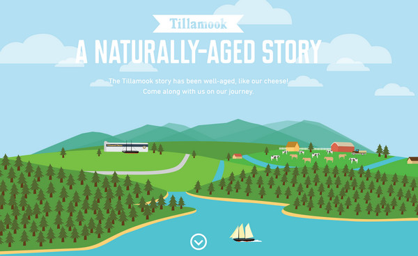
A Naturally-Aged Story is a fantastic website that is based on a visual storytelling. The company quite creatively and skillfully familiarizes regular users with its history, grabbing their attention by means of captivating vibrant illustrations.
Robby Leonardi has a magnificent, truly extraordinary online resume that has an old-school game vibe. It is fully based on vivid flat illustrations, where even “fake” 3d elements are created by means of simple plane shapes. The adventure of a small funny character is simply intriguing.
With Postcards Email Builder you can create and edit email templates online without any coding skills! Includes more than 100 components to help you create custom emails templates faster than ever before.
Free Email BuilderFree Email Templates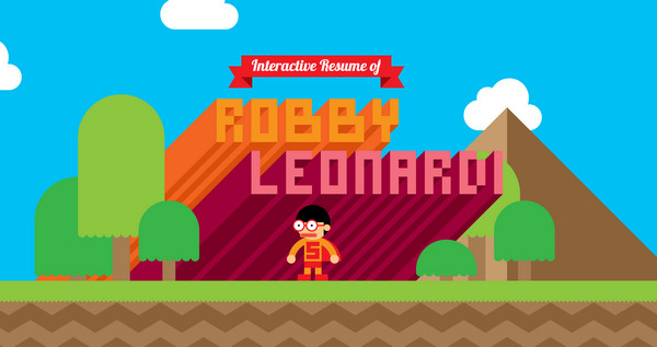
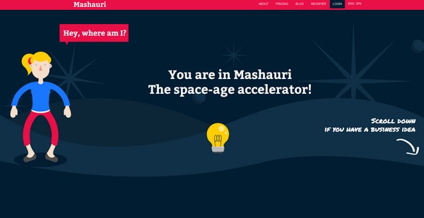
Mashauri is an intricate corporate website that also adopts approach of visual storytelling. The web developer makes use of vertical parallax in order to bring it to life. The website comprises flat essential components throughout a whole design.
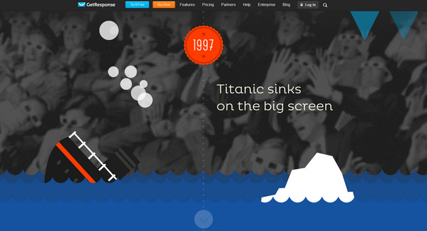
GetResponse resorts to an optimal solution of a perfect combination between image background and plane garish pictures on a foreground in order to create a spectacular scene that is ably populated by interesting facts. This is a great example of how to effectively acquaint users with results of its intensive 15-years work.
TeamGeek is a clean and open portfolio that leverages lots of flat icons and graphics. Thus the “What We Do” section comprises a nice eye-catching grid with intelligible icons made in a saucy flat style while other subpages are complemented by modern graphics with elegant long 5 O’Clock shadows.
Play It Forward is a non-profit website that is aimed to reveal benefits of sport to children via small captivating game. The flat illustrated background along with a positive vibrant color palette creates a healthy atmosphere, and easily conveys a cheerful mood.
With Pulsetic you’ll be instantly notified the moment your website, API, or server becomes unavailable. Monitor uptime from multiple global locations and respond to incidents before your users are affected.
Create beautiful status pages in minutes to keep customers informed during outages and build trust with transparent communication.
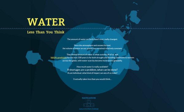
Start Monitoring for FreeLess than you think – The website is intended to raise awareness of water supplies, presenting a sophisticated attention-grabbing design. The website is an interactive infographic that displays statistical data in a pleasant manner, which are supplemented by splendid flat illustrations.
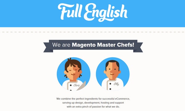
Full English is a clean and neat online portfolio of two Magento gurus. The developers choose to adopt a kind of cartoonish approach in order to create a friendly atmosphere. The website effectively balances of bags of plane graphics with dynamic components, giving the website a lovely advanced appeal.
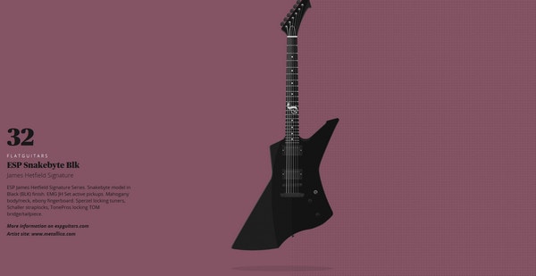
Flat Guitars is a specific website that is dedicated to rock, and to be more precise, it showcases various popular guitar models. It highly resembles the website about New York windows that also makes use of flat illustrations in order to effectively bring attention to regular things.
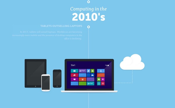
Visual History of Computing – As the nameplate implies, you will be able to briefly explore a history of computing, which traces its story from distant 50s. Each era is supplied with an amazing flat illustration of a corresponding to this time device and of course, a short note. The flat illustrations help to abstract from shapes and exterior design and take a closer look at what actually was happening.
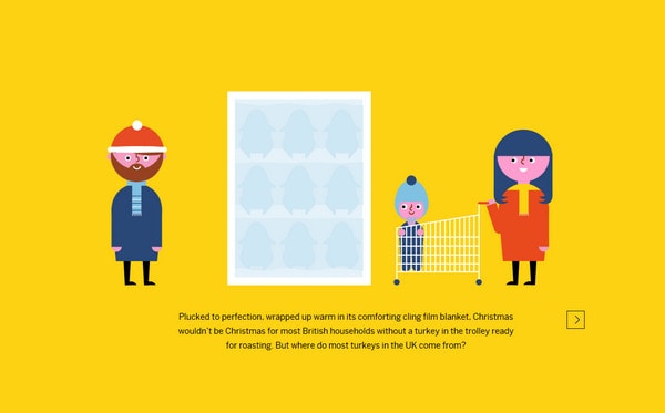
Let’s talk Turkey is a juicy website that leverages an approach of interactive journey in order to notify online audience about the meat market. The story is also presented by means of a set of colorful flat illustrations that adds to the website a positive feeling.
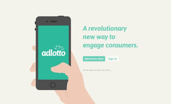
Adlotto – The website welcomes its readers with a pleasant cartoonish flat illustration. In sum, the website looks neat and elegant mainly because of soft pastel coloring and clean flat graphics that is dispersed throughout the entire design.
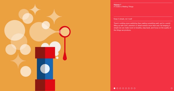
Volume 1 is an interactive eye-popping website that leverages fantastic flat drawings with lovely dynamic effects in order to get the readers’ attention, and make the guide appealing.
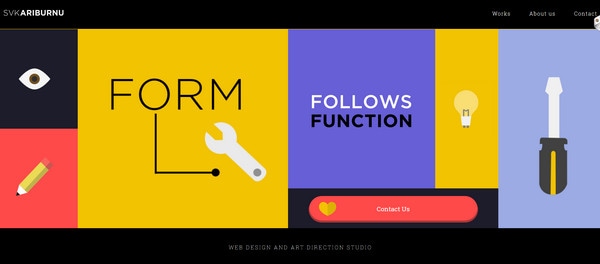
SVKARIBURNU has a crisp website that employs a powerful combination of content and illustrations. Thus, the website utilizes only these 2 components in order to make the website look sophisticated, modern and clutter-free. Flat illustrations perfectly co-work with a sharp type and solid color backgrounds.
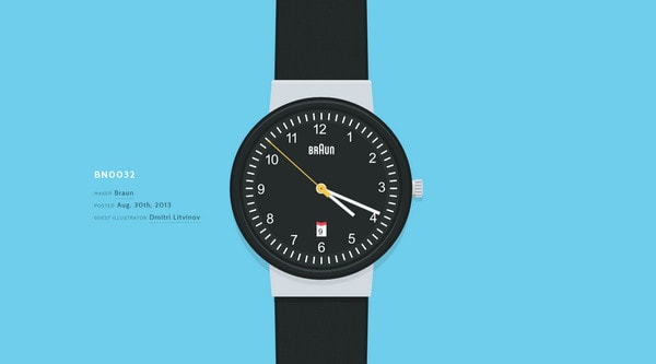
Wrist – Much like the example number 9, this website also graphically displays various models, and in this case, it shows off different wrists. The designer has chosen flat style, since it doesn’t clutter up the design and quite effectively demonstrates tiny details. Moreover, plane graphics laconically collaborate with background and content.
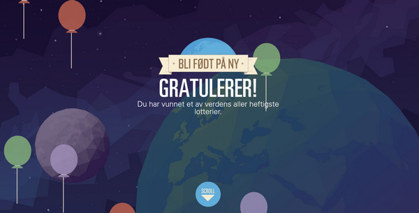
Gjenfodt is an advanced website that is based on top-notch vector illustrations. Flat drawings and characters, even polygonal style graphics can be found on this spectacular website.
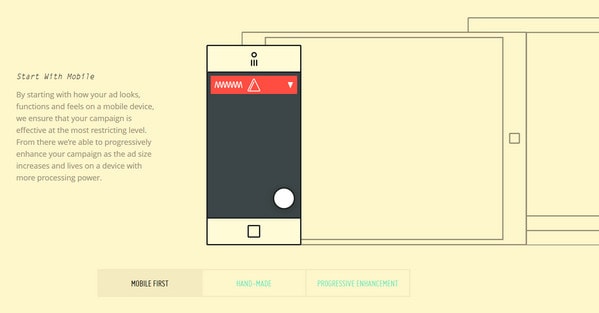
Adcade is a subtle website that is made with flat style in mind. There are lots of contour style figures, plane illustrations and smooth typography. The developer ably mixes graphics and dynamic effects, making the website look interactive.
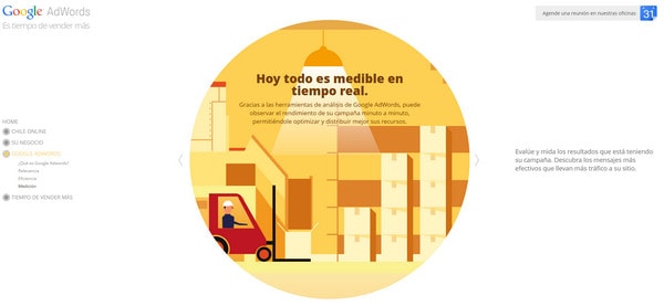
Google Adwords always goes with the times, so it’s not surprising that its website also employs bright flat illustrations for explanations.
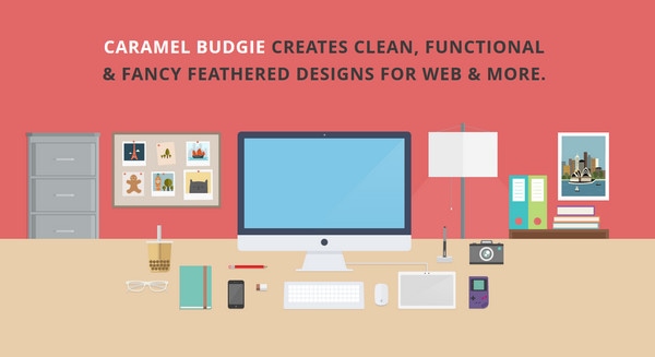
Caramel Budgie – The designer efficiently leverages a set of flat colors, giving the website a soft and modern appearance. All icons and graphics are also made in flat style in order to effectively contribute to the theme.
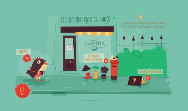
Cuisines Schmidt – A set of garish flat illustrations is the centerpiece of this website. Moreover, every interactive picture is provided with enthralling dynamic elements and widgets in order to grab as much attention as possible.
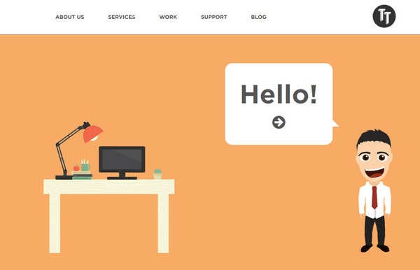
Tiga Tech is a small yet productive online portfolio that is constructed via flat exciting drawings. Every section includes its own cartoonish picture.
Reflection
Use of flat illustrations and flat graphics in website design is quite a predictable outcome, all the more so the flat style websites look more harmonious and completed with an appropriate graphics. Icons with long shadow, plane graphics and dramatic flat illustrations are essential components of such type designs.
What do you think about such websites? Like or hate it? Why? Do you know any other good examples of websites utilizing flat illustrations?
