10 Distinctive Features of Japanese-Style Web Design
Many of Japan’s distinctive features can also be found in websites from that country, including unique vision, a high-tech vibe and a fondness for nature. These details are the root of the philosophy of Japanese website design.
We’ve collected 10 examples to inspire your creative projects.
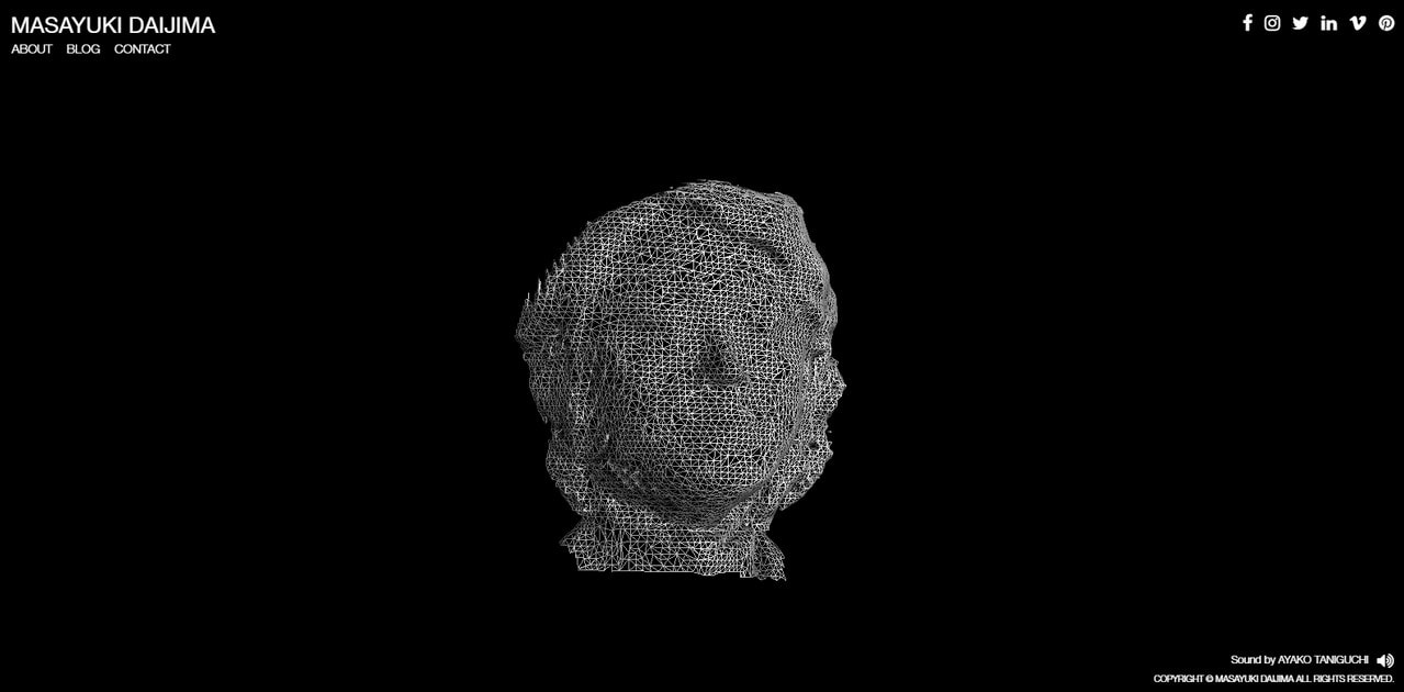
Let’s start with the high-tech vibe. WebGL, GLSL, GSAP animations, Three.js, Nginx are advanced solutions not foreign to Japan-based teams. As expected, these libraries are used to benefit hero sections like Personal Portfolio of Masayuki Daijima. Here, they produce the desired wow factor but do not overwhelm users nor “crash and burn” their system.
It’s a fragile balance between making an impression and letting users enjoy the experience has been vigilantly preserved.
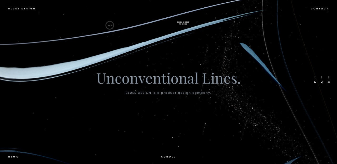
The high-tech elements are present not only on a welcome screen. Consider Blues Design. It oozes a refined techno atmosphere that manifests itself throughout the project. There are amazing scroll transition and navigation effects, 3D rotation menu, drag interactions and more.
Unusual Solutions
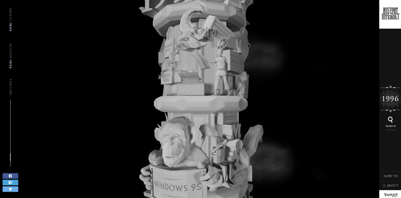
A tech vibe and progressive thinking go hand-in-hand, and website development is no exception. With powerful tools and a passion for innovation, you almost expect something incredible. Look at Royal Gallery and History of the Internet. These examples are fabulous. Both draw attention with a fantastic realization and idea that is one-of-a-kind.
With Postcards Email Builder you can create and edit email templates online without any coding skills! Includes more than 100 components to help you create custom emails templates faster than ever before.
Free Email BuilderFree Email Templates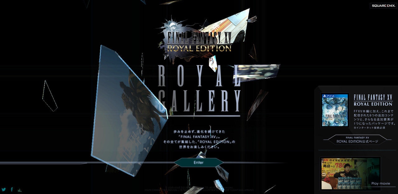
Offbeat Coloring
Color is an integral element of Japan culture. Think about gorgeous lavish kimonos that have been worn for centuries. The colors of these garments are incredibly inspiring.
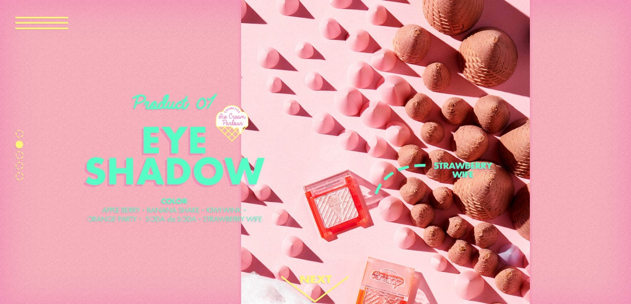
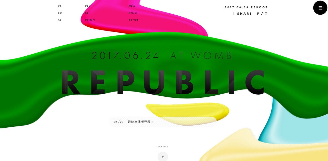
Do not be afraid to mix tones and hues to come up with eccentric solutions. Consider Ice Cream Parlour Cosmetics and Republic. The first gets its beauty from the drastic union of neon turquoise and dusty pink; the second uses bright green, blue, yellow, crimson without shame.
Vertical Rhythm
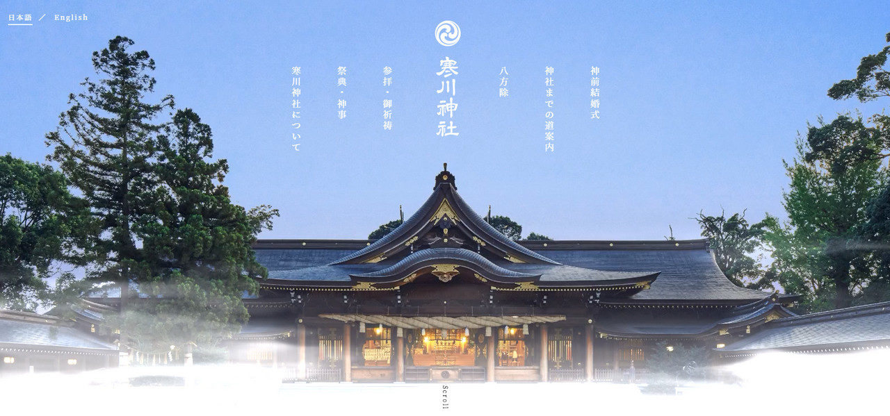
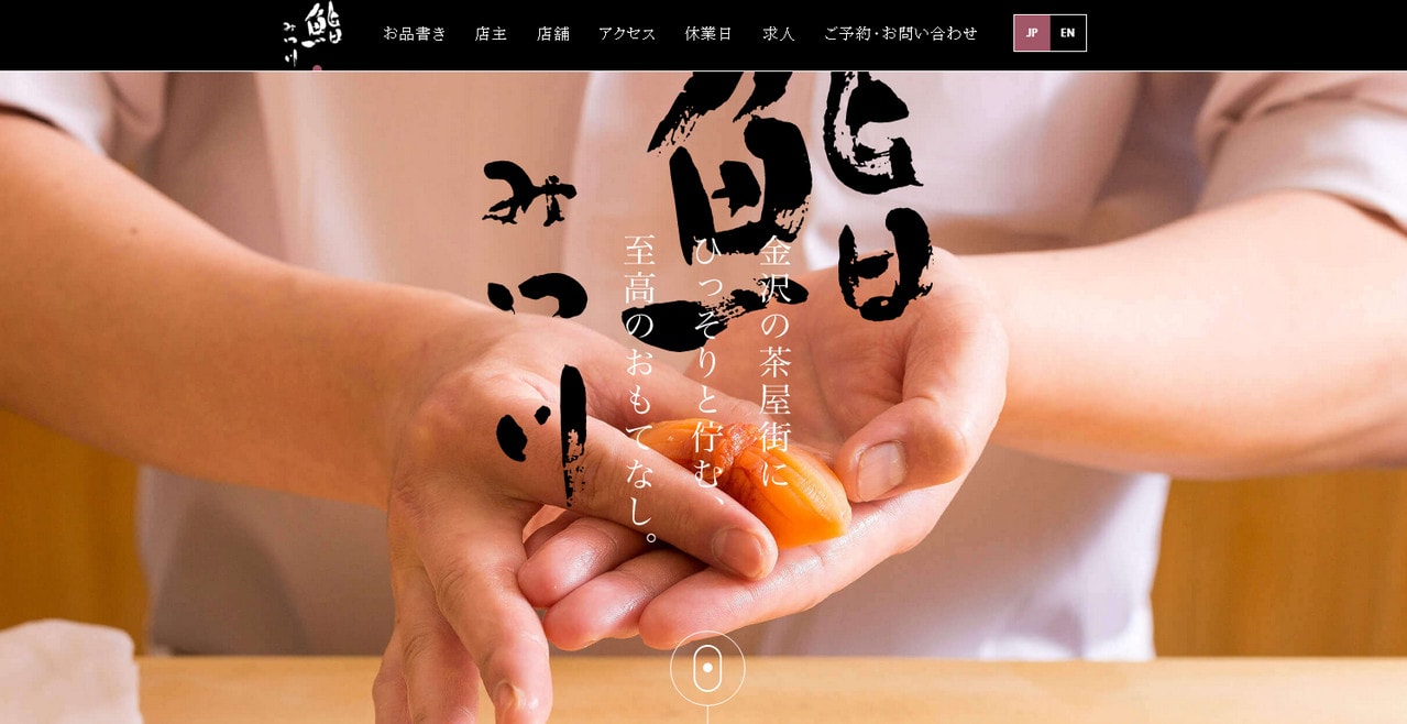
Vertical rhythm is inspired by the Japanese writing system. Tategaki, a traditional writing style, is a format in which characters are written in columns from top to bottom. You can see the vertical rhythm in websites like Samukawa-jinja Shrine or Sushi Mitsukawa. What’s more, vertical lettering is a trending web design element all over the world.
Nature
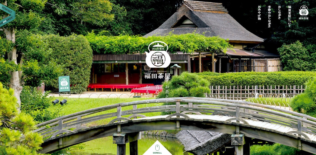
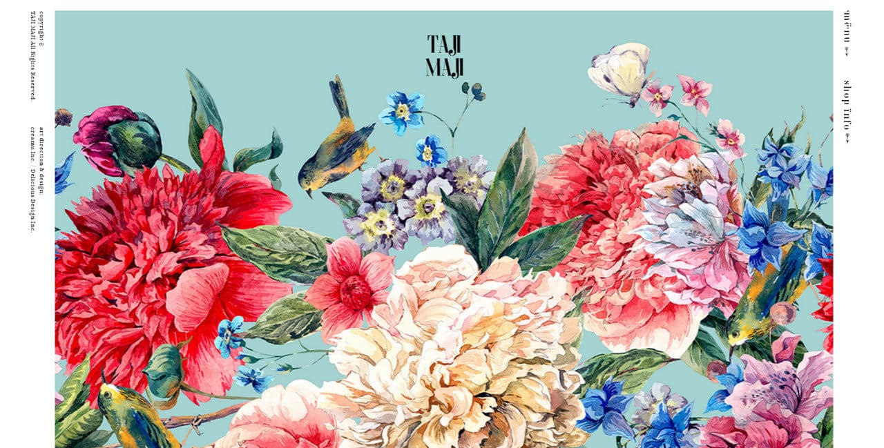
A love of nature is evident in many Japanese projects. Take a look at Fukuda-Chaya. A range of picturesque scenes is so authentic and rustic that you want to jump right in. The front page of Taji Maji exhibits a marvelous flowery illustration with a charming personality.
Crafty Hero Areas
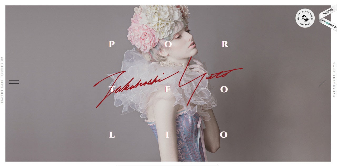
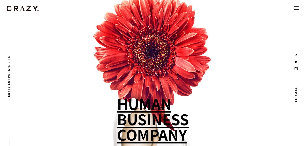
Our collection of Japanese projects also uncovered that hero areas are true masterpieces in many projects. Consider Portfolio of Yuto Takahashi and Crazy. Both examples skillfully combine natural beauty and tech tricks. The welcome section of Yuto Takahashi’s portfolio is akin to the cover of a luxurious fashion magazine; the corporate site of Crazy agency oozes creativity.
Anime-Inspired Illustrations
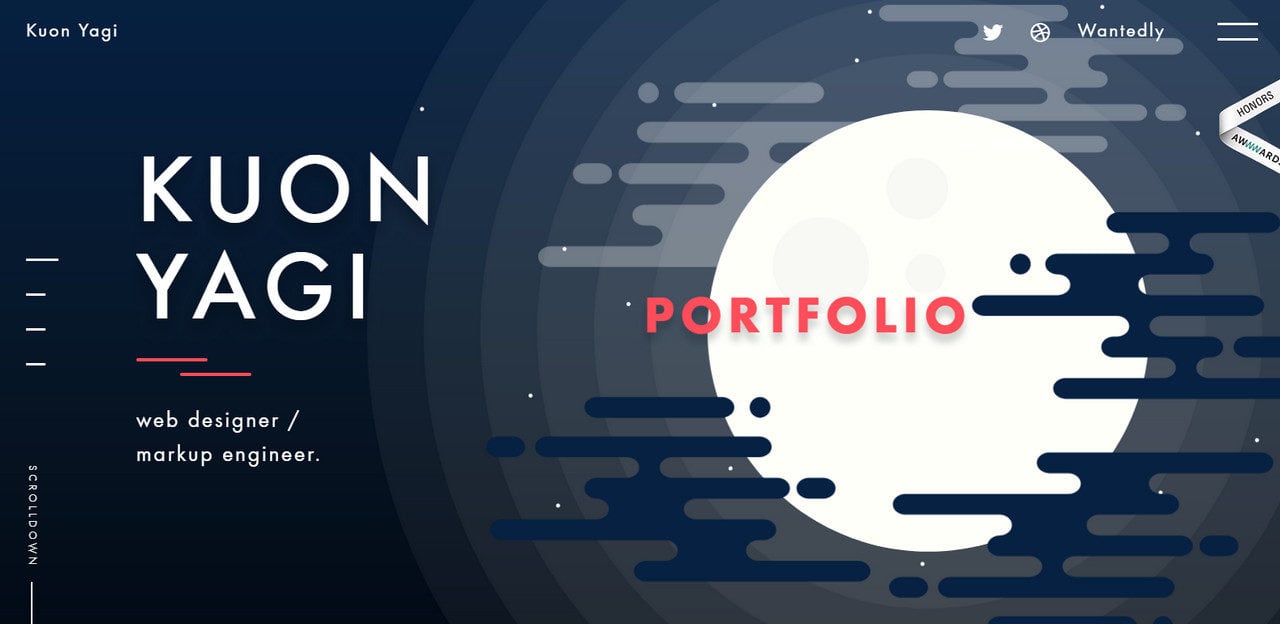
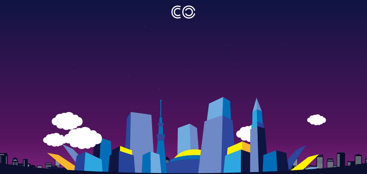
We could not help but mention anime-inspired illustrations. Do you remember all those mesmerizing fantasy worlds reproduced by the incredibly talented animators of Studio Ghibli? Anime as well as Manga, printed comics, are distinctive elements of Japanese pop culture. Consider Kuon Yagi and Co.
Let us not forget about characters, hieroglyphs and music. These things can identify eastern Asian style.
Characters
The first thing that comes to mind is classic Manga art, including girls with long hair and big-big eyes. But the design style is much more diverse.
With Startup App and Slides App you can build unlimited websites using the online website editor which includes ready-made designed and coded elements, templates and themes.
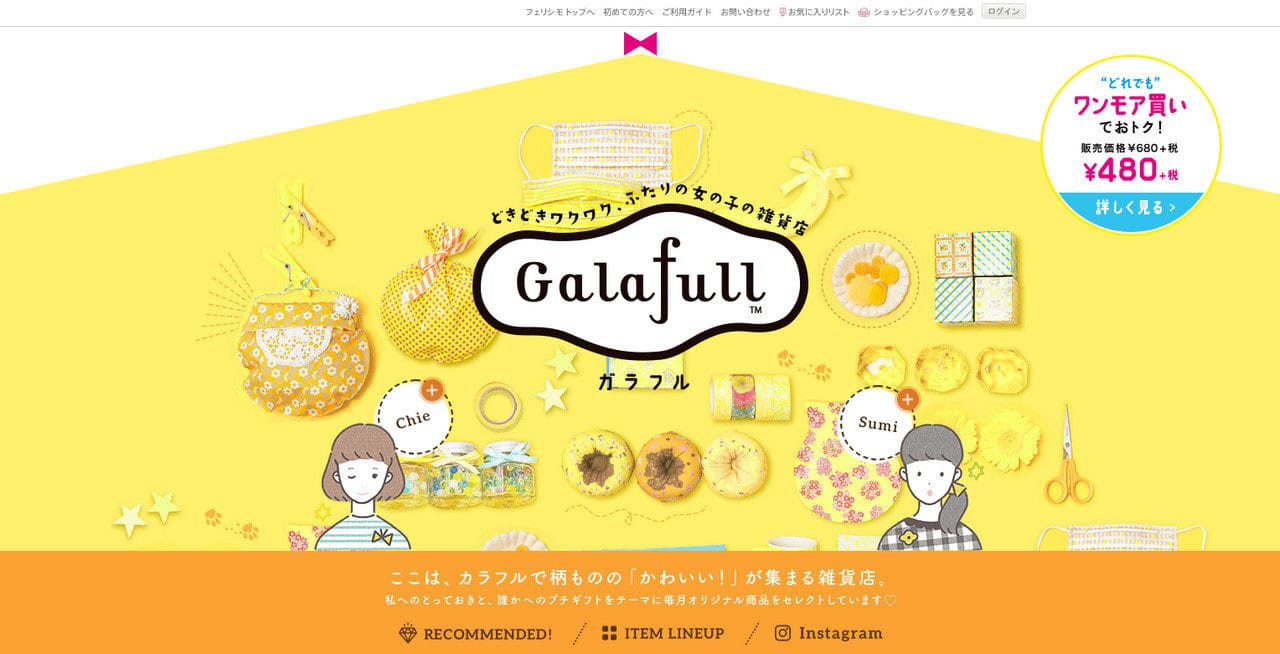
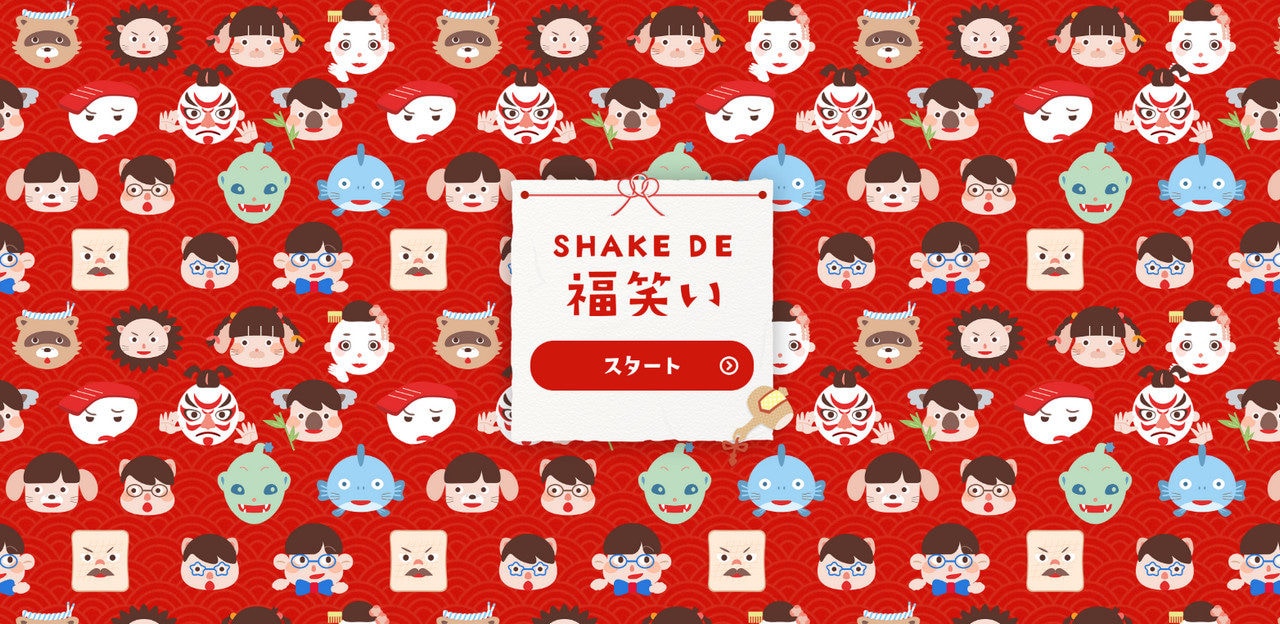
Try Startup App Try Slides AppOther ProductsTake a look at Galafull. Here, you will find several beautiful female characters and they have nothing in common with Sailor Moon and her group of comrades. If you are a fan of the Pokemon universe, then you won’t be surprised to see imaginative creatures used in the background of Shake De.
Japanese Hieroglyphs
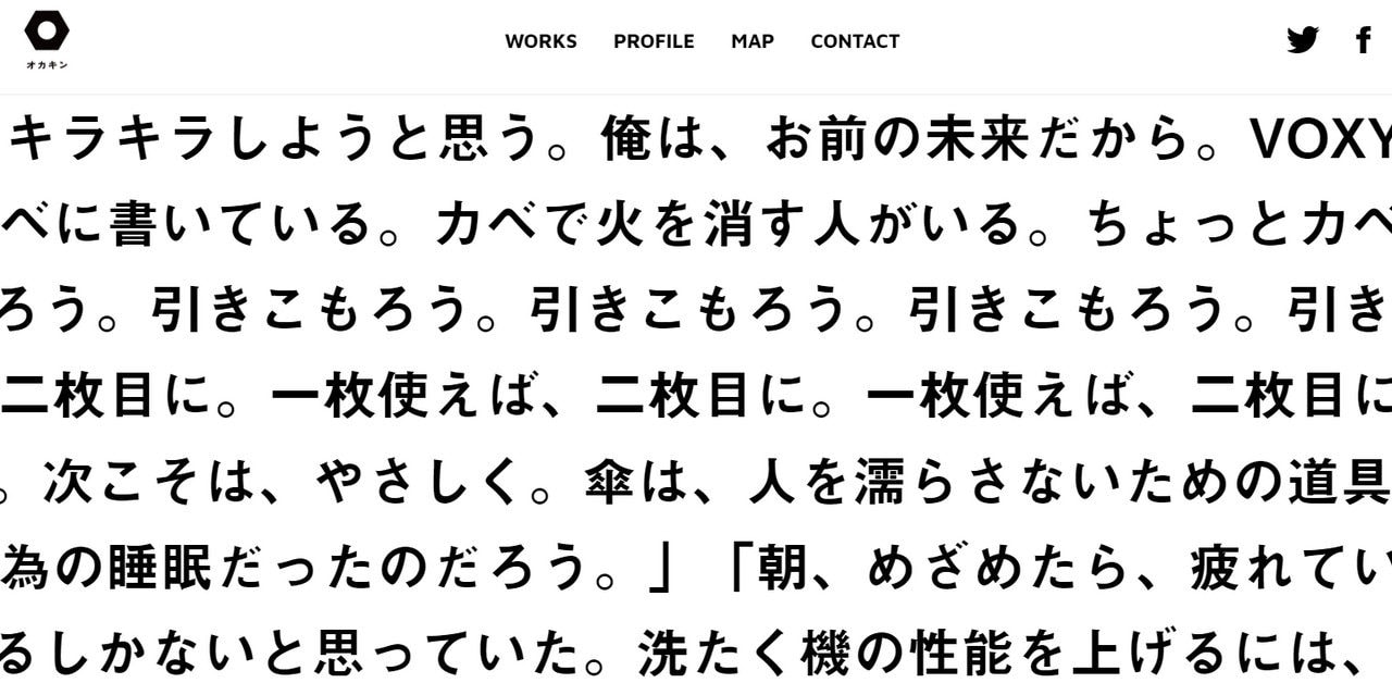
It is hard to imagine a website in Japanese style without hieroglyphs. Take a look at Okakin. Even when you switch languages to English, there is still a chance that you will encounter a few Japanese characters.
They convey information and also reflect the more spiritual side of a project since it is believed that some of these characters can bring luck, prosperity and happiness.
Traditional Sounds
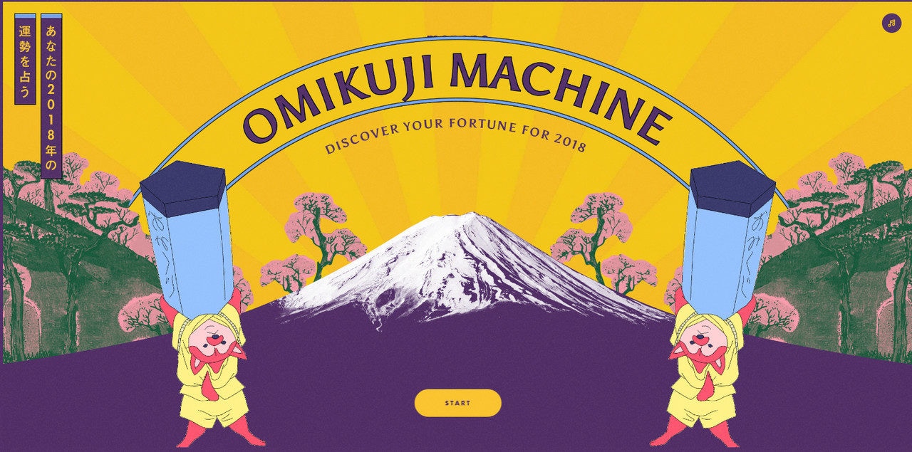
Sounds are not a rare thing in a website anymore. We saw a rise of musical backgrounds several years ago and they are still in-demand. Omikuji Machine uses traditional sounds to complete the user experience. The beautiful musical accompaniment is an integral part of the website.
Wrap Up
Websites in a Japanese style are identifiable thanks to elements such as symbols, Manga characters, vertical lettering or high-tech features.
A love for nature, artistic approach and passion for advanced solutions are also distinctive features of this web design style.
