Modern Fonts: Most Popular Typefaces, Best for Webfonts
The Modern fonts or Didones tend to carry even sharper contrasts compared to transitional types such as the influential Baskerville. If experts believe that the Baskerville was trying to blind readers, Didones even took the contrast even further. The first true Modern type was created in France by Firmin Didot and was first introduced on a published text on 1784. The font of Didot was then followed by the more influential fonts of the Modern style such as Bodoni created by Giambattista Bodoni. This punch cutter and printer were influenced by the unbracketed, flat serifs of the Romain Du Roi and the high contrast types of John Baskerville.
Why Modern Style?
The types classified within the Modern Style are represented by characters that reveal the end of the character evolution that are mainly pen-inspired. The Modern Style was also created as an effort to utilize type design as a means to create a contemporary format for written/printed communication. With the rise and acceptance of transitional fonts, there came about a unique sense for type design that has become prominent across Europe especially in Italy and France. Those who are inspired and drawn to the Baskerville type avoided the use of Old Style Fonts and carried on the tradition of refining and perfecting types.
The Influence of Bodoni
The modern style was the period of Bodoni’s incredible popularity. Even today, his works are recognized by type designers who would create well-crafted renditions or create digital copies. Many are still imperfect copies but nevertheless, it shows how Bodoni truly influenced the world of typography. Bodoni, himself was successful in his craft, with thousands of punches and hundreds of unique types that he created during his lifetime. The Manual Tipografico (1818) by Bodoni represents more than a hundred Roman types with their Italic versions. There are plenty other versions that would include numerous ornaments for types as well as Tibetan, Greek, Russian, and Arabic types
Bodoni was a successful type designer and was commissioned the Duke of Parma to create a royalty press. The purpose of this royalty press was not for mass production, but creating refined published texts for the upper class. Bodoni was the perfect fit for the job with his refined eye and masterful methods. His work was deemed legendary and throughout his lifetime, his work was unsurpassed by others. In fact, to this day, the quality of Bodoni’s work is still heralded as the best.
The goal of Bodoni was to create art in typography: the pursuit of art for art’s sake, and to create beauty for its own sake. He also wanted to create a more logical form to the work of Baskerville whom Bodoni idolized. To do this, he used not just a pen and imagination: he took the job using precise, mathematical calculations to determine the finest strokes and translate them to the copperplates for a perfect form.
Thirty years ago, Didot would be the influential type maker who modernized fonts, but it was Bodoni’s precision who would gain the most popularity across Europe. Nevertheless, Bodoni respected Didot’s contributions and also worked with his previous fonts and thus, the Roman Style was created that carried radical forms unlike its predecessors. Prestige and support from the aristocrats put Bodoni’s work on the pedestal. Nevertheless, experts still consider Didot’s creations as truly refined masterpieces on their own.
With Postcards Email Builder you can create and edit email templates online without any coding skills! Includes more than 100 components to help you create custom emails templates faster than ever before.
Free Email BuilderFree Email TemplatesThe Bodoni Font
When looking at Baskerville and Bodoni, you will see a resemblance, but an obvious deviation. In Bodoni, the contrasts were extreme and there is a variation in weight. The serifs are hairline thin and unbracketed. The x-height was smaller and the stress was on the vertical line. Since the contrast was extreme, using the Bodoni in small, continuous texts would make the page hard to read. Nevertheless, Bodoni definitely has drama in its form, but would require considerable spacing for small and large scale prints.
Readability seems not the main goal of the modern style fonts but definitely, they are visually striking. With a heavy reliance on expression and visual appeal, the Modern types are more expressive in form than their predecessors. At the end of the century, Modern types would be well established and with new technological advancements, the world will see yet a new advancement.
Most Usable Modern Fonts
Encorpada Pro
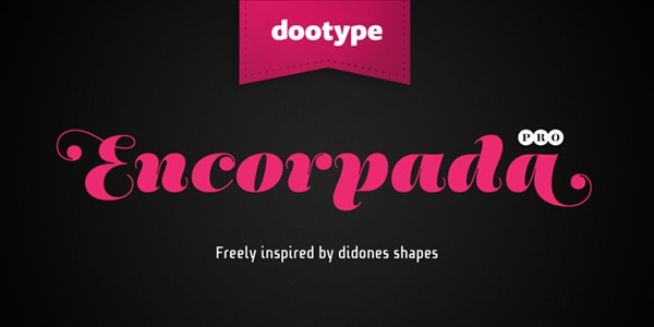
Aire
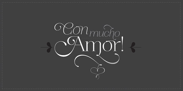
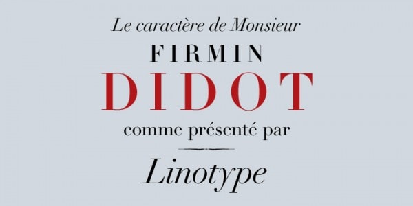
Linotype Didot
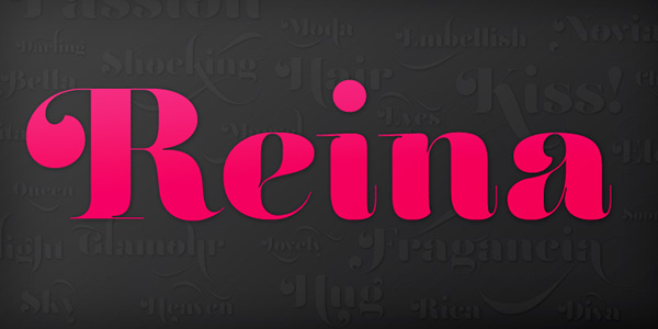
Reina
Port
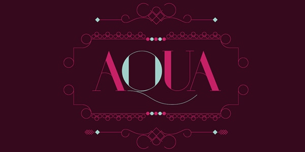
Lust
With Startup App and Slides App you can build unlimited websites using the online website editor which includes ready-made designed and coded elements, templates and themes.
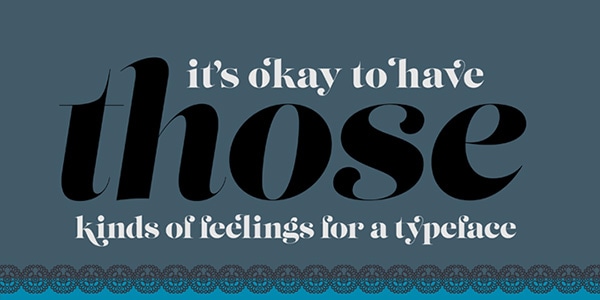
Try Startup App Try Slides AppOther ProductsMussica
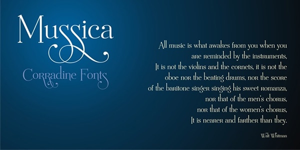
Lynx
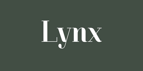
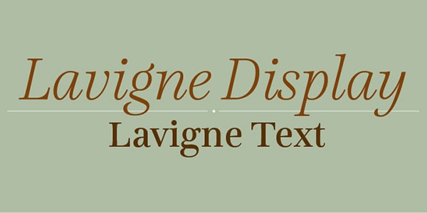
Lavigne
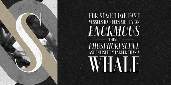
Vanitas Stencil
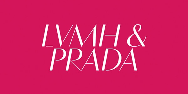
Aquus
Using Modern fonts
One can say that these fonts are not as warm as the calligraphic, handwritten appeal of Old Style types but they have their own unique, almost austere elegance. They are definitely well executed, and are calm. Sadly, the Roman letters are designed to flow from up to down and do not have considerable flow to enable more effective reading compared to the fonts during renaissance times. Since every letter of Roman fonts are designed to stand and look dignified on their own, they are ideal for large format printing, such as in posters, facades, and other forms that would allow you to stand back and look at its form.
Successful usage of the Modern font requires tons of inter-line space and white space so the margins and spacing should be well planned.
Modern day Moderns are everywhere. They are used for branding and not just any products. The luxury business seems to have a liking for the sophisticated but distant appeal of moderns that that they are used as fonts for Vogue magazine and even other luxury goods brands.
