Design Trends for Fixed Navigation Menus in Web Design
Designing a navigation takes some careful planning. You need to think about what your users might look for and what type of nav would fit best in your layout.
Some designers prefer smaller navigation bars while others like huge mega-menu designs. But one trait that I saw in web design is the fixed scrolling navbar.
This can work for all sizes, all styles, and it’s a very common design choice. If you’re looking to add a fixed navigation to your site have a look over these trends to get some useful ideas.
This is definitely a staple for modern designers, especially if you’re working on a site with a big retro navigation menu.
With an auto-sizing navbar you can rest assured that your menu won’t take up too much space. This is a big concern for fixed navs since they stick to the screen at all times. And this goes double for mobile menus where screen space is sacred.

Have a look at the Fandango Media Group website and check out their fixed nav style.
With Postcards Email Builder you can create and edit email templates online without any coding skills! Includes more than 100 components to help you create custom emails templates faster than ever before.
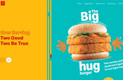
Free Email BuilderFree Email TemplatesIt doesn’t shrink by much but you can tell there is a difference when scrolling. This is the type of thing I look for in very large navigation menus.
I also like to see custom media queries that resize the navbar while on smaller screens. That’s not a necessity but it certainly improves the user experience.
Now alternatively you can choose to just resize the links or reformat the logo. You see this on the Tweed Barbers website.
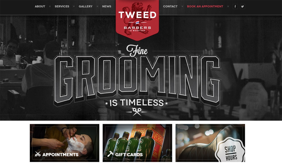
Once you scroll away from the header you’ll notice the logo auto resizes a little smaller.
This is pretty standard for overhanging logos and it makes the navigation a lot friendlier on small screens.
We all know about fixed horizontal navigation menus. These are, by default, the most common navs on the web by a long shot.
But you can get a vertical navigation working just as well if you know how to design it properly. Most of these do require a sticky nav style so the links are accessible from anywhere on the site.
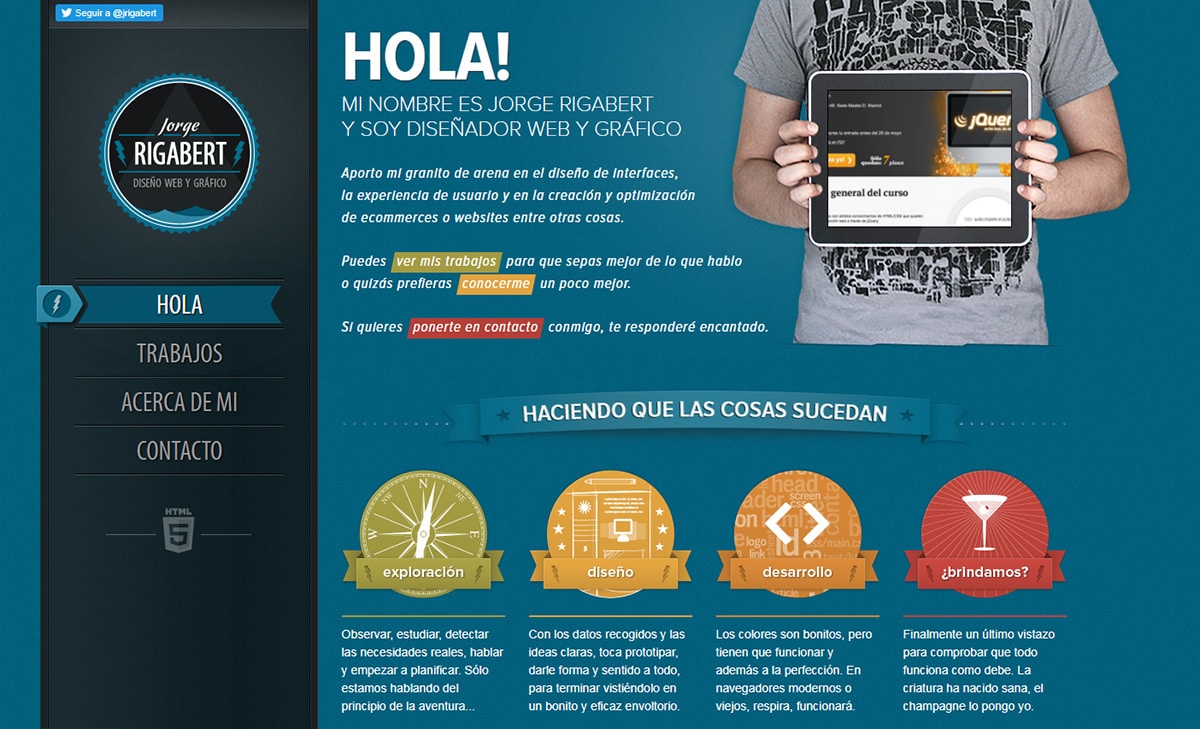
The portfolio of Jorge Rigabert offers a nice example of a lengthy vertical nav.
With Pulsetic you’ll be instantly notified the moment your website, API, or server becomes unavailable. Monitor uptime from multiple global locations and respond to incidents before your users are affected.
Create beautiful status pages in minutes to keep customers informed during outages and build trust with transparent communication.
Start Monitoring for FreeInside you’ll find links all over the side including social media profiles and a pretty clear logo. When you have a design like this you don’t need to worry much about resizing when scrolling down.
Instead, you have to make sure the vertical nav can rearrange itself properly on mobile. That’s a whole task by itself, but when done right it can look phenomenal.
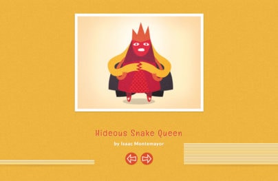
Another nice example is the portfolio of Michael Ngo.
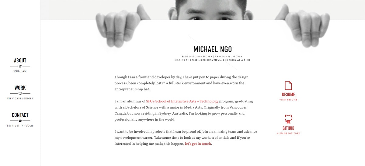
This one’s a little simpler and uses custom icons to improve the navigation style. It follows a very minimalist approach to design which I think fits well in most portfolios.
But you could also get a little technical and do something like Roman Kirichik.
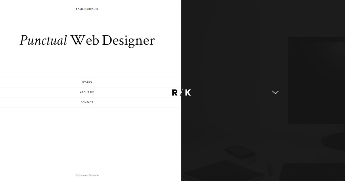
This nav takes on a half-screen design in the header but quietly relocates itself to a smaller sidebar once you scroll down.
Naturally, the links stay in place as you scroll so they’re easy to access.
But if we move away from portfolios and take a look at a sample restaurant layout you’ll see fixed vertical navs can work in almost any scenario.
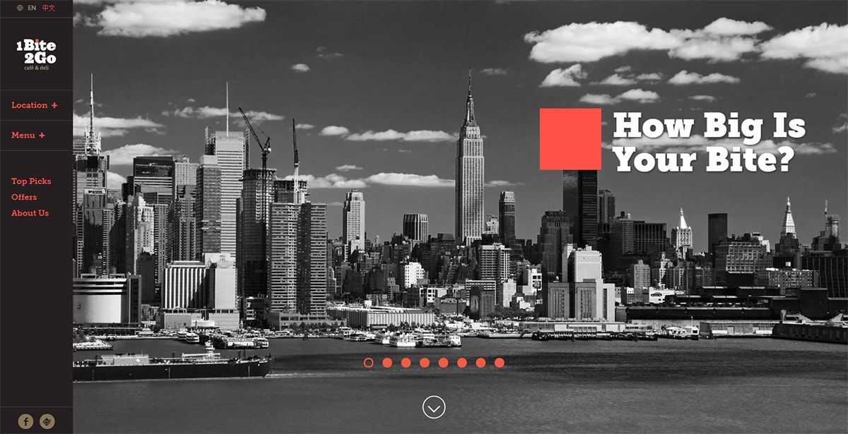
The goal is to make sure all navigation links are easy to use, visible, and not taking up too much space.
If you can do that then you can get a vertical nav working on any website.
Add Depth With Drop Shadows
If you browse the web frequently then you’ve definitely seen drop shadow effects.
Many designers like to follow the flat design trend of long shadows but I prefer the subtler CSS3 shadows to add depth into a page.
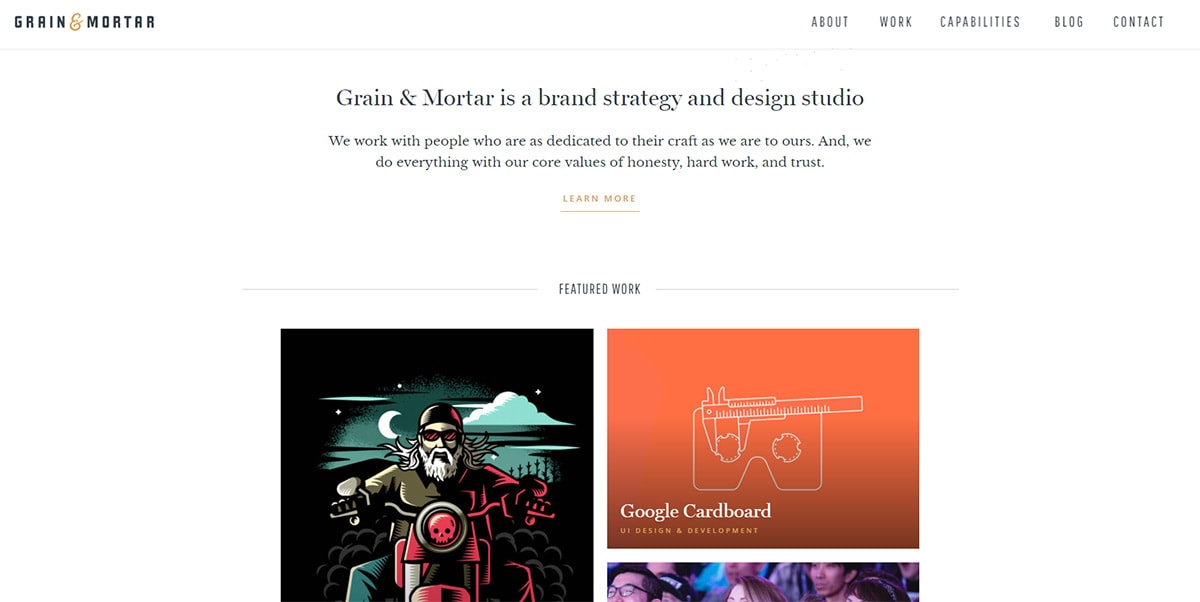
The Grain & Mortar site uses a simple drop shadow falling off their fixed nav.
It doesn’t jump right off the page but it does add a subtle hint of layering. This makes the nav appear “on top” of the content, which visually makes sense because it’s scrolling over everything.
Here’s another good example from Karma with a much more visible drop shadow effect.
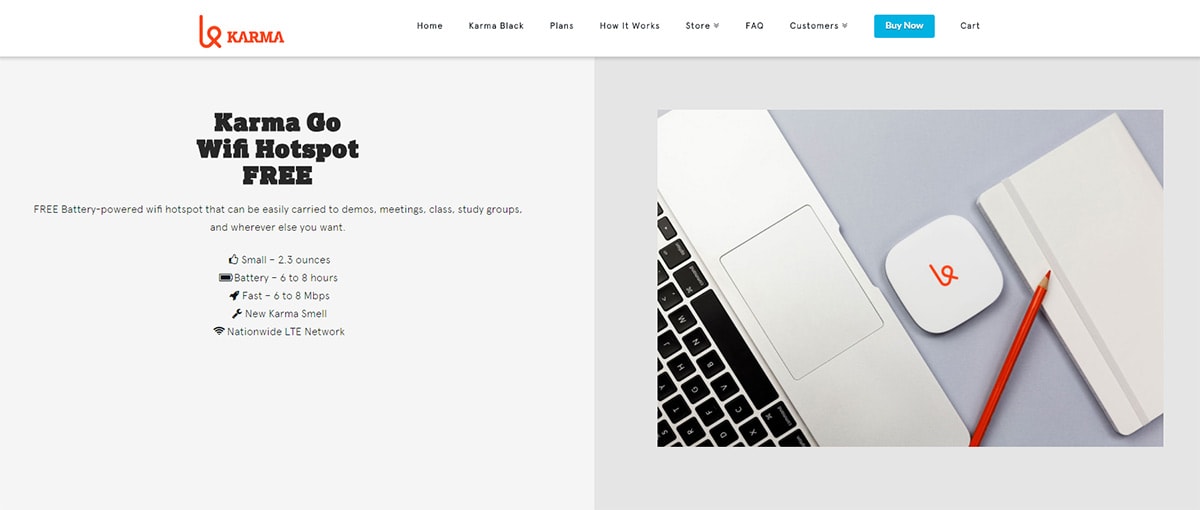
There is no perfect drop shadow style and you also don’t need this on every fixed navigation.
I just like this because it clarifies depth and lets the visitor know that the navbar is staying fixed on top of the page. If you like it then use it, otherwise, skip it.
Custom web animation was a tricky concept for developers 10 years ago. Now it’s as easy as writing some jQuery or adding some plugins.
This makes it even easier to customize layouts with little microinteractions and smaller animations that react to small but noticeable behaviors.
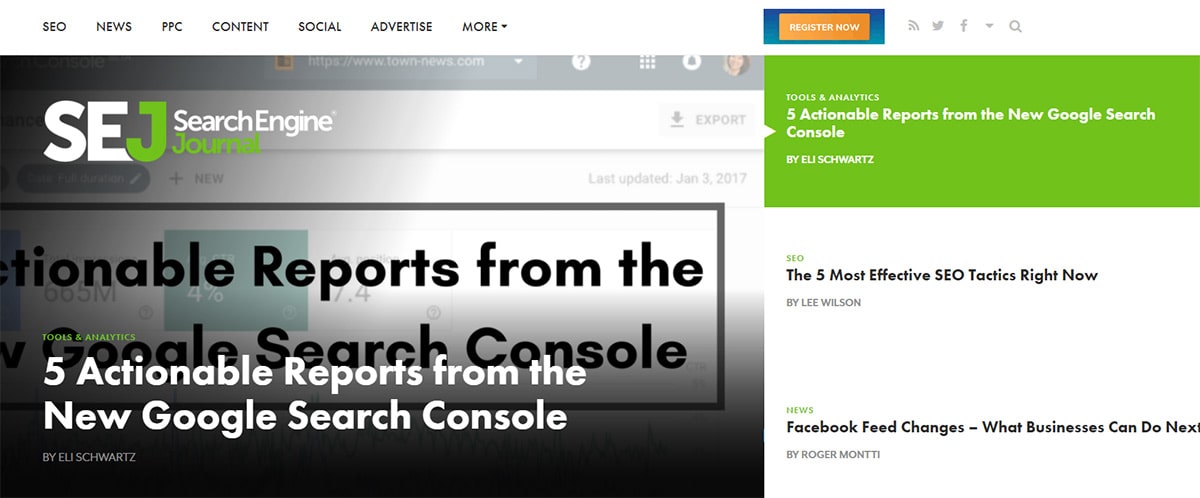
Take for example Search Engine Journal which keeps their logo fixed at the top of every article page.
If you visit the homepage and scroll down you’ll notice the logo animates into view in the header.
This keeps the nav bar clean at the top of the page and gives the logo more space to grab attention.
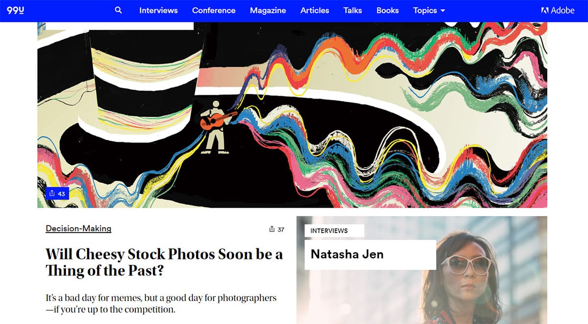
A slightly different option is to fade the fixed nav into view once the user scrolls far enough. You can see this on 99U with their top navigation.
So long as the user doesn’t feel caught off guard with anything on the page, you shouldn’t overthink animations too much.
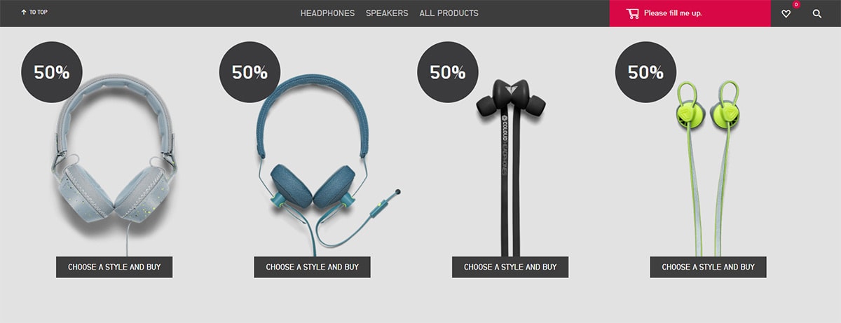
There are all sorts of little animations you can do from fading into view or sliding down into the page like on Coloud’s website.
But if you wanna jazz up your fixed nav try adding some custom animation effects.
They’ll leave quite a dazzling show and likely encourage more user engagement.
The Wrap Up
I try to keep my eyes on the web and watch out for any new design trends. Navigation trends have changed a lot in recent years and I’ve got a feeling that fixed navs are here to stay.
Hopefully, these trends can help you plan some cool nav designs keeping those links fixed and easily accessible on every page.

