Guide to the Onboarding Process in Mobile Apps
Onboarding can take on a few different shapes. Sometimes it’s as simple as account creation or logging in. Sometimes it’s more extensive where it includes a walk-through or a tour of your app. No matter how extensive your onboarding process is, it’s always valuable to see how others are doing it to see what you can learn.
Below I’ll go through the onboarding process of four different apps — Days, Duolingo, Acorns and Authenpic.
Days
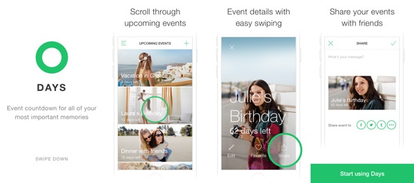
Days is a countdown app that helps you see how many days are left until an event. At first you are greeted with a simple and white screen that has the app’s logo and a quick explanation of what the app is about. This is perfect because it eliminates the guesswork for users who for whatever reason didn’t know what this app did when they downloaded it.
There is a clear call to action at the bottom and that’s to swipe down, doing so will take you to a quick walk-through of the app. This part of the walk-through is interactive; first an iPhone screen is loaded up with preloaded events and you are guided to swipe through premade events. Next, one of the events opens up to show you what it looks like full screen.
You get a perfect idea of exactly what the app will be like.
With Postcards Email Builder you can create and edit email templates online without any coding skills! Includes more than 100 components to help you create custom emails templates faster than ever before.
Free Email BuilderFree Email TemplatesYou are again prompted to scroll up and this tells you how you can easily change from one event to the next when in detail view. The last thing the walk-through asks of you is to tap the share icons. This, of course, prompts a few social share icons. It also marks the end of the walk-through as a new and big green button shows up that asks you to start using Days.
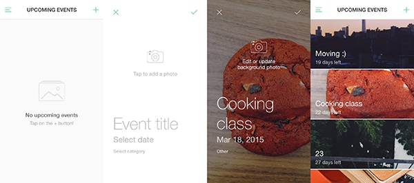
At this point, you’re in the app and you’ve been explained exactly how the app works. You weren’t able to get here without interacting with the walk-through so you’re off to a great start because you know exactly how to use Days. You’re good to go and good to create your own event countdowns.
Duolingo
Duolingo is a fun app that helps you learn a language by doing small exercises for a few minutes a day. Naturally, you’re first greeted with a simple log in versus create an account screen. If you’ve got a login, you simply do that and you’re in. While if you don’t have an account you get to take a wonderful tour of Duolingo.
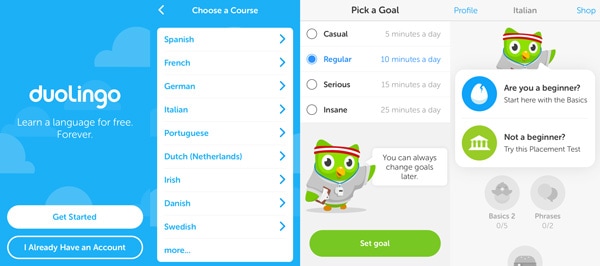
First, you’re asked to pick a language. They have nine languages for English speakers on the app and a bunch more for other languages (like learning Polish when you know only Dutch). One you decide, you’re asked whether you’d like to take a placement test. It’s there to determine how advanced you are so as to not waste time for you with stuff you already know. If you don’t know anything you’re able to jump into the basics right away.
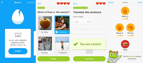
For newbies, you’re jumping straight into a first lesson without any gimmicks. Only after you’ve completed a level, you asked to create an account to save your progress. This type of sign up flow is interesting and extremely compelling. You’ve already made progress in the app, you’ve put effort toward it so it’s wasteful for a user not to make an account. At this point, the user knows what the app is like; it is much more likely they are enjoying it enough to sign up because they’ve already got a taste for it.
With Startup App and Slides App you can build unlimited websites using the online website editor which includes ready-made designed and coded elements, templates and themes.
Try Startup App Try Slides AppOther ProductsAcorns
Acorns is a mobile app for automated investing. Acorns take the leftover change from purchases and invests it for you so that over time you can make money automatically. The first four screens of the app are explanatory of how the app functions. It briefly tells you how Acorns works. It works through the different steps with a lovely animated graphic as well a short sentence to make sense of it.
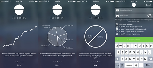
The very last slide is a login/create an account screen. It’s a pretty typical walk-through setting. However, when you’re ready to create an account and start to fill in the email and password the screen changes a bit to make room for password requirements. Not only that, the app tells you which requirements you’ve checked off already and which ones you’re missing. This is actually pretty great for two reasons.
First, it makes your life easier because it helps you by showing you what requirements you’re still missing this way you will type in a correct password the first time around. There is no guess work, “Do I need a special character or a number, or not really?”
The second, and more important thing, is Acorns’ transparency. It is the first sight of how the app cares about the user and is willing to hold you hand through every step of your way. It doesn’t leave anything as silly as a good password creation up in the air. No. It makes sure you get it right, right away.
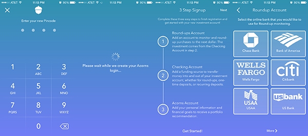
If you’ve successfully created an account you’re past step one of onboarding with Acorns. The next step is setting up investing accounts and connecting bank accounts. Just like in the first walk-through, this one too takes the user through the set up one step at a time. It’s kind of a long process, but Acorns makes it bearable because they make things obvious for you and easy on you as well. It’s a big part of their brand and it shows in their onboarding process.
Authenpic
If you’re a fan of surprises and photos this app is for you. It acts as a disposable camera. You’re able to take 24 photos, without previewing them, without redoing them. Then, if you want to see them you order the prints to see what you’ve got yourself into.
It’s a fun app, let’s be real. Being surprised and having the power of control relinquished from us can turn into something interesting. When you first enter the app you’re greeted with a Facebook login button. This is merely done to make the signing up process easier on the user.
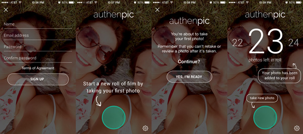
For those who don’t have a Facebook, you’re welcome to just create an account with Authenpic the traditional way. When you’re done doing that you get a quick walk-through.
The first screen you see within the app itself is just a big green button that’s the gateway to starting your new roll of film. It takes you to a prompt that makes sure that you, the user, understand the rules of the app: you can’t review or redo photos. You get what you take and that’s final. And then, you can take a photo.
Once you do you get a screen explaining to you a few different things, like a prompt on how many photos you’ve got left and where the camera button is for you to take your next photo. It’s a super simple app, with a super simple onboarding process.
What does this mean for your app?
Onboarding is an important process within your app’s experience because it’s the first thing your users go through when opening an app. What your onboarding process looks like will vary based on your app so I hope this post helped you see there are a variety of ways you could go about this. As long as your walk-through is informative and helpful, you’re off to a good start.

