Fresh Breath of Polygonal Style in Website Design
Polygonal style has definitely found renewed interest.
Amid extensive use of flat style graphics, visual storytelling solutions, rich content media approaches and a great deal of websites based on dynamic layouts, polygonal style — which was enormously popular several years ago — has recently found renewed life as an emerging design trend.
So what has actually changed? In terms of actual direction and implementation, almost nothing. It is still the same brilliant artwork with convex or concave plane areas that are constructed with the help of various plane geometric shapes entwined with ingenious color palettes. As for its use in website design, it has certainly undergone some changes. For example, a couple of years ago polygonal style was mainly static and served as a complementary ornamental instrument that used for backgrounds, standalone decorations and logotypes, whereas now it is being spiced up by various dynamic effects. It definitely occupies a favorable place in design and contributing to the whole aesthetic and as a way to draw user attention.
Moreover, it has also become more sophisticated and complex: Magnificent poly-style scenes and breathtaking landscapes with a geometric vibe came to the forefront. The web has become more advanced, and so does the polygonal style, and it really makes me glad since our toolkit of styles and themes doesn’t grow scanty, but on the contrary, stays diverse despite of current trends.
Today we are going to take a look at fresh examples of using the polygonal style in website design.
Zeropixel is a creative digital studio that immediately grabs your attention with a help of an eye-catching vivid background made in using polygonal shapes, which recreate a strong three-dimensional effect. The smooth animation along with saturated coloring gives the landing page a mesmerizing appearance.
With Postcards Email Builder you can create and edit email templates online without any coding skills! Includes more than 100 components to help you create custom emails templates faster than ever before.
Free Email BuilderFree Email Templates![]()
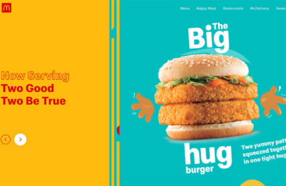
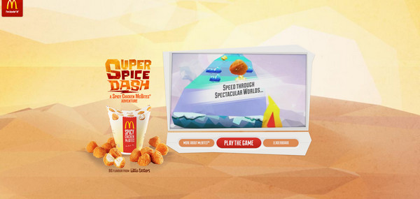
McDonald’s – Like many giant brands, McDonald’s is famous for its ingenious promotional websites. Here you will find a fantastic site dedicated to Spicy Chicken McBites that allows users to play a game. The latter as well as the home page make use of polygonal art that is bolstered by a warm color scheme.
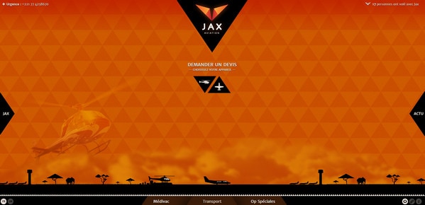
Jax – The website design is centered on regular plane geometric forms, mostly triangular shaped. The backgrounds, controls and buttons are all made in it. Orange and black are two primary colors that effectively complement it.
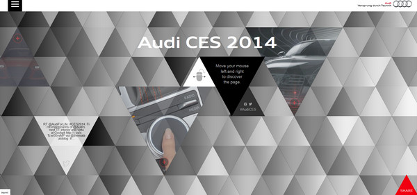
Audi CES – Much like the previous example, the design features numerous flat triangles the coloring of which varies from light grey to dark grey. The website has an alluring effect that comes alive when you move the mouse from left to right.
SNCF is actively supported by polygonal artwork. First of all, poly-style backgrounds with a smooth and sleek coloring are used for introduction, and second the main website has a flawless urban scenery that is also filled with artistically crafted and perfectly combined sets of plane shapes.
With Startup App and Slides App you can build unlimited websites using the online website editor which includes ready-made designed and coded elements, templates and themes.
Try Startup App Try Slides AppOther Products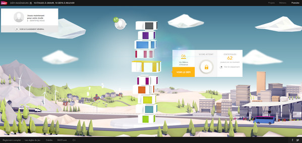
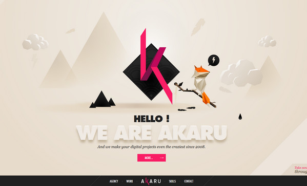
Akaru – The homepage has a simple slider that includes two fantastic imaginary scenes. Each combines flat graphics with slightly protuberant drawings made with a help of polygonal style that is effectively bolstered by small, yet eye-catching, animations.
Soleil Noir – The website is mainly based on a clean dark background and regular sharp typography, so in order to bring a bit of liveliness into the theme. The designer uses a dynamic moving set of colorful triangles that is featured on every page.
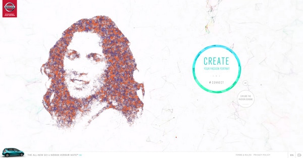
Nissan USA has a lovely mosaic appearance. The flat polygonal style is used to present various portraits and to decorate basic components on the front page.
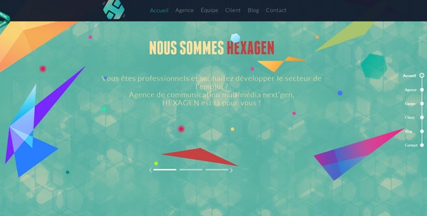
Hexagen – The theme is aimed to visually support the agency name “Hexagen.” Thus you can find various poly-style backgrounds and numerous colorful triangles that are elegantly scattered throughout the design.
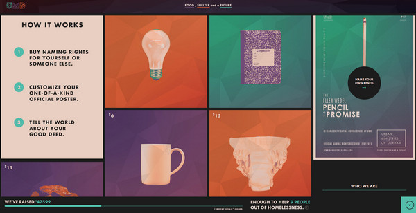
Names for Change – The website gets the feel of sophisticated retro design mainly from soft muted coloring, geometric illustrations and of course, polygonal backdrops that together create a harmonious and eye-popping appearance.
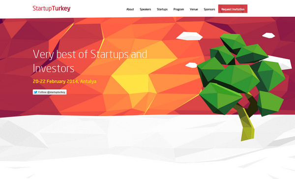
Startup Turkey – The geometric theme runs through all sections and pages of the website. It features not only poly-style backgrounds, but also coloring that creates 3D feeling. The site further employs plane shapes for showcasing team members, videos and statistics.
Run South – The website welcomes users with a top-notch introduction that walks them through a small journey. You have an opportunity to visit spectacular valleys, forests, mountains and even an underwater world, with amazing 3D polygonal artwork.
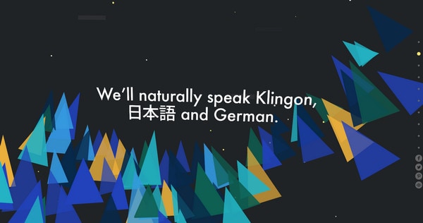
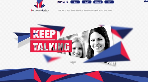
Best Language Academy has a long landing page that does a great job of familiarizing online readers with the company. The website has a nice geometric vibe that is achieved with a help of both flat graphics and skeuomorphic-style elements.
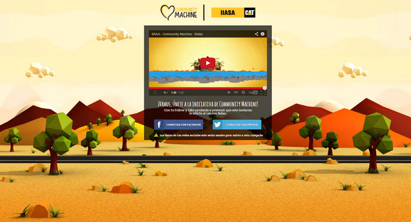
Community Machine – Much like Examples 2 and 5, this website also tries to grab users’ attention via a magnificent fully illustrated brisk landscape with a properly structured feeling.
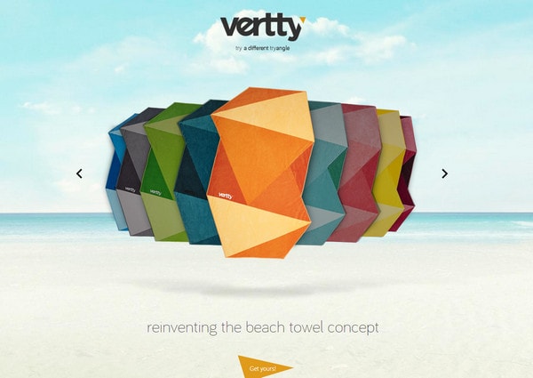
Vertty – The designer resorts to a clever marketing ploy by presenting goods with the help of bright, appealing poly-style graphics. Paired with a matching color scheme effectively contributes to the juicy beach theme.
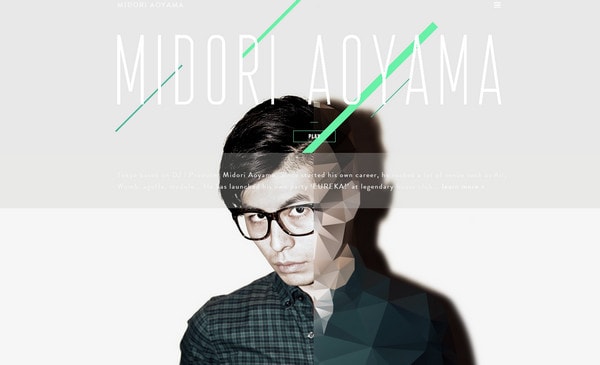
Midori Aoyama – The designer uses simple shapes and geometric-style graphics to turn a regular online portfolio into something exceptional and sophisticated.
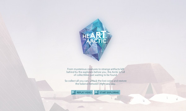
Heart of Arctic exhibits a matchless three-dimensional logotype that is built from tiny geometric pieces with icy touches. Such a solution helps to effectively convey a sense of wonderful, yet freezing adventure through the Arctic.
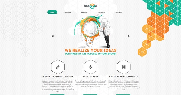
Imaqo – The designer uses a honeycomb-style background that is nicely supported by bright and clean hexagon-shaped graphics.
Conclusion
Though the flat style increasingly dominates a great deal of website interfaces, there are still website designs that include three-dimensional decorative elements made from basic geometric shapes that allow them to instantly stand out.
How do you feel about the polygonal style? Does it look appropriate in the era of flat style? Why or why not? Share your thoughts in the comments.
