How to Improve the UX of Your e-Commerce Website Visitors
One of the main parts of a high-level website is undoubtedly a great user experience.
This will, ultimately, tell if you have an increase in your exit rate or an increase in your conversion rate.
You will find that a lot of companies nowadays invest in the user experience of their website, in order to stay competitive. You must guide and help users navigate when they’re using your website or application.
Providing access
The fastest, and by far the easiest way, to get feedback from your users, is with your customer support team.
The team spends most of their time in talking to the customers, and they are the ones who are most familiar with what customers would like to see implemented, and what they think should be improved.
With Postcards Email Builder you can create and edit email templates online without any coding skills! Includes more than 100 components to help you create custom emails templates faster than ever before.
Free Email BuilderFree Email TemplatesIf you want to know if the user interface is confusing, you might just ask the user of the app what he or she thinks of it.
That way, you get immediate feedback and you can go ahead and add that to your list of priorities. Regardless of what the specific problem is, talking to your customers can give you an idea of how they would expect you to solve it.
Onboarding
If you want onboarding to be successful, you want to let your users achieve success. The only way of achieving success is knowing what your customer thinks is a success for them, what they hope to achieve with your product or website.
Every new user that uses your website, has a definition of what success is. What you should do, is make sure they think they’re on the path of getting their success. Here are a few tips and tricks to achieve that:
Understand the roles your website or product is most commonly used for
For example, with a project management tool, your platform may be used as a way to boost productivity, or for users to improve themselves at remote working.
These are all problems that can be solved with project management, but this gives your product a lot of other use cases as well. You should know them all, if possible.
Understand what each of these roles considers ‘success’
With Startup App and Slides App you can build unlimited websites using the online website editor which includes ready-made designed and coded elements, templates and themes.
Try Startup App Try Slides AppOther ProductsPeople want to get promoted, or prove themselves, or gather a group behind a problem, they aren’t using your product or website just for the sake of using it.
A simple step would be just asking your users what they want to achieve with your product. You will find that this gives you an opportunity to make a lot of changes in a short time period.
Teach the users how they can get the most out of what you offer
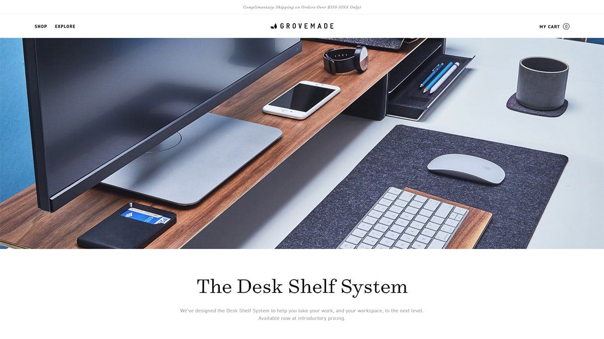
You should have specific paths that guide your users through the features, and those features will help them get to what they consider ‘success’.
Once you know what their end goal is, you can design your website or tool’s flow to guide them there. This is done easily by asking what your users what to achieve, what they consider success.
Talk to users, and help them get there
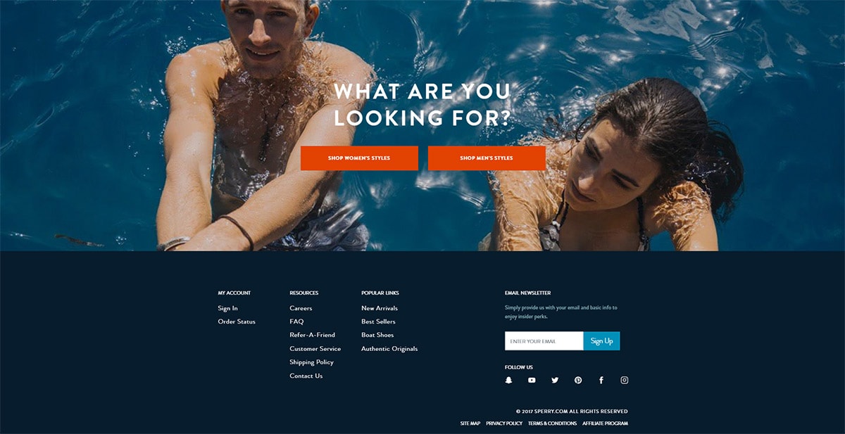
The time spent since sign-up doesn’t necessarily signify how many things the user has done, and how many of those things are useful.
Activity and usage are important, and you should know where your user is, where he wants to go, and give them appropriate directions.
Improve abandoned cart rate
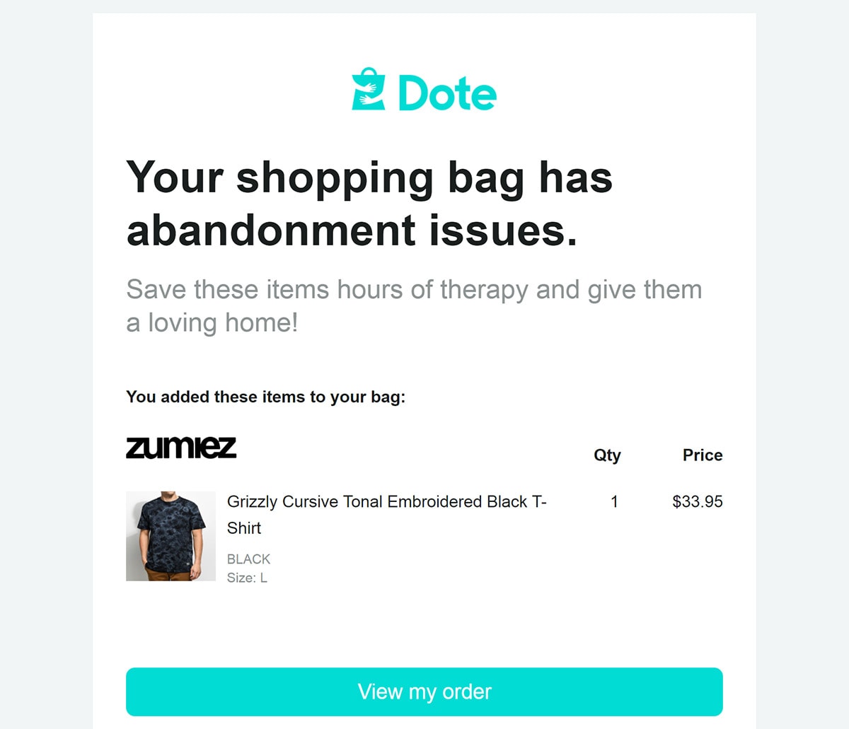
Most websites will wait until someone doesn’t convert, and only then will they ask how can they get the customer back.
Instead, make sure you know what failure looks like, and start talking to the customer before they have already made up their mind.
How to improve your customer service
Live chats and virtual assistants have been around for a while, but with the recent technological advancements, things are bound to become more interesting in a while.
You will achieve cost savings by using automation, but you should be sure that personalization isn’t sacrificed for that automatization.
Know how people experience your website or product
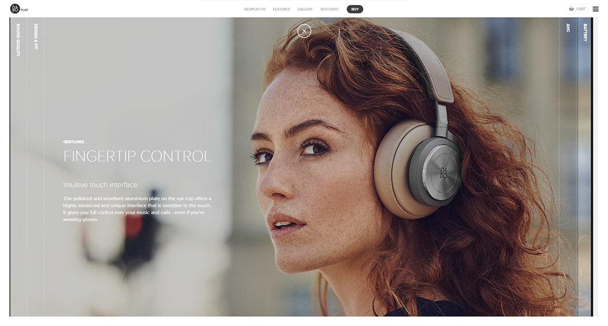
When you get no feedback, or someone says that everything is great with your prototype, that can mean either that they haven’t spent enough time to find the flaws, or that you aren’t asking the right questions.
A good thought to keep in mind is that nothing is perfect. There is always a place to improve, and you should make use of it.
A user may not tell you about a problem because they think it’s minor, but if you initiate the conversation, you will most likely get real insight into how people use and experience your website or product.
You can see this is a problem by asking any non-designer friend what irritates them most, and the most likely answer you’ll get is that they often aren’t able to find stuff. And testing out the navigation on your website is one of the easiest things you can do.
Have a stack of 10 to 20 cards, and have a description of a goal your system supports written on each one.
On the back side of the card, write the main headings from your current navigation structure.
Give your users the cards, and ask them to select the heading they would use if they want to do that task. This is known as a tree test and is only one among many ways to see how your users think.
You have a UX gold mine ahead of you
Whenever you have a customer telling you about a problem, that isn’t a problem, but an opportunity you can seize.
The raw information isn’t always useful, and you won’t always come up with new solutions on every conversation, but those few situations when you do, and when you can indeed use the information, are more than worth it.
What you should remember here is that everyone wins. The user gets the support and help, they have a feeling they’re being listened to, and an opportunity to directly influence the product.
You, on the other hand, get a real-life situation on how usable your product is, and a specific direction in which you can improve. At worst, you have a fixed bug, and you have solved a short-term problem.
At best, you get a huge leap forward in terms of UI and UX, or a brand new feature. Your designers will be glad to implement this because it means that your users are actually engaging with your product or website.
Downsides
The user experience can be a tricky process. There are a lot of moving parts, a lot of stakeholders you have to deal with, and you have your own desire to make something that fits your ideas and standards.
The perfect process isn’t something you can achieve overnight, instead, it takes time. However, it is very important to evaluate your UX, and constantly work to improve it. You should look back at your last release every once in a while, and ask yourself a few questions.
Do you need to improve the interactions? See what works and what doesn’t, and fix it. Did everyone understand what your vision is? Make a whiteboard sketch, and make sure they do. Or have a targeted collaboration session with your teammates.
Did everyone know how the product should work? Try getting them to tell you their stories, you will see if you did anything wrong. Do you need to do more user testing? Take any five people from the office, get them a coffee and do some quick usability tests.
Wrapping things up
Innovation has much more to do with making things better, than taking a huge leap of faith. You should offer your consumers new ways of interacting with a service, business or product.
A website has to adapt to the users’ needs and to the way their competition works.
However, it should also respond to what the users expect. You should understand and accept the fact that innovation is important if you want to grow, and you should know how to tackle it and be effective.
If an action is based on the process that may lead to success, make it a priority. Make sure you’re ahead of the innovation, that will give you a competitive edge over anyone else.
And, last but not least, have an innovative thinking environment in your page’s mission, which enables systems’ growth in the future.

