Intro Guide to UX Reviews for Web Designers
A great UX review can do wonders for any website. By looking over the entire design you can learn what’s working, what’s not, and maybe find solutions that can increase the UX and ultimately increase revenues.
But learning how to conduct a review is the first step to solving problems and creating a better experience. In this guide I’ll cover the basics of a UX review and how you can get started running your own.
This does require some background in UX design but it also relies on basic principles of making great websites. If you’re willing to learn and put in some elbow grease then a UX review of your own website can be a great opportunity for growth.
Conducting a Review
The goal of a UX review is to comb over an entire site and find spots for improvement. These spots could be obvious or they could be small, but you should aim to improve the site as a whole.
You should always aim to study objective trends and find statistics that back up your ideas. Designers aren’t always the most quant-oriented people but it’s a necessity in a good UX review.
Try to avoid vague opinions or how things feel to you personally. Instead gather user feedback and study traffic trends to gather ideas for where problems could be and why they’re happening.
With Postcards Email Builder you can create and edit email templates online without any coding skills! Includes more than 100 components to help you create custom emails templates faster than ever before.
Free Email BuilderFree Email TemplatesThis can be done through a number of techniques:
- Direct user feedback
- Screen recordings
- Analytics goals
- Analytics user flows
Each technique offers a different perspective for studying the same website. UX reviews can try to improve everything or focus on one specific task like high bounce rates, signup rates, or time on page.
If you’re working on a personal project then you can set the metrics yourself. But client projects require collaboration because you’ll need to know what the company wants to improve.
How you conduct the review and how much information you gather will differ based on the client. Larger businesses can require more information where you’ll need to compile everyone’s goals into one big strategy.
The initial stage of a UX review is about information gathering moreso than anything else. Once you have enough raw data you’ll begin to see patterns, and these patterns can lead to insights for solving the tasks you’re faced with.
Planning Specific Goals
It’s easy to keep asking yourself questions and never really coming to detailed conclusions. But with specific goals you’ll be forced to study certain metrics and try to solve for very specific end results.
Think about the goals you need to aim for and what they mean. A high bounce rate means people leave the first page they enter. But are they on that page for a while? If yes, then they’re probably finding the information they need and leaving.
But what if it’s a landing page? Then people are leaving because they’re not interested. But why? Maybe they just don’t see the CTA button to sign up, or maybe they don’t understand what the page is for.
With Startup App and Slides App you can build unlimited websites using the online website editor which includes ready-made designed and coded elements, templates and themes.
Try Startup App Try Slides AppOther Products
The planning phase goes beyond just goal setting. You’ll need to look into a few points:
- What is the problem(or problems)?
- Why do these problems exist? What is the cause?
- What is the end result you’re looking for?
- How can you move from the current state to one that solves these problems?
By repeating these steps over and over you’ll find new problems, look for new solutions, and leave yourself a big ground for testing. There’s never a fully completed project so there’s always room for more optimization.
Another step is creating believable personas that can fit into your target audience.
These are like marketing segments that may visit your website and be looking for a certain experience. And these general demographics can have very different goals that you need to support. UX designers go so far as to find custom CC photos for personas because they can make a difference.

When studying goals it helps to get into the head of your typical visitor. With a persona it’s easier to get into this theoretical mindset and look at the site from their point of view.
But personas can be far too vague to actually offer value. Try to use them sparingly and find situations where they’re useful.
And be sure to share ideas with other designers or project leaders to gather feedback. Goals need to be in line with KPIs so that your UX review results can improve the right metrics.
Pinpointing Issues
This is perhaps the most fun and ironically the most tedious stage of the review.
Once you know what the goals are you’ll want to dive through the website and look for issues. You can do a quick trial run through every page or give yourself set goals playing like a “typical user”.
As you spot issues organize them into a spreadsheet, or whatever system you prefer. This way you can sort issues by severity and tackle the most serious issues first.
I recommend Jakob Nielsen’s severity rating guidelines because they’re almost a staple in UX communities. This scale includes 5 rankings starting from 0(no problem) to 4(glaring usability problem).
- 0 = I don’t agree that this is a usability problem at all
- 1 = Cosmetic problem; doesn’t need fixing unless there’s extra time
- 2 = Minor problem; should be fixed but lowest mandatory priority
- 3 = Major problem; important to fix as soon as possible
- 4 = Catastrophe; this needed to be fixed yesterday
Rate each problem you find with this scale and also consider ranking the difficulty level.
If the solution is obvious and only takes 15 minutes of coding then it’s a quick fix. If you need to brainstorm with other designers and spend a few days finding a solution then it’s a much more detailed problem.
Always look for the quick fixes and correct these ASAP. These can boost morale and help you feel like you’re actually getting somewhere.
Not all problems have obvious solutions and many problems require a good amount of brainpower to solve. But don’t try to solve everything at once.
Organizing all UX problems first can make solving them a heck of a lot easier.
Finding the Right Solutions
The toughest part of any UX review is finding the best solution for each problem. But this is basically the whole point of a UX review.
Oftentimes the best solutions come from common sense. You can study other websites to see how they’ve solved problems or look up case studies online. If you’re facing a common issue like increasing time on page you better believe others have too and many offer their solutions online.
I also recommend user testing if you can afford a simple test along with setting up a heuristic evaluation to get the most information possible. You’ll want eyes on the design because those eyes offer a fresh perspective that may come up with fresh ideas.
Test, implement something, gauge results, and test again. UX is in many ways scientific, but it’s also repetitive and the only way to know if something works is to try it out.
You will absolutely have questions during this process. Even professionals get stumped at times.
If you work alone and don’t have a team then you may feel lost at sea. But remember the Internet is a huge place with tons of communities willing to share advice.
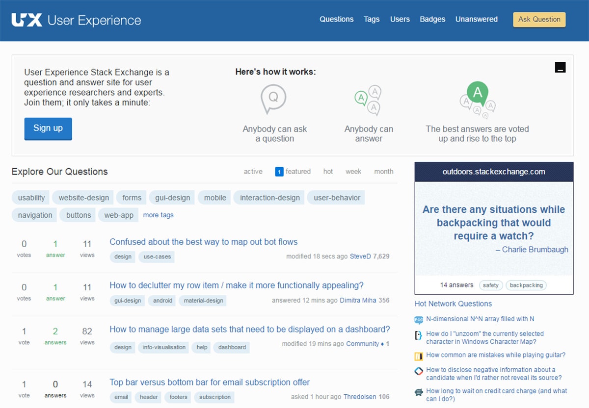
You can find plenty of great UX-oriented sites but these are my favorites for asking questions(and they’re all free!).
- UX Stack Exchange
- /r/UserExperience
- Quora User Experience
Moving Forward
If you’re new to UX reviews then start small and work in steps. Research online when you have questions and make sure you’re always working towards a goal.
Professional UX designers spend years doing UX reviews and they can become like second nature. But they always require critical thinking and solutions that solve real-world problems. I hope this guide can get you started on that path and hopefully this guide can encourage every designer to look into the value of a great UX review.
Image credits: freephotos.cc


