Circular Elements in Website Design – Best Practice
Despite of being one of the basic geometric shapes, circle is not such a frequent guest in website design; of course, I do not consider social media icons. There are a lot of reasons why designers resort to commonly used elements of polyhedral shape such as squares or rectangles. Whether it depends on grid structure and form of a web page that historically has right angles; whether long-term rejection of round form was caused by difficulties of its realization, remember that time, before CSS3 appearance, when designers had to create circular elements by means of graphics editors and only then upload them on website thereby overloading a server by images.
Moreover, use of circles can be tricky since they don’t always harmoniously go well with a whole website style. The only thing can be said for sure is that if they are properly implemented they will definitely grab users’ attention.
Implementation of Circles in Web Design
There are two main ways of profitably using circles in website design. First method involves inclusion of a circle as a main shape for elements that should be traced throughout a whole design. In this case majority of website essential elements such as logotype, navigation items, pop-up windows, sliders, images and other take after circle. The second one, vice versa, precludes the repeating inclusion of circular elements and relies only on a single appearance of this type of form, thereby drawing attention by its uniqueness. Regardless of what technique you will choose you should remember about readability, usability and harmony.
Meantime take a look at our fresh collection of websites that were able to make excellent use of circular elements in their designs.
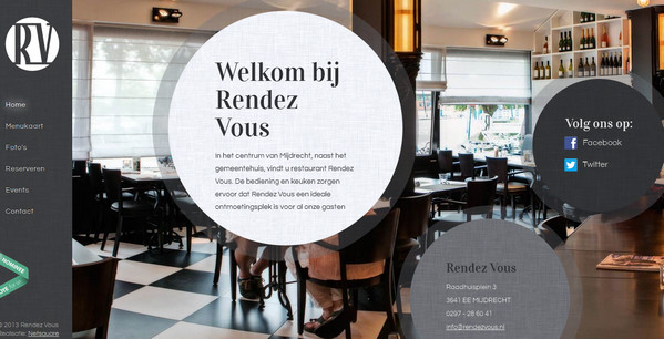
Rendez Vous is a modern restaurant website design that by means of circles primarily highlights 3 main points such as welcome message, location and social media.
With Postcards Email Builder you can create and edit email templates online without any coding skills! Includes more than 100 components to help you create custom emails templates faster than ever before.
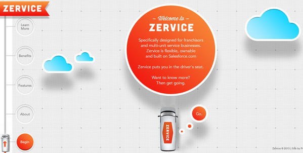
Free Email BuilderFree Email TemplatesZervice is based on parallax effect displaying navigation items along with all content in circular blocks.
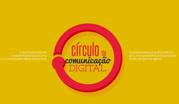
Circulo da Comunicacao Digital uses circle which serves as the main element for every section that transmits visual information.
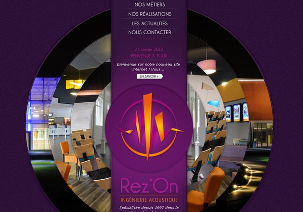
Rezon draws attention with its unusual circular image slider which occupies all central part of landing page.
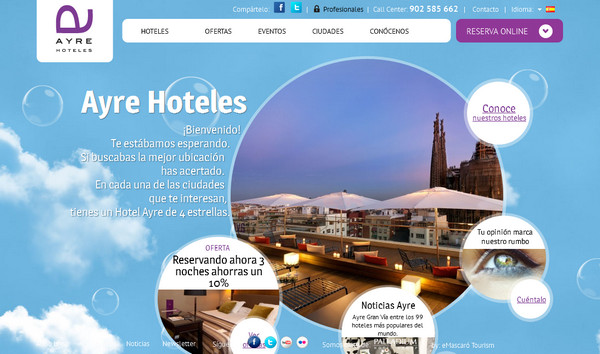
Ayre Hotels also welcomes its visitors with circular multimedia content slider that is surrounded by smaller discs with services and special offers.
With Startup App and Slides App you can build unlimited websites using the online website editor which includes ready-made designed and coded elements, templates and themes.
Try Startup App Try Slides AppOther ProductsKikk Festival introduces each participant in a circular image with appealing frame that resembles a molecular links.
Jet Peppers has a content-heavy landing page that demonstrates recent works and process steps via set of circles.

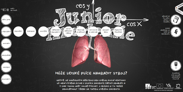
CVUT fascinates users with its well-thought and appealing chalk-based design. All main menu items, facebook icon, controller icon and image frames are made in circular form.
Like there is no tomorrow reveals all information blocks in a trio of flat colorful discs.
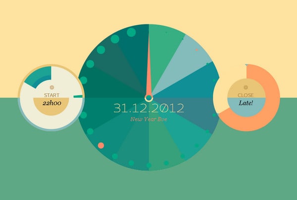
Ousback goes for unique style for creating video player that has a round shape and grayscale mode.
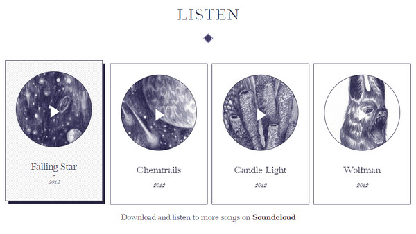
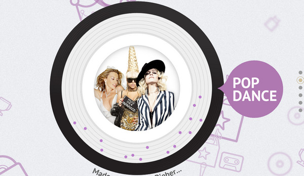
Fannabee uses a concept of vinyl record in order to show famous music artists.
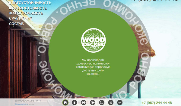
Wooddecker opts to use circles not only for familiarizing users with motto, but also for attracting them to logotype and pictogram-based navigation system.
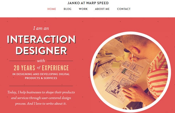
Janko at warp speed greets everybody with brief “about me” information and self-portrait that is enclosed within round white frame.
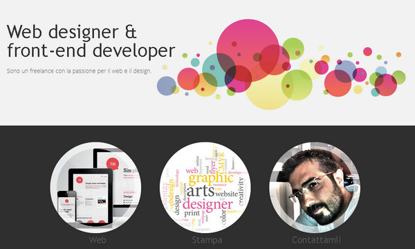
Fabrizio del Gaudio uses disks elements that are traced throughout the whole design and are manifested not only as an image shape, but also as a graphical decoration.
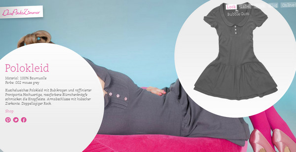
Das Pinke Zimmer is a contemporary e-store with round tooltips that include information about goods.
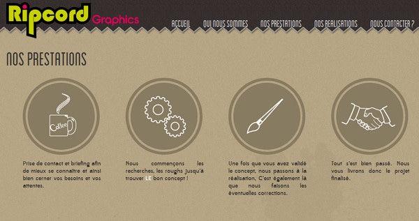
Ripcord Graphics communicates their working process through set of brown circles that are supplemented by simple monochromatic icons.
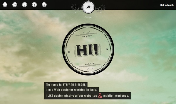
Stedesign utilizes ring-like shape as a base for welcome message, contact form background, pagination items and logo.
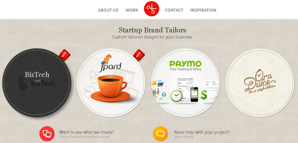
Five Tailors exhibits its portfolio items as circles with stitched strokes. When you hover over the item it substitutes its image by fabric textured background with regular explanatory title.
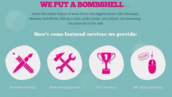
Soap Media provides potential customers with main services using hand-drawn irregular grey circles with bright pink icons.
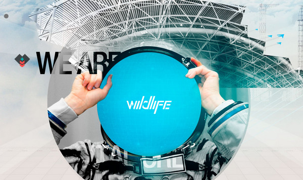
Wildlife breaks the diverseness and complexity of photo background by radiant blue circular logo that looks absolutely neat and sophisticated.
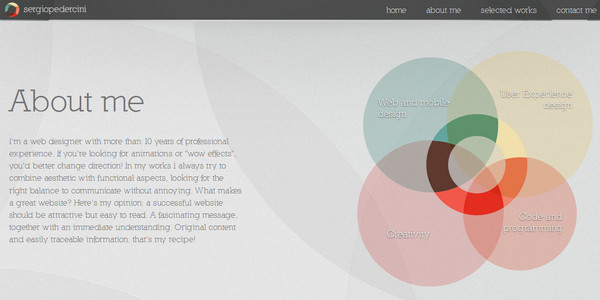
Sergio Pedercini makes a use of a common method for showing skills levels. Each ability gets its own size and color.
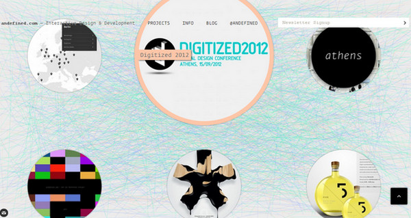
Andefined also resorts to a standard method of showcasing previously done projects. Each work is represented in a circular form which increases in size when a cursor rolls over.
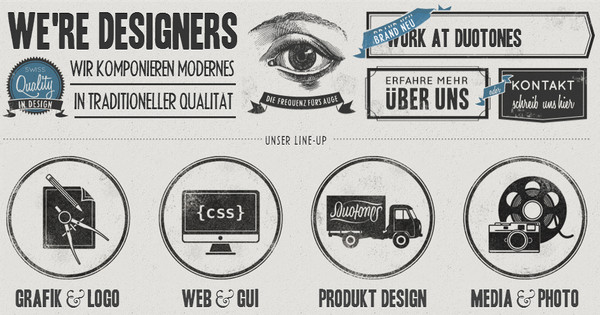
Duotones has a beautiful grungy feel with a bunch of stamp-like adornment elements, including neat circular frames that can be seen as an image decorations and process steps visualization.
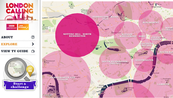
London Calling uses translucent pink discs as a map pins that are equipped with titles.
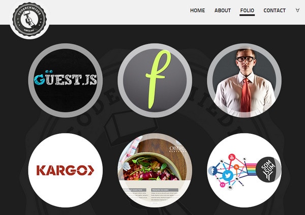
We love code is another good example of using circular images in order to demonstrate portfolio works.
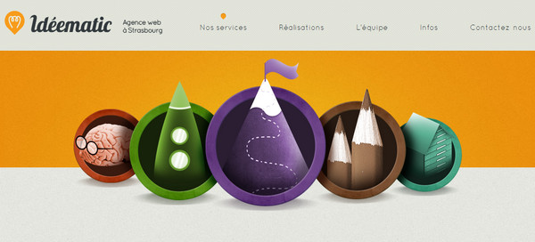
Ideematic represents service section as a set of vibrant illustrated images that are enclosed in circles. Moreover, pictures of the agency members are also made in a form of a ring.
Reflection
More often due to an inherent smoothness circles do not always fit into design, especially, when it comes to creating something rough, mundane, gnarly or with clear grid. Although, round shape is able to add a note of elegance and queerness, also it’s one of the easiest ways of engaging people and focusing them on selected items. Whether circles are part of a design or just illustrated graphics that are used as a decorative element, properly made they can cause a significant positive effect.
So, it’s your time. Tell us what do you think about use of circles in website design? Do you think circular elements are highly unappreciated in our time? Or you find rectangular shape a lot easier and more versatile in utilizing? What basic shapes do you prefer to use on your web designs?
