It’s time to look Alternatives to Futura Font
It’s not that Futura is bad, quite the opposite. Futura is glorious. It’s a classic, and a personal favorite of mine. The issue is when artistic and cultural trends narrow the ranges of expressions that we see in typography. Stay within the popular eye for enough decades, and typefaces begin to gain use merely for their name.
But Futura isn’t as plagued by this. Most uses of Futura I see tend to be very well done. (The new identity made for the Barbican Arts center, for example, is masterful). And I think that’s because those who are using Futura understand what Futura is, and what makes it work. The problem with Helvetica, and what provoked me to write about alternatives to Helvetica, was that its widespread use demonstrated a clear lack of understanding of what Helvetica is. That’s why the typeface and its uses are always so flawed.
So we need to understand how Futura works, and by understanding Futura, we can then look at alternatives with the right set of eyes. This is only one interpretation, mind you; I encourage you to develop your own viewpoints.
Now, some history!
Rise of the Bauhaus
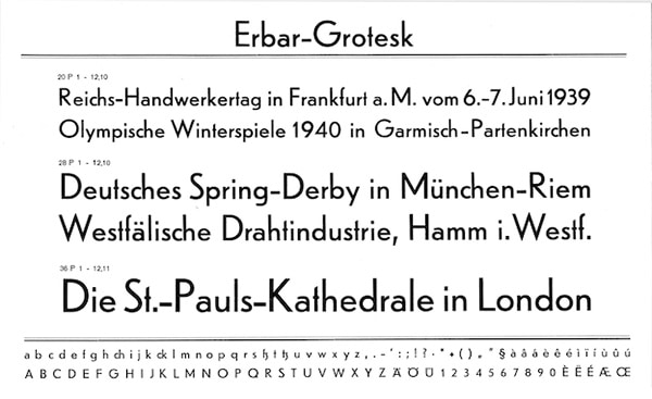
At the end of the First World War, Walter Gropius, an architect, wanted to create something meaningful after the horrors of combat, and decided to found the Bauhaus, a school of art in Weimar. The Bauhaus was huge inspiration to western countries following its demise during the rise of the Nazi regime, as it forwarded the philosophy of modernism within art, rooted within the idea of functionality, clarity and simplicity (you see this in nearly all forms of art in the early 20th Century, as with Samuel Beckett plays and Kafkaesque literature). I’m sure you can see how this influenced Jacob Erbar when he designed Erbar-Grotesk, the first known geometric typeface.
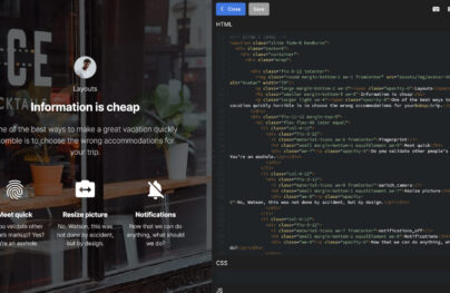
With Postcards Email Builder you can create and edit email templates online without any coding skills! Includes more than 100 components to help you create custom emails templates faster than ever before.
Free Email BuilderFree Email TemplatesPaul Renner has worked as an architect, a painter, and a graphic artist. Also inspired by the Bauhaus, he set out to outdo Erbar’s designs. What was special about Renner was his very strict and traditional protestant upbringing, which caused him to resent forms of popular culture at the time, like Jazz or Cinema. Yet he was still inspired by the functional ideals of modernism.
So Futura, at least at the time, can be seen as a mix between the traditional, and the aspect of the modern that is more compatible with the traditional: function and form over wild expression and deviance, which was exactly what made Futura deviant, a very weird little paradox. Futura was completed in ‘27, and released commercially in 1936 by the Bauer foundry.
Display or Text: Where does Futura fit?
The reason why books mostly feature transitional serifs in their text is because transitional serifs don’t bring attention to themselves; they’re meant be transparent, for the reader to easily look straight past the typography, and mostly focus on the words themselves. But Futura isn’t meant for readability. Not that Futura is unreadable – you can definitely read it in small sizes, or even put it in paragraphs – but it’s too artistically charged to appear in something like a book; you can’t easily ignore and look past it. Rather, Futura is meant to add feeling to the text that’s already there within a print or poster.
Futura is sharp, elegant and striking in its efficiency, but overall it’s dramatic, and it pulls this off in several ways.
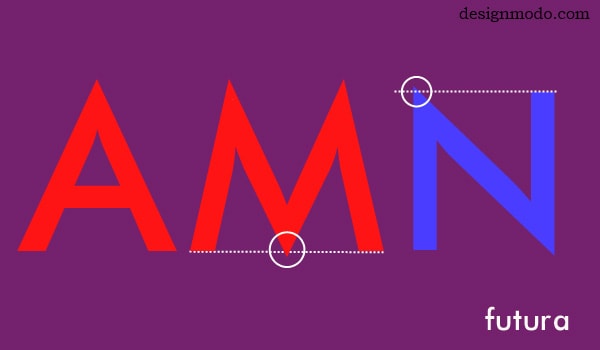
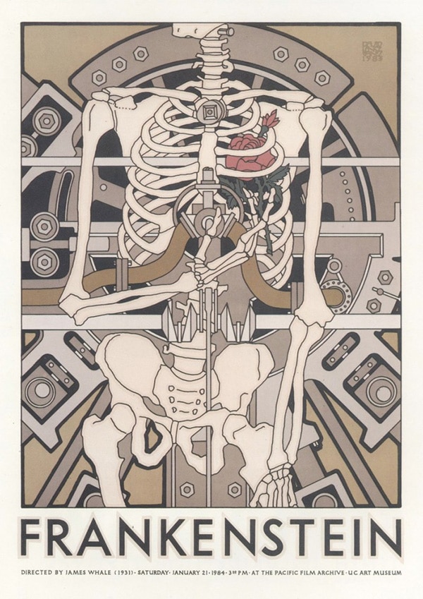
The white circles reveal overshoots: stroke corners that reach a little higher than the normal cap-height, or below the base. Futura has several overshoots.
I say the word “sharp” quite often, and I generally mean when a typeface with has very noticeable pointed corners or vertices at the end of its strokes. Futura’s apexes are razor-sharp; it’s striking and lovely, but sharp typefaces tend to feel somewhat intimidating, and Futura is no exception. It isn’t friendly or approachable, in the sense that I don’t feel comfortable around Futura the way I do with Droid Sans when I use my Android phone, or with Microsoft Sans Serif when I use my PC. Rather, I’m meant to be drawn to Futura itself, and be compelled to actively contemplate the ideas it’s used to express. What Futura’s apexes do (and sharpness in general), is they intensify Futura, and give it an energy that makes Futura striking. We become drawn to it, either in awe, fear, or contemplation. A poster to show what I’m talking about:
With Startup App and Slides App you can build unlimited websites using the online website editor which includes ready-made designed and coded elements, templates and themes.
Try Startup App Try Slides AppOther ProductsYou’ll notice how the overshoots add to that creepy feel, here.
Futurism and the Geometric
This is where we see the modernist philosophy at play. Futura balances its intensity with the elegancy of the geometric form. This is nothing new, at least by now. Futura features circled counters and consistent rounding of its curved strokes, and its long stems paired with its short counters on letters like ‘b’, ‘d’, and ‘p’, give Futura a subtlety.
I think Futura carries a different taste than it did in the 20s and 30s. After all, modernism is long dead, and postmodernism is in its distorted, zombified form. What’s often seen is Futura being paired with the futuristic and the scientific. Futura and Futurism work because they both stress efficiency and beauty through functionality. This is why it feels so right on a plaque on the moon, or on the title screen of 2001: A Space Odyssey: its design dramatizes and pumps energy and emotion into the futurist ideal, whether or not those ideals carry over into the content itself. Conversely, Futura’s functional philosophy can be seen as cold and inhuman, which makes it so effective with horror posters like the one above, or various forms of surrealist art.
But Futura with science fiction can only last so long. Futura isn’t perfect; it has limits to what it’s capable of. That’s why it’s important to understand how Futura works, if we want to look at alternatives. By truly understanding Futura, or at least forming developed opinions about Futura, we can create a proper reference point for when we look at similar typefaces.
Now, the alternatives of Futura Font
Code Pro
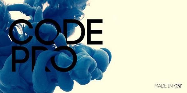
What Code Pro takes from Futura is its intensity, as the typeface is bold and striking. Its letterforms are strictly geometric, dense, and feel overpowering in their size and shape. The above photo shows that it doesn’t take clever wordplay to bring across a point with Code Pro. The typeface dominates space quite easily. It also has a lowercase style, where the tone is a little less intense. It still resembles Futura, but its counters are much more drastic, they definitely play a larger part in Code Pro’s identity. And the space between letters is much larger as well, which separates it from its Uppercase counterpart and Futura.
Steagal
Steagal is essentially a Futura Soft. I know I’ve used that term before but it’s because I’m referring to certain kind of shape: the pointed apexes, geometric counters and letterforms, and dense spacing of Futura, but with subtle tweaks that try to set it apart, usually toning down its intensity in the process. What Steagal does is subtle, but important. It’s use of a two-storey ‘a’ as opposed to an open ‘a’, its use of vertical stems as opposed to angular ones on its ‘M’, its straightening of the spur area, the widening of its letters and increase of its spacing show that Steagal prioritizes readability more than Futura does. Steagal is sharp and stylish, and it works in large paragraphs. You can read Steagal inside a book and it won’t look off, like Futura would.
ITC Avant Garde
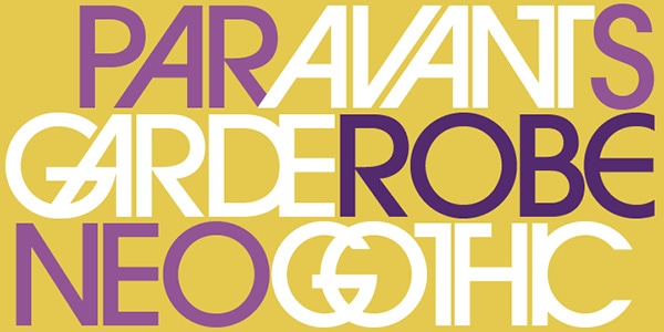
There are some who would think that ITC Avant Garde should have its own “alternatives” article—many see it as a classic. It was designed in ’77 by Herb Lubalin, in an attempt to bring his popular magazine logo of the same name into the typographic world. It’s hard to tell if he succeeded. I’m mentioning Avant Garde because I think there’s value in it, but I do find it to be boring. It’s the neutering of the geometric construct into its most basic form. Avant Garde’s normalcase letters just seem to exist, airing vague ideas of modernity and style but lack power and emotional poignancy. I’ve found Avant Garde to be most powerful in full uppercase display, often with custom kerning, sometimes touching letters or even overlapping them. Basically, it seems to work best when it’s most like the logo that inspired it.
Brandon Grotesque/Text
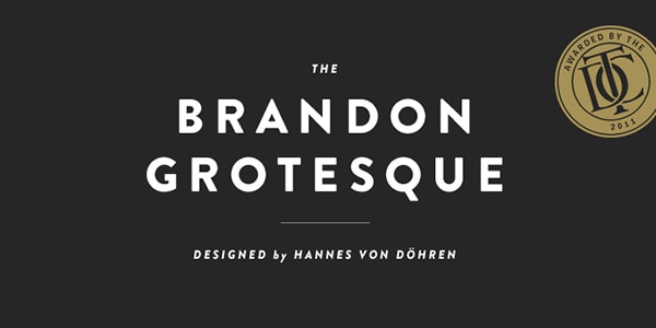
Brandon Grotesque is one of my favorites on this list. It’s also the closest to Futura, maybe that’s a pattern. I’ve discussed Brandon Grotesque before, when I layed out alternatives to Helvetica, which I do see as a slight oversight. Brandon is much closer to Futura than it is to Helvetica. It relatively retains the same shape and density. What makes Brandon different and distinctive, is the rounded corners of its ends, which is subtle as hell, I know, but rounded ends has incredible influence on a typeface. It makes Brandon friendlier and more approachable than Futura.
Neutraface
Neutraface is beautiful. It’s expensive, but beautiful. The type plays around with Futura’s efficient design: lowering the middle arm of its ‘E’ or the crossbar of its ‘H’ so the two spaces aren’t equal, curving the ends of its ‘t’ and ‘j’, or setting the stems of letters like ‘b’ and ‘p’ way above their counters. These quirks make Neutraface warm and playful, but the typeface still retains a relative amount of sharpness on its apexes and its geometric shapes, to sustain some of that functional design. Neutraface is a fantastic compromise.