Responsive Web Design: 50 Examples and Best Practices
The number of handheld devices operating worldwide is growing exponentially. According to stats, more than 90% of adults own a cell phone, whereas almost 50% of smartphone users admit that they could not live without their devices. What can we say; the mobile web is a huge thing these days. That why in this post we write about responsive web design and show some good examples from the industry.
On the one hand, it is a good thing since we have an opportunity to address issues quickly and efficiently, locating information on the spot. On the other hand, this reality has created a challenge for all those who provide users with information.
The deal is, in the late 2000s, serving information for users was a piece of cake. You just needed several versions of the same website: one for mobile phones, the other one for desktops. However, in the 2020’s we cannot commit to supporting each new user agent with its own bespoke experience since each year, we witness new dimensions and screen sizes.
Export Figma Designs to Live Website – No-Code
With Postcards Email Builder you can create and edit email templates online without any coding skills! Includes more than 100 components to help you create custom emails templates faster than ever before.
Free Email BuilderFree Email TemplatesCreating styles for each screen size is time-consuming, resource-consuming, and expensive. Even if you manage to cover all the breakpoints in the World, this will seriously overload the website and ipso facto decrease performance that drastically worsens conversions and user’s engagement with the brand, to say nothing about investing lots of money without decent ROI. So, how can entrepreneurs avoid this fate and successfully meet the fast-changing realms of digital expanses? The answer is simple – adopt responsive design.
Investing in a website whose pages are responsive and accessible, regardless of the browser, platform, or screen that your reader must use to access, is the only way to stay afloat these days. Responsive web design is no longer a tendency; it is a standard that we need to enforce to make the web a better place.
Let us take a moment to walk through the essentials of a responsive website to understand better why it is important and what you need to do to ensure your site responds to the device’s capabilities it is viewed on perfectly to let users enjoy the excellent visual experience.
What is Responsive Web Design?
So, what is a responsive website? What does it look and feel like?
According to Wikipedia, responsive web design is an approach that ensures all the pages of the website look, work and feel perfectly on any device. Whether it is a tiny old cell phone with a screen width of 320px, a modern phablet with 7 inches screen, a big iPad, or a TV with a massive diagonal line, all the main aspects such as content, design, and especially functionality should perform consistently to provide users with an excellent user experience.
In technical terms, responsive web design implies a set of instructions that help web pages change their layout and appearance to meet different screen widths and resolutions.
The concept of a responsive website appeared due to non-effective and ill-suited ways of handling screen sizes. Originally, pages were built to target a particular device. This approach implied creating a range of designs for each responsive tier resulting in different versions of the same page. However, with the mobile web becoming a reality and more and more devices with non-standard resolutions appeared, this approach has quickly become irrelevant since it could not handle this variety efficiently.
In the early 2010s, largely thanks to a gifted Ethan Marcotte, developers started to switch from popular adaptive design (an approach that implied creating several versions of one design) to responsive design (an approach that suggested only one yet flexible version of a website that stretched or shrunk to fit the screen). Although that technique was pretty new and untested, nevertheless its benefits were hard to ignore. Even now, those advantages prove to everyone that a responsive website is the only way out. Let us consider them.
With Pulsetic you’ll be instantly notified the moment your website, API, or server becomes unavailable. Monitor uptime from multiple global locations and respond to incidents before your users are affected.
Create beautiful status pages in minutes to keep customers informed during outages and build trust with transparent communication.
Start Monitoring for FreeBenefits of Responsive Web Design
The main benefits of using a responsive website are
- consistent visual experience;
- better user experience;
- no need for redirects;
- lower bounce rates;
- lower maintenance needs;
- high web page loading speed;
- no extra fees for creating and maintaining different versions;
- easy analytics reporting.
Even though responsive design is not flawless, it has its cons, for example,
- It is not fully optimized;
- It can slow performance;
- It may suffer from web browser incompatibility;
- It makes it challenging to run advertising campaigns;
- It makes it challenging to offer different things to different users depending on the device used;
Nevertheless, it had and has significant advantages over other solutions. Therefore, nowadays, responsive web design is a standard for websites.
If you still doubt responsive web design, let us find out why it is important.
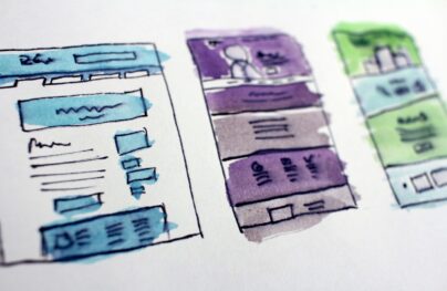
Happy Responsiveness by Alejandro Ramirez
Why is Responsive Web Design Important?
The rise of responsive design has to do much with the rise of mobile devices, tablets, and smart devices like Kindle, game consoles, etc. The modern-day user expects to be able to access any website with a vast range of devices. Your website should be ready to handle any scenario. You cannot ignore these demands because numbers do not lie: according to recent studies,
- more than 80% of users surf through the internet using mobile devices in 2019;
- more than 60% of Google’s visits are done via a mobile device;
- mobile devices accounted for more than 50% of website traffic worldwide.
Your brand cannot neglect this tendency. If you cannot meet these expectations and growing demands by quickly adapting to the new reality, then you are doomed to failure, and your brand is doomed to extinction.
Let us consider some good reasons why responsive web design is important:
- Google gives priority to websites that display well on smartphones and other mobile devices. Since 2015, a responsive design with mobile-friendly behavior is a must-have for those who care about ranks in search engines.
- Consistent user experience across all devices reinforces engagement, amplifies lead generation, and boosts sales and conversions. According to studies, one in two people has gone to a competitor’s website after a poor mobile experience.
- Without a good responsive website, you may lose out on new leads and sales from the mobile web.
- It lets you reach customers and deliver messages on all types of devices (tablets, phablets, smartphones), thereby widening your target audience.
- It builds positive brand recognition and trust with consumers. According to stats, people are more likely to recommend a business with a well-designed mobile website.
- It keeps prospects on your website longer by providing a consistent experience and bringing them value on the spot.
- It is cost-effective. Responsive design offers a lower cost than creating various versions of the same website to meet multiple screen sizes. In addition, it is easier to maintain. You do not need to hire a whole agency to handle your multi-version platform.
- Last but not least, you can get a chance to stay ahead of your competition since almost 50% of companies all around the World still ignore mobile behavior and responsive layout.
Although initially responsive web design was chosen as a recommended solution due to lack of proper alternative, it has proved to everyone that it is a reliable approach with lots of benefits for the brand over the past years. It can cope with various situations and scenarios, providing a solid foundation for developers to build on and entrepreneurs to run their marketing campaigns to generate revenue and help businesses stay afloat.

100 UX Statistics Every User Experience Professional Needs to Know
Core Principles of Responsive Web Design
To understand better responsive design, it is important to familiarize yourself with its essentials and core principles.
So, first things first – let’s find out how does responsive web design works.
How Does Responsive Web Design Work?
The idea behind responsive web design lies in building a flexible website whose content and design behave like water that fills the container, aka a device that customers use to visit the website. All elements of the website undergo changes to feel comfortable inside the screen. If it is necessary, they shrink to perfectly fit into smaller spaces or, on the contrary, stretch to occupy every inch of space. Everything scales up or down automatically to match the device.
A responsive website’s key point is to understand that its primary task is to provide a comfortable user experience for anyone. This requires ensuring good readability, proper visual experience, a certain level of accessibility, as well as maintaining consistent functionality from device to device.
In practice, responsive web design works through CSS and sometimes JavaScript plugins to cope efficiently with screen size, orientation, resolution, color capability, and other user’s device characteristics. The most popular CSS properties that help realize responsive web design are the viewport and media queries.
Key Features of Responsive Web Design
Coined by Ethan Marcotte in 2010, responsive design implied three key features that are still considered the main pillars of this concept. They are:
- Flexible layout;
- Flexible images;
- Media Queries.
We will add one more key feature: responsive typography since the content is a king that requires its dose of attention.
If you think you can do without one or another feature, then you are wrong. It may work for some scenarios; however, you could not manage to provide universal access regardless of the situation without this quartet. That is the whole point of creating a responsive web design.
Remember, not only do you need to accommodate various screen sizes, but you should also take into account device orientation since people adore switching from portrait orientation to landscape in an instant. It is here where the flexibility of all details comes in handy. Each one plays its essential role in properly serving information.
Therefore, these four features are necessary to ensure you have a fully responsive website design.
Let us consider them closely to understand better their roles, why they are so crucial, and how to bring them to life.
Responsive Animation Zhenya Rynzhuk
Flexible Layout
A flexible layout is the heart and soul of the design. As a rule, it is a flexible grid built with the relative units of measurement like percentages or em’s, rather than absolute units like pixels or points.
It is important to understand the ideology of a flexible grid that states that you need to add in a breakpoint when the content starts to look bad instead of covering all differently sized devices.
There are two general ways to implement this.
Ethan Marcotte suggested one of the legacy layout methods that was increasingly popular last decade. Its principle was to scale up or down the grid elements using the simple mathematical formula: Target size/context = relative size. This formula underlies the mechanics of layout sizes and spacing. It is applied to all child elements within your grid, making all page elements in relative units that are changed due to the course of events. While this method was pretty reliable and time-tested, there were still some imperfections.
Therefore, nowadays, developers prefer modern technologies that offer more polished, elegant, and clean solutions, like multiple-column layout, Flexbox, and Grid. While the first option requires you some extensive coding, the latter two will shrink and distribute space between the items on their own, giving you clean, hassle-free tools to create flexible layouts.
Last but not least.
It is vital to remember ordering, reordering, nesting of rows and columns to align content perfectly.
To realize this in practice, you can use grid systems like Bootstrap that already has a fluid grid or define your parameters for columns, spacing, and containers. With the invention of Flexbox, the latter option has become preferable since it gives you freedom, helps to create a lightweight skeleton, keeps your code clean, and saves you from messing with other premade solutions that can be difficult to adjust to your own needs due to restrictive use of CSS classes and styles that are hard to superimpose.

Topway Institutional Project by Arthur Cardozo
Flexible Images
Images have been an obstacle to implementing truly adaptable responsive pages since the dawn.
The deal is, use of a flexible grid in the project made us abandon our beloved pixels and replace them with relative units of measurement. This means that all elements inside the grid should follow this lead. Images are no exception. More so, by playing a crucial role in visual communication and user experience, they should first obey this principle.
However, this is not easy. To play along, images (photos, illustrations, and other graphical units) should be flexible. They should move and scale along with a flexible grid, container, or column instead of overflowing it. In addition, they should maintain their sharpness and quality. So, this is a hard nut to crack. However, there is a way out.
For the past decade, developers have come up with several techniques to resize images proportionately or show images that perfectly fit the screen without sacrificing quality; let us consider them.
Multiple Versions of the Same Image
The first method implies adding multiple versions of the image on the server. The simplest, the easiest, and the oldest but unfortunately not the most efficient way to handle this situation; nevertheless, it works.
This approach’s core principle lies in the fact that you need to upload multiple versions of the same image and dynamically serve the appropriately sized version depending on the user agent. The main flaw of this method is, of course, overload. Modern websites are visually heavy. There are hundreds of images on websites, and this number grows exponentially. Although this approach served the community in the past pretty well, today, it can be used either in limited projects or in tandem with other modern techniques that help to optimize images and use as few of them as possible.
Use of CSS’s Max-width
The second method was suggested by Ethan Marcotte and was warmly accepted by the community in the early 2010s. It makes the most out of CSS’s max-width. The idea behind that is you deliver images at the maximum size and let the browser resize the pictures deciding on their relative size based on the CSS guide.
There are two significant considerations about this approach. First of all, some browser versions do not support this CSS property, especially the infamous IE. However, the share of IE usage across the World slowly but surely is becoming negligible; therefore, you might not worry about this issue soon.
The second big issue is download times that is a much serious problem than the previous one. If the original image size is big since it is meant for large devices at the first outset, it may take extra time to adjust to smaller screens. As a result, it can significantly slow down the website and worsen the overall performance, leading to a higher bounce rate.
Nevertheless, this approach is a popular option that is pretty much reliable despite these two significant considerations.
Responsive Images
The third method implies the imitation of responsive images. This technology has been with us for many years. Therefore, there are several ways for implementing it:
- Depending on the viewport size or screen-density, you can choose the appropriate web-optimized picture from the collection and show it to the customer by using the srcset attribute in <img>.
- Depending on the screen’s device CSS width, you can choose the same image with a different cut and focus on the image’s meaningful part by capitalizing on the <picture> attribute.
- Use of image() function that allows cropping the picture differently, depending on the CSS viewport width size.
SVG
The fourth method implies using SVG. Although it does not work for photography, nevertheless the rest of the visuals, such as illustrations, icons, logotypes, etc., greatly benefit from this technology.
Each method has its own merits. Each one has its cons and difficulties in implementation. Therefore, you might find that you benefit from one or another depending on the project you need to create. What’s more, you may find yourself in situations when the best way to handle images is to turn off all of them and focus mainly on the content – believe it or not, that is also a viable way to handle this situation.
Responsive Device Animation by Miguel Cardona
Last but not least
When it comes to flexibility in images, there is one significant consideration to take into account: to find a way to adjust gracefully to new screen size and save the quality of the picture. That sometimes can be pretty challenging. You need to balance between keeping the quality and reducing the file size not to jeopardize page speed, load time, and website weight.
On top of that, you need to consider the difference between CSS Resolution and Screen Resolution. It exists on all mobile screens and even on some desktop screens. The problem is, to display sharp images to users with high-resolution screens, you need to upload an image that is up to several times wider than the regular one, aka retina-ready image. This may weigh down the project considerably. Add to this slow mobile internet connection, and you may end up with a rather frustrated and confusing user who is waiting for your image to load. Therefore, when choosing the method for creating flexible images, make sure you consider all the crucial moments. Play smart.
Media Queries
The third key ingredient of a responsive website is media queries.
Media queries allow building different layouts within one project by tweaking your whole design or parts to best suit the screen size. With them, you can re-arrange and reorder existing elements like columns, rows, and containers using basic CSS. Based on the user agent’s features, such as the browser window’s size, orientation (landscape or portrait), screen resolution, etc., they provide different responsive tiers with a bunch of unique styles.
The great thing is that you can create multiple style sheets and define basic layout alterations to fit ranges of widths simply by combining different media queries. And they can be dropped right into a single style sheet.
A common approach with media queries is to show a multicolumn layout for large screens and reduce the number of columns one by one to fit the smaller screens. In the end, on mobile devices, the website should have one column and slide-out navigation.
Last but not least.
Note one thing. Although browsers widely support media queries, there are still some older versions that do not recognize them. To address this particular issue, you can use the JavaScript library (css3-mediaqueries.js) that helps these browsers to support this feature.
Media Queries
Responsive Typography
Although modern websites are rich in visuals, still web design is all about shaping the written information. Content is a king. No one could argue against that. Therefore, typography, as a prime tool to serve it, is increasingly important.
In the early 2010s, when the mobile web was still new, no one thought about making typography responsive since everyone was busy trying to master fluid grids and images. Today in the early 2020’s it is a crucial part of the larger puzzle.
Check out our guide Responsive Typography in Web Design: Understanding and Using to understand it better.
Indeed, if you are up to a fully responsive website that meets all current demands and needs of the market, then scalable, fluid typography across multiple breakpoints and predefined font sizes is simply obligatory. It is just should be here, no question asked. It ensures the content legible and appealing on all devices and improves accessibility delivering information to all readers’ groups.
However, there is a catch. People tend to believe that the larger the screen size is, the larger typeface has to be. And vice versa, the smaller the screen size is, the smaller typeface has to be. At some point, this principle works excellent, but there are situations when it does not work as intended doing more harm than good.
For instance, when it comes to small screens like ones on cell phones, you need to make the typeface bigger since it is very difficult to make out words set in small font size. Apple recommends sticking to 16px size instead of the expected 12px since it provides better readability. The same goes for large monitors and TVs. You cannot increase font size infinitely; you need to find the best font size for your audience to hit optimal readability.
In a word, typography can be tricky. It certainly requires your attention. You need to invest in responsive typography as much as any other key element of a responsive website.
The good news is, even though responsive typography is relatively new and there are no standards or one-size-fits-all solution, it is still easy to handle. There are different approaches in the wild that you can try and see what works best for your project. Let us consider the two most popular solutions.
Ways to Create Responsive Typography
One of the popular and widely acknowledged ways to create scalable typography is to use well-supported browser features, basic algebra, and automation through Sass. Making the most out of simple mathematical formula, aka linear equation definition and CSS calc(), you can easily bring to life the trendline equation and ensure typography smoothly scales with your layout. If you are familiar with Sass, you can automate it simply by using a code snippet. Check out Fluid Responsive Typography With CSS Poly Fluid Sizing on Smashing Magazine for more good math-based solutions.
Another method is to use viewport units. These relatively new CSS features are incredibly handy. Just set the font size in viewport units and let the browser do its job
For those concerned about browser compatibility, the latter is pretty promising for viewports units and calc() function but still is not flawless; there is another popular and time-proven way of creating responsive typography. It uses breakpoints that you may already have in your flexible layout to set typeface in the preferable size depending on the resolution, thereby controlling this situation manually.
Whatever way you choose, make sure your responsive typography provides the best readability and user experience across devices.
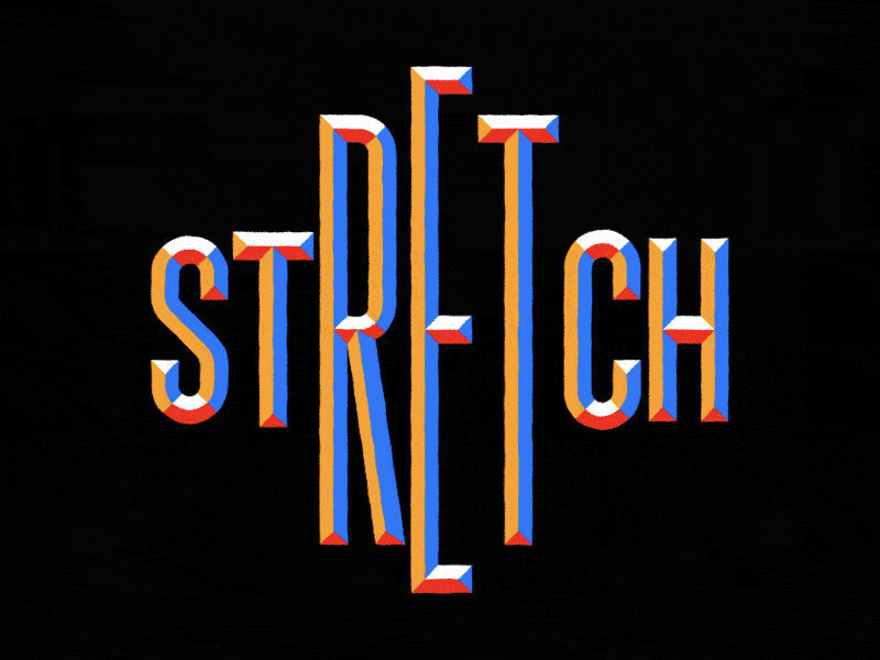
STRETCH by Mat Voyce
Last but not least, responsive web design is about best practices.
Responsive web design is not just about plugging these key features in and being done. Neither is it a separate technology. It is a set of the best practices used to create a website that responds to the device, including pages that instantly adapt to a reader’s needs.
Therefore, it means you need to follow the modern technologies and employ practices that cope with the task better than the others do. The vivid proof of that is the slide-out menu. Along with the hamburger button, the slide-out menu has become a standard for responsive designs, overthrowing other old yet time-proven solutions simply by offering the best flexibility for the ever-growing mobile market.
In addition, along with seeking the best solutions for current demands, you need to test and analyze methods that you have already implemented to see whether they fit the bill since the situation is changing rapidly.
Best Uses of Responsive Web Design
- E-commerce websites: With the growing trend of online shopping, it is crucial for e-commerce websites to provide a smooth browsing and shopping experience across all devices.
- News and media websites: Users often access news and media websites on-the-go, making it essential for these sites to be responsive and provide a consistent reading experience.
- Blogs and portfolios: Freelancers and professionals can showcase their work through responsive blogs and portfolios, ensuring their content is easily accessible to potential clients and employers on various devices.
- Corporate websites: Businesses can benefit from responsive web design by providing a seamless experience to their customers and clients, regardless of the device used to access their website.
Technical Issues and Solutions of Responsive Web Design
- Image scaling: One of the main challenges of RWD is ensuring images look sharp and load quickly on all devices. To tackle this issue, use responsive images with the ‘srcset’ attribute to serve different image resolutions based on the device’s screen size. Additionally, consider using CSS techniques such as ‘background-size’ and ‘object-fit’ to scale and position images properly.
- Navigation: Designing a responsive navigation menu can be challenging, as it must adapt to various screen sizes and orientations. Employ mobile-first design principles, and consider using a collapsible or off-canvas menu for smaller screens.
- Performance optimization: Websites with a lot of content, images, or multimedia elements can suffer from slow loading times on mobile devices. To optimize performance, use lazy-loading techniques, compress images, and minimize HTTP requests.
- Cross-browser compatibility: Different browsers and devices may render your website differently. To ensure consistent display, use feature detection libraries like Modernizr and test your website on various devices and browsers.
- Managing CSS media queries: As the number of devices and screen sizes increases, managing media queries can become complex. Utilize pre-processors like Sass or Less to keep your CSS code modular and maintainable.
Difference between Responsive Design and Mobile-friendly Design
There are two basic options when deciding how you want your website to look on small devices (cell phones and phablets): responsive web design or mobile-friendly design. While some people believe that these two are the same thing, in fact, they are not. So, who is who?
Responsive website changes depending on the screen size. It uses a dynamic grid, responsive images, and typography to adapt perfectly to whatever resolution is coming its way. It gracefully refits the content to each change in screen size.
Mobile-friendly design functions the same way regardless of the device: it just does not change. Simply put, it is a mobile version of the website. Although it stays relatively neutral to screen size changes, it still has some significant benefits over responsive design. First and foremost, a mobile-friendly website is made with mobile users in mind. It means it provides the best user experience, taking into account even the tiniest details. For example, it has a navigation that is “thumb-friendly,” buttons and links that are easily tappable, graphics that is large, uncluttered design with fewer features, etc.
Responsive Design
- Improved user experience: Responsive web design enhances the user experience by delivering a consistent layout across various devices. This ensures that users can easily navigate the site regardless of the device they are using.
- Cost-effective: RWD eliminates the need to develop and maintain multiple versions of a website for different devices. This reduces the overall cost of web development and maintenance.
- SEO friendly: Google and other search engines prioritize mobile-friendly websites in their search results. Implementing RWD can improve search engine visibility and drive more organic traffic to your website.
- Increased conversion rates: A seamless user experience on all devices can lead to higher engagement, increased dwell time, and better conversion rates.
So, which one to choose? Well, everything depends on your brand, target market, and most importantly, marketing goals. Answer these three essential questions to get some hints on direction:
- What is the purpose of your website? This helps define what information is essential and what information can be eliminated to provide quick access to crucial details.
- What will visitors do on your website? This helps define what functionality is vital and how to make it easily accessible on each screen size.
- What devices do your target market use most of the time? This helps to focus on the most viewed version and provides the best user experience for customers.
Finally, bear in mind that your website should take your visitors on a smooth, frictionless, valuable, and enjoyable journey. If this journey targets mostly audiences on the mobile web, then the mobile-friendly design is your option. However, if you are up to a broad audience from various devices, then responsive design is the only way out.
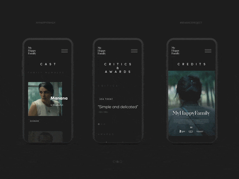
My Happy Family by Shota
How to Create a Responsive Design – 3 Popular Approaches
Designing a universal website accessible to everyone and adaptable to various screen sizes flawlessly and graciously sounds bold and daring. However, no obstacle is insurmountable since the web developers’ community is always searching for the best solutions to address users’ needs and wishes efficiently.
So, what can we do? There are some excellent options in the stock for both tech and non-tech-savvy people. Let us consider the most popular universal approaches to creating responsive designs these days.
Responsive Website Builders
Website builders are a quick, easy, and flexible way to create a responsive website. They fit both tech and non-tech-savvy people by providing a comfortable environment where you can build a website from scratch without writing a single line of code. Some of them focus mainly on responsive behavior, while others take into account mobile-friendliness, offering tools for creating a fully optimized website for mobile devices.
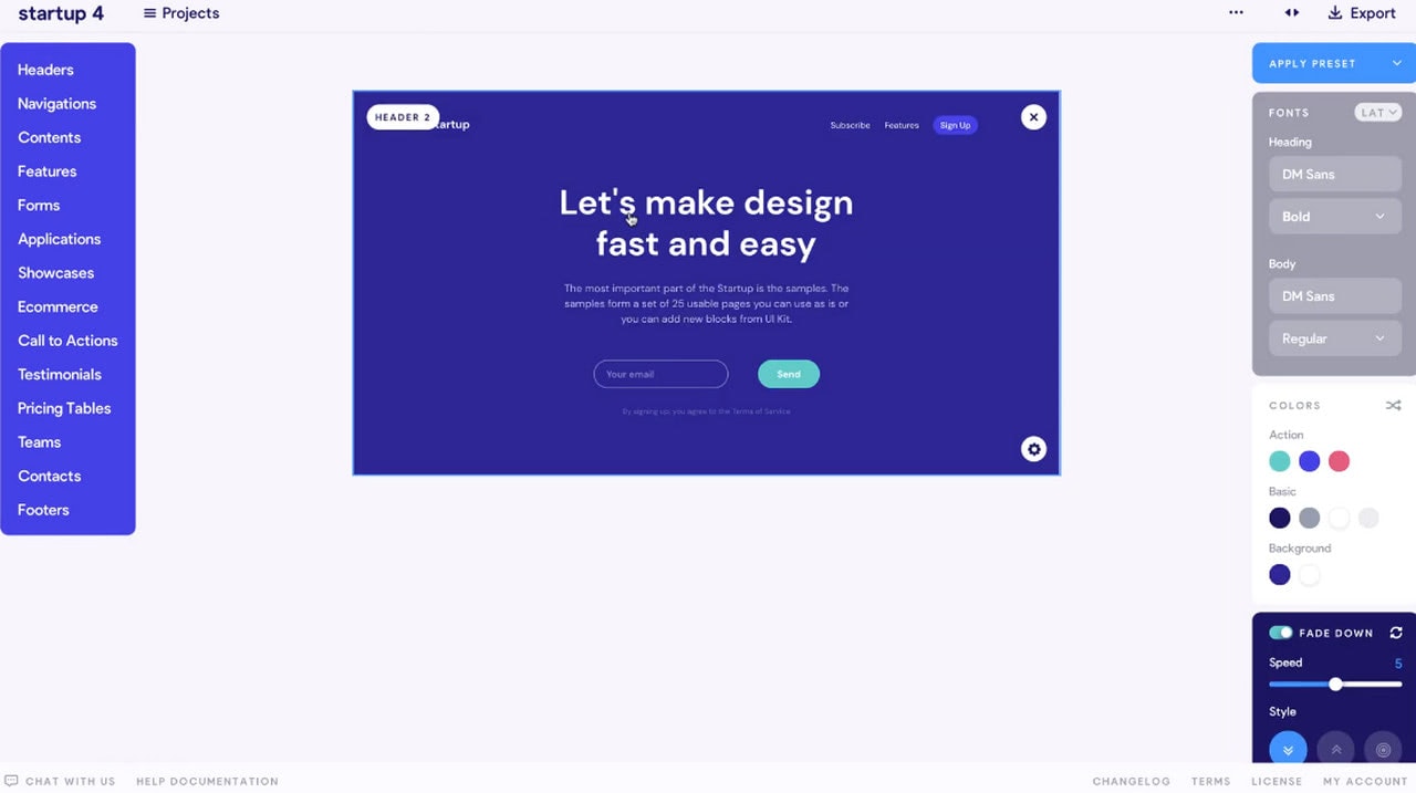
One of the bright representatives is Startup. This award-winning website builder includes more than 300 blocks with modern styles, excellent responsive behavior and mobile-friendly features, a browser-based drag and drop editor that anyone can easily handle, and powerful customization options.
Grid Systems
If you love to code or create everything from scratch controlling each stage of development, then responsive grid systems may be right up your alley. They already have everything you may need: containers, columns, rows, classes for ordering, arranging, and nesting, some basic styles that smoothly adapt to screen sizes thanks to media queries and a range of popular breakpoints. As a rule, developers use them as a solid foundation to build on.
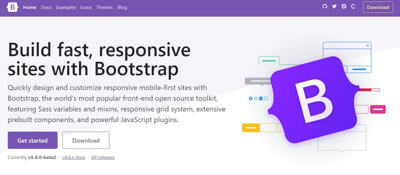
There are a dozen responsive grid systems in the wild: some are simple and primitive, while others are complex and all-embracing. The most notable representative of this direction is, of course, Bootstrap. It is regularly updated to use the best features of modern technologies. By now, it offers a mobile-first flexbox grid to build layouts of all shapes and sizes and a dozen of helpful utilities and assets that make the coding pleasant and enjoyable.
CMS
Last but not least. One of the ready solutions that, much like website builders, can be easily handled by non-tech-savvy people is CMS like WordPress, Shopify, etc.
Popular content management systems do not stay aside from the current demands of the web audience. Although, by default, they do not offer responsive behavior, however, those who create themes for these frameworks certainly take this into account, providing responsive templates that are partially or sometimes even fully optimized for mobile devices.
Best Practices for Responsive Designs
As we have already said, a responsive website is not a separate technology with a one-size-fits-all solution. To nail it, you need to use techniques that bring about the best result for your brand, audience, and marketing goals. This implies capitalizing on the key features such as flexible layout, flexible images, media queries, and responsive typography, as well as introducing some time-proven tips and solutions. Let us walk through some good practices that may help you create a fully responsive website that meets all your users’ expectations.
- Design the mobile website first and work your way up to the desktop version. According to stats, the mobile web is prevailing over the desktop one. Therefore, chances are your users will visit your website using handheld devices. Prioritize the mobile version and use it as a foundation to build on. More so, it is easier to scale up design rather than scale it down.
- Know popular screen resolutions. According to GlobalStats, almost 25% of visitors use small cell phones with 360px wide screens, and only 12% use laptops with standard 1366px widescreens. In addition, there is no one preferable size in each niche. This means you need to find the perfect responsive tier in each category. Use Statcounter to define what devices your target market use to determine the best responsive tiers.
- Cater to resolutions that are gaining popularity to create a future-proof user experience that will work even when the market share changes.
- Know web browser market share. Responsive design is also about adapting to the capabilities of the device hardware and web browser. Seamless experience requires your website to work flawlessly across all platforms. The harsh truth is, the World of web browsers is not perfect. There are still browser versions that do not support even the popular CSS features, to say nothing about such modern and pioneering methods like calc() or Flexbox. In this case, you cannot rely blindly on your solution. You need to adjust it according to the browsers that your audience use. In addition, it is highly recommended to provide a fallback if you want to widen your target market and serve content to every customer regardless of the web browser he or she might use.
- Take into account physical differences in using the website on a small screen and a large one. Mobile World is all about designing for thumbs. At a minimum, it means that
- the buttons should be big;
- the links should be easily tappable;
- sliders should be swipeable;
- interactive elements, key details, and navigation should be within easy reaching distance of thumbs;
- navigation should be at the bottom;
- search should be responsive.
- fingers should not block the view of the content when trying to reach navigation;
- target area should be enlarged to accommodate touching ideally.
- Do not be obsessed with the F-shape pattern. While on desktop versions, it rules the roost, when it comes to small screens like cell-phones, it is useless. People prefer exploring interfaces in other ways. As a rule, mobile users look at the center of the screen first. It is also the easiest place for them to reach. Therefore, the most critical information, including CTAs and navigation, should be there. However, when it comes to tablets and mid-sized devices, the screen’s central part is not easy to reach. Here you need to place navigation and crucial details on sides.
- Make sure you are not embarrassed with what happens in between breakpoints. Remember, not all people are going to maximize their windows to surf through your website. Your interface should be ready for such a scenario. The layout should naturally adapt as the browser resizes.
- Do not ignore landscape orientation since it is the main hindrance to achieving optimal usability and accessibility.
- Avoid bombarding the user at the small screen with all the content. Eliminate friction and focus on vital information. Do not scale down the whole design since you will end up with a long-long page that is difficult to read on small screens. Also, according to stats, mobile users are usually after quick answers. They should locate information in no time. Otherwise, they will leave. Therefore, display only what matters most to users and give them the controls to find the rest.
- Do not cling to the past. Follow the trends. Sometimes modern approaches may meet current demands more efficiently than old and time-proven ones. As proof, it is highly recommended these days to use scalable vector graphics, aka SVG. While there are various ways to ensure your images are responsive and adapt gracefully to new sizes, but why not benefit from the format that already knows how to behave in such a situation. Furthermore, SVGs often have a small file size so that they do not overload the website nor compromise the website’s speed, and most importantly, they save the quality of the visuals.
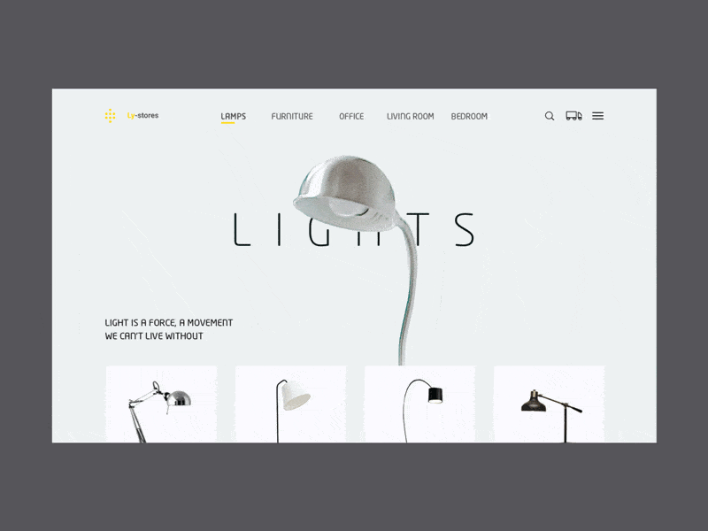
Lamps by Augustus
5 Top Responsive Web Design Testing Tools
We have acquainted with the basic principles of responsive design; however, that is only the first step. The theory is one thing, and practice is another. The next step is to grab some good tools that provide a well-crafted virtual environment where physical devices are perfectly emulated. They will help you define whether your project is responsive and give you some hints on what breakpoints to use and what elements should undergo changes to work and look excellent on selected resolutions.
Check out these 5 top responsive web design testing tools.
The first tool in our collection of 5 top responsive web design testing tools is, of course, Inspect Tool in Chrome (it is also available in Firefox and Opera). Although this tool is not for non-tech-savvy people, it is still easy to use: the interface is intuitive, and the panel for inspecting responsiveness is easily accessible.
The device toolbar shows you how the page looks and performs on different devices. It has two modes: mobile viewport mode and responsive viewport mode. While the first one offers you a selection of popular cell phones that let simulate a specific mobile device’s dimensions, the second option is much more powerful. It allows you to play with size by stretching out or narrowing down the working area to catch the breakpoints when the layout becomes broken or content becomes difficult to read.
Mobile-friendly Test by Google
This is another tool from the Google team designed to help fellow developers to improve their online estates. Unlike the previous one, which is quite extensive and powerful in what information it can provide, this one focuses only on one type of information. It helps to find out how mobile-friendly your site is according to Google’s principles. It investigates and measures how easily users can access, read, and navigate the site on mobile devices. It grants you a score and offers some suggestions for improvements.
The tool considers such vital parameters as viewport issues, speed issues, load time, horizontal scrolling, scalability and readability of the content, touch elements, etc. Even though developers criticized the tool several years ago, today, it has many improvements and serves as a reliable platform to get insights on the mobile version of your website.
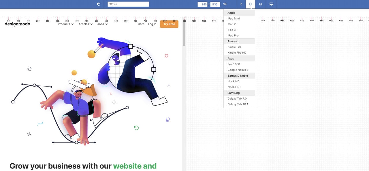
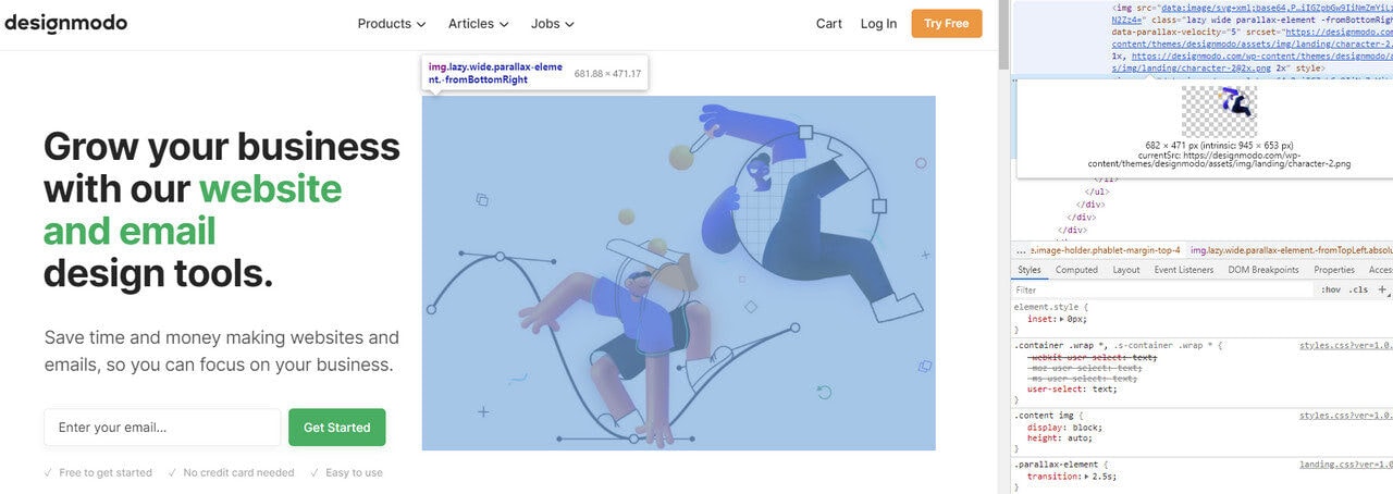
Responsive Test Tool by Designmodo
The beauty of the Responsive Test tool by Designmodo lies in its simplicity, even though it is pretty powerful. It has an intuitive interface that can be handled by non-tech-savvy people to see whether their current websites look great across popular devices and platforms. All they need to do is to type in the web page’s URL, and the tool shows how a web page renders in the different screen shapes and sizes.
Here, you can find a wide range of cell-phones, phablets, tablets, laptops, and desktops so that you can target and inspect every popular and not-so-popular device. Also, you can set your dimension and see how your web page looks in a custom size.
Last but not least. The great advantage of the Responsive Test tool that many developers find extremely useful is that it allows interacting with pages and inspecting dynamic details of the interface like navigation, sliders, tabs, etc. You can click on links, activate slide-out navigation, type into the search field, etc., to detect minor problems with the interface.
Am I Responsive?
“Am I Responsive?” is perhaps one of the oldest responsive test tools on the web. Unlike the previously mentioned here, it has a more static answer to the issue. All it does is show your web page on four popular devices: desktop, laptop, tablet (portrait mode), and cell phone. The surprising thing is, you can interact with every frame. You can open the menu, click on links, scroll down, etc.
Of course, this is not enough for developers. Still, it is a good alternative for non-tech-savvy people who want to find out how their websites render on different devices and tech-savvy people who want to take screenshots of local development URLs for reporting.
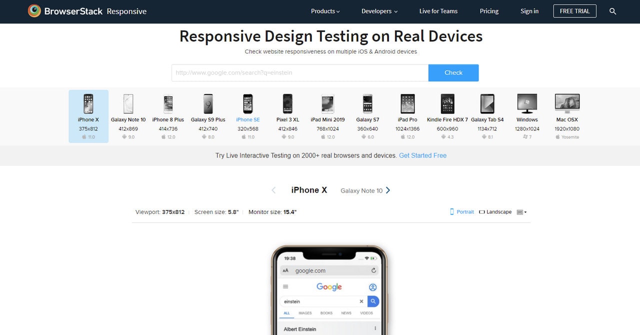
Responsive Testing
Responsive testing, a free tool from BrowserStack, shows your website on an assortment of iOS and Android devices, including mobile phones, tablets, and laptops. iPhone X, Galaxy S9 Plus, iPad Mini, iPad Pro, MacOSX, and even Kindle – the selection is pretty good. It is a great instrument to verify if a website is being displayed correctly.
Although you do not have such freedom as in Responsive Tool by Designmodo – you cannot interact with each version, and the only thing you get is a screenshot – nevertheless, it helps to get the overall picture of the online estate.
Responsive Web Design Examples
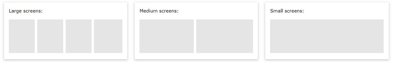
Responsive web design term is related to the concept of developing a website design in a manner that helps the layout to get changed according to the user’s computer screen resolution. More precisely, the concept allows for an advanced 4 column layout 1292 pixels wide, on a 1025 pixel width screen, that auto-simplifies into 2 columns. Also, it suitably fixes on the smartphone and computer tablet screen. This particular designing technique we call “responsive design”.
Responsive website designing is an entirely different designing version than traditional web designing, and developers (especially fresher) must know about the pros and cons of responsive web designing. This blog is a mighty example of the approach so we will reveal a few facts about the uses of responsive web designing. The basic instinct might be to choose media queries to develop a responsive site. However, the hassle one faces with media queries is that new queries can pop up from moment to moment; each time, the user experiences sudden and drastic changes to the look and organization of the site. Experts suggest using some CSS transitions to ease the jump.
Pages that include data tables pose a special challenge to the responsive web designer. Data tables are extremely wide by default, and when someone zooms out to see the whole table, it becomes too small to read. When one tries to zoom in to make it readable, he or she is supposed to scroll both horizontally and vertically to look through it. Well, there are several ways to avoid this problem. Reformatting the data table as a pie or mini-graph is an approved solution. The mini-graph fixes even in narrow screens.
Images in responsive web designs are called context-aware. This particular technique serves the purpose of responsive designing in true sense as the images serve at different resolutions, ranging from larger screens to smaller ones. The scaled images appear to change fluidly with the help of updated developer tools and coding languages, allowing designs to look sharp in every context.
Responsive web designing is remarkably different from traditional designing in terms of technical and creative issues, and careful use of this can do wonders while designing.
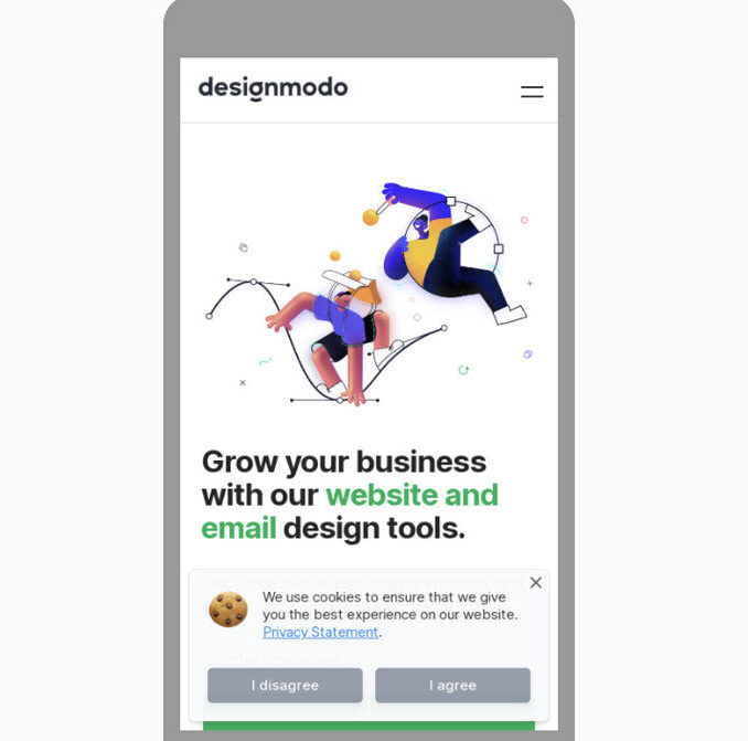
Designmodo
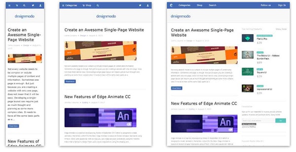
Designmodo has a very clean and clear design with a perfect responsive design interface. The images and the text scaled perfectly on different mobile screens sizes.
Simon Collison

Though nowadays this greyish grid-style static website looks a bit boring and dull, however when it was released it caused some kind of furor with its high-end layout.
The main reason was that the designer primarily focused its attention on responsive behavior that was only gaining popularity those days thereby providing ordinary developers with a representative example of how regular grid-style layout should gracefully transform.
Andersson-Wise Architects

Being dedicated to an architecture and design studio it doesn’t surprising that the main focus of the website are photos that showily represent skills, experience and clients of the company.
The landing page includes 3 main sections, each of which is based on image background. The flexibility solution helps to effectively form a proper structure for every standard screen size, creating a pleasant content flow for readers.
Stephen Caver

Stephen Caver has a topnotch website when it comes to responsiveness. You will definitely ask, what so special in it. The answer is simple, take a closer look at the front page and you will see; it consists of
- huge welcoming message dished up with a help of a rough typography;
- set of huge blocks that is a duplication of the main menu on the top;
- regular layout for blogging.
So as to say, 3 essential aspects that can be found on every website. The designer gives us a hint of how typography, grid-style markup and blog section should change according to device screen dimensions.
Sparkbox

Sparkbox demonstrates a basic structure of a corporate website. The layout is pretty simple; it is based on a standard, commonly-used set of horizontal stripes that present data in a non-intrusive manner. Such structure is really easy to adapt to various screen sizes. The sequential arrangement of blocks deprived of embellishments undergoes changes quite smoothly and effortlessly, giving users a nice-looking and well-organized layout.
Food Sense

Transformation from a regular left-sided blog-style magazine layout populated with numerous yummy pictures to an elementary block-by-block layout – here is how the main process of adaptation looks like in this website.
However, there is nothing supernatural; it is believed to be a typical solution to a great deal of projects that want to attract online readers from mobile web, win over new audience, and at the same time, save the website’s aesthetics from a visual overload.
The Boston Globe

The Boston Globe is an excellent example of a well-thought-out news-related website that is based on a responsive layout. The website takes on a conventional approach that is helpful for those who are eager to run its own frequently updated online magazine.
Though as befits, at first sight it seems that the website has a complex, slightly messy outward that is really hard to handle, actually the solution is really primitive. The designer has wisely split all the information into 3 columns, the amount of which decreases according to screen size, slowly but surely passing stages of displaying data in 2 columns and finally in one; in this way you will be also able to set a necessary order of showcasing your blocks.
Think Vitamin

To be honest, Think Vitamin can’t boast of anything particular concerning its blog design. It has the same markup as everyone else’s. It has 1 main column with a right-sided widgetized sidebar, a header populated with navigation, a logotype and a search bar, and a footer that presents information via set of blocks.
However, the team not just mindlessly uses a responsive framework as a base; they also actively muster support from some styling elements. Thus, a contrasting color palette helps to distinguish content blocks and some functional elements such as social media and ads, enhancing visual perception for mobile users and reinforces readability.
Sasquatch! Music Festival

Sasquatch! Music Festival has to deal with a lot of multimedia content including videos and dynamic effects that in addition is spiced up with some artistic hand-written lettering and fantastic graphics. So for the team, it is quite a challenge to display everything correctly on mobiles and tablets.
Nevertheless, the responsive behavior here is well elaborated. It neatly touches every detail, creating a visually pleasing appearance that doesn’t lose its charm of originality and creativity even on small screens.
Internet Images

This is another clean well-organized website that is based on a flexible horizontal stripe layout. The responsiveness here is also effectively bolstered by a color differentiation that visually separates one logical block from another.
Such simple yet powerful combination helps to increase readability chiefly on small devices where, as a rule, everything is presented as a one continuous data stream that, because of an inherent monotony, is able to easily destroy all the piquancy and decrease readers’ interest.
Staffanstorp

Here, an ability of a beautiful adaptation to smaller screens as well as to bigger ones brings such benefits as
- perfect readability regardless of devices that display your website;
- well-structured appearance for increasing information hierarchy;
- easily conveying messages to readers that mostly leverage tablets and mobiles.
Though the blog designs do not differ from others, yet its desire to satisfy current web requirements takes it at the whole new level.
Seminal Responsive Web Design Example

As the nameplate implies, the website serves as a perfect example of responsive design. It even has a proper title “A Flexible Grid”, so it becomes clear that everything here is riding on rules of graceful degradation. As expected, the team pays more attention to an ideal data presentation rather than to aesthetics, so styling goes into the shadows.
The demo page includes navigation, a text block, grid-style area, and even illustrated logotype, so to speak covers a minimum of integral elements. The team showcases how sizes of logical divisions and arrangement should properly change in order to provide users with an excellent experience on portable devices.
Naomi Atkinson

Naomi Atkinson leverages a mosaic-style layout for the front page. This solution is widely-used among those who want to immediately shed a light upon its artworks by creating online portfolios.
The website is worth mentioning not because of its design, since, to put it mildly, it leaves much to be desired but due to its functional side that is quite intelligent. The designer employs irregular grid that nicely transforms into a correct grid once you start minimizing your browser window. And that’s not all; metamorphoses are supported by pleasant effects that add dynamics and attractiveness to the project.
Forefathers Group

What can you say about this website? It certainly conveys a distinct, quite overwhelming impression with its matchless, sophisticated design. The team has not stinted on the artistry that manifests itself in various moments.
The website charms with its incredible retro-style typography, fantastic hand-drawn illustrations, textured background, and amazing graphics; and these all embellishments skillfully co-work with textual content that takes up a special place in the design.
So as you can see, the team has to take into account lots of details in order to turn the website into a comfortable place that will satisfy needs online visitors that surf the website via various pocket devices.
Spigot Design

Here, the responsive behavior should leave an imprint not only on a standard layout that includes grid-style and line-by-line data presentation but also on intro video, dynamic graphics and of course, menu.
Bearing everything in mind, the team is managed to provide an online audience with an elegant design spiced up with some charming effects and full of whitespaces that nicely reflect data regardless of screen dimensions.
New Adventures In Web Design Conference 2012

Being based on a flexible grid allows the organization to win over as many potential visitors as it is possible. And in this case, this quality not only contributes to the appearance of the website but also unobtrusively supports the event that it publicizes. Since the website is dedicated to a web design conference, it is highly desirable to demonstrate regular users that the team is aware of current web requirements and rigidly sticks to them. So building a website with all specifications is an important move towards success.
Illy Issimo

The responsiveness is an essential feature of every high-quality promotional website that understands rules of attraction. Illy Issimo got the hang of it and used a flexible grid in order to
- provide a pleasant user experience;
- extend a targeted audience;
- draw in potential customers that use small devices.
So as a result, its advertising campaign is certainly out in front.
Arrrrcamp Conference

The website focuses more on text rather than on multimedia. Thus, the large part of the website is based on a white monotone background that nicely underlines text and some trendy “ghost” buttons.
The front page undergoes changes once you resize your browser window; it ably supports all resolutions starting from 1920px and ending up with 240px that is really convenient since Ruby-lovers definitely know how to use tablets and mobiles in search of necessary stuff such as conferences in internet.
Robot or Not?

Robot or Not? is a demo website that puts a flexible grid in action.
Featuring an equal mix of textual and multimedia data that takes up the whole browser screen (as is often the case) and stripping away all the decorations and creative styling, the team tries to make from the regular page an excellent example for newbies that want to vividly understand basic transformations that happens with the layout when it adapts to various screen dimensions.
Earth Hour

Earth Hour is a really advanced and complex website that is filled with lots of multimedia including both videos and eye-catching photos. Moreover, it is also an online infographic that utilizes some beautiful graphics and smooth transitions in order to draw attention to the issue.
Unfortunately, the adaptation is not well-crafted and fully elaborated, since the website suffers from some inconsistencies starting from tablet version, to say nothing of displaying on a much smaller devices such as mobiles.
Teixidó

The creative team resorts to an ingenious approach of using textures, fantastic drawings and illustrations in order to effectively set its company online and make it look unique and eye-catching.
An artistic side is absolutely stunning. How about an ability to skillfully adapt to competitive environment? Here is also all present and correct. Though the website is static, there are no magnificent effects or dynamic zest, yet the responsive behavior dramatically contributes to the users’ experience, saving the day.
Ribot

Ribot is a high-end digital design studio which specializes in mobile, tablets and beyond – as the title says.
The key words here are mobile and tablets, it means that the team concentrates on creating designs that will be suitable for namely such devices, so it’s not surprising that the website design itself also easily blends into screens of such gadgets, nicely displaying information and providing regular online visitors with a proper way of exploring company’s services and possibilities.
Deren Keskin

Deren Keskin has a compactly arranged, clean online portfolio that obviously resorts to a rule that every web page should occupy only browser screen, even blog falls under this requirement.
The same goes to modified (according to responsive scheme) layouts, so everything is compressing until the whole structure perfectly fits into a screen regardless of its dimension. Furthermore, the designer is managed to save all the proportions and relationships between integral components in order to save and carefully identify the previously set priorities of some elements.
Sweet Hat Club
<
Much like the previous example, the content is tightly packed together. The newspaper-style layout is aimed to predominantly feature images since the website is an online club of those who like to wear hats.
The textual filling here is quite optional, so the responsive grid should chiefly take care of properly modifying image sizes and fitting them into new dimension. What is worth attention here is that even the mobile version of a website includes 2 columns as the original one.
Glitch

At the present time the website is closed. The home page includes some information about the previous project activity, helpful links and characteristic illustrations. This is only one static web page that is reminiscent of the old days.
However the non-working status in no way affects the responsive behavior that is inherent to the website. Even now, being out of service, it continues to complying with web requirements and formally notifying users about its current status whether they stumble upon the website sitting at his computer or using a cell-phone.
dConstruct

dConstruct is a website dedicated to conference and workshops that take a look at perceptions of technology and culture. Though the design is quite primitive, yet the informative side is really well-thought-out. Thus, the front page draws your attention to only 3 main moments:
- speakers and workshops’ teachers;
- description about the event;
- sponsors.
Those are the main things that worry potential visitors and need to be instantly highlighted.
Adaptive Web Design

As the nameplate implies, the website is concentrated on adaptive issues. To be more precise, this is a promotional website that advertises a book that will answer all you questions.
So it’s quite predictable that the developer leverages it as a tool for showcasing its skills through providing users with a representative example of how should a regular website behave when users come to it from various devices.
Authentic Jobs

Authentic Jobs is an online directory that is aimed to unite employers with job seekers. It traditionally displays data via a list-style layout that is quite elegant and easy to handle when it comes to adding versatility via incorporating responsive behavior.
The transformation does not cause much trouble, since the structure stays the same; the only thing that undergoes changes is a sidebar which is moved down the hierarchy by giving way to more relevant and priority data.
Five Simple Steps

The website of Five Simple Steps has a clean appearance that features only some kind of valedictory speech and a list of helpful stuff from those who previously run this website.
Staying responsive till the end is a good rule of etiquette, and the company is perfectly conscious of this. Even being closed, the website continues to meeting current web requirements and supplying its mobile and tablet readers with a perfect readability.
Splendid

Splendid is a simple online portfolio that emphasizes users’ attention on artist skills and experience. You will not find neither fantastic illustrations nor ingenious effects; the designer takes a minimal approach in order to present himself, and it definitely stands in a stark contrast to other sophisticated creatives’ websites.
In this particular case, the minimal design doesn’t mean minimal functionality. The artist feels that the responsive design is and will be the primary focus, so he takes care about a proper adaptation to huge and small screens.
Ryan O’Rourke

When you run into online portfolio of Ryan O’Rourke, it seems that the designer is guided by the wise phrase “brevity the soul of wit” and realizes it literally. Minimalism, minimalism and again minimalism…there is only one web page that features one sentence, email and small gif animation that shows off his activity. However much like the previous example, the website is based on a responsive framework that makes the website ready for mobile web audience.
FlexSlider

FlexSlider is a lightweight jQuery slider from WooThemes with simple semantic markup and numerous valuable features that was created to become your reliable companion for an ideal image showcase on every popular device.
Nevertheless, the web page that promotes the product, unlike the slider itself, is not as adaptive as it should be. Unfortunately, the team has missed this point that really disappoints.
El Sendero del Cacao

El Sendero del Cacao has a visually-appealing website with a calm and warm atmosphere that is achieved with a help of soft coloring, spectacular images and appropriate graphics. Moreover, thanks to such integral features as
- responsive layout;
- cross-browser compatibility;
- easy navigation;
- multi language support.
the website is able to unobtrusively force users to indulge in an enjoyable pastime.
Do Lectures

Do Lectures is a regular blog that makes use of a 3-column format layout that effectively copes with lots of news and posts populated with images. The website has an old-timey feeling because of its conventional markup and lack of any dynamic elements.
Coming with the retina support, the website looks fantastic on huge desktop and notebook screens, whereas on small tablet and mobile screens everything is not so rosy. The responsiveness, unfortunately, is not fully thought-out here, leaving users of mobile web with ill-suited horizontal scroll bars.
St Paul’s School

Nowadays, a great deal of educational institutions has their own websites. Even the official page of the St Paul’s School is not lagging behind others, having a website with
- an appropriate discreet appearance;
- highly informative home page;
- comprehensive navigation;
- and of course, mobile and tablet friendliness.
And concerning schools, it is really something. Having a fully adaptive well-crafted website that not only reveals necessary information but also has a pleasant design supported by flexible grid looks like a jump above its head.
Naomi Atkinson Design

Naomi Atkinson Design is a small passionate UK-based design studio that has a tightly-packed together website. The team employs a boxed-style layout with centered content diluted with minimalism that is aimed to:
- briefly but efficiently display data;
- instantly catch the viewers’ focus and draw attention to portfolio items;
- provide users with a handy instrument for quick feedbacks.
Moreover, such layout is really easy to turn into responsive one, so it’s quite beneficial solution.
Ben Handzo Photography

After casting a mere glance at the website, it becomes clear that the artist is simply obsessed with photos. The home page of his online portfolio is packed with images; there is absolutely no text, with the exception of navigation and small panel placed on footer. Moreover, being bolstered by a responsive grid that handle all the inconsistencies occurring during adaptation to smaller screens, the website brings benefits not only to the owner but also to online visitors by giving them a chance to enjoy spectacular works no matter where they are.
Stunning CSS3 Media Queries Example

As you have already noticed this is another website in our collection that is dedicated to responsive solutions called media queries that are highly popular among developers nowadays.
Of course, the design, styling and semantics are quite primitive here, however, they are not highlights; the flexible grid that plays a role of a solid foundation for this project is a true star here. The website serves as a mere example that graphically formulates the rules of graceful degradation for a standard 4-column layout.
Nordic Ruby Conference

Nordic Ruby Conference’s official website conveys a distinct sense of something really interesting should happen. Such features as:
- clean overall design;
- textured solid color backdrops;
- well-formatted layout;
- informative home page;
allows a pleasant, and at the same time, professional atmosphere prevails on the website. The responsive grid that is used as a base makes the presentation of the event available for a wide range of internet users.
Halifax Game Jam

Halifax Game Jam has a powerful artistic vibe due to its ingenious flyer-inspired home page that features a mind-blowing illustration and highly original backdrop.
Of course, the creative design helps to make your website to stand out from the crowd, but how about basic web requirements that need to have complied? The team has also thought this through, and supplied the website with:
- solid surface;
- responsive layout;
- proper optimization for browsers.
even despite of having only one page.
Diablo Media

The team has obviously built the website with current trends in mind. There you can find
- a hero area that greets newcomers;
- smooth effects;
- slide out highly comprehensive navigation;
- flat-style graphics.
They also did not miss an opportunity to add flexibility as well as supply it with some extra features that are necessary for website’s well-being in a competitive internet.
ASU Online

ASU Online is not reliant on an incredible design to be memorable. Being a website dedicated to a local university, it has a quite modest design that, by the way, goes perfectly well with a site’s mission. The front page depicts everything that is needed to effectively familiarize visitors with an establishment.
As far as functionality is concerned, the website sticks to such core features as:
- responsiveness;
- seo optimization;
- cross-browser compatibility.
3200 Tigres

When your task is to inform about the acute problem and draw as many attention as it possible, establishing a proper online foundation is a must have. The WWF like no other knows the rule of the game, so it’s not surprising that 3200 Tigres (one of its child websites) is pulled by such essential features as:
- modern flat style design;
- optimal information hierarchy;
- responsive layout.
Kings Hill Cars

Kings Hill Cars is an official website of a company that provides taxi services. The landing page tries to cover everything that can be of use for potential clients.
Despite the fact that the website design is outdated and quite unremarkable, it is fully adaptive. And the last feature is more than enough to increase the conversion rates for company whose targeted audience, as a rule, comes from a mobile web.
8 Faces

8 Faces is a printed magazine that forces its readers to speculate about typography, asking only one but tricky question:” If you could use just eight typefaces, which would you choose?”
The official website as befits is aimed to achieve a maximum exposure for its product with a help of
- clean elegant design;
- wide-screen image slider;
- ability to gracefully fit the content into smaller screens.
Asbury Agile

Asbury Agile is a conference for web professionals. As we have grown accustomed, when the event concerns web technologies and includes some high-end professionals, the official website not only has to look modern and up-to-date but also stick to some strict specifications such as
- seo friendliness;
- responsiveness;
- browser optimization.
like Asbury Agile official website do.
Alsacréations

Alsacréations is a French-based web agency that has a regular online portfolio.
Though it seems that the website craves for some kind of a “facelift” since the design definitely comes from the past with its glossy icons and boxes with shadows, however, it has one huge advantage over some others; it is based on an adaptive grid that slightly changes the attitude to it, making us (I mean potential customers) believe that at least the base of your project will meet current requirements.
Sleepstreet

Sleepstreet is a fully responsive website that is really pleasing to the eye, even when it is displayed on your cell phone. Moreover, it can boast of such features as
- a grid-style layout for showcasing various rent options;
- a retro appearance for creating a warm and cozy home-like atmosphere;
- a multi-language support for covering a wide range of potential customers.
Responsive behavior embraces lots of aspects. Being fully adaptive doesn’t mean solely being mobile and tablet friendly, it also involves proper display on huge desktop and notebook screens. Moreover, this feature is no longer optional; every website, whether it is an online portfolio of an artist or a regular school web page, has to quickly and efficiently react to changes related to screen sizes. There are different ways of sorting out this issue, however, we are here not to shed light upon these techniques; we just want to demonstrate how ordinary websites, which flood the internet, are capable of gaining benefits from being responsive.