What is UI Kit and Why You Should Use it
We’ve been launching a few great free and premium UI Kits at Designmodo. But some of you may have missed it simply because you don’t care about it… yet.
Today we’ll see what you lose by skipping those great collections, and how to get more from them.
It’s not just about copying and pasting elements, at all. It’s about improving your workflow, getting more and working less, and getting an incredibly better overall look. Yes, we’ll talk about how it affect your paycheck as well :)
So, let’s rock!
What is this “User Interface Kit” thing?
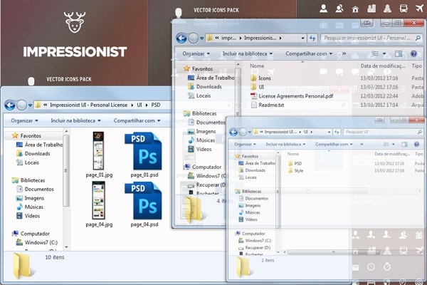
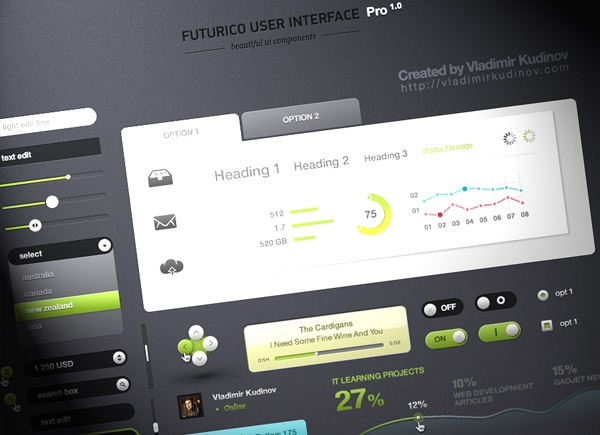
UI Kits are files (usually PSD’s, but the premium ones comes with a lot of additional stuff, as you can see above) with a lot of useful components – User Interface Elements – for user interface design. They come with the possibility of a lot of color variations and they easily integrate with your own design since they actually are done for this propose. They can also include patterns, brushes and asl files, which make the integration process even easier, you can play with colors, create new components and just include them as smart objects in your own design If you want.
With Postcards Email Builder you can create and edit email templates online without any coding skills! Includes more than 100 components to help you create custom emails templates faster than ever before.
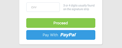
Free Email BuilderFree Email TemplatesThey contain a lot of components that you just shouldn’t be designing, like default (and pretties) selects, checkboxes, slideshows, avatars, lists.
Also sometimes they include components that you don’t even think about using, until you see them. This is the case of those sliders form components. Before them designers and developers used simple input fields or select boxes but a clever guy noticed that a slider could solve much better this problem.
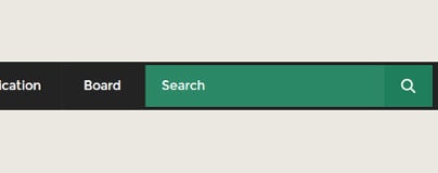
Also, User Interface Kits give you a lot of ideas to solve common problems, like navigation styles, breadcrumbs, CTA’s, icons, notification boxes, lists… And they are amazingly detail-oriented, so you end up with a much better result than if you were doing it by yourself, in no time.
So, how do they save me time? (beyond the obvious copy & paste)
Think about it the same as when you find a good supermarket. You know that once a while you’ll have to search for new supermarkets or stores out there, but for 99% of the cases you’ll just go there, find what you want, pick it up, pay and go back home. No waste of time.
Imagine if every time you need to buy something you’d need to find a new store. Remember last time you moved? Yeah, just like that. That sounds completely crazy, right? Actually, I’m pretty sure that it’s what you’ve been doing so far with your designs. For every project you go out there and search a little bit about cool components to use.
So the key point is that a single UI kit can be used for virtually all your projects, and once you find a really good and complete UI kit you can just reduce to ZERO the component searching step.
Did I mention that they save you MONEY?
Ok, this one is quite simple. For freelancers and companies time equals money. Each second you spend doing unnecessary things you are losing jobs to your competitor.
With Pulsetic you’ll be instantly notified the moment your website, API, or server becomes unavailable. Monitor uptime from multiple global locations and respond to incidents before your users are affected.
Create beautiful status pages in minutes to keep customers informed during outages and build trust with transparent communication.
Start Monitoring for FreeAnd the opposite effect is, oh, so true.
If a guy spends 10 hours doing a layout that you can do in 4h because you don’t spend time doing unnecessary things you can just charge the DOUBLE of the usual rate and still 20% cheaper than him (crazy math, but you can check it if you want :D).
So, client is happy, you are happy, the other guy kills himself. Win-win.
Also, you can learn a lot from the roots!
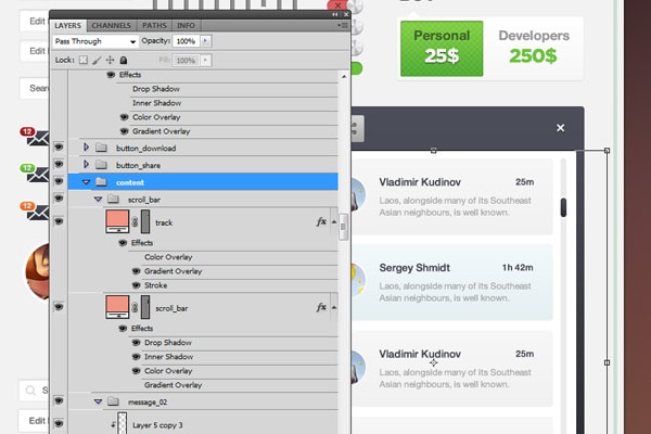
Oh layers. Who doesn’t love them? So, the UI Kits (at least the good ones, you know) are all layered (shaped). So you get an amazing file AND you’ll know how to replicate the effect and do same thing in other custom elements.
You can also copy the layer styles and play around with a few of them, like pre-made effects (wooden, brushed metal, carbon fiber…), so you’ll learn a lot of cool stuff about effects, objects, organization and why not, color combinations and styles.
UI kits are for designers as Frameworks are for Developers
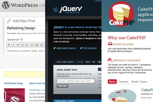
I bet you see a lot more projects based on Frameworks or CMS’ than built from scratch. That’s something that designers have a lot more to learn with developers: they are not ashamed to reuse stuff. There are plenty of code sharing services, frameworks, plugins, and themes.
But designers tend to do things on their own, just relying on inspiration. As a wise guy (Picasso, maybe?) said “Good artists copy, great steal”. Don’t be afraid to make use of things out there (as long as you don’t break copyright laws, of course). Don’t be afraid to don’t reinvent the wheel. Just focus on the key points, on the real uniqueness of your work.
And developers can just do things by themselves
In addition to what UI does for designers, they can also help developers. Since developers get a lot of things already made with UI Kits, they can just do projects without hiring designers at all. Same way that designers can just use WordPress and a theme, developers can just use UI kits and a little knowledge on design to get good looking layouts saving a few bucks.
Standardized interface
![]()
Another important thing is about standards. Once you use User Interface Kits, Icon Packs and stuff like this, you’ll keep the same look for all elements in your website. People will look to different pages and different components and still feel that they are similar.
Also, they are made in a way that it’s easy to integrate new items. If you don’t find what you’re looking for in your UI Pack, you can create your own items!
It’s far way easier to completely change the look
Clients are crazy, aren’t they? So if by the end of the project the client calls you saying “Hey, how about changing the whole design to pink? My wife would love it!” you can just change a few layers and you’re done. Also if even after the implementation client asks you to change all the icons the Front-End guy will love you, because he would have done the whole thing with sprites and just have to change a single image, not the whole code.
“I’ve been there, kid”
As a Front-End Guy and Designer I’ve seen both sides of this story. I can ensure you that UI kits do save a lot of time and hassle, doing really well a job that you shouldn’t be doing. At the same time, well layered layouts, especially for small and detail-oriented components are much better to work with.
