Gradients in Web Design: Trends, Examples & Resources
The gradient trend started with web 2.0 and has advanced quite a ways since then. Modern gradients can be designed purely in CSS3 so it’s easier to build them into buttons, backgrounds, and even typography.
Let’s delve into this trend of gradients in modern web design to see how they’re advancing and where they might go in the coming years.
I’ll also share free gradient design tools for web designers who don’t wanna code them all from scratch.
Header Gradient BGs
Probably the most common trend I see for web gradients is the background header.
This is so much easier to create now that gradients can be built in pure CSS. Many websites use gradients to add some color into the page and expand the basic color scheme.
With Postcards Email Builder you can create and edit email templates online without any coding skills! Includes more than 100 components to help you create custom emails templates faster than ever before.
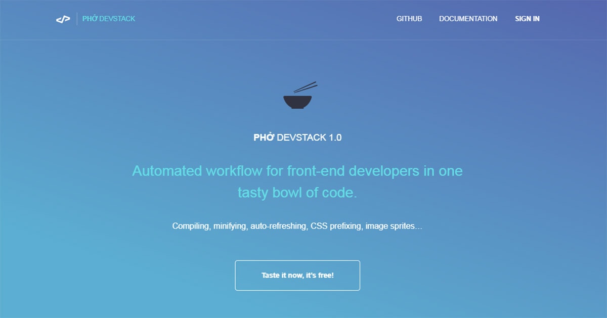
Free Email BuilderFree Email TemplatesThe Devstack site is a great example with a real simple background gradient. It’s designed with pure CSS3 but also uses a static color as a fallback method.
It’s common practice to support an alternate color just in case your visitors run an outdated browser. Although the total browser share market has been consistently increasing so this is quickly becoming less of a concern.
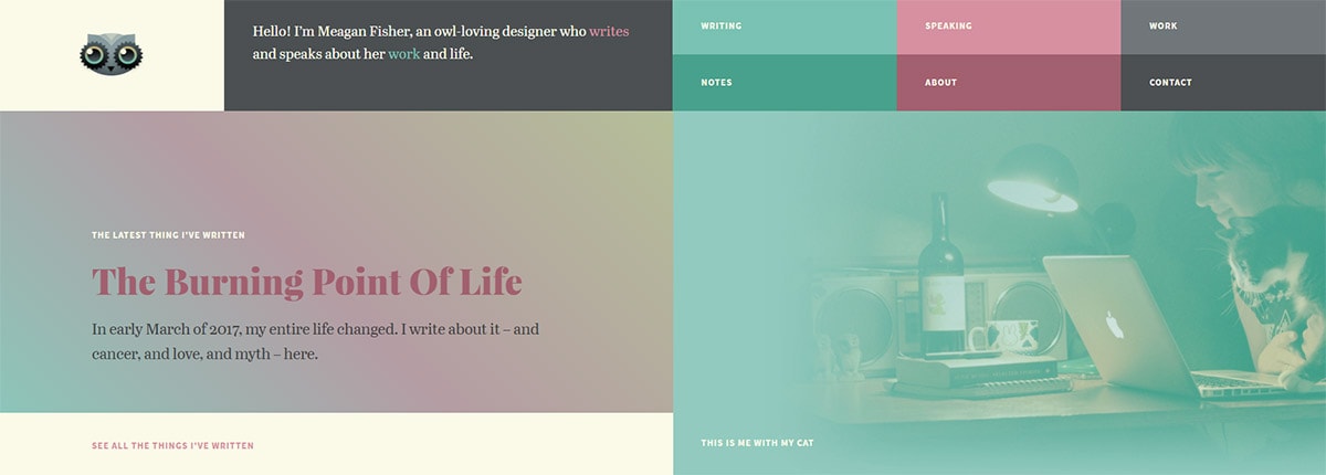
The portfolio site of Meagan Fisher is another fantastic example of gradients in action.
She uses them a little differently by creating multi-color gradients that span individual elements on the page. Some gradients are pre-designed in Photoshop like the photo of her aligned to the right side.
But the more interesting part is the navigation hover effect.
If you mouse over any of the links you’ll see these also have gradient BGs on hover. Definitely a unique approach to this trend and it’s not something I’ve seen on other websites.
Now one other example that really pushes the boundaries is NYC Pride which uses fullscreen gradients across the entire page.
With Pulsetic you’ll be instantly notified the moment your website, API, or server becomes unavailable. Monitor uptime from multiple global locations and respond to incidents before your users are affected.
Create beautiful status pages in minutes to keep customers informed during outages and build trust with transparent communication.
Start Monitoring for Free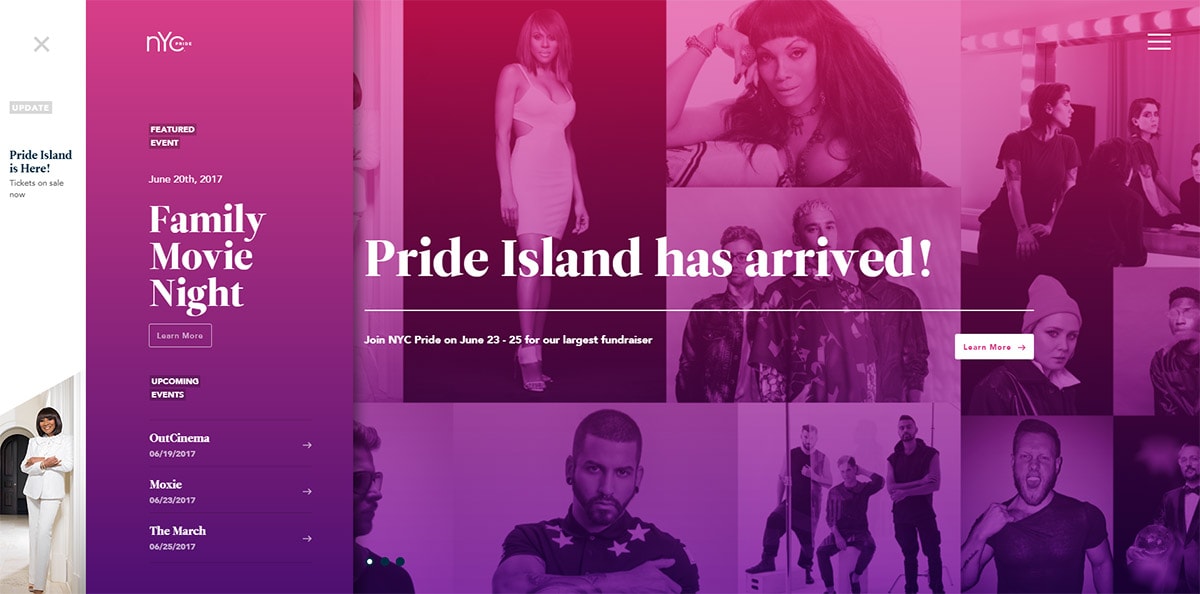
Many other pages on the side have gradient backgrounds fixed solely in the header. These vary by color and by page section but they all follow the same type of gradient design.
Headers are the perfect place to add gradients if you’re looking for some extra color in the layout.
Just make sure you get them to match your site’s branding so the gradient’s don’t feel out of place.
Dynamic Effects
Since the modern web is packed with dynamic effects it’s easier now than ever to create pages that really push the boundaries.
With a site like symodd you’ll notice that gradient effects are generally part of the overall dynamic interface. The site works like a single page lander where you scroll to different sections and find varying gradient styles along the way.
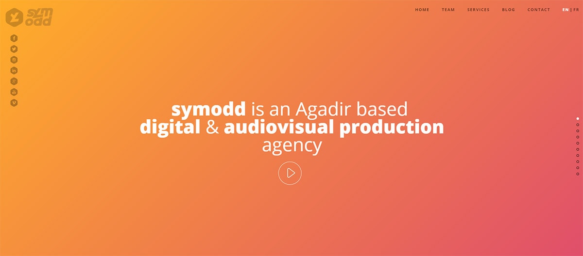
Creative agencies can get away with this stuff because their websites can function more like UI/UX experiments. There’s a lot of value in pushing trends and this site proves that in spades.
But dynamic effects can mean pretty much anything and they don’t have to include gradients that change over time.
The website for One John St is actually the complete opposite. This has one main gradient fixed in the background and it follows you along while scrolling.
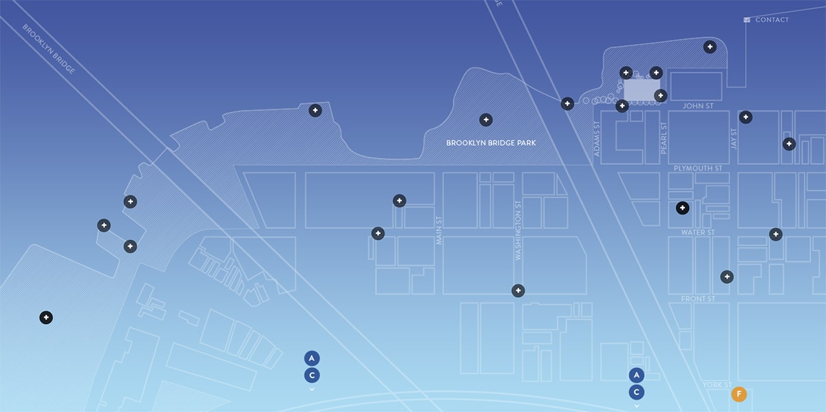
It is another single page layout so it works well considering the interface. But it’s certainly not a trend that everyone will want to use on their own site.
Dynamic gradient effects should grab attention and differentiate yourself from the rest of the web. They should be experimental but still create a usable experience.
The portfolio of Lewis Lopez is a great example.

Every section has its own gradient background and even the photo backgrounds work with gradients over them.
Really unique design but certainly an experimental approach to background gradients on a portfolio. You should try these on your own but remember that design aesthetics should never come before the user experience.
Logos & Text Effects
Here’s one of the newer trends I’ve seen that started popping up in recent years. Designers can now add custom gradients to icons, logos, and even typography on the page.
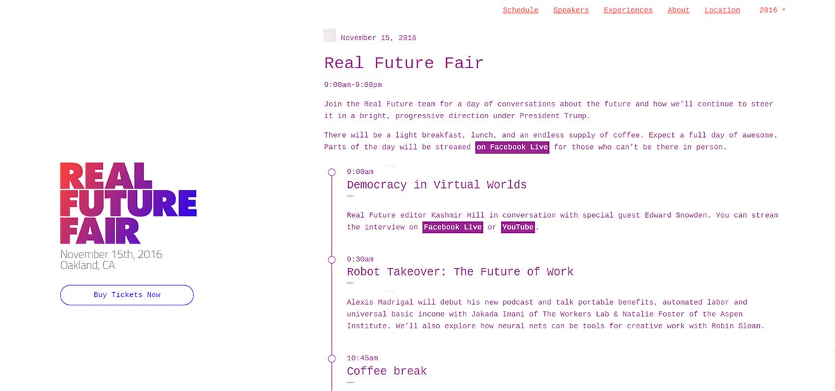
Real Future Fair is perhaps my favorite example because of the consistency. The header uses a fixed color gradient but as you scroll down this gradient shifts over to the logo.
This stays fixed along the way and the designer paid careful attention to the logo’s position as the user scrolls. This way if the logo is mid-way between the header and the main page it’ll only show part of the gradient logo. Pretty cool right?
It’s such a crazy level of detail that it doesn’t seem possible.
But then sites like Pierre Georges’ portfolio pop up and there’s even more proof of this trend.
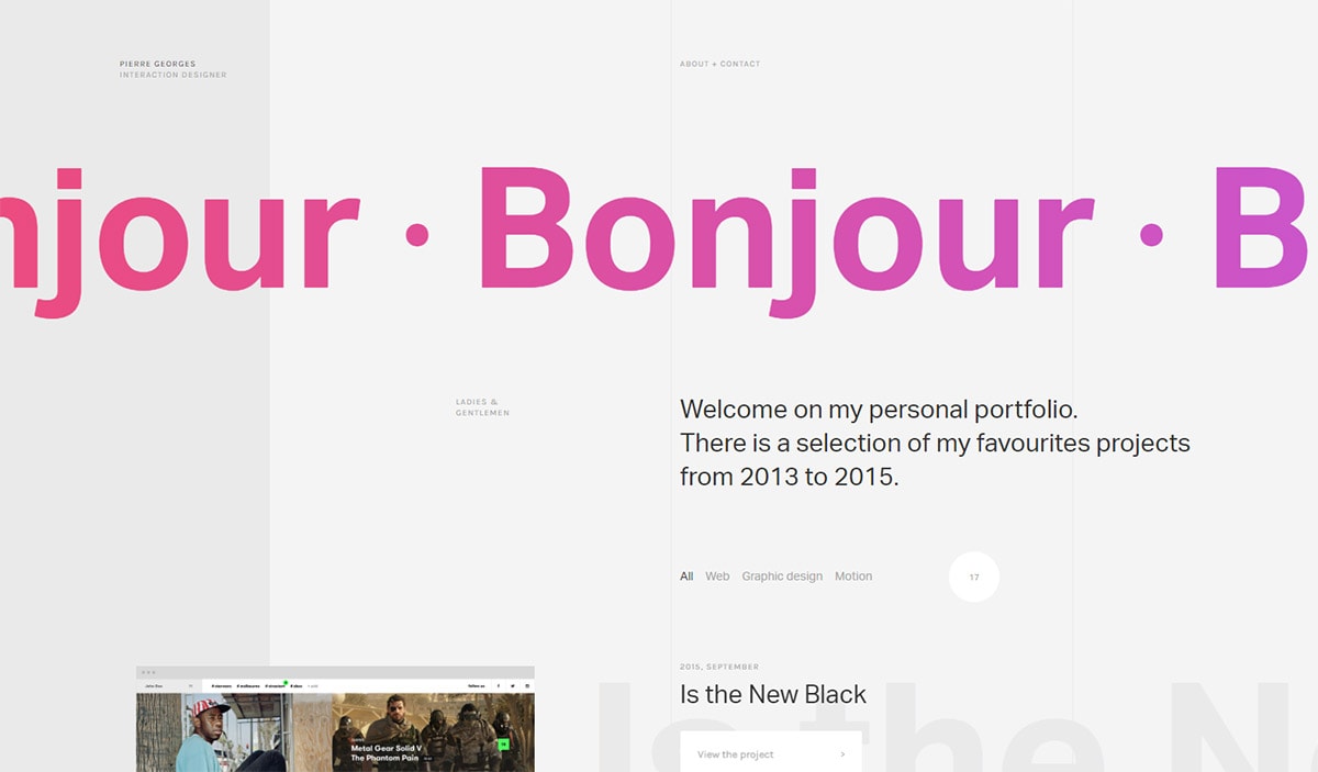
He uses a dynamic sliding text bar but the text itself is slightly altered based on the gradient. This isn’t a perfect design feature it it does stand out from the page.
Pierre’s style is one of many and I think it’s the start of a growing trend.
Over the next few years, I think it’ll be easier than ever to add gradients to text and custom logos. The fact that we already have people doing it shows that designers are willing to push boundaries.
Gradient Design Tools
To wrap this up let’s cover a few of the coolest free gradient tools out there.
Granted there are probably dozens of these so I can’t say this is a complete collection. But these are some of my personal favorites and if you see any you like be sure to bookmark them.
Grabient
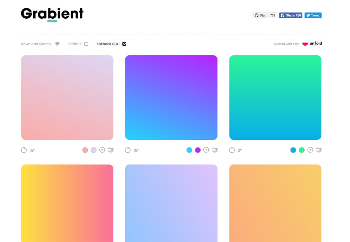
The free Grabient webapp gives you full access to custom gradient backgrounds and their CSS code.
Just hover a block and click “copy” to instantly get the CSS properties you need. You can even edit the gradients right in this site by adding extra colors or changing the ratio/spread of the colors.
You can change the tilts, gradient styles, and even download a free color palette for Sketch if you’re into that program.
coolHue
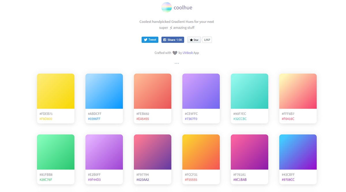
The free coolHue webapp features a huge library of gradients with full access to source code and downloadable palettes.
What’s interesting is this webapp is hosted for free on GitHub and it’s one of the best resources for gradient selection. These mostly follow pastel colors but you can find a huge variety from dark to light and everything in-between.
WebGradients
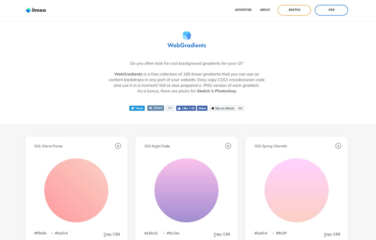
WebGradients definitely deserves a place in this list because it’s one of the best free resources for all types of gradients.
The library contains a massive 180 total gradients that you can pick from and copy into your websites. There’s an easy click-to-copy button for the CSS and there’s a download arrow button if you want to pull the Sketch or Photoshop palette files too.
Plus this site is also freely available on GitHub so you can aim to expand the library or even use this as a base for your own projects.
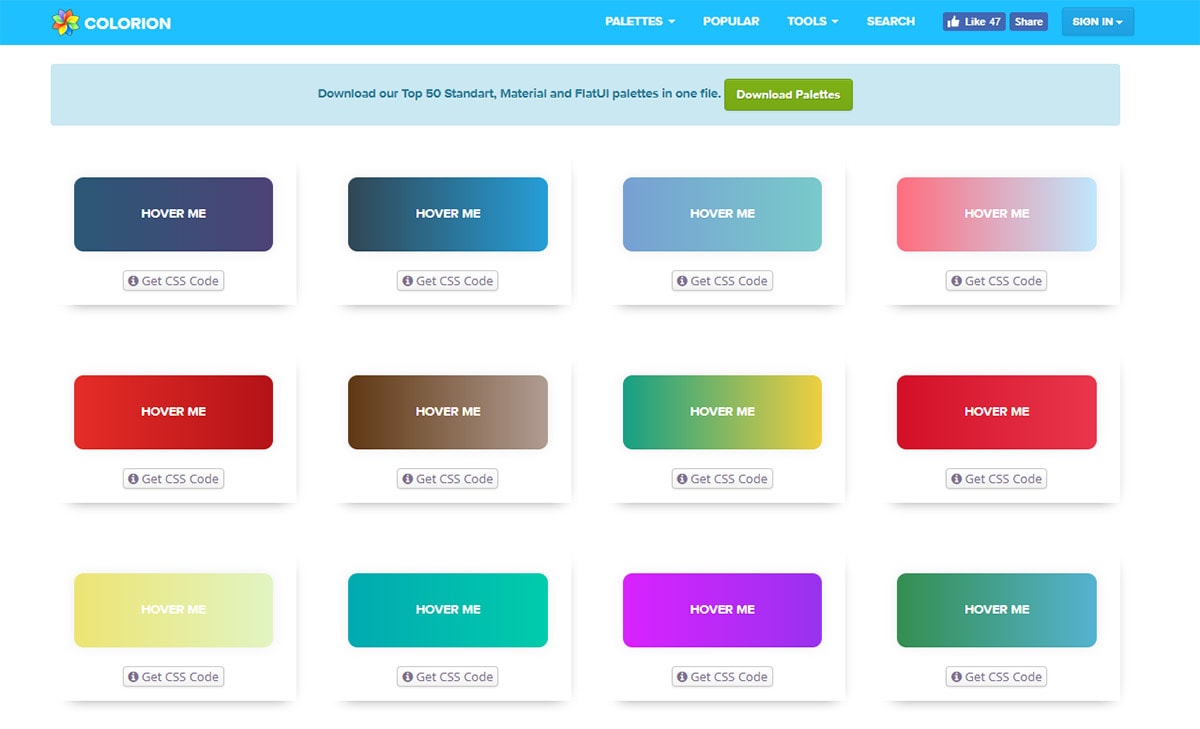
Last but certainly not least is Gradient Buttons. This small webapp doesn’t just focus on gradients, but rather gradient designs applied to buttons via CSS.
Again you can easily copy the code with a single click. Just add these styles to any button class on your page and you’ve got a brand new gradient button ready to go.
The Colorion site also has a bunch of color schemes and related tools if you wanna dig deeper.
But with all the various color tools online this one is just a drop in the bucket.

