Guide to Verification Emails – Best Designs and Examples
Email validation scares entrepreneurs away since it sounds like a thing that needs extraordinary technical skills. That is not entirely true. Even though it is a complex mechanism that includes a series of sophisticated tests and algorithms, it is straightforward within most platforms.
Validating email offers many significant advantages for your brand and marketing. It saves you from penalties and, most importantly, from invalid users in your mailing list. According to recent studies, those who ignore sending verification emails to their newcomers end up with 20% of garbage on the subscription list. This results in high hard and soft bounce rates and a significant spam complaint level that entirely ruins the sender’s reputation.
Create Email Design with Postcards Email Builder [Video]
To make matters worse, you cannot avoid this since people make mistakes all the time: typos happen 2 times in 10, plus almost 20% of users do not leave their real email addresses on purpose. The new email address in your subscription list isn’t necessarily a real subscriber. You need the extra layer of security that email validation provides.
Let us break down email validation and verification emails into essentials so that you can get a good idea of what they are, why do you need them, and how to nail them to avoid the harmful consequences of invalid email addresses in your subscription list.
With Postcards Email Builder you can create and edit email templates online without any coding skills! Includes more than 100 components to help you create custom emails templates faster than ever before.
Free Email BuilderFree Email TemplatesVerification Email Essentials
Before diving into what verification email is, it is vital to know basic email authentication principles.
How Does Email Verification Work?
The original SMTP has no such feature as email validation; therefore, users often become subject to email spoofing, phishing, email spam, and various types of fraud. To stop this madness, email authentication techniques have been developed.
Email verification, or in other words, email validation or email authentication, is a process of verifying an email address through a collection of techniques. Its task is to provide verifiable information about an email message’s origin and define whether an email address is deliverable and valid. After complex tests, it grants an email address with a mark that indicates its safety and validity so that you can decide what to do with it next. There are three types of marks:
- Valid email address: As the nameplate states, this email is safe: it is error-free and exists. Therefore, you can add it to your subscription list, or if it is already inside, you can leave it as it is.
- Risky email address: This one is a bit tricky since there is no exact answer to whether you should delete it from the subscription list right away or still use it at your own risk. All you know is that this email address exists. However, the machine email checker considers it “grey” since there is a high risk of bouncing due to other factors.
- Invalid address: The address may be flagged as invalid due to such reasons as syntax errors, DNS errors, mailbox errors, and some others. However, whatever stands behind this mark, you should avoid such email addresses at any cost. If you find them in your subscription list, delete them immediately since they can do much harm to your sender’s reputation.
The email verification process is multistage. Everything begins with email validation on your website (quite often in subscription form). Using various scripts on both the client and server sides and the magic of regular expressions, the validation mechanism ensures that the email address is formatted correctly: there are no syntax errors which is the number one problem in this area.
After that, the validation mechanism needs to verify your email through email verification services. At a minimum, it will check:
- The email address to ensure it is not a spam trap
- DNS records to make sure that it is correct and registered
- The mailbox to ensure it exists and can receive messages
Email validation takes extra time and particular attention from your side, even when you use professional tools. However, it needs to be done since it is crucial for your business. Whatever niche you are workin ing, whatever budget you have, and whatever mission you pursue, email verification is obligatory since it directly affects the deliverability rate and your email sender karma. Let us consider other reasons for email validation’s importance.
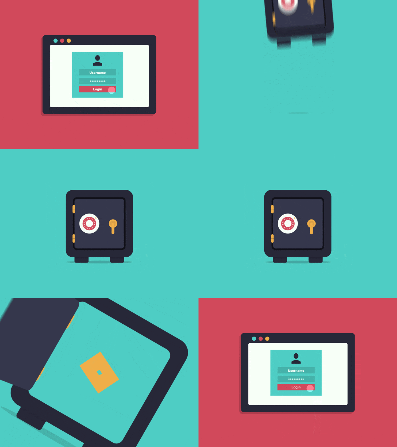
Two-Step Verification Levi Doherty
Why Email Verification Matters
Email validation matters because email addresses become invalid or simply stop working, turning into garbage inside your precious mailing list all of a sudden. According to statistics, more than 20% of email addresses become invalid each year.
With Pulsetic you’ll be instantly notified the moment your website, API, or server becomes unavailable. Monitor uptime from multiple global locations and respond to incidents before your users are affected.
Create beautiful status pages in minutes to keep customers informed during outages and build trust with transparent communication.
Start Monitoring for Free- The person changed the email address or email provider. This is one of the most common scenarios. To make matters worse, the old email may still exist, but the person does not use it, which results in bouncing and low open rates.
- The person changed jobs or positions in the company; therefore, his or her email address has a new format.
- The domain or email provider is temporarily dead. This is the most common technical problem.
- The server is out of reach. Again, this is a common problem.
You can never be sure that the email address is valid. Although it is not your fault in most cases, however, every invalid email address brings some harmful consequences that you need to face efficiently to avoid fiasco in your email marketing campaign. It is crucial to verify emails regularly and use tools that support different verification methods to maintain your subscription list clean and healthy and fight new threats.
Regular email verification improves the deliverability rate and ensures you do not compromise the sender score. The latter is a massive thing in the digital marketing universe. This simple factor helps ISPs determine if you are worthy of the inbox or if you should be flagged as spam.
The higher the score you have, the better chance you have of reaching your audience. A high deliverability rate is directly related to open rates, indirectly related to click-through rates, and directly translates to ROI. To find out more about this crucial factor and how to nail it, check out our Guide to Email Deliverability: Best Practices and Tools to Avoid Spam Folders.
Along with that, there are some more valid reasons why email verification matters:
- It underlies a good foundation for high conversion rates.
- It keeps your subscription list clean and healthy.
- It instills trust in your IP and sender name.
- It ensures better performance.
- It boosts productivity in your marketing efforts.
- It engages with your customers and helps them succeed.
- It reduces the risks of being placed on blacklists.
- It reduces spam complaints.
- It saves money by reducing the budget for maintaining invalid email addresses.
- It makes a good first impression, indirectly paving the way for such crucial digital newsletter campaigns as Welcome Emails and Onboard Emails, laying the first solid brick in their success.
Email validation matters and is increasingly important. It is a multistage process filled with all sorts of checks. However, that is not all. For all those who collect subscribers and intend to run email marketing campaigns regularly relying on their subscription list enormously, there is one extra stage in the email validation process that should be done – sending out a verification email. If you’re managing leads from places like LinkedIn, it’s equally important to clean and validate them once you export the leads from social media to ensure accuracy and improve outreach effectiveness.
Email validation and verification email are often used interchangeably. However, they are not synonyms, though they certainly relate to each other.
As we already know, email validation is a set of techniques that checks email addresses to define whether it is a valid candidate for your email marketing campaign, but what is a verification email?

Current Statistics about Email Spam by Dataport
What is a Verification Email?
A verification email is a kind of transactional email sent to a user after he or she leaves an email address on your website or landing page. Although it is generated automatically, it has a serious mission. Its prime task is to ask new subscribers to confirm their email addresses manually and give their consent to be added to the subscription list once again. There are several spheres of its usage.
It is used in double registration, a process when a user signs up for your platform or an email marketing list but still needs to acknowledge their decision by clicking on a link sent in a special confirmation email.
Some believe that this process may scare away prospects since they do not like to take extra steps. Nevertheless, the advantages of adopting this mechanism (e.g., it ensures you have a clean list of high-quality subscribers who genuinely want to keep up with your brand) outweigh the cons and general concerns.
Besides, double opt-in has become pretty common.
It is used in some middle-stage processes during the user’s lifecycle in your platform. Companies send verification emails when:
- They have a security leak
- They have suspicions about the user’s account
- They have changed the company’s privacy policy or edited some vital information in the Terms and Conditions
- They need confirmation of the profile update
Whatever the situation is, it is crucial to send a verification email to ensure that everything is fine.
Benefits of Verification Emails
The benefits of using verification emails are obvious and often similar to those we have listed for email authentication. However, some other good advantages from a marketing perspective prove to everyone that verification email is worth the investment.
- It builds trust and loyalty.
- It builds brand awareness.
- It creates proper anticipation.
- It sets the right expectations.
- It keeps interest alive by reminding users of what they will get in their subscription or registration.
- It can be used as a cross-sell and upsell if this verification email is sent to newly registered customers who put goods in the shopping cart.
- It can be used as a Re-engagement Email to remind about the product left in the shopping cart.
- It can be used as a nurture email to offer your subscribers a discount or some kind of shopping incentive that may serve as an extra boost to finalize the deal.
- It can be used to gain feedback and insight into customer satisfaction.
- It can provide extra information about your brand to make customers feel like a members of an exclusive club, thereby building loyalty.
- It can be used to generate traffic by offering some valuable material with backlinks.
- It can be a purely informative piece that includes valuable data for users like delivery times and dates, returns information, and support details that increase loyalty to the brand and build brand evangelists.
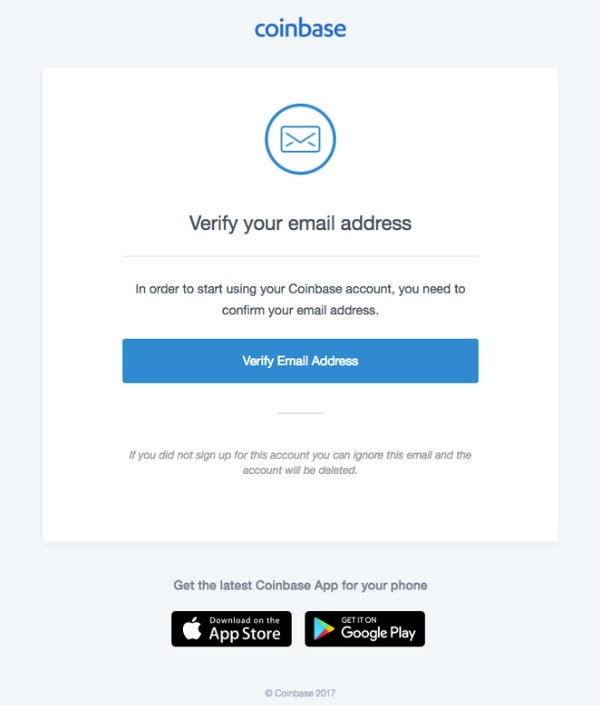
Verification Email from Coinbase
When to Send Verification Email
Let us define several popular scenarios when it is highly recommended to send a verification email.
- The first situation is registration to your platform. Double opt-in is a widespread mechanism; everyone knows about it. It simply cannot be done without a well-done verification email.
- The second situation is signing up to your subscription list. It can be a simple appeal in your footer or a pop-up window that appears right after the user starts to scroll down. Entrepreneurs often ask their new customers to get into a subscription list in exchange for exclusive deals, freebies, or access to private content or a gated part of the platform.
It is here where you need to be persistent with validation. In double registration, users are more willing to confirm their emails since they require access to your platform. When it comes to signing up for a mailing list, visitors can doubt whether they are ready to dedicate more time to your company. However, it does not mean that verification emails will scare them away, even when they are a flight risk. When well done, they compel newcomers to finalize the action. They will also help maintain a clean and healthy subscription list right from the get-go, saving you from future troubles of cleaning it regularly.
- The third situation is when your company is up to some serious changes in the platform, Privacy Policy, or Terms and Conditions. Along with informing users about these changes, you need to get their agreement. Asking to accept new terms is always done through the confirmation of their email addresses. This helps to ensure that everyone is on the same page.
- The fourth situation involves changes by the user. It is highly recommended for SaaS and e-commerce sectors to confirm email addresses when users have edited their profiles or preferences.
- The other situation involves security concerns. It sometimes happens that you may doubt users’ authenticity, or you may spot some data leakage or any sort of suspicious behavior. It is obligatory to ask your existing users to confirm their email addresses. Google and popular ESPs widely adopt this practice. And it is highly recommended for e-commerce and those sectors that deal with payments.
The Best Time to Send Verification Emails
When it comes to the best time to send out a verification email, there is only one answer – act quickly and avoid delays at any cost. Even though it is a standard transactional email, it helps to overcome the main obstacle in the user’s journey. Therefore, usually, people are looking forward to it. The verification email should be generated right after the particular action.
Sometimes one verification email is not enough to get the desired confirmation. In this case, you can send more emails; however, they should be Follow-up Emails that not only remind newcomers about this crucial step but also give a little bit of a boost. For example, you can add a shopping incentive or seduce potential customers with content or exclusive early bird sneak peeks into a new collection.
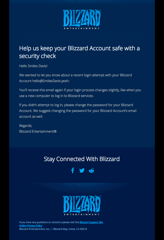
Verification Email Example from Blizzard
Subject Lines for Verification Emails
Much like subject lines for confirmation emails, pitches for verification emails are pretty limited. However, it does not mean they should be boring and tasteless. You can experiment a little bit with them by adopting such tips as:
- Be creative and straight to the point.
- Be personal and use a customer’s name or other information that you may derive from his or her last interaction with your platform.
- Add your company’s name to separate yourself from the competition.
- Use emojis or slang if your audience is ready for that.
Please bear in mind that verification emails, especially those sent during double registration, are highly anticipated by customers. Therefore, the open rate promises to be high. It means that at some point, you may benefit even from the trivial subject lines; however, it still does not hurt to add some spice to it.
The verification email is the first-ever email that your new customers receive from your brand. As we all know, we never have a second chance to make the first impression. Therefore, it should be perfect, and the subject line is no exception.
Consider some good examples from real-life projects that may give you some inspiration:
- Activate your Headspace Plus Membership
- Confirm your email address to start riding for work
- Help us keep your Blizzard Account safe with a security check
- Welcome to Paste | Please verify your email address
And of course, some banal yet still effective subject lines
- Your Netflix profile was changed
- Complete Registration
- Complete your Freelancer registration with one click!
- Welcome to the Neighborhood!
- Please Verify Your Email Address
- Welcome to Webflow – Please Verify Your Account
- Please Confirm your email
- Please verify your email for Typeform
- Verify Your Email on Udacity
- Tedium: Please Confirm Subscription
You may have noticed that there is no one-size-fits-all solution, but there are still similarities. For instance, such words as “confirm” and “verify” are the most popular options. It means that people are accustomed to them. Therefore, users may decide on your verification email quickly if they see these words.
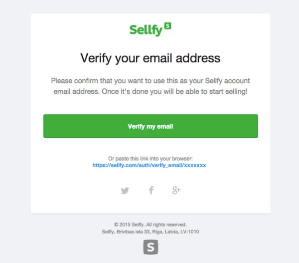
Verification Email Example from Sellfy
How to Create an Effective Verification Email
Let us consider three main pillars of effective verification emails: content, design, and functionality.
Content: What to Include in Verification Email
The rule of thumb of every email that you send to your subscribers is – bring value. It is here where you need to focus on content. As for verification emails, there is one crucial thing that should be present in each and every newsletter: the verification link.
Do not make your users seek: be explicit and straight to the point. If you need to give additional instructions – add them. However, the verification link should occupy its place and be evident from the first seconds.
If you want to extend the verification email, you are more than welcome. There are some more time-proven elements that you may add to produce a better impact on newcomers. For instance, you can add such things as:
- Welcome message. It should be concise, straight to the point, and most importantly, personal. Add subscriber’s name if you can, or any other personal information (even information about products added to the shopping cart) may appeal to the user and tug their heartstrings right from the get-go.
- Short intro. Tell your users what it is all about, what you expect them to do, and what they get at the end. Be explicit.
- Thank you message. Showing your gratitude is increasingly important. While some marketers prefer to send a Thank You Email or Customer Appreciation Email afterward, it does not hurt to add a small thank you note in the verification email as well.
- Add personal signature. It can be a simple phrase like “The Google Team” or the whole block from the CEO. This element will add the company’s personality to the newsletter and make it more attractive and impactful to the audience.
- Address users who get verification emails by mistake, asking them to just delete this newsletter instead of flagging you as spam.
- Footer information. Even the minor transactional email should have such information as the company’s contacts and physical address, links to the Privacy Policy, direct email address, and link to contact the support team.
Along with these essentials, you can also add some more information. Everything depends on the situation when this email is sent and the mission that you pursue. Let us consider some popular solutions,
- Suppose you send verification emails to those who want to register to your platform without any purpose. In that case, you may treat them with some saucy data snippets from the most popular blog posts, thereby generating extra traffic to some inner pages.
- If you want to make sure your new customer finalizes the deal and buys everything he or she has put into the shopping cart, you may send a verification email with some shopping incentive.
- If you want to attract more customers, you can promote the referral program and give a bonus on the next purchase, thereby increasing loyalty and planting a seed for the next visit.
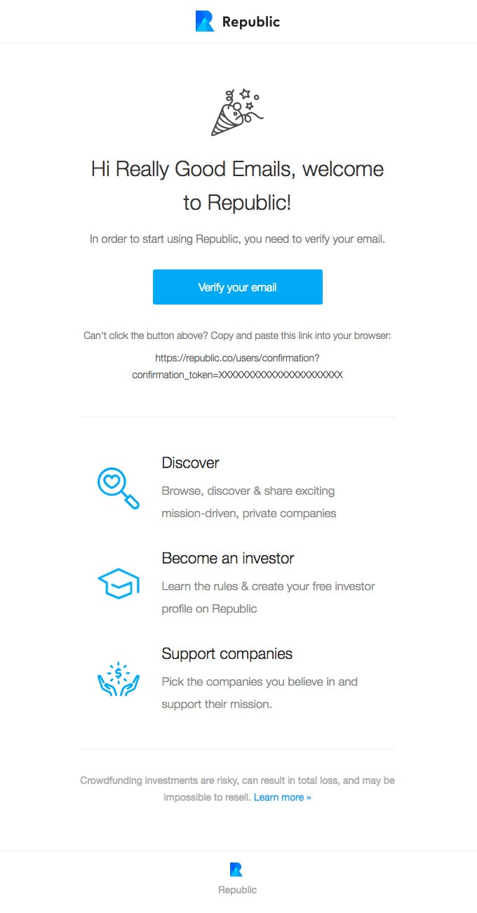
Verification Email Example from Republic
Design
In the era of custom HTML email newsletters and professional tools like Postcards that allow you to shape any idea within seconds, verification emails are no longer dull plain-text messages. Like any other promotional or informational blasts, they should bear the company’s charisma and personality, serving as an integral element of the overall email marketing strategy.
When it comes to design, you can be a little bit creative, even though generally you do not have much content to play with.
For instance, it will not hurt to add some meaningful or impressive images to make the statement. More so, they are the first thing that people notice and understand. When played right, this helps to make the verification process pleasant and smooth.
Check out the general advice that helps to create an effective verification email design:
- Use elements of brand identity in the header and/or in the footer. Always add a logotype to separate yourself from the competition immediately.
- Add image background to hero area. It can be a spectacular photo or a beautiful illustration that depicts the verification process or instills some extra meaning into the newsletter.
- Turn the verification link into a button. Make it bold and prominent so that it catches an eye from the first seconds. Also, use some motivational words to compel users to act promptly.
- Use formatting. Proper information hierarchy unobtrusively leads users from top to bottom through all the focal points. Also, with basic formatting like headings, paragraphs, and typical styles for links, you can be sure that even those who prefer to scan rather than read get all the crucial information.
- Add icons for social media links.
- Use animated gifs to set the proper atmosphere or simply lighten up the mood and break the ice.
- Structure information in the footer.
- Add primary navigation to the header and footer so that users have some extra getaways at their fingertips.
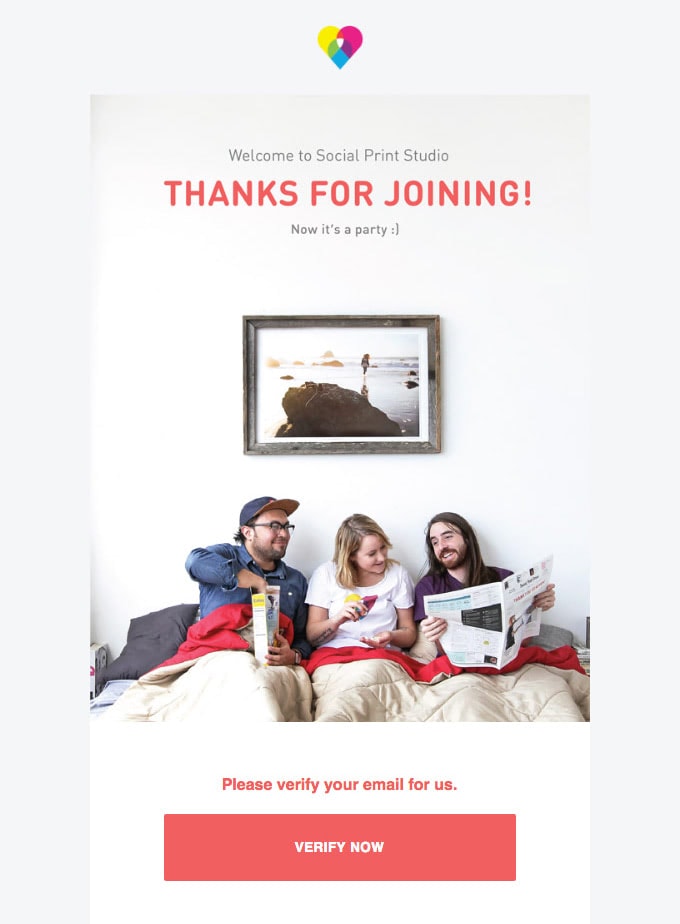
Verification Email Example from Social Print Studio
Functionality
We have already mentioned situations when verification email can be used as a tool to generate traffic and amplify sales by adding cross-sell or upsell blocks. However, this should not be your top priority. First and foremost, a verification email should carry out its prime function – provide users with a verification link and information that explains what they need to do and why they need to do this.
It is increasingly important to check and double-check the efficiency and validity of the verification link. On top of that, you need to have a plan “B” if the link suddenly stops working which may happen due to various technical reasons that you cannot control.
Add another link that can be copied and pasted into the browser to provide your customers with an alternative way to finish registration without losing their time and nerve. On top of that, it is imperative to do A/B tests to define what is the best way to onboard users and make verification of email addresses a pleasant and smooth process.
Ensure verification emails work and look consistent across all email readers, browsers, and devices. To put it simply, the newsletter should be responsive and mobile-friendly. Check out our Guide to Responsive Email Design: Tips & Considerations to familiarize yourself with the best practices.
If you find it difficult to create a layout that works great on every device, you can use Postcards where all the units are responsive, mobile-friendly, and accessible.
A verification email should be accessible. The share of people who use assistive technologies to read digital newsletters is growing exponentially. Making your email design accessible helps bridge the gap between your company and all groups of people and turns them into brand evangelists.
Check out our helpful guide to Email Design Accessibility: Why It Is Important to Improve It, which gives you some good insights into meeting the current requirements.
Finally, it is crucial to secure a high deliverability rate. This tip seems a bit looped since we have already stated that verification email improves deliverability. You can ensure the high deliverability of your newsletters through best practices.
- Choose a reliable ESP and server provider that guarantees your transactional email will be automatically generated and sent on time.
- Improve sender reputation and IP reputation through third-party services.
- Create a strong subject line so that the email reader does not flag you as spam.
- Add a digital signature and secure the connection between your and the newcomer’s email addresses.
Check out our guide to Email Sender Reputation – What You Need to Know to get some valuable advice.
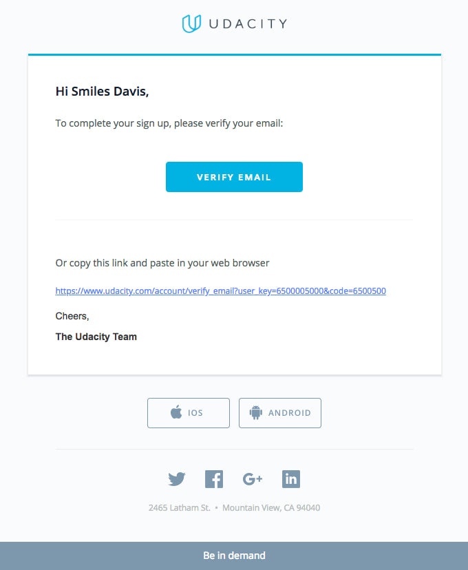
Verification Email from Udacity
Collection of Effective Verification Email Examples
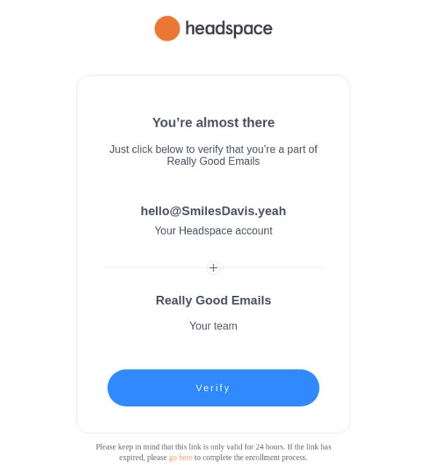
Verification Email Example from Headspace
We start our collection of verification email examples with a design that perhaps is one of the most popular among the brands. It is also the cleanest, simplest, and surprisingly effective solution out there. The deal is it skillfully adopts all the best practices for verification emails and email designs without cracking nerve, time, and budget. So, what are its key traits?
- It gets straight to the point and does not distract the user’s attention from the prime mission.
- It embraces minimalism but still does not look boring and insipid.
- It has well-formatted content so that users quickly understand what they need to do, even those who scan rather than read.
- It features a prominent call-to-action button that, thanks to its blue color, produces a pleasant, businesslike impression.
- It is responsive, mobile-friendly, and accessible.
So, it is the whole package yet with minimal design and eye-pleasing aesthetics. Just what the doctor ordered.
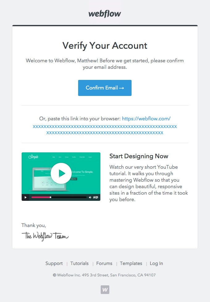
Verification Email Example from Webflow
Webflow gives us one of those verification email examples that took the previous approach to the next level. Along with the prime mission – get the users to confirm their email address – the team also tries to generate extra traffic to the platform and ignite newcomers’ interest. So, what are the key takeaways?
- The email design nicely balances text and visuals. Thanks to proper information hierarchy, users move from top to bottom, naturally noticing all the crucial details.
- The team follows the best practices: the confirmation link is turned into a prominent hard-to-miss button; there is an alternative way to verify email through the extra link; everything is well-formatted.
- The newsletter is personalized.
- There is a nice welcome message that strengthens the brand’s first impression and speaks directly to the audience.
- The newsletter also has the personal signature of the CEO.
- Finally, you can find a video that helps newcomers get on board and drive extra traffic to the landing page.
The email is compact, yet it is not minimal. Even though it does not have fancy design features, nevertheless it looks elegant and polished; and most importantly, it is informative and valuable.
Verification Email Example from Discord
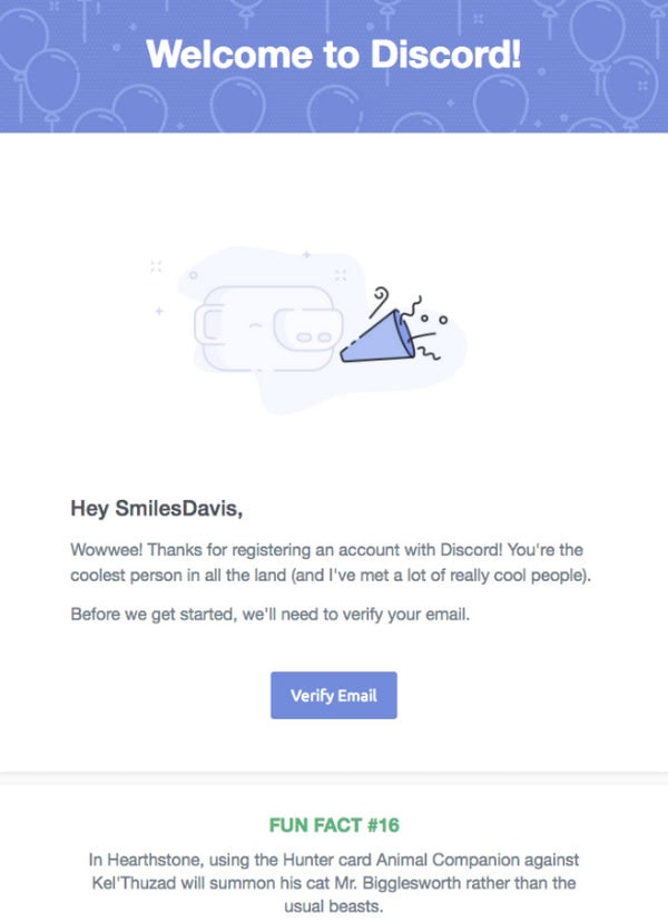
Again, it is one of those verification email examples that has given the traditional approach some twist to impact new users significantly. The newsletter is up to establishing a positive atmosphere, generating positive emotions, and laying the first brick in healthy and friendly relationships between the company and its clientele. Let us consider the design closely.
The team behind Discord goes for an illustration to make the hero area more meaningful. Even though it is small, it certainly appeals to the users because everyone loves whimsical illustrations with their warm personal touch. It helps to break the ice in the conversation.
The rest of the layout is split into two functional parts. The first one is all about the prime goal of the verification email. You can see a message that explains what users should do and a big and bold button (aka masked verification link) that they need to click.
The second part includes the “Fun Fact” to ignite interest and establish proper expectations.
Verification Email Example from HiyaCar
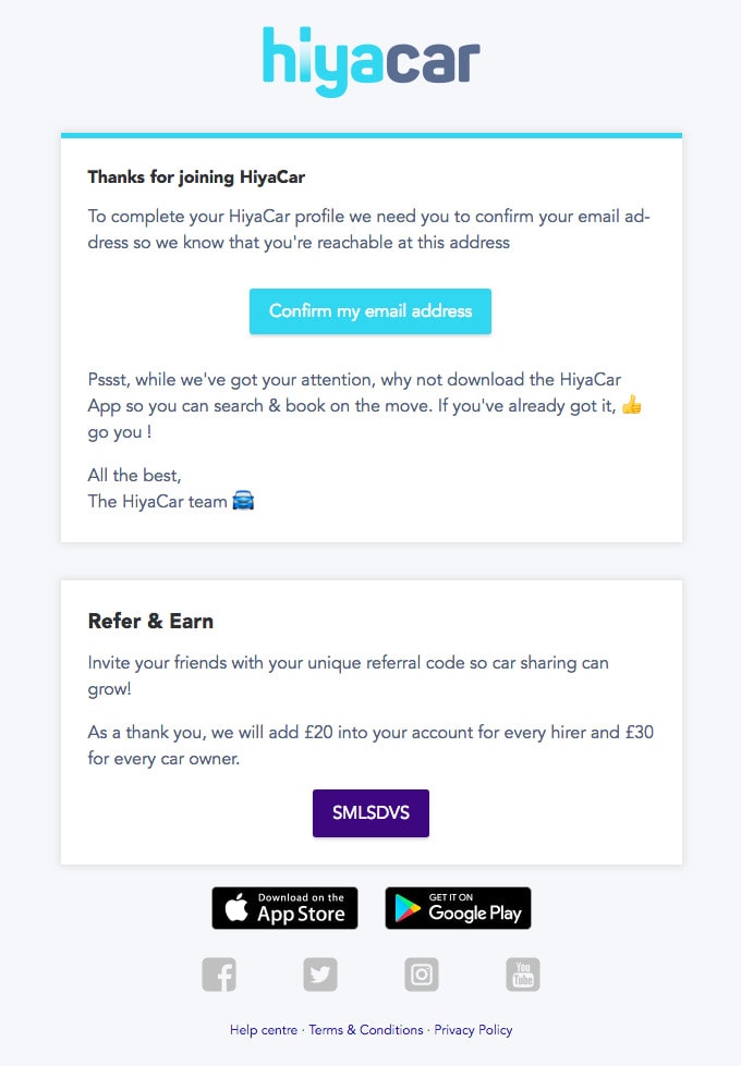
This adorable email design from our collection of verification email examples successfully capitalizes on the Cards – approach that many web and mobile designers love for its ability to create order out of chaos. Here, it provides an easily digestible bite-size format where users get all the necessary information without much hassle. So, you can be sure your message is delivered.
Cards are not the only smart move in this email design. Along with excellent readability and a smooth user experience, the team has invested in the language. Note the message. It is so friendly and personal that it certainly wins over newcomers. Also, the call-to-action button features action words that compel anyone to act quickly.
The great thing about this verification email is that it easily does with basic stylistic options and ends up with a pleasant and even impressive design with adorable aesthetics that is hard to resist.
At the bottom of the newsletter, you can see a block with a referral program and a special bonus that is an extra nudge to finish registration. Clever.
Verification Email Example from Lyft
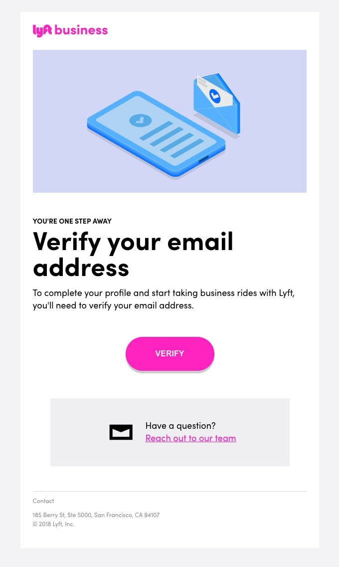
The verification email example from Lyft wins over clients with well-implemented time-proven methods. For instance, the email design is compact, neat, and eye-pleasing. There is a lovely illustration in the header that supports the prime goal of the email visually and at the same time advocates the brand by adding to the design a businesslike appeal.
The phrase “Verify Your Email” – is a star of the show. It is the first thing that people notice. So, no double meaning whatsoever.
The call-to-action button is aligned with the brand identity, and at the same time, it catches an eye with its prominent look.
Finally, right at the bottom of the layout, you can see a block with a direct link to the support team with whom you can address all your issues. Smart.
Verification Email Example from Krrb
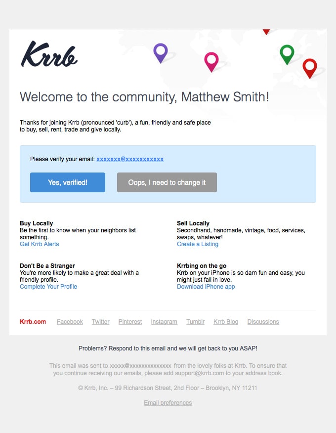
This verification email example feels a bit cramped and heavy. This is because it is rich in information, and the team does not use cards to break information into digestible pieces. They strongly rely on a traditional layout that, to be honest, complicates perceiving information.
That does not mean it does not work. While it causes problems for those who scan the newsletter, it still fulfills its prime mission. It provides quick access to verification links made as a call-to-action button that occupies the leading position.
Besides, the email is personalized and has a lovely welcome message and a thank you note so that the conversation with newcomers is conducted in a pretty friendly way. This tone, language, and copy inspire loyalty and secure good relationships.
Finally, there is a block with some helpful information that intends to bring actual value by providing solutions to some common issues right away.
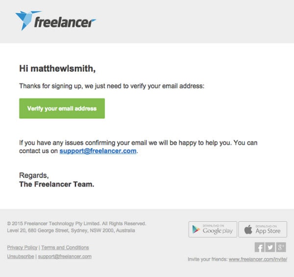
Verification Email Example from Freelancer
It is an excellent example of a verification email whose techniques and ways can be easily extrapolated into any project out there. Although it does not have entertainment or wow factor, and the design is pretty banal, still, it still reaches its goal by compelling users to verify their email addresses and leaving everyone happy.
The key takeaways are:
- Stick to a minimal approach and prioritize content.
- Use formatting. It helps establish natural focal points and draw attention to such things as the user’s name, which instantly appeals to the newcomer.
- Turn the confirmation link into a prominent button set in one of the brand’s official colors.
- Add an email address of the support team.
- Finish the newsletter with a personal signature.
Also, note the header and footer. The first one includes a brand identity to make the company stand out from the crowd.
As for the footer, it has it all: there are social media icons, contact information, button-like links that are tappable, and of course, links to Privacy Policy and the option to unsubscribe.
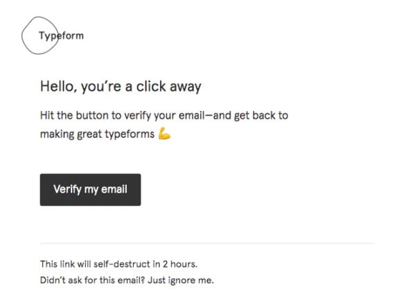
Verification Email Example from Typeform
What makes this verification email example worth your attention is that the team has skillfully embraced the minimal approach and come up with an exquisite and refined design that provides just enough information as a standard confirmation message. If you are up to just one mission, it is a perfect solution for you.
The newsletter has a character that instantly appeals to newcomers. Details make the real difference here. Let us consider them closely:
- It is friendly and welcoming.
- Brand identity. The email design features a logotype and the company’s official colors to set up the proper atmosphere.
- Call-to-action button. The verification link is bold. It talks business right away, thanks to action words and clever styling.
- Extra information. It includes some additional information for those who received this email by accident.
- The email features just one pictogram, but it perfectly blends in so that it looks increasingly natural and gives charm to the overall experience.
A step-by-step guide to Verification Emails
Verification emails are an essential part of the user registration process for websites and apps. They ensure that the email address provided by the user is valid and belongs to the user. Here’s a step-by-step guide on how to set up and send verification emails.
- Plan your verification email workflow: a. Decide when to send the verification email (e.g., immediately after user registration, before accessing certain features, etc.). b. Determine the expiration time for the verification link (e.g., 24 hours). c. Set up a system to track the status of email verification (e.g., verified, unverified, pending, expired).
- Choose an email service provider: a. Research and select an email service provider (ESP) that suits your needs (e.g., SendGrid, Mailchimp, Amazon SES). b. Sign up for an account with the ESP and set up your domain for sending emails. c. Get your API key or SMTP credentials from the ESP to integrate it with your application.
- Design your verification email template: a. Create an email template with a clear subject line, such as “Please verify your email address.” b. Include a concise message in the email body explaining the purpose of the email and how to complete the verification process. c. Design the email with a clear call-to-action button or link for the user to click and verify their email address. d. Include the expiration time for the verification link in the email.
- Generate a unique verification link: a. When a user registers, create a unique token for each user that will be used for email verification. b. Save the token in your database along with the user’s email address and the expiration time. c. Create a verification link by combining the token with your verification endpoint URL.
- Send the verification email: a. Integrate your application with the ESP using their API or SMTP credentials. b. When a user registers, send the verification email to the user’s email address with the unique verification link.
- Verify the user’s email address: a. When the user clicks on the verification link, your application should verify the token and check if it’s still valid (not expired). b. If the token is valid, update the user’s email verification status in your database and show a success message to the user. c. If the token is invalid or expired, display an error message and prompt the user to request a new verification email.
- Handle unverified users: a. Regularly check your database for unverified email addresses and send reminder emails to users who haven’t verified their email addresses. b. Implement restrictions for unverified users, such as limited access to certain features or temporary account suspension.
- Monitor and optimize your verification email process: a. Track the performance of your verification emails, such as open rates, click-through rates, and verification completion rates. b. Make improvements to your email template, subject line, and sending frequency to increase the effectiveness of your verification emails. c. Stay up-to-date with email deliverability best practices to ensure your verification emails land in the user’s inbox.
Conclusion
Only five years ago, people were hostile to verification emails. Today, when the web is teeming with spammers, all sorts of frauds and privacy leakage scandals happen all the time, more and more people start to believe that the lack of validation on the platform is very alarming. If the platform deals with payments, this alarm increases exponentially, making people believe that this website is not worth their trust.
Indeed, people have changed their attitudes toward email validation. A verification email is warmly welcome today and sees one of the highest open rates. So, do not neglect it. More so, it offers many bonuses for your company.
Even though initially verification emails were designed with just one mission in mind (that is, ask users to verify their email addresses), modern email marketing proves to everyone that this newsletter can be used for achieving different goals, even those that help to convert users into leads, generate extra traffic and increase profit. Indeed, it comes in handy in numerous scenarios, not only in double registration. Therefore, it should be an integral element of the customer’s journey.
The important thing to remember about verification email in order to make the most out of it is that even though it is a confirmation email generated automatically and triggered by a specific user’s action still, it should not be boring or primitive.
At a minimum, it should be personal and brand-related. It should provide a great user and visual experience producing a strong first impression. Whatever overall marketing strategy you employ, it should be aligned with it. Also, it should speak on behalf of your brand, and most importantly, it should be tailored to your target market’s needs.
Therefore, follow the best practices featured in our guide; always remember to make verification email (whatever small and compact it can be) responsive, mobile-friendly, and accessible. Finally, when in doubt whether it works fine or not for your audience, perform A/B tests.

