Infographics and Statistics in Website Design
A quality website is based on three fundamental postulates: design, development and content. The latter has a greater impact on users rather than the first two since its changeable nature, at first place, attracts and wins users over. But what if the content – is statistics, which, to be completely honest, is not every user cup of tea. Numbers, numbers and again, plain numbers – not everyone will be able to study such type of data. Majority of visitors more often look for easily and quickly digestible information. So, in this case, you should refer to a rescue method of graphic visual knowledge representation that can transform any boring data into a piece of cake.
In website design, infographics are used either to tell an edificatory story that is embellished by awesome illustrations or to show up a summary of work in figures. Also, they can be easily divided into 2 types: interactive and static. First one usually has a lot of dynamical elements with pop-up blocks and even with adjusted data that is based on current conditions, whereas the second one is just an ordinary image with one-time collected data, but with vibrant heavy illustrations. As a rule, interactive infographics are less vibrant and illustrated since they mostly bet on data and technical side rather than design, but this does not diminish their dignity and attractiveness.
Similar to infographics are tiny blocks with statistical data which can be often found on agency websites or creative portfolios; widgets with social media and email subscription counters can be also attributed to the statistic. It is a good way to shed light on done work and introduce potential clients to your possibilities. Moreover, being well-thought, visually appealing and unobtrusive they will definitely engender confidence.
Take a look at our collection of websites that have built-in infographics and statistical data blocks.
Examples of Infographics and Statistics in Web Design
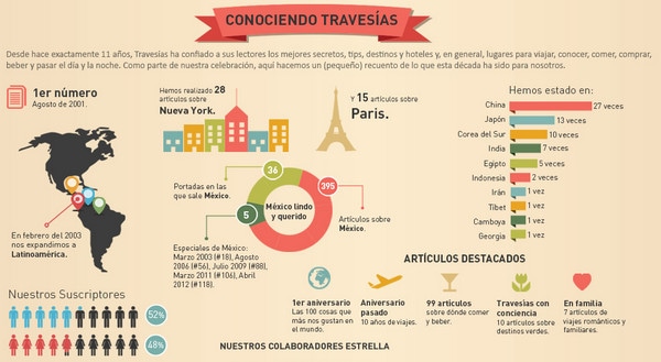
Travesias has a clean and clear look with vibrant vector graphics and muted color palette.
With Postcards Email Builder you can create and edit email templates online without any coding skills! Includes more than 100 components to help you create custom emails templates faster than ever before.
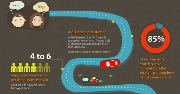
Free Email BuilderFree Email TemplatesRate Us shows statistical data in a playful and enthralling way, revealing all aspects of it as a car moves down the road.
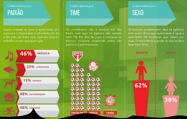
Creative House provides its users with information about agency staff through 3 main categories: preferences, time and gender.
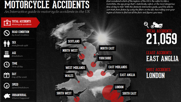
UK Motorcycle Accident Hotspots carries out cautionary and informative mission by graphically familiarizing visitors with motorcycle accident statistics.
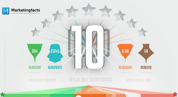
Marketing Facts represents 10 marketing facts that include information about 10 previous years.
With Pulsetic you’ll be instantly notified the moment your website, API, or server becomes unavailable. Monitor uptime from multiple global locations and respond to incidents before your users are affected.
Create beautiful status pages in minutes to keep customers informed during outages and build trust with transparent communication.
Start Monitoring for FreeMailChimp Annual Report makes a brief statistics of 5 major points of their work such as an application itself, support team, operations, social aspects and geography.

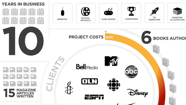
Airgid succinctly and schematically acquaints customers with achievements of decennial work activity.
Every Last Drop reports about water issues by virtue of sterling illustrated story that is supplemented by interesting facts with figures.

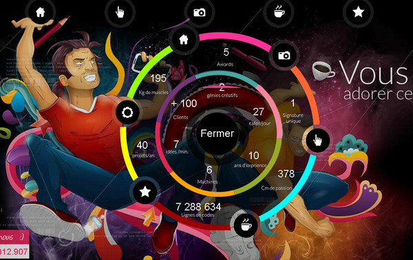
Dibiasotto welcomes visitors with homepage that contains not only spectacular bright illustration but also offbeat circular navigation panel that reveals agency statistics.
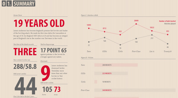
James Anderson is a good example of using color differentiation to focus users’ attention on main aspects of summary; graph and bar chart recreate a sense of neatness and frankness.
Urbangap uses a blend of regular flat elements made in grey shades and soft coloring that dilutes by colorful images in order to create a neat and fresh look.
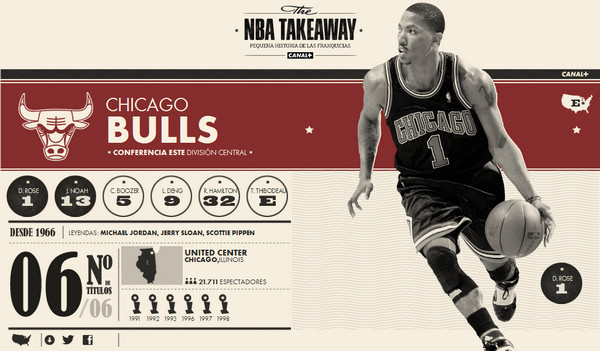
NBA Takeaway does a good job of crafting an elegant typo-based infographic that has a newspaper feeling.
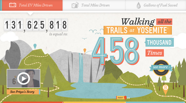
Chevy Volt beautifully combines heavy-illustrated background with statistical data.
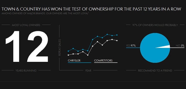
Chrysler: Test of ownership accurately represents data dividing it into 3 clean sections. Flat monochrome graphical elements help to stand information out from a background.
Uniform 15 vividly tells about fifteen-year story using only a bunch of illustrations that are once in a while supplemented with digital data.

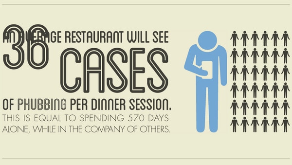
Stop phubbing informs visitors about phubbing problem showing full scope of the issue by means of impressive comparisons.
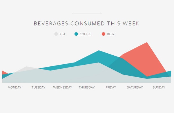
Built by Buffalo has a tiny chart on about page that reveals the secrets of beverages habits among personnel.
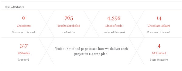
Made by Shape noiselessly and neatly imparts weekly studio statistics to customers using only color and font size distinction.
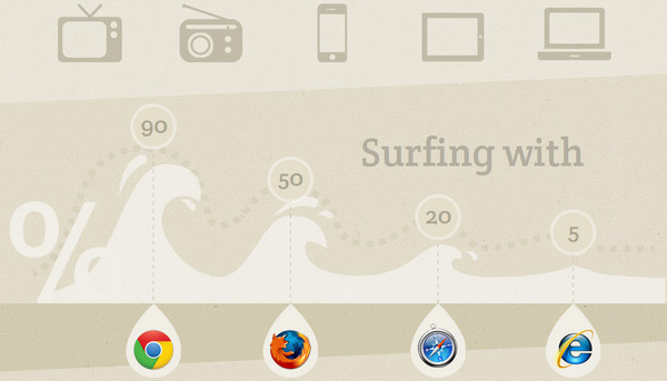
Mobile Statistics. The whole website is dedicated to mobile statistics providing information in a quickly-to-understand and convenient manner.
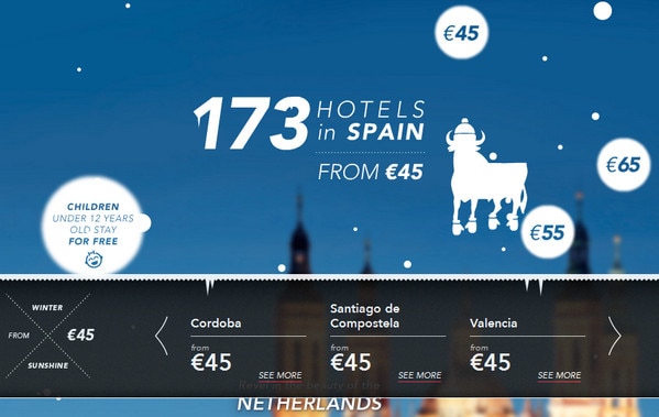
NH Hotels reports travel enthusiasts about prices and availability of hotels during winter holidays; each country gets its own photo background and graphic elements.
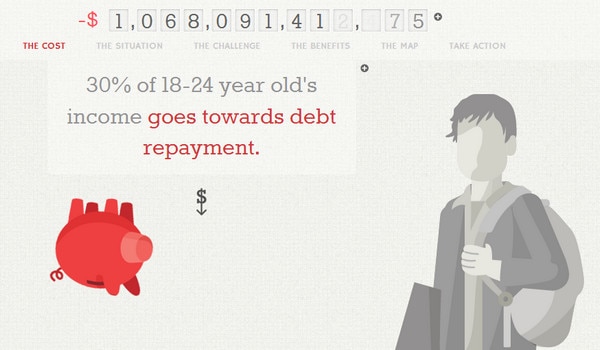
CEE uses parallax effect to inform about the status of debt repayment showing piggy bank as a mascot and an integral participant of storytelling.
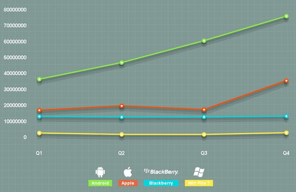
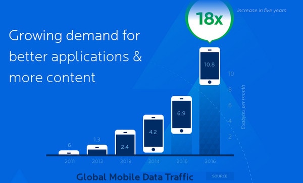
Vasona Networks utilizes different charts and graphs to clearly state anticipated growth of a service.
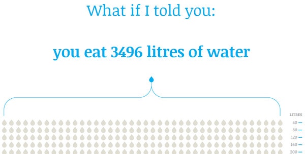
Virtual Water addresses water problems; gradually painting over clean empty drop shapes in a blue color thus adding a bit of drama.
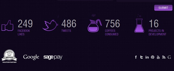
Bond Media is one of common examples of showing site statistics that usually include social media counters and number of different types of published content.
Visual representation of data in website design is not only a tool of showing off – it’s also a great way of winning customers over. You don’t have to impress your viewers by staggering numbers; regular summary of your activity presented in an uncommon, clean and neat way is able to make your relationship with users transparent, open and trustful.
Do you think statistical data in website design takes its place? Does such openness get you on the right side of an owner? Do you think websites with infographics can cause growth of problem awareness on which they throw light? Do you know any other good examples of website designs with infographics or statistics data widgets? Share with us your opinion via comment form.


