A Quick Guide to Serif Fonts
Even if you’re an experienced designer, it’s never a bad time to refresh your memory a little with the structure of serif typefaces, a few recommendations and a little history. Yes, there’s history. It’s painless I promise.
Humanist and Old Style
In the Middle Ages, nearly all moveable type, books and portable documents, was written in blackletter. Although there are modern blackletter typefaces that are stylish and very usable, old blackletter is almost unreadable to the modern eye. Humanist type, then, began to appear in the fifteenth century, moving in sequence with the renaissance era of literature and art, which explains why some websites call them ‘venetian’ typefaces.
Humanist serifs are the most faithful to calligraphic type, as their curves are uneven and shaky, and many of their counter-carrying letters like ‘o’ and ‘e’ tend to angle to the left. There’s isn’t too much contrast between strokes, and letters are very dense in terms of their black color in relation to the pages at the time (try squinting at your screen and you’ll see what I’m talking about). A quirk that I would say is a signature feature of humanist typefaces is the lowercase ‘e’ with a slanted crossbar.
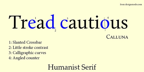
Humanist and Old Style types are often written in the same category, as Old Style fonts appeared not long after. The crucial difference you should probably know is that Old Style typefaces are straighter. So letters like the lowercase ‘o’ aren’t very slanted, and the lowercase ‘e’ now has a normal, straight crossbar. A lot of us tend to use both terms interchangeably with a lot of fonts, but we’re often talking about Old Style types, not Humanist ones. Some recommendations:
Text/Display – Calluna
Calluna, designed by Jos Buivenga and released in 2009, is beautiful. It looks sharp in small sizes with distinctive ascender and descender serifs, while its more calligraphic elements come to life at larger sizes. I definitely recommend it for display, as well as for text, but would warn that you try and keep the size at least 14pts.
With Postcards Email Builder you can create and edit email templates online without any coding skills! Includes more than 100 components to help you create custom emails templates faster than ever before.
Free Email BuilderFree Email TemplatesTransitional
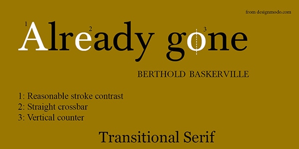
As we move further up the chain of time to Modern Serif, you’ll notice we move further from the nature of calligraphy. Transitionals are the Georgias and the Baskervilles, the Times New Romans of your PC. They emerged during the age of enlightenment, a movement of intellectuals who aimed to forward reasoning though the scientific method. Letters are straighter, curves are more consistent, and there’s more contrast between the thick and thin strokes. The letter angle (or stressful time) on letters with counters like o, b, and e, are now fully vertical.
Text – Georgia
Georgia is an old one, but I feel it’s notable because of its size. It feels incredibly large compared to most transitionals at the same point size, and it has fantastic readability in large paragraphs. That probably explains its use in the New York Times and the Chronicle, where it elegantly explodes at a mere 15pts.
Slab Serif
Until the 19th Century, typography was mainly designed for large blocks of text in books and documents and the like, but the industrial revolution in saw a boom in advertising of many kinds. And so came the slab serif, a typeface style with large, thick serifs at the end of strokes, to grab attention in all kinds of prints, billboards, and posters across Great Britian. Napoleon returned from his voyage from Egypt in 1809, among the western world’s growing fascination with Egypt, which may explain why “Egyptian” acts as a subname.
Among the early slab serif group lays Clarendon, the first registered typeface that was released in 1842 by Robert Besley in London. Another important design is the Fat Face, a typeface design that took Modern Serifs, and stretched and inflated them until they looked, well, fat. Advertisements in the 19th Century show a mix of slab and fat face.
Display – Sanchez
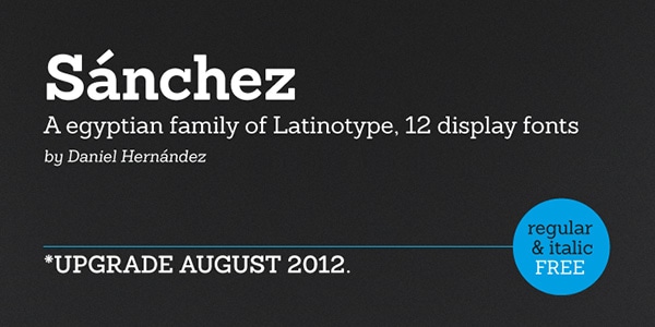
Look, Sanchez is one of my favourite slab serifs. It’s fantastic. I’ve used it in several prints that I’ve made. It’s a good example of where the modern slab is these days: more elegancy and little to no stroke difference; frankly it doesn’t really need it. Its serifs are creative, and there’s a fun style to its curves. It’s one of the few typefaces where I can see use for every one of its weights: the light looks great on subtitles, while there’s a controlled power to the semi-bold that I’m enamored with. Sanchez is absolutely one of Latinotype’s best works. If you want something that’s a little more readable in smaller sizes, the foundry recently released Sanchez Condensed.
Text – Museo Slab
Given the history of the slab, it’s shouldn’t be a surprise that it’s a little difficult to find slab serifs built for large paragraph in small sizes. A good thing to do, or at least what I did, is to go to a site like myfonts.com, check the section you want, and decrease the width to 12 points, and see which one is readable. In my attempt at this, Museo Slab came out on top. It’s not perfect, as it’s not too readable at under 14pts, but I certainly recommend it for unique looking paragraphs.
With Startup App and Slides App you can build unlimited websites using the online website editor which includes ready-made designed and coded elements, templates and themes.
Try Startup App Try Slides AppOther ProductsModern Serif
We now reach the modern serif. Stroke difference has reached full extreme, and serifs are incredibly thin and straight. Apertures, the gaps on letters like ‘e’, ‘n’, or ‘w,’ are generally smaller, and have a fully horizontal stress.
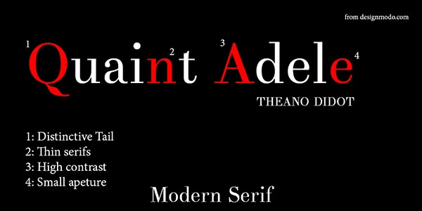
Text – Bodoni/Didot
You probably know Didot and Bodoni as landmark typefaces of the modern serif. The Modern Serif first appeared as Didot, designed by Frenchman Firmin Didot, of the Didot family. Since then, it’s been reimagined by just about every type foundry you can think of. Bodoni, designed by Giambiasta Bodoni, was inspired by the classics of the transitional age.
The differences between Bodoni and Didot are incredibly intricate, but they’re helpful to know. Bodoni and Didot have subtle quirks on certain serifs and tails and stems that give them some flair and feel less reserved. If we think of a typeface as a harmony between its uppercase, lowercase, and number set, we can say that Didot is more quirky with its numbers and uppercase letters, and Bodoni with its lowercase letters. This might be a good way to pick the right face if you’re choosing between the two.
Display/ Text? – Lust
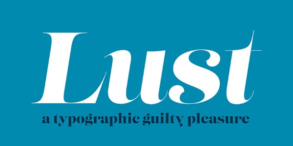
Let’s go even further from the convention. Lust is a one weight typeface that’s incredibly thick, with an intense stroke contrast, evoking a controlled and elegant fat face style. It also carries a didone version that flattens and lengthens its serifs to make them perpendicular to its vertical stems. The surprising thing about lust, is that it’s quite readable at small sizes, in spite of its heaviness. If you can spare the $50, I would encourage trying out lust in dense paragraphs, and seeing what comes out. You could make something quite unique.
So what’s the point of all these categories?
I wrote a guide to serifs to try to make your life a little more convenient. Categories are guides make things simpler, but what’s important is that this is only a model. Everything is a model. And models break, and will always fail to encompass the full artistic spectrum. I can only urge you to approach this article, and articles like it, understanding that drowning semantics and terminology will do you nothing. The point of them is to help you better understand how ideas and feelings are communicated. Anything that doesn’t is a waste of your time.
So don’t listen to me full-heartedly. I may say that Georgia is good for text, but you may find that it’s fantastic for display. You might look at Sanchez semi-bold or full bold and want to put in a 12pt subtitle. Do it. You have nothing to lose. All I can do is offer my opinion. But you have so much opportunity to create.
References for Deeper History:
History of Type (ILoveTypography)
Type classification (Thinking with Type, Ellen Lupton)
