12 Best Email Newsletter Examples & Templates (+ Design Tips for 2026)
Every marketer says their newsletter is “engaging.” But are they really? The ones that actually work share three traits: a repeatable HTML template, one clear action per content block, and a layout that holds up in Outlook, Gmail, and Apple Mail alike.
We pulled 12 of the best HTML email newsletter examples that get this right, and for each one, we broke down the exact layout or code decision worth stealing.
An email newsletter is a regular email that goes out weekly, biweekly, or monthly to keep subscribers updated. Instead of pushing one single offer, it packs several small pieces of content into a single send.
- That’s the main difference between a newsletter and a regular marketing email.
- A marketing email usually asks for one thing: buy this, sign up for that.
- A newsletter mixes a few things, such as a main story, a couple of extra links, maybe a product update or an upcoming event.
Good newsletter HTML loads fast, looks right in every inbox, and doesn’t fall apart on a phone. 55–60% of all emails are now opened on mobile devices; that’s why most non-mobile-friendly emails get deleted within seconds.
Here’s where most newsletter layouts fall apart, and how each example below avoids it:
| Problem | Why It Happens | Fix |
|---|---|---|
| Layout collapses in Outlook | Outlook renders emails with the Microsoft Word engine. | Use nested HTML tables with inline styles instead of CSS Grid or Flexbox. |
| Blank space where an image should be | Many inboxes block images by default. | Add real, descriptive alt text to every image. |
| Text hard to read in dark mode | Transparent PNGs or light-only text colors invert unpredictably. | Test dark mode directly. Don’t assume it inherits your light theme. |
| Wasted first line in the inbox | Preview text defaults to “view in browser”. | Write your own preview text that adds value to the subject line. |
| Multi-column section looks improper on phones | No mobile-specific stacking rule. | Force a single-column layout below 600px. |
Take a two-column “story + image” block as an example.
With Postcards Email Builder, you can create and edit email templates online without any coding skills! It includes more than 100 components and the AI Suite, which builds and translates full templates from a single prompt.
Free Email BuilderFree Email TemplatesIt looks fine on desktop, but it overlaps or shrinks unreadably on a phone screen unless the HTML explicitly forces it to stack vertically below a set width.
600 to 800 pixels is the ideal width. That’s narrow enough to avoid horizontal scrolling on mobile and wide enough to look intentional on desktop.
Screens used to only support that size, but that reason doesn’t really hold up anymore since most screens and email clients today handle widths well beyond 600px. The safest way to know your ideal width is still to test your own email across the clients your subscribers actually use.
To stay safe, keep your newsletter’s width somewhere between 600 and 650px.
Not sure how to land on the right number? Postcards, our email builder, builds templates at 600px by default. Push it to about 700px if you want more room, or go wider once you’ve tested it properly.
Use HTML tables, not modern layout tools like Grid or Flexbox. Outlook renders emails through the Microsoft Word engine, and Word doesn’t understand a lot of modern CSS. That mismatch is the most common reason a newsletter looks perfect in Gmail and improper in Outlook.
A two-column layout built with Flexbox, for example, can stack into two separate full-width blocks in Outlook instead of sitting side by side, because Outlook ignores the Flexbox code entirely. Tables don’t have that problem.
Our complete email design guide walks through the table-versus-CSS tradeoff in more depth if you’re coding from scratch.
With Pulsetic you’ll be instantly notified the moment your website, API, or server becomes unavailable. Monitor uptime from multiple global locations and respond to incidents before your users are affected.
Create beautiful status pages in minutes to keep customers informed during outages and build trust with transparent communication.
Start Monitoring for FreeEvery example below leads with what it does well, then gives you one concrete layout or code detail you can reuse.
1. Brew Markets
Hundreds of thousands of people start their morning with Brew Markets because it delivers the day’s market news in a few minutes.
- Preview up top: a short greeting followed by a bulleted “in today’s newsletter” summary, so readers know what’s coming before they scroll.
- Numbers in a table: a market snapshot table for exact figures like stock prices and interest rates.
- Story blocks: a headline, an image, and a short summary with bolded sub-points.
- Sponsored content, clearly marked: it gets its own background tint so no one mistakes it for editorial content.
- Up or down at a glance: the “Movers & Groovers” section swaps the table for small green and red dot icons, which read faster than numbers do.
The whole email holds together because every block uses the same thin dividers and typeface, even as the content format changes block to block.
That consistency is the real lesson: pick the visual format based on what the reader needs to do with the number.

2. Notion
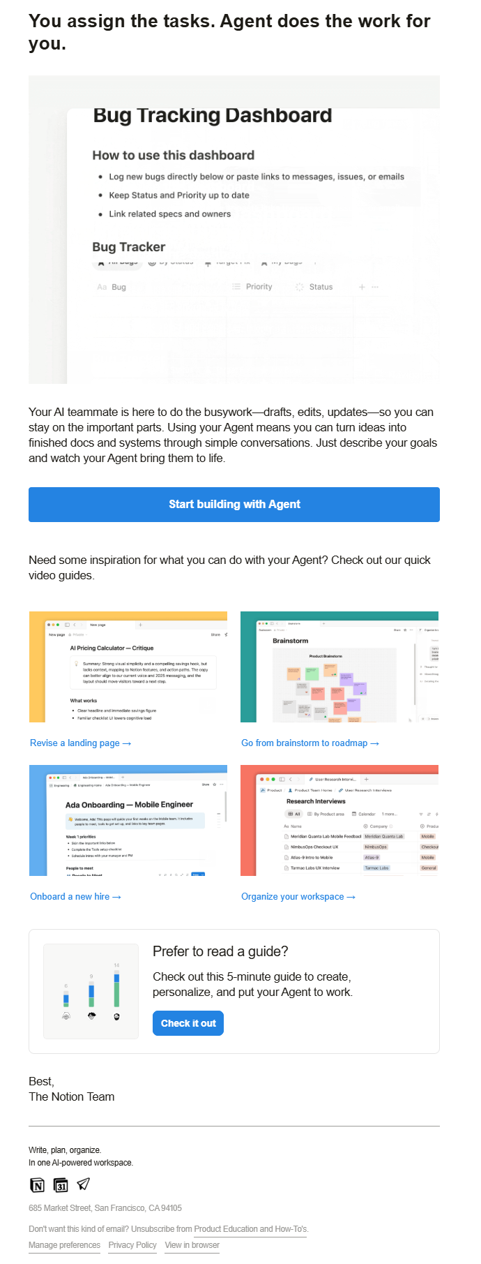
Notion’s newsletter solves a problem a lot of product emails ignore: not every reader wants to read a guide when they’d rather watch one.
- A 2×2 grid of short video guides for people who learn faster by watching.
- One primary CTA button behind the main pitch.
- A separate boxed option, “Prefer to read a guide?”, with its own button for people who want text instead.
The lesson here is simple. Don’t force everyone into the same learning format. Offering a five-minute written guide next to a set of short videos costs very little, and it means neither group has to settle for a format that doesn’t fit them.
3. Webflow
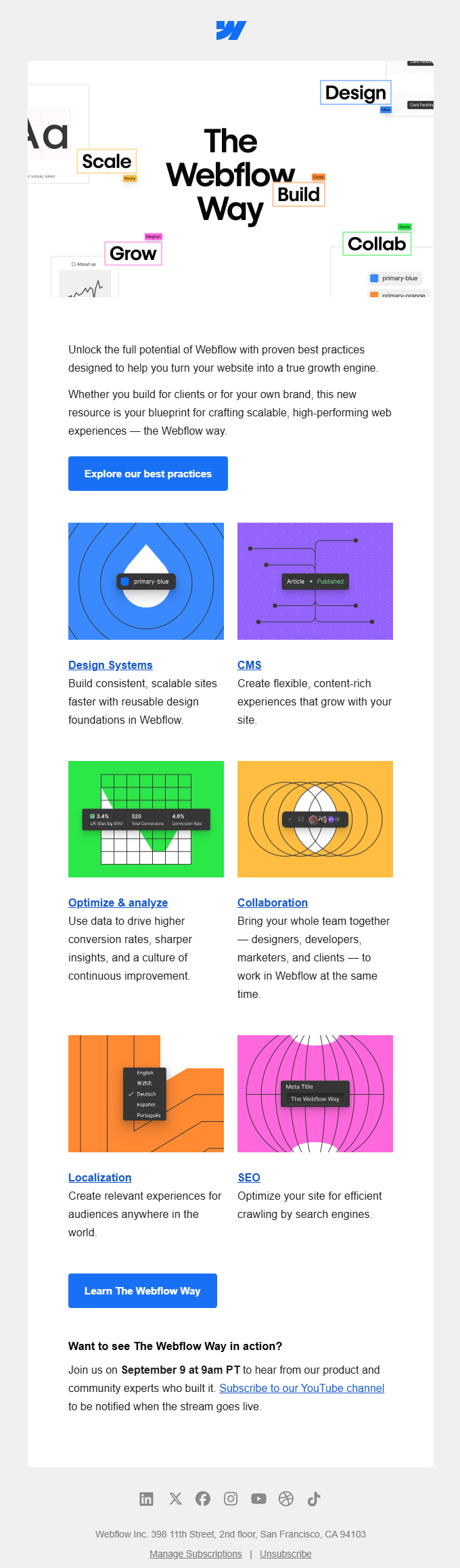
Webflow’s newsletter has a lot to say in one email, and it manages that without turning into a wall of buttons.
- A bold, colorful hero built from small UI-style tags.
- One intro paragraph and one CTA button.
- A six-item feature grid where each item gets its own color, a linked title, and a short description instead of its own button.
- A second CTA and an event callout to close things out.
Only two things in this whole email get a full button: the main pitch and the event invite. Everything in that feature grid earns just a linked title and a line of text.
That restraint is worth copying. When you have six things to mention, giving all six a button dilutes the important ones.
4. Litmus
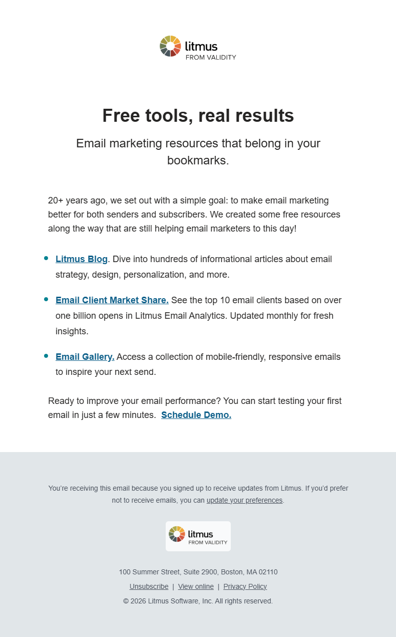
Litmus barely uses design at all, and that’s exactly the point.
- A centered logo, one headline, one short paragraph.
- A plain bulleted list of three linked resources.
- One closing CTA link.
There’s no grid, no color palette, and no hero image competing for attention here, and the email is better for it. When you only point people toward a handful of resources, a plain list of links is faster to build than a designed grid, and it’s faster for the reader to scan too.
5. Grammarly
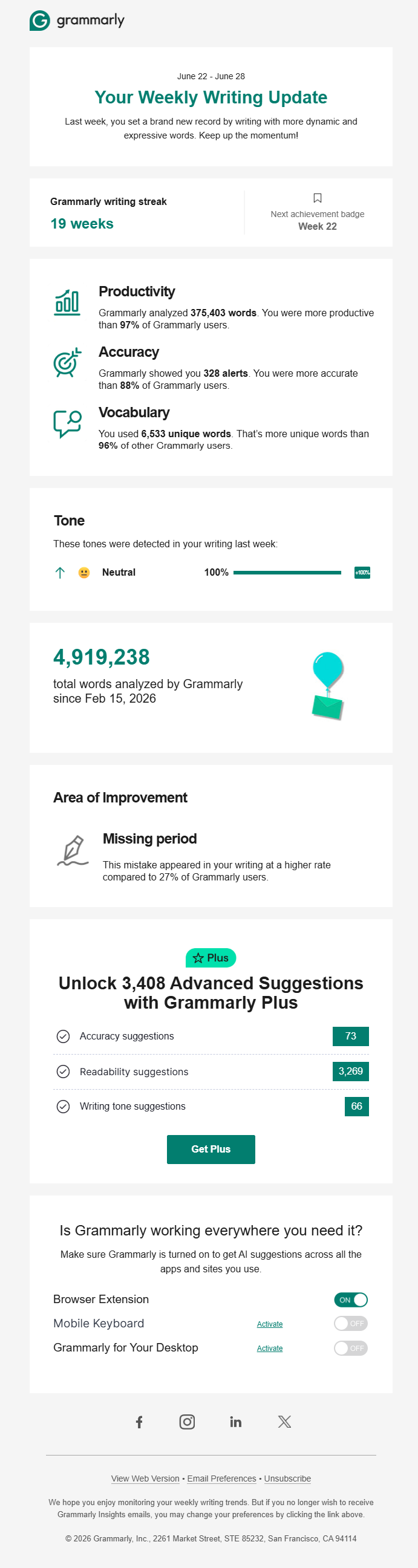
Grammarly’s newsletter turns your own writing habits into the pitch, which is a smart use of data the company already has.
- A streak counter up top.
- Three stat blocks (productivity, accuracy, vocabulary), each compared against other users as a percentile.
- A tone breakdown and a running total of words analyzed.
- An upgrade pitch built from that same usage data: the exact count of advanced suggestions the free plan holds back (3,408, in this case).
That last detail is what makes the upgrade pitch better. Instead of a generic list of Plus features, Grammarly shows the specific number of suggestions you personally missed last week.
A number tied to your own account is much harder to ignore than a bullet list of hypothetical benefits.
6. Figma
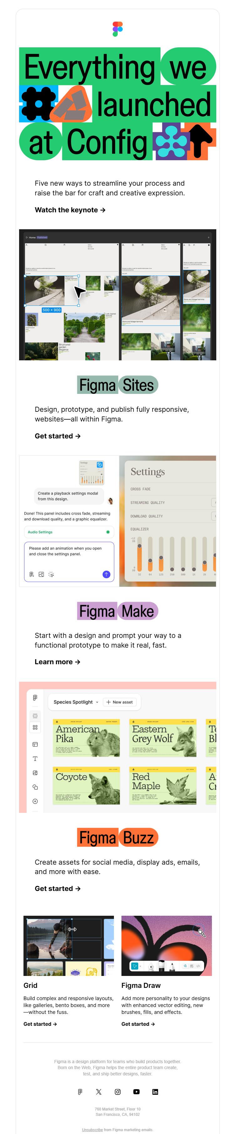
Figma had five features to announce in one email, and it solved the organization problem with color.
- A bold, oversized hero announcing the news.
- The same repeating pattern for each feature: a two-tone color pill label (Figma Sites, Figma Make, Figma Buzz), one line about the benefit, a text-link CTA, and a screenshot underneath.
- Each section’s colors match its own pill.
The layout stays exactly the same for every feature, and only the color changes. That does two things at once: readers can tell the sections apart at a glance, but the email still feels like one announcement instead of five separate emails stapled together.
7. HubSpot
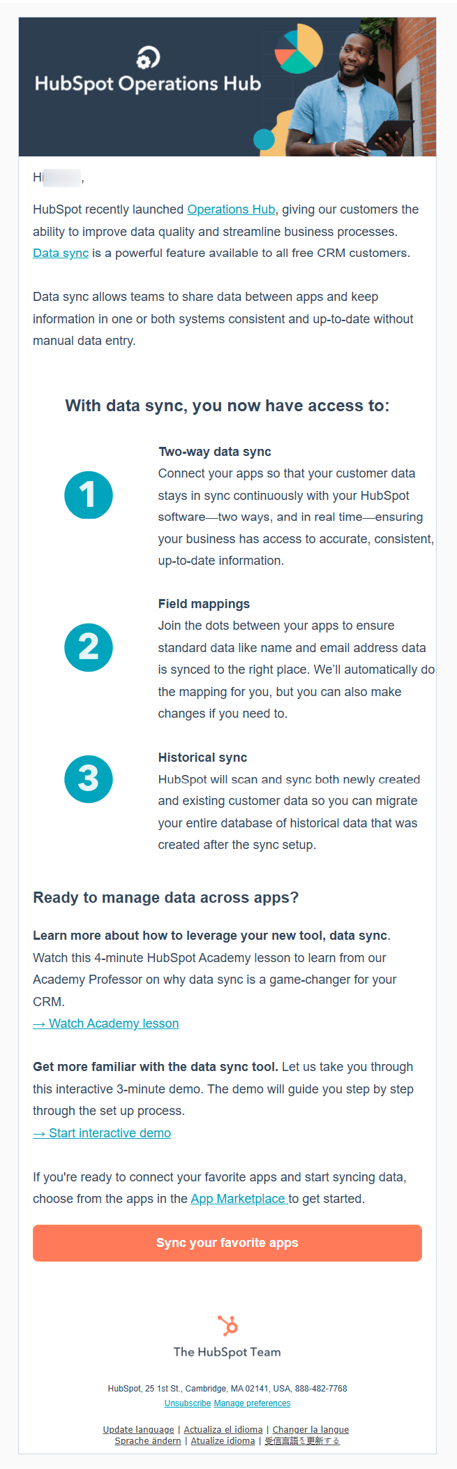
HubSpot’s Data Sync announcement email numbers the benefits instead of listing them.
- A short, personalized greeting and a two-sentence intro to the feature.
- A bold subheading (“With data sync, you now have access to:”) followed by three numbered points, each with a circular number badge, a bold sub-title, and a short paragraph.
- Two learning links for people who want more depth: a short video lesson and an interactive demo.
- One final CTA button.
- Numbering the three capabilities instead of bulleting them sounds like a small choice, but it changes how the reader thinks about the feature.
A bulleted list reads like a spec sheet, whereas a numbered one reads like a sequence of things you get, which is easier to remember and easier to bring up later.
8. Canva
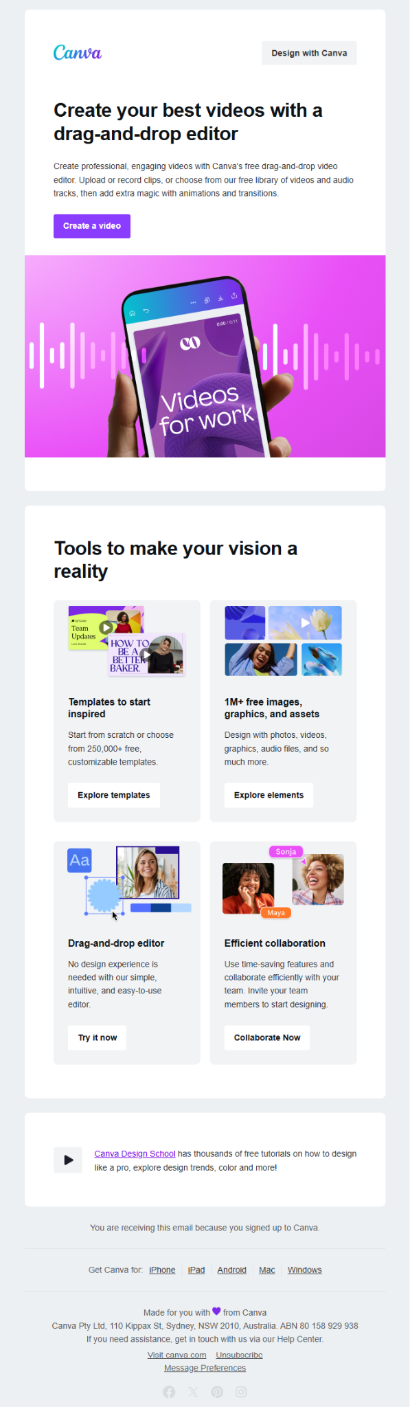
Canva’s newsletter promotes one big feature and four smaller ones underneath it, and it treats those two jobs differently on purpose.
- A bold headline and short paragraph for the main feature (video editing), backed by one CTA.
- A full-width visual banner that reinforces the same feature.
- A 2×2 grid of secondary features (templates, free assets, the editor, collaboration), where every item gets its own full button.
Every item in that secondary grid is a genuinely different tool, not four related links to the same idea, so each one earns a full button instead of a linked title.
Give a full button to something the reader can click on as its own destination, and save the plain link for things that are closer to footnotes.
9. Loom
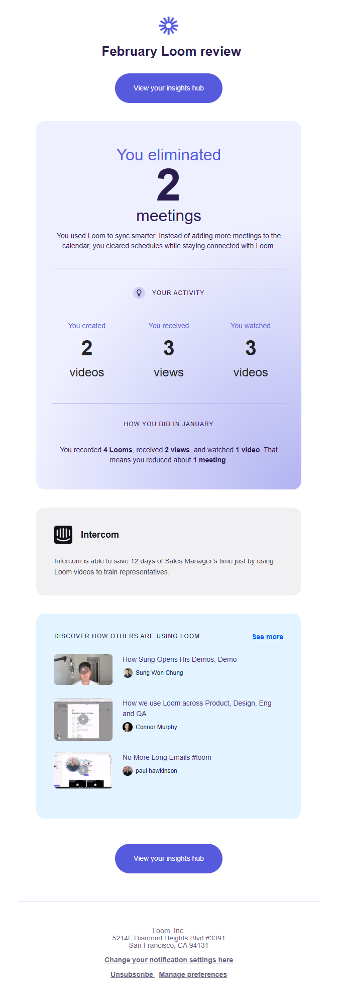
Loom’s monthly recap leads with an outcome and that one choice does a lot of work.
- A headline stat framed around time saved rather than raw activity: “You eliminated 2 meetings.”
- A breakdown of videos created, received, and watched.
- A customer testimonial from Intercom about saving 12 days of a sales manager’s time.
- A small carousel of real videos other users made, right inside the recap.
Two meetings sound like a small number until you remember what a meeting actually costs in a day. Pair that outcome with someone else’s testimonial in the same email, and you turn your own usage stats into social proof at the same time, without needing a separate case study.
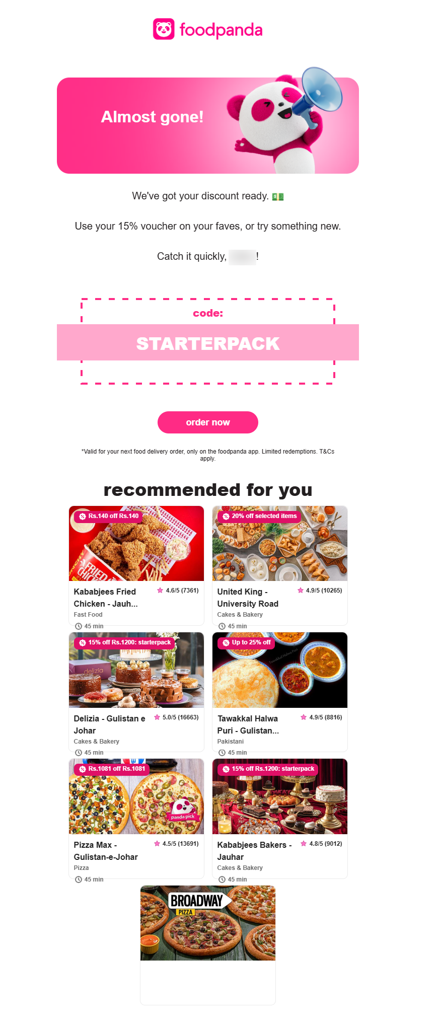
10. foodpanda
foodpanda’s promo email personalizes the email (not only the greeting) and that’s the part worth copying.
- A personalized greeting with the subscriber’s first name worked into the copy.
- A “recommended for you” grid of six restaurants, each with its own live discount badge instead of one blanket offer repeated six times.
- A coupon code inside a dashed, ticket-style border, so it reads like something to tear off and use.
Most promo emails personalize the greeting and stop there. foodpanda carries that same idea into the product grid, so each restaurant shows its own live discount instead of the same generic banner over and over.
Six different offers feel more relevant than one offer copied six times, even when the total discount is similar.
11. Kamran Ahmed
Kamran Ahmed’s newsletter reads like an email from a person because it is one.

- A first-name greeting and a casual, first-person update from Kamran himself.
- An embedded mini tool right inside the email with a “What can I help you learn?” input box along with Course, Guide, and Roadmap options.
- Short sections underneath for each new feature, each with its own button.
- A real sign-off, “Kamran, roadmap.sh,” instead of a company name.
The embedded tool is the standout choice here. Most product emails just show a screenshot of a feature and ask you to click through to try it. This one lets you start using the tool from inside the email itself, which removes a full step between seeing the feature and trying it.
12. Semrush
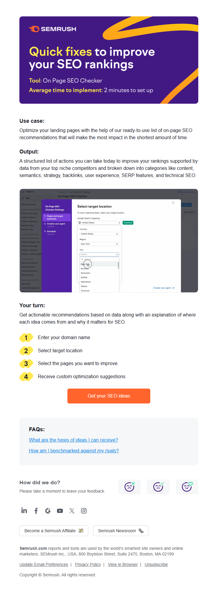
Semrush’s tooltip email is structured like a lesson plan.
- A “Use case” line explaining the problem it solves.
- An “Output” line showing what you’ll get.
- A product screenshot.
- A numbered “Your turn” list, four simple steps with circular number badges, that shows exactly how to do it yourself.
- One closing CTA button, a short FAQ box, and a quick emoji feedback rating.
Use case, then output, then steps, in that order, means the reader knows what they’re getting before you ask them to do anything.
That order matters more than it looks like it should. A numbered list of steps is also just easier to act on than the same instructions written as a paragraph.
If you’d rather start from a working layout than build one from scratch, here are three free HTML newsletter templates you can use.
Eniva
Opens with a warm, editorial-style hero: a big serif headline over a photo, followed by a simple checklist of services and one clear button to book a session.
Below that, an icon grid walks people through how the process works, and a quote-style callout builds trust before you ask for anything.
Use this one if you’re announcing a service, walking a new client through how a first session works, or sending a softer newsletter that needs to feel calm and trustworthy rather than salesy.

Edit This Email Template in Postcards
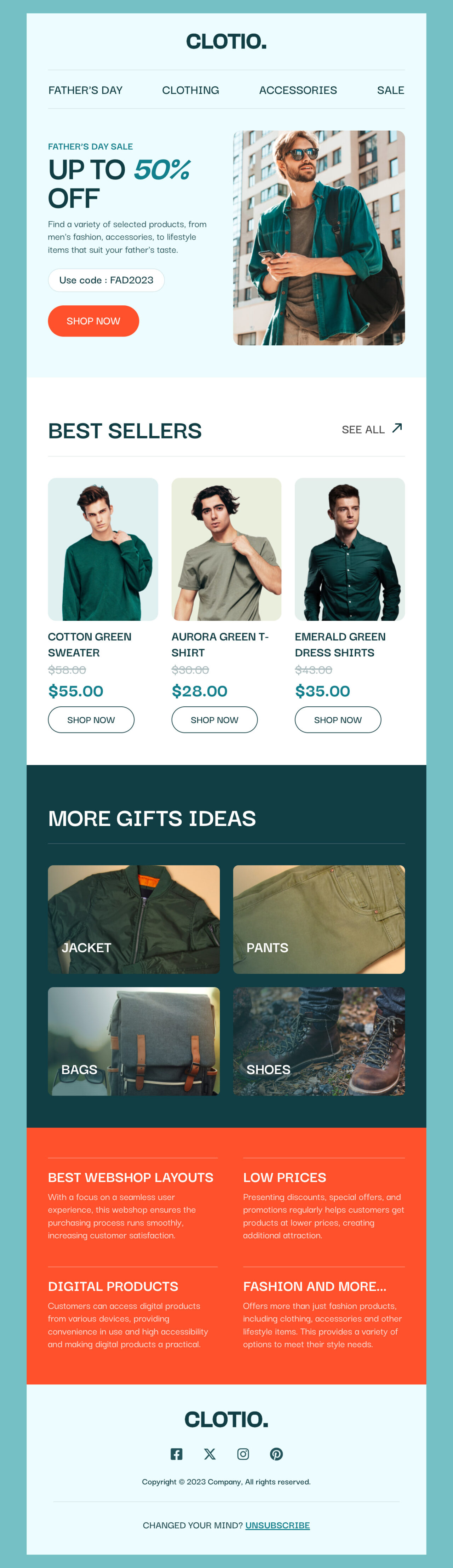
Clotio
Leads with a promo hero carrying a coupon code and a discount callout, then moves into a “Best Sellers” grid that shows real prices with the old price struck through.
Underneath that is a category grid for gift ideas, and a closing band of short features explaining why someone should shop with you.
Use it for a seasonal sale, a holiday gift guide with discount codes, or a product drop announcement where showing prices and several items side by side actually matters.
Edit This Email Template in Postcards
MatchCenter
Built for sports media and event coverage, this template leads with a bold photographic hero, then drops straight into a live-score grid where each match carries its own status tag, like Live or Watch.
Below that, a card-based roundup of articles gives readers thumbnails and “Read more” links for the stories behind the scores.
This one is perfect for a live matchday digest or any content roundup where readers need quick, scannable updates on several time-sensitive items at once.

Edit This Email Template in Postcards
Run through this before sending any email:
| Check | Target |
|---|---|
| Content width | 600 to 800px |
| Layout method | Nested tables plus inline CSS |
| Image alt text | Present on every image |
| Mobile behavior | Collapses to a single column |
| Dark mode | Tested directly, not assumed |
| Preheader text | Custom, 90 characters |
| CTA placement | One per content block |
| File size | Optimized for mobile data |
| Unsubscribe link | Present and functional in the footer |
Use a drag-and-drop builder like Postcards by Designmodo, which exports clean HTML for you. You build the blocks visually: headline here, image there, button below. The tool handles the table structure and inline styles behind the scenes.
With Postcards, you put together the same kind of reusable blocks covered above just by dragging and dropping, and it exports HTML that holds up in Outlook, Gmail, and Apple Mail.
That means you’re not manually checking the whole list above every time you send. Pair it with our free HTML newsletter templates if you’d rather start from a finished layout than a blank canvas.
Also worth a look: our 2026 email design trends roundup, for what’s changing in the space right now.
FAQs
What’s the difference between a subject line and preheader text?
The subject line is the first thing someone sees in their inbox list. The preheader is the short preview text right after it, and if you don’t set it deliberately, most clients default to pulling in your first line of body text or a “view in browser” link.
Some email clients auto-invert colors for dark mode, which can make light text disappear or backgrounds look wrong in ways you didn’t intend. It’s safer to set dark-mode-friendly colors deliberately than to let the client guess.
Should every content block have its own CTA?
Yes. People read newsletters in short scroll bursts, and a reader who stops at any single block should still see a clear next action instead of finding one CTA at the very bottom.
Only if you’re active enough on those platforms to make the click worth it; otherwise, a row of icons linking to inactive accounts adds clutter without giving subscribers anywhere useful to go.





![Best Transactional Email Services: Email API and SMTP Providers Compared [2026]](https://designmodo.com/wp-content/uploads/2026/05/transactional-email-templates-3-404x263.jpg)