Best Landing Page Examples You Need for Inspiration
The landing page has become a surefire way to reach out to customers these days.
According to recent studies, distributing a brand message through search engines, social media, email, and websites makes it possible to market directly to people. In an era when the World has stepped into digital expanse to do everyday stuff such as working, shopping, and even doing sport, digital marketing has become a powerful way to generate leads and rake in cash.
Digital marketing can be realized through various channels; it encompasses a wide variety of marketing tactics. However, among all of them, a landing page examples is one of the trusted treasures that can bring immense benefits. Anyone can handle it since being with us for ages; it has plenty of valid assistants such as Startup that lets you create the landing page of any complexity without any tech skills and numerous tech platforms that collect information to analyze and improve your marketing strategies. Therefore, whatever business you have, whatever skills you possess, you can run marketing campaigns through landing pages quite efficiently.
Let’s walk through the basics of the landing page to find out what essential elements it has to reach its primary goals, what examples of landing pages are excellent sources of inspiration, and what you can do to generate conversions and quality leads.
What is a Landing Page?
Examples of landing pages are numerous; however, in the traditional sense landing page is a page whose task is to convert visitors into leads. It should have one goal not to distract attention from the prime offer. As a rule, it does not have navigation or any other sorts of getaways. It should have a contact form that converts traffic into leads. While a decade ago, this solution worked; now, everything is not that simple. In 2021 customers need much more than that.
Today’s realm requires some drastic measures to face competition with music. The target market is getting pickier. There are so many competitors: it is tougher and tougher to stand out from the crowd. It is not enough to just promote your product. First and foremost, you need to earn trust and loyalty. Then, you need to warm up the crowd by providing hyper-personalized experiences.
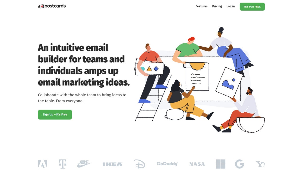
With Postcards Email Builder you can create and edit email templates online without any coding skills! Includes more than 100 components to help you create custom emails templates faster than ever before.
Free Email BuilderFree Email TemplatesThese trustworthy individualized landing pages that sometimes are even pre-filled with subscriber’s data are today’s present. They help not just to convert the users into leads but also shorten the customer’s path, make the journey more compelling, and of course, establish healthy and friendly relationships between the brand and target market.
Goals of Landing Pages
The goal of the landing page is to convert the visitor into a lead. However, what kind of lead are you hunting for? Do you want to collect subscribers? Do you want to create a database of people who are interested in your product? Or do you want to turn leads into sales right away? Depending on your mission, the landing page may have different goals. The most popular ones are:
- keeping your audience focused on a specific campaign;
- promoting an upcoming product, event, or sale;
- testing new product ideas;
- collecting subscribers;
- moving visitors down the funnel;
- moving the landing page up in SEO ranking;
- tracking the success of a particular product;
- advocating the brand.
It is imperative to decide on a goal before jumping into designing a landing page. The clear aim will help to create structure and content that will resonate with your target market the best.
Essential Elements of Landing Pages
Since the landing page is all about converting visitors into qualified leads, it has a specific set of core elements that help achieve this goal. Even though there is no one recipe, since different niches, different objectives, and different situations require different landing pages; nevertheless, whether you are up to leads, clicks, or sales, this set of core elements always stays the same. All high-converting landing pages examples have these things in common. Let’s consider them closely.
Unique Selling Proposition
The first core element of any landing page is a unique selling proposition, aka USP. It sets clear expectations for potential customers and vies for the heart of eligible customers. It should outline who you are and how your offer will benefit users.
It is a complex element that consists of
- the main headline,
- the supporting headline,
- the closing argument.
To nail it, it should be like a short story that leads the visitors from top to bottom, increasing the level of engagement with each step. It should leave an impression and promote the author. Therefore, it should be well-thought-out and enjoyable. Let’s consider each element separately.
With Startup App and Slides App you can build unlimited websites using the online website editor which includes ready-made designed and coded elements, templates and themes.
Try Startup App Try Slides AppOther ProductsKilling Headline for Landing Page
The headline should be short, straight-to-the-point, but with all that punchy and memorable. There are different tactics to go for when finding the best pitch. It can promise something outstanding or address the emotional state visitors have. However, the main thing is to make sure it proves the promises your brand has made and hits the level of commitment you are being asked for.
Supporting Headline for Landing Page
The supporting headline can serve two different purposes. On the one hand, it can be a direct extension of the headline since if you manage to find the short and sweet pitch, you will need some more details for your customers to drag them in.
On the other hand, it can become a sole unit that extends the message and supports the primary statement. It can also cut to the chase and get down to business right away.
The key to every successful supporting headline is to make sure that even scanners and skimmers get what your product does and what they will get in the end.
The Closing Argument
The closing argument is your final chance to communicate your offer’s benefit and win over the potential clients. Believe it or not, but whatever impressive your headline and supporting headline could be; still, your users need a final assurance that they’re making the right move. As a rule, it is a powerful call-to-action that uses action words or some additional shopping incentives and pleasant terms.
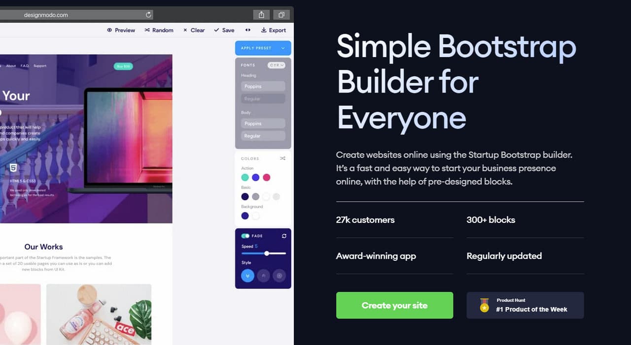
Last but not least, when you create USP, it is essential to consider different page variants since they will help define the version that works the best. To create multiple options for one campaign to A/B test messaging or address different target audiences, you can use Startup.
Visually-Impactful Hero Area
“People eat with their eyes” and “packaging sells,” all of us have heard these adages at least once in our life. Not only do these truths never get old, but they also underlie all the marketing strategies these days.
The deal is, in an era of information overload, people are prone to short attention spans and quick shifting in focus. You can’t expect your customer to spend hours on the landing page. All you have is just several seconds to prove that your product is worthy of their precious time. It is here where the “seducing” packaging, aka design, comes into play. First and foremost, it means that your hero area should sell.
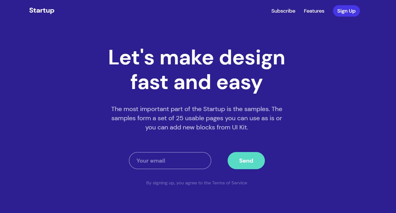
Hero area usually focuses on the visual representation of an offer that helps your visitors better understand your service. The right coloring and good scene can boost the decision-making process and increase the motivation to acquire the product.
For example, instead of using industry or content-specific images, you can use the picture that depicts an action that customer needs to take to benefit from your product. This tactic has a better chance of ending up in high conversion rates. Therefore, stick to visuals that make your product familiar to the customers.
Important things to note when creating a hero area:
- Along with providing visual support for the offer or message, it should also resonate with the audience and help them better understand its benefits.
- It should occupy the upper part of the page so that users instantly drive home a proper message.
- If you use static visuals like pictures, illustrations, or art compositions, you can, and you certainly should use directional cues like eyelines or arrows to draw user’s attention to CTAs or headlines.
- If you use animations, make them all about interaction with your product.
- If you use videos, make sure they are short and straight to the point.
Features and Benefits
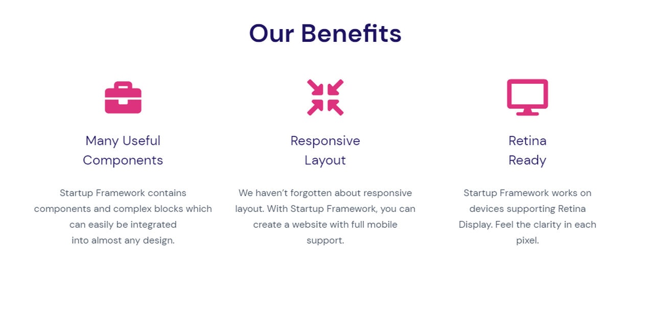
When you win over clients with visual assets, it is time to provide a little more context to amplify the overall effect. For this, you will need a well-thought-out features and benefits section.
The goal of this block is to bring value to the user and show them how your product can solve their problems. To make this part of the landing page effective, you need to turn complicated features into situational benefits. What’s more, follow these best practices:
- Be short and sweet since no one will read a long story of your product, even if it is fascinating.
- Choose the features and benefits that are of the most value to your customers.
- Highlight features that separate you from the competition.
- Use formatting to avoid walls of text.
- Use visual assets as icons or small illustrations to make content easily and quickly scannable.
Section for Quantifying and Qualifying your Brand and Product
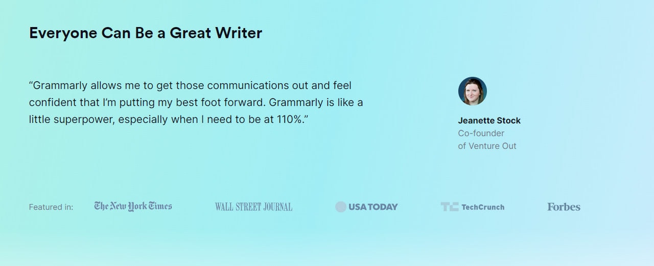
In 2021 when everyone is sitting in the digital World, you simply can’t do without a section that quantifies and qualifies your brand. People should know why you are the best one, not from you but from their friends, colleagues, peers, and neighbors. For this, you need either social proof or some impressive statistics.
Believe it or not, but a product review is a powerful tool of persuasion, especially when it covers not only bare facts or insipid comments, but also video, personal view of the product, and maybe even some personal but not harsh cons since there is always room for improvement.
According to recent studies, the average consumer spends almost 15 minutes reading feedback before committing to you. Therefore, to avoid him or her hitting google in search of some alternative comments about your product that may ruin everything, provide feedbacks by yourself, and save the day for both of you.
So, what can you use on the landing page to qualify and quantify your brand and product? There is a number of social proofs, such as:
- List of famous brands that use your products;
- Awards from reputable organizations;
- Impressive statistics about your brand: count of how many customers you have or how many products were sold;
- Feedbacks and video reviews.
Some companies use all of them, while others employ only the best of the best. Depending on your campaign, you should choose your way to quantify and qualify the brand.
Pricing
Pricing is one of those things that should not come as a surprise. Believe it or not, there is no point in hiding pricing like entrepreneurs did it a decade ago. Prospects will find it out eventually. And if it disappoints them, they turn away not only from your product but also your brand.
The policy of playing fair and square always earns the brand some extra points and helps to build trust. It ensures leads that you get are interested in your brand and agree on your terms. You can work with them later, push them down the funnel, and get some valid results.
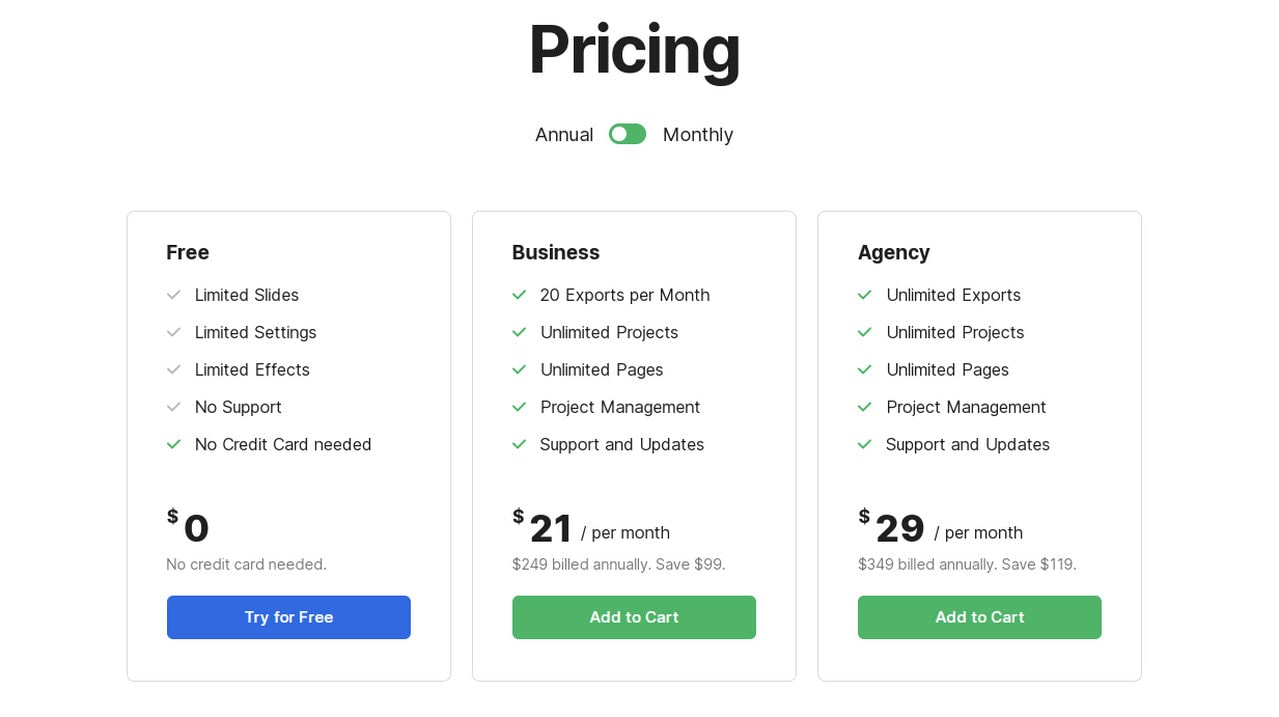
What’s more, we are living in an era when people appreciate transparent terms. Everything should be on the surface. People do not want to waste their time on mining. They want to get crucial information right here, right now. The price tag is critical: it influences the entire decision-making process. Therefore, a clean and neat pricing table should be present.
Call-to-action
Call-to-action is arguably the most critical element on the landing page. It belongs to the trio that includes such bandmates as USP and hero area. It is like a closure that every story should have to delight readers instead of disappointing them. It is that part of the landing page where the conversion happens.
It can be a part of a lead gen form or just a standalone unit that finishes off the visitor’s journey. It should be clear and transparent. To make it impactful, it should not only feature action words or some other marketing tricks, but first and foremost, it should clarify what a visitor will receive in exchange for their click.
As for design, CTAs usually have a striking appearance that helps them stand out from the reading flow and catch the eye of the potential customer. There are five things you need to consider
- It should be significant and prominent.
- It should have some effects that make it enjoyable to interact with.
- It should be not only at the bottom of the page but also “above the fold.”
- It should be twice the size of the body copy.
- It should use a pivotal color. The best color options are blue and green since they add to the buttons some additional psychological traits like a sense of trust or safety. However, it does not mean that you can’t use brand colors. On the contrary, if you have a bold and eye-catching hue, then go for it.
How to Create Successful Landing Page
Since there is no one-size-fits-all solution, excellent marketing is all about finding the right balance between formulaic landing page format and details that wrap your message and make the UI stand out from the crowd.
The success of a landing page strongly relies on your ability to create an unforgettable customer experience and prove to customers that they need your product. Of course, your primary weapon is personalization. However, if you aim at new clients, you do not have the pleasure to use the subscriber’s preferences and purchase history to make the experience that fits the bill. Though it does not mean you have to shoot in the dark, follow these landing pages’ best practices to improve your marketing asset.
- Set clear goals.
- Do keyword research.
- Define the target market. Tailor your landing page for individual audiences.
- Personalize every critical aspect if it is possible.
- Do not overlook the power of trust signals. Add testimonials, reviews, feedbacks, awards, accolades, or any other credentials.
- Make the design mobile-friendly. According to stats, mobile users are more likely to convert than desktop ones, especially if you have an instant chat with a team member or phone number.
- Make the design accessible. Provide alt’s for images, add information for AT, hit the optimal contrast, use whitespace and formatting to make the copy easily readable and scannable.
- Avoid sleazy marketing buzzwords and terminology. Stick to the content that is understandable by the large crowd.
- Use a language that emphasizes the prospects’ wants and needs.
- Use “power words” to subtly manipulate prospects’ fears.
- Employ short and compact forms.
- Ask for the minimum amount of information.
- Keep navigation clean and simple.
- Well-format copy to ensure the focus of the audience remains on the content.
- Stick to promises throughout all the media channels. Keep landing page and ads in sync.
- Optimize for SEO.
- Use a custom questionnaire or several forms where each one suits the individual needs of the visitor.
- Make the landing page fast. Optimize all crucial elements of the interface: scripts, images, videos, animations, and even tiny interactions.
- Find the marketing automation tool to get all the required information about your fresh clients and their interactions with the interface. This information helps nurture the lead to turn him or her into a qualified lead, which is much likely to move through the marketing funnel.
- A/B Test. Test everything: the headline, font and coloring, call-to-action, the position of forms, and even copy. There is always room for improvement. Find the best landing page variant for your target market. If you don’t want to waste your time on creating everything from scratch, you can use Startup, where you can assemble the template within minutes and alter the details within seconds, thereby generating various versions of the same landing page in no time.
Trends in Landing Pages
Aesthetics judgments are a real thing. The first impression of your brand happens in a split second. If it is wrong or if the design is old and stale, you won’t have any chance. Your users will close the tab and never get back again—design matters.
The high-converting landing page is about getting all the crucial elements in line and staying at pace with the leading trends applying them wherever needed.
Consider these three massive trends to embrace in order to make your next landing page look up-to-date.
Custom Illustrations
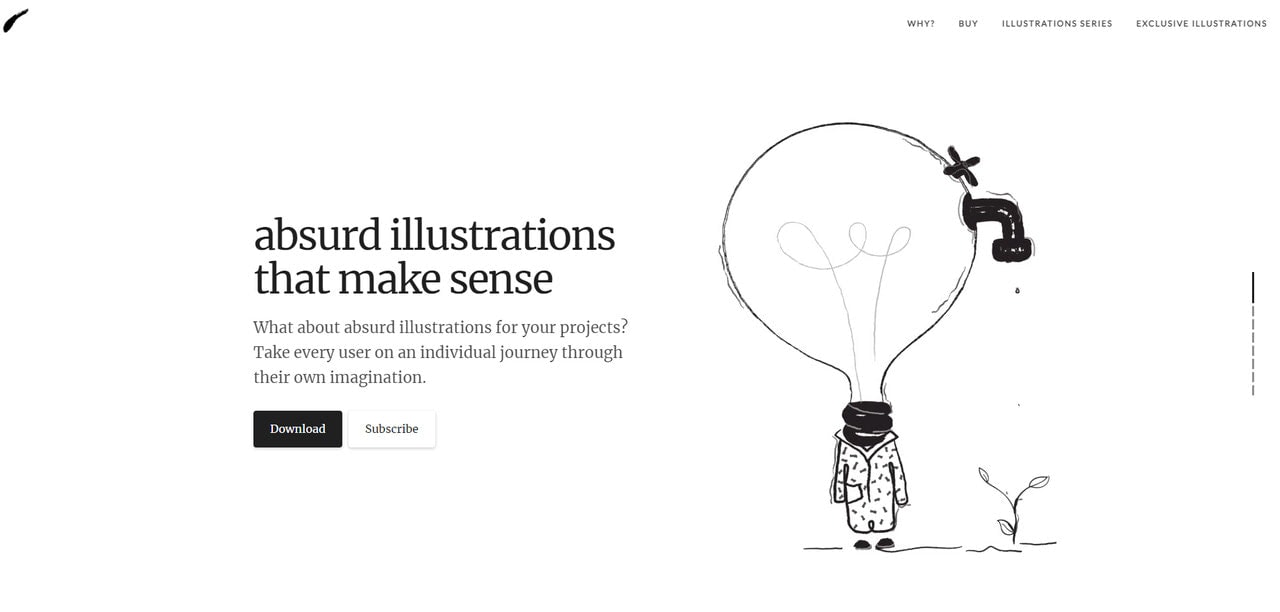
In 2021 custom illustrations will take the place of stock photography and get widespread attention. It is a huge trend in web design, email design, and of course, landing pages.
Although custom illustrations come in all shapes and sizes, this year, brands will fall for surrealist illustrations, human illustrations, and abstract art compositions that feature nothing more than just primitive geometric shapes.
The main reason for this trend’s growing popularity is that it offers a variety of cost-effective and time-saving options where you can let your imagination run wild. It bridges the gap between genders and generations; when properly applied, it can easily promote inclusivity. Finally, it helps to communicate with your brand on a new level and makes the aspects of the product clean and transparent.
To make this trend even more beneficial, you can set illustrations in motion, turning them into short animations.
Neumorphism
A successor to skeuomorphism, neomorphism is a compromise that was so necessary to end the strife between fans of the flat style and those who pine for some graphic details in the interface. It combines the best qualities of these two approaches that generated a huge stir back in the day.
Neuomorphism mimics physicality but at the same time stays clean and neat. It simplifies concepts in a way that adds to the aesthetics a touch of sophistication.
The approach was gaining traction last year; it certainly does not intend to stop now. Use it in icons, small illustrations, and of course, buttons. Thanks to embossing or debossing used in this approach, you will make any detail of the interface pop out naturally.
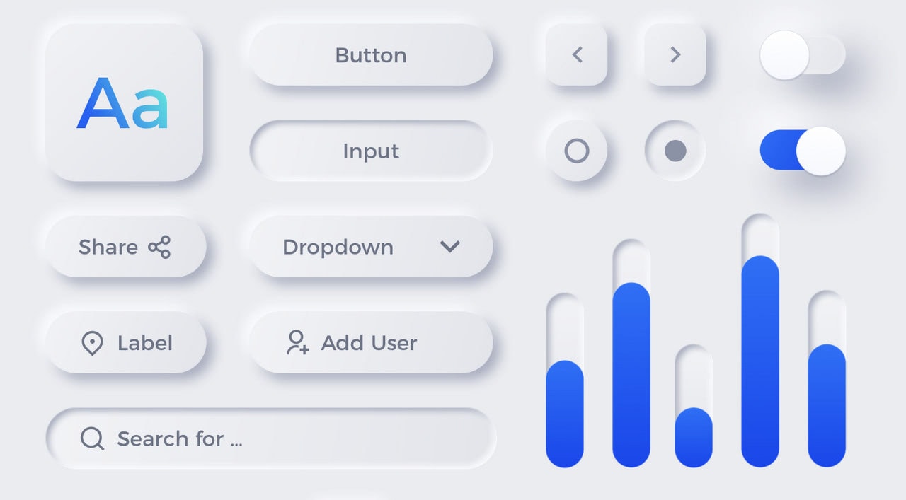
Freebie Neumorphic UX UI Elements by Emy Lascan
Interactions
2020 was all about the scroll. We were scrolling through Instagram stories, news in online magazines, products on Amazon, digital books, and just Google pages in search of fresh updates on Cyberpunk.
However, in landing page scroll does much more than navigating; it is used to interact and get positive responses from users. It increases engagement, gives the product a cutting-edge feel, and wins extra points for your company by being ultra-modern and sophisticated.
Parallax animations, scrolling transformations, small playgrounds, and captivating questionnaires, we’ve witnessed the rising popularity of various interactions last year. 2021 won’t be any different. Therefore, be ready to spruce up your landing page with some interactions that will take the user experience to the next level and make the story of the product more enjoyable and memorable.
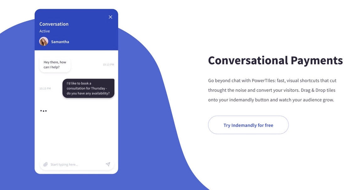
Indemandly home page design interaction by Taras Migulko
If putting trends into action seems like a real challenge, you can always address this issue to Startup. Its development team regularly updates styles in its collection to help the users build modern landing pages within minutes.
Perfect Landing Page Examples
Walking through various examples of landing pages is increasingly important since it is here where you can get some valid and, most importantly, working solutions. Let’s dive into our collection of fresh landing page examples made by famous brands, aka teams of real professionals, to find cues to improve your landing page.
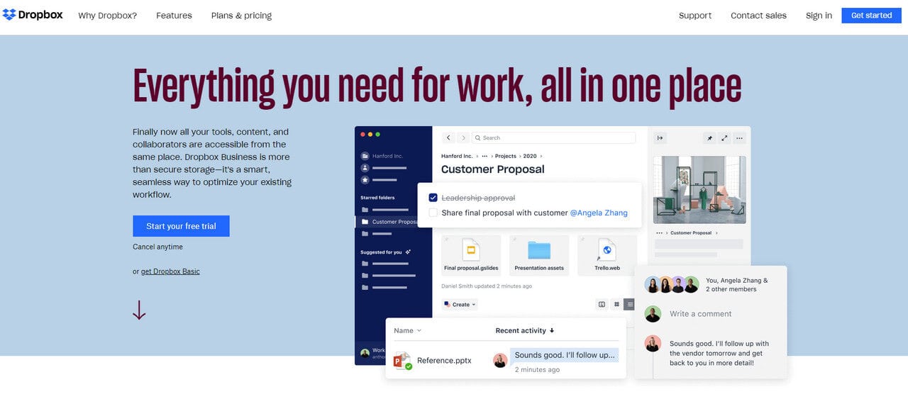
We will start our collection of landing page examples with one of the industry’s goliaths, Dropbox. It has several landing pages to hit different target markets.
The landing page that we have chosen zeros in on one of the most popular user’s problems: keeping all crucial tools and assets in one place.
Here, the USP is all about saving the day. Even though the main headline is pretty long and the subheading feels like “TL;DR;” at first glance; nevertheless, it still works since the immense size and contrast colors do magic, making the main heading an absolute eye-catcher.
As for other core elements, the landing page has a powerful hero area with a product screenshot, pricing table, features and benefits section, social proof section, and of course, a call-to-action banner. Every detail perfectly blends in and pursues one goal, aka convert visitors into customers.
Note one thing. Here you can see navigation in the header and footer. Even though it is a mauvais ton, here, it looks organic. The deal is, this landing page is a part of the main website. Therefore, you can use regular navigation and even provide links to other landing pages.
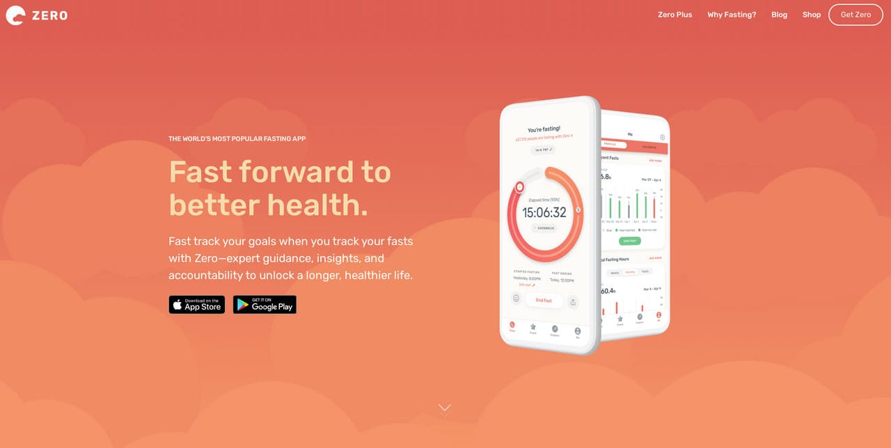
Zero Fasting
Zero Fasting is one of the traditional landing page examples used for promoting mobile applications. However, it does not look outdated. The team skillfully follows the modern tendencies turning the micro-website into a true masterpiece.
- It gets kudos for being structurally correct.
- It tells the story instead of blindly leading visitors from top to bottom, leaving pretty much a positive impression.
- It smartly uses motion. There is no overwhelming videos or animations: everything is simple yet elegant and subtle.
- Each section is like a sterling chapter that keeps a user’s interest alive and promotes the product.
- The entourage is flawless. The landing page is aesthetically pleasing to enjoy. It makes a powerful first impression that will remind about itself even later.
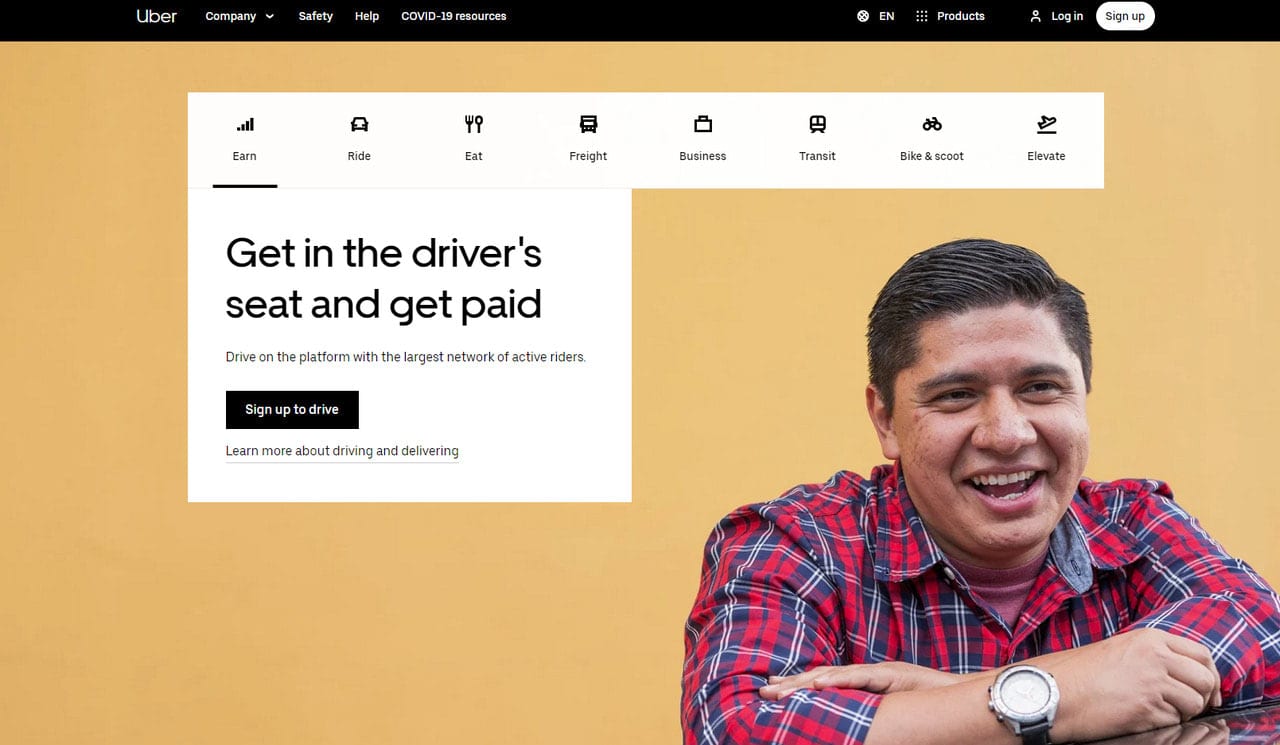
Uber
Uber’s homepage is a unique kind of landing page examples. It is a perfect source of inspiration and hints for everyone who wants to serve various target markets.
So, what key takeaways you may find here.
- It is a multifunctional hero area. Thanks to the classic UI element, tab, and compact and straight-to-the-point answers, users with various needs can quickly locate the necessary information. Whether you are up to earning money or requesting a ride, or discovering delicious eats, you can do this without extra moves.
- Each such tab addresses an issue quite efficiently: it offers a form or link to get further information. This approach strengthens the motivation of potential clients right from the get-go and keeps them on the hook.
- There is social proof that quantifies the value of the brand.
- There are beautiful illustrations that give the aesthetics a pleasant appeal and show various situations that are familiar to the clients.
- It is pretty compact, cutting to chase and delivering the message right away.
Although it does not fall in examples of landing pages traditionally made, since it has two call-to-actions, nevertheless, as a platform that should meet different market types and convert users into leads of various niches, it certainly works.
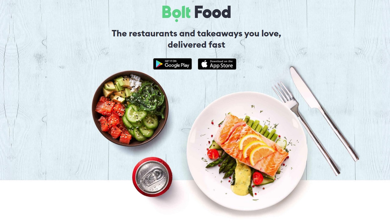
Bolt occupies the same niche as the previous example. Like Uber, it provides services for various markets: drivers, passengers, eaters, restaurants, etc. However, each page has one goal, even the homepage, whose task is to promote applications and increase their downloads.
Let’s consider one of its examples of landing pages dedicated to food. As we have said, each page on a website can be a landing page. This is vivid proof of that.
So, what things make it stand out from the crowd?
- It greets users with a powerful hero area. Here you can see a “delicious” image, a bold headline, and two buttons for downloading the application.
- It includes some helpful content for all those who are interested in this application.
- It is minimal and compact, providing only value.
- It has a good closure with call-to-actions that are duplicated for better convenience.
Note, although this landing page can’t boast of ultra-modern features like interactions or animations, still, thanks to beautiful coloring, lovely images, and some abstract shapes set in the background, it feels refreshing and up-to-date.
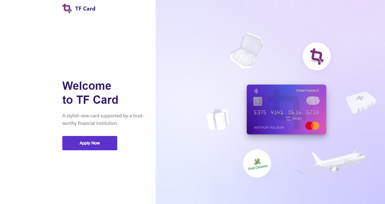
TF Card
Unlike the previous examples of landing pages, TF Card wins over potential clients with a storytelling experience. Using scroll animations, tiny interactions, and illustrations, it promotes the product in a quite engaging way. Thanks to a split-screen, you can read not only copy but also get engaged with smart visuals. All these tiny design solutions efficiently increase engagement and improve conversions.
That’s not all; the team also sticks to the best practices:
- A landing page has a powerful USP.
- Call-to-action is above the fold and at the bottom of the page, making a good start and satisfactory closure.
- A beautiful short animation supports each benefit and feature.
- The design is mobile-friendly and responsive.
- The copy is well-formatted so that users can quickly scan it.
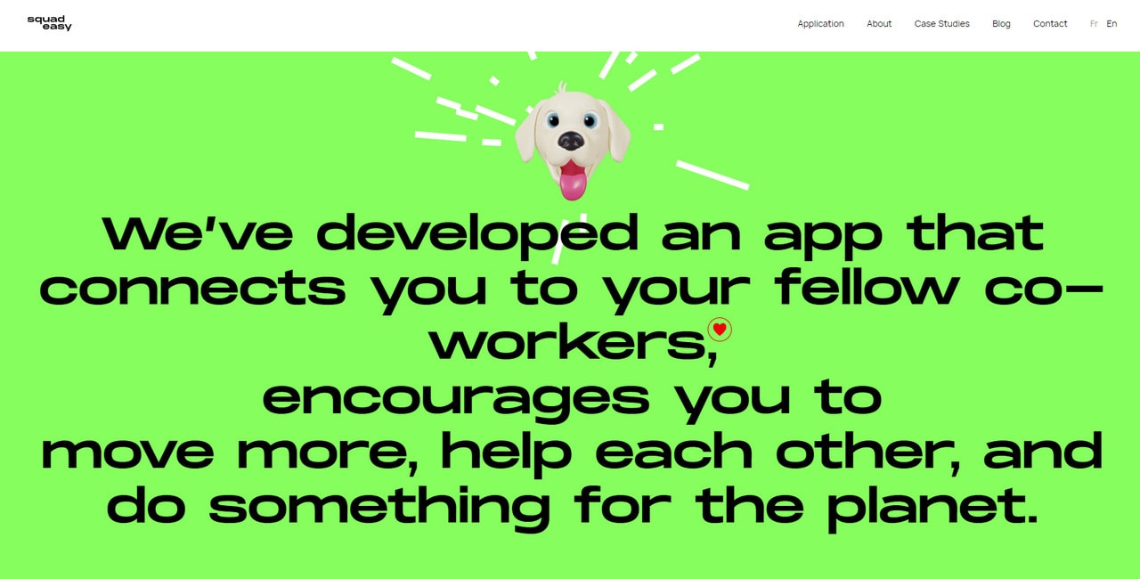
Squadesy stands out from the crowd with its unique entourage. It looks extravagant and sophisticated, even though all it does is just promote the application. However, the first impression always counts. Do bear this in mind when you strive to create a high-converting landing page.
The design is built with the help of several ultra-modern tricks. They are
- Scroll-activated animations and interactions that are intertwined with content.
- Beautiful typography that amplifies the statement.
- The bold and daring coloring that accentuates important details.
- A mascot that is set in motion to keep the user’s focus on the page.
- A well-thought-out choice of core components.
Last but not least, note how traditional elements were taken to the next level. The social proof section is flawless: the brands and awards are featured as a trendy newsticker, testimonials and numbers that quantify the brand’s value are made as toxic cards. Impressive.
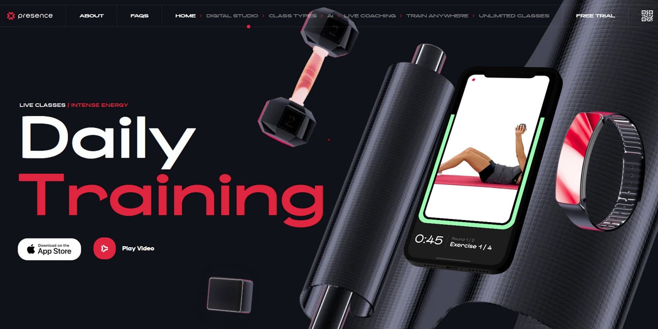
Presence
Presence is one of the representative examples of landing pages that strongly rely on videos’ impact. Here short and long videos rule the roost. They greet the users right from the doorstep; they follow the user during the journey through the page; they are used as supporting material.
On the one hand, they make an impression; on the other hand, they clarify things about the product and make it more familiar to the target market.
Note other essentials.
- The headline and sub-headline are well-thought-out. They are strong; they are bold. You get messages even without going into details.
- The application’s benefits are skillfully integrated into the design occupying the critical part of the user’s journey.
- The pricing tag is featured right at the bottom.
- The section with trainers raises trust and qualifies the value of the application.
- Several call-to-actions pursue the same goal. They use action words and power words.
- Last but not least, the landing page looks ultra-modern. It wins over users with its stylish appearance that has some pioneering features to marvel at.
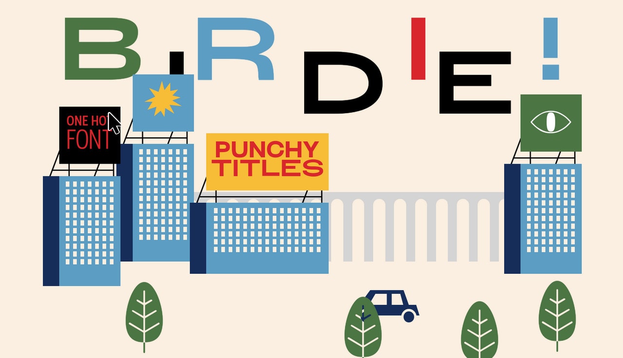
Whirly Birdie is a typical example of a landing page used for advertising typeface. This direction is increasingly popular. Many designers try their hands in this sphere.
To give their product a solid foundation, they use compact yet increasingly creative landing pages impregnated with the product’s artistic nature. This one is no exception. It looks like a sterling artwork where beautiful illustrations meet typeface to create excellent aesthetics.
Note, even though this landing page relates to a specific business sector, it has all the essentials of high-converting landing pages from other niches. There is an impressive hero area with bold and strong headlines, features, and benefits realized as small playgrounds where you can see the typeface and icons in action, a pricing table, and of course, a CTA.
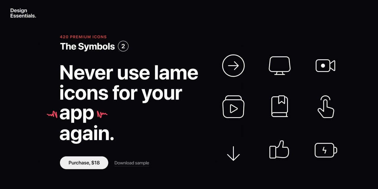
Symbols
Much like several previous examples of landing pages, this one also represents a product made by designers. It is a typical promo page for a premium set of icons. Again, we can see here all the core details, yet with some twists.
Consider a hero area. It has a headline that is partially animated. The team plays with several words to make the statement more convincing. You can see a showcase of icons on the right side. However, unlike other landing pages where the hero area is static, this one is interactive. You can hover over icons and get an actual response. There are also a call-to-action and even price tag.
The hero area combines all the crucial details flawlessly. It is a powerful tool that ignites interest, captures attention, and pushes users forward.
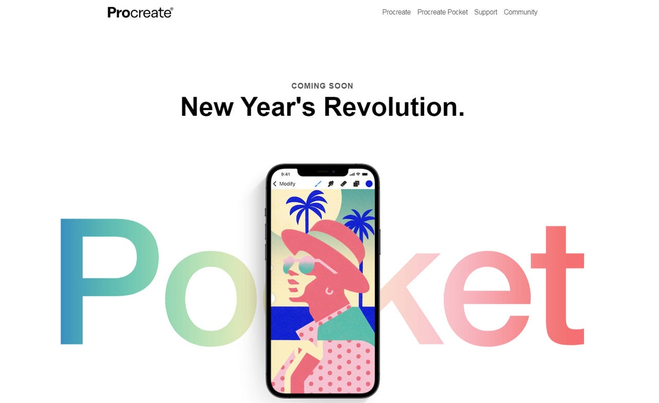
Coming soon can be considered as a unique type of landing page examples when done right. This ultra-minimal, compact, and almost capsule page has one goal – get subscribers on board to fill the database with potential clients. So, it is a landing page, after all.
Note, it is managed to use crucial elements such as USP, hero area, and CTA. It also uses some modern design features that make it aesthetically-pleasing and even trustworthy. Although the landing page seems a bit scarce at first sight, nevertheless, it is enough to carry out its mission.
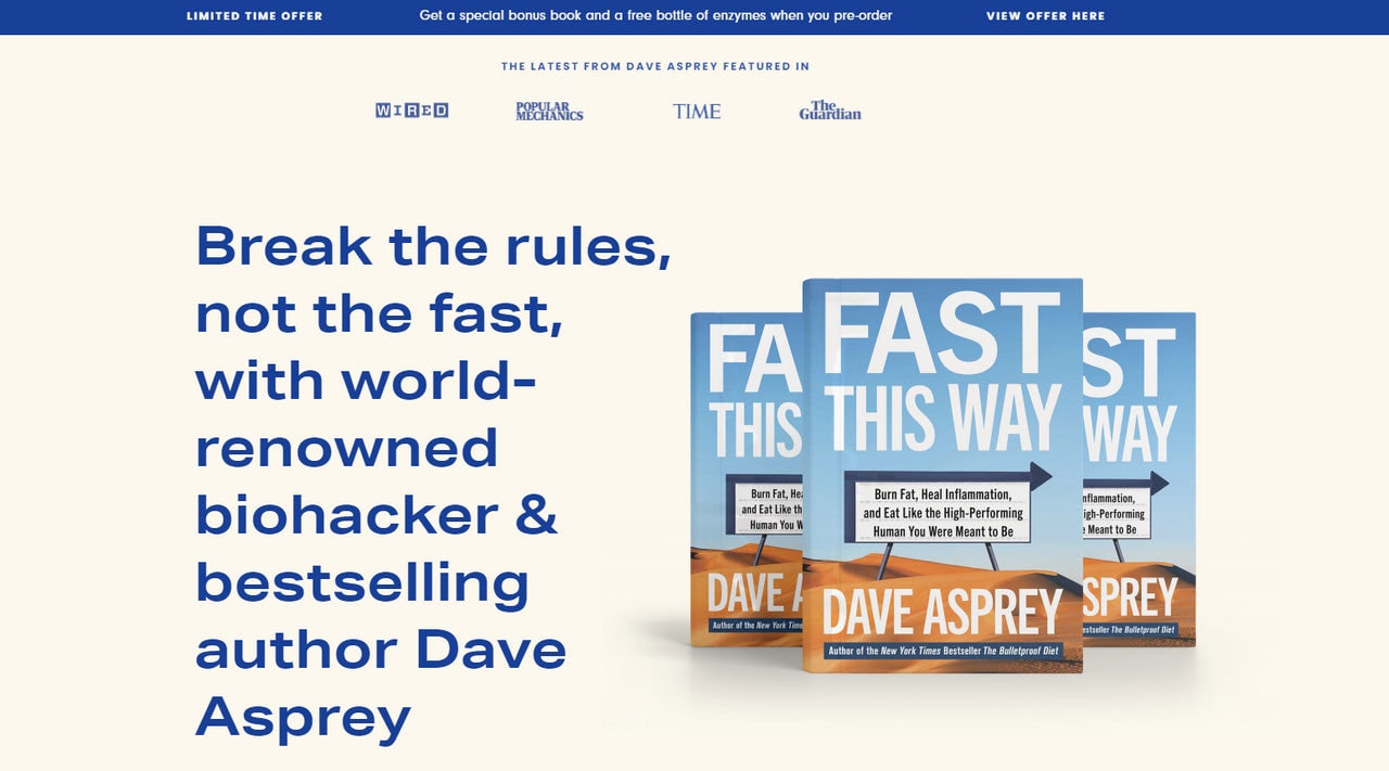
We are going to end up our collection of landing page examples with a purely traditional solution. If you want to see how it was done, say, five years ago, this one is to take a look at. It is like a blast from the past. However, it does not look dumb nor insipid. The deal is, it has a slew of renovations that helped it to meet the current demands and trends.
So, what can you find in this refurbished version?
- It is packed with modern features: tiny dynamic effects, illustrations, bold coloring, scroll-triggered animations, and interactions.
- It offers scannable yet descriptive headers.
- It has social proof right at the top.
- It has testimonials from authoritative sources.
- It has a personal bio with a portrait that increases trust.
- It has several blocks with CTAs.
- It has a special offer for every committed customer.
Although the landing page is quite long, it is still intuitive and easy to navigate. And, thanks to the modern take, it feels enjoyable.
Conclusion
Being a quick-fire tactic that gets results right here right now, the landing page has come a long way. A decade ago, it was like an insipid treatise, whereas nowadays, it is like a short yet captivating interactive story.
Much like anything else in the web design sector, it also is not alien to trends. It constantly undergoes changes to meet modern tendencies to keep up with the fast-changing World. Therefore, while five years ago, the landing page was a strict term with no exceptions; today, it has become much broader. It can be any page on a website as long as it pursues just one goal. Therefore, it can easily be your homepage.
The key to a high-converting landing page lies in various details: personalization, proper segmentation, strong USP, beautiful aesthetics that best resonates with the audience, and copy that brings actual value to the potential customer. Therefore, stick to the core elements, follow the best practices, and get some helpful cues from landing page examples from over the World to create a platform that will convert users into qualified leads.
